Chapter 6 - Causal Diagrams

6.1 Causality
In this chapter, we are going to discuss causal diagrams, which are a way of drawing a graph that represents a data generating process (DGP). We are going to be using causal diagrams in the rest of the book. We will use these diagrams to work out our research designs and figure out what exactly we should do with our data, and how we can identify the answers to our research questions.
Before we get to the diagrams part of causal diagrams, let’s talk about the causal. We are going to use causal diagrams to think about research because it will help us address causality. What does it mean for something to be causal? What is causality? We can say “\(X\) causes \(Y\),” but what do we specifically mean by that?
For that matter, why worry so much about causality? Because many research questions we are interested in are causal in nature. We don’t want to know if countries with higher minimum wages have less poverty; we want to know if raising the minimum wage reduces poverty. We don’t want to know if people who take a popular common-cold-shortening medicine get better; we want to know if the medicine made them get better more quickly. We don’t want to know if the central bank raising interest rates was shortly followed by a recession; we want to know if the interest rate hike caused the recession.
Okay, maybe we do want to know those other things too.94 If we do, we have a descriptive research question. But a lot of the time, even non-causal analyses and research questions have a causal question lurking underneath. How many times have you seen a headline like “getting less than eight hours of sleep a night is linked to early death!”? The actual study itself may have made no causal claims. And “linked to” doesn’t technically say anything about causality. But because “does a lack of sleep kill you?” (causal) is so much more interesting a question than “do people who die early also tend to sleep less?” (non-causal), we the readers apply wishful thinking to incorrectly interpret the result as causal.95 And in case you’re wondering, yes. The author of this book does get far angrier at this stuff than at actual problems.
There are lots of words that are generally taken to imply causality, as well as words that describe relationships without implying causality.
What are some of these words?
We can say that \(X\) causes \(Y\) by saying: \(X\) causes \(Y\), \(X\) affects \(Y\), the effect of \(X\) on \(Y\), \(X\) increases/decreases \(Y\), \(X\) changes \(Y\), \(X\) leads to \(Y\), \(X\) determines \(Y\), \(X\) triggers \(Y\), \(X\) improves \(Y\), \(X\) is responsible for \(Y\), and so on…
We can say that \(X\) and \(Y\) are related without implying causality by saying \(X\) and \(Y\): are associated, are correlated, are related, tend to occur together, tend not to occur together, go together, and so on…
There are also some “weasel words” that don’t technically say anything about causality but clearly really want you to hear it. If some weaselly writer (certainly not us) doesn’t want to say causality but does want the reader to hear it, they might say: \(X\) is linked to \(Y\), \(X\) is followed by \(Y\), \(X\) has ramifications for \(Y\), \(X\) predicts \(Y\), people who \(X\) are more likely to \(Y\), \(Y\) happens as \(X\) happens, and many others.
Knowing these terms can help you interpret what scientific studies are really saying, and when someone might be trying to pull one over on you.
Also, looking at these words might help us figure out what exactly causality is. Look at the causal phrases. They have direction. They tell us that \(X\) is doing something to \(Y\). In contrast, the clearly non-causal terms don’t even need to specify which of \(X\) and \(Y\) goes first. They just talk about these two variables and how they work together. The weasel terms are so weaselly specifically because they’re written in a way that implies that direction from \(X\) to \(Y\), even if they’re not literally claiming a causal relationship.96 The key is that all the weasel phrases are equally true if you swap the positions of \(X\) and \(Y\), even though swapping them would really change how we’d interpret the claim. “Aspirin is linked to headaches” is no more or less true than “Headaches are linked to aspirin.” You can hear the notion that aspirin causes your headache in the first one, which is false. You can get away with it without technically lying because it’s true that they’re “linked.”
This idea, that \(X\) is doing something to \(Y\), is going to help us think about what causality is.
There is no single definition for causality. But a good way to think about it, at least for the purposes of this book, is this:
Cause. \(X\) causes \(Y\) if, by intervening to change \(X\), the distribution of \(Y\) changes as a result.
We can say that \(X\) causes \(Y\) if, were we to intervene and change the value of \(X\), then the distribution of \(Y\) would also change as a result.
Let’s take that definition for a spin.
Let’s say that penicillin causes bacteria to die. So, imagine there’s a bunch of bacteria in a petri dish without any penicillin on it. The bacteria is alive. If we intervene and put some penicillin in the dish (changing the value of \(X\), where \(X\) is “is the bacteria exposed to penicillin”), then the bacteria will die (changing the value of \(Y\), “is the bacteria alive,” as a result). So far, so good.
This definition lets us distinguish between correlation and causation. For example, we can observe that the number of people who wear shorts is much higher on days when people eat ice cream. However, if we were to intervene and swap out someone’s pants for shorts, would it make them more likely to eat ice cream? Probably not! So this is a non-causal relationship.
We can even use this definition to link far-off variables. For example, surely the price of cigarettes by itself has no causal effect on your health. But if we were to intervene and raise the price of cigarettes, that would likely reduce the number of cigarettes smoked. So the price of cigarettes causes cigarette smoking (to go down). Also, if we were to intervene and reduce the number of cigarettes smoked, that would cause your health (to improve). So the price of cigarettes causes cigarette smoking causes health. In sum, the price of cigarettes causes health.97 Note also that simply saying one thing causes another doesn’t necessarily imply which way. By itself, “cigarettes cause health” could mean “cigarettes improve health” or “cigarettes harm health.” If you want to be more specific, you gotta say so!
One addendum we will need is that we’ll still say \(X\) causes \(Y\) even if changing \(X\) doesn’t always change \(Y\), but just changes the probability that \(Y\) occurs. As I said earlier, it changes the distribution of \(Y\) (see Chapter 3).98 Another addendum: The definition I’m using does imply a question of whether variables that can’t actually be manipulated - race, for example - can causally affect anything. There’s a lively debate here, but I think it’s valid to say they can. We can’t practically manipulate race, but it’s reasonable to ask something like “what would have happened differently if this person’s race had been different?”, which is a kind of theoretical manipulation. For example, it’s pretty obvious that turning on a light switch causes the light to come on, right? The light is off and so is the switch. Then we intervene to turn the switch on (change \(X\)), and the light comes on as well (\(Y\) changes too). However, sometimes the light is burned out. So on occasion, turning the switch on does nothing. Regardless, we’d still say that “flipping a light switch” causes “the light comes on.”99 A very small percentage of you may notice that this differs from the legal concept of causality, which requires something to actually happen. The law does funny things to a person’s brain. More charitably, our concept of causality would be pragmatically difficult to apply to the law because then everyone would be causing each other harm all the time. “Your honor, the respondent played a loud sound that increased my client’s chances of tripping and falling by .05%. He didn’t actually trip, but we demand .05% of a million dollars.”
This last part turns out to be very important in social science, where very little is ever for certain. Does buying a child a copy of Alice in Wonderland cause them to read it? Not always! Some kids won’t read it no matter what, and some kids would manage to read it on their own without you buying it for them. But in general, buying children copies of Alice in Wonderland increases the probability that they read it, and so we’d say that buying them the book causes them to read it.100 There are other interesting results that come out of this definition. A well-known example by Judea Pearl comes from sailing. Surely, a wind from the west causes the sailboat to go east. However, the sailor will respond to the wind by moving the sail, canceling out the effect so as to continue in a straight line. So even though we don’t even see a correlation between wind and direction, we’d still say that there’s a causal effect of wind on direction - the wind changed the distribution of direction. It just happens to be exactly balanced out by the causal effect of the wind on the sailor’s decisions.
Now that we have a basic idea of what causality is, let’s see what we can do with it. How can we use our ideas about what variables have causal relationships to address our research questions?
After all, what do we know so far?
- For many research questions, in order to identify an answer to them we need to have an idea of the DGP (Chapter 5).
- If we can think of some variables as causing others, then the causal relationships between them must be a part of that DGP. If \(X\) causes \(Y\), then \(X\) must be a part of what generates our observations of \(Y\).
So then, how can we represent the DGP and the causal relationships within it so that we can figure out how to identify the answer to our research question?
6.2 Causal Diagrams
Causal diagram. A representation of a DGP including the variables in that DGP and the causal relationships between them.
A causal diagram is a graphical representation of a data generating process (DGP). Causal diagrams were developed in the mid-1990s by the computer scientist Judea Pearl (2009Pearl, Judea. 2009. Causality. 2nd ed. Cambridge, MA: Cambridge University Press.), who was trying to develop a way for artificial intelligence to think about causality. He wanted reasoning about DGPs and causality to be so easy that a computer could do it. And he succeeded!101 If you are a graph theory buff - and let’s be honest, who among us isn’t - you’ll recognize a lot of the concepts here. If you have no idea what graph theory is, don’t worry, you’ll be fine. Pearl brought us a whole new way of thinking about causality that’s far easier to approach than what came before.
A causal diagram contains only two things:
Node. A variable on a causal diagram with arrows coming in and going out of it.
- The variables in the DGP, each represented by a node on the diagram
- The causal relationships in the DGP, each represented by an arrow from the cause variable to the caused variable
Let’s start with a basic example. Let’s say Brad has taken the last slice of cake.102 Totally something Brad would do. You also want the last slice of cake, and offer to flip a coin for it. If it’s heads, you get the cake. Brad agrees.
There are two variables we can observe: the outcome of the coin flip (which can be heads or tails), and whether you have cake (you have it or you don’t).
There is one causal relationship - the outcome of the coin flip determines whether you get cake. We can add that to our graph with an arrow from one to the other: Coin \(\rightarrow\) Cake.
Figure 6.1: The Effect of CoinFlip on Cake

And that’s it! There are only two relevant variables here - the coin flip that determines whether you get cake, and whether or not you get cake. They’re both there, and we’ve accurately described the relationship between them.
Note a couple of things here. First, each variable on the graph may take multiple values. There’s only one node for “CoinFlip” here, rather than one node for “Heads” and another for “Tails.”103 This is different from how you might do things on, say, a flowchart, where each value of the variable sends you in a different direction. Similarly, there’s only one node for “Cake” rather than one for “You get cake” and another for “You don’t get cake.”
Causal arrow. An arrow on a causal diagram indicating that the variable it’s coming from causes the variable it’s pointing at.
Second, the arrow just tells us that one variable causes another. It doesn’t say anything about whether that causal effect is positive or negative. All we have on the diagram is that the outcome of the coin flip affects your cake status.
Third, we’re focusing on the important stuff here. There are plenty of things that could happen at this point that could affect the outcome of the coin flip or whether you get cake. A gust of wind could affect the outcome of your coin flip. Or perhaps a masked stranger might steal the cake while you’re busy coin-flipping and you’ll end up with no cake regardless of the coin flip. But we can ignore these trivial possibilities and really focus on the important parts of the DGP.104 These are clear-cut examples, but can’t the question of which parts of the DGP are “important enough” for inclusion be highly subjective and a topic for heated debate? Yes! Dang, research is hard.
Along the lines of “focusing on important stuff,” causal diagrams are often drawn with a particular outcome variable in mind. This is done because it allows you to ignore anything that is caused by that outcome variable.105 Most of the time. Sometimes you need to consider some of the things caused by the outcome variable, like when you’re avoiding collider bias. See Chapter 8. So in this graph, if we’re thinking of Cake as the outcome variable, we don’t need to worry about the fact that the Cake might give you a StomachAche later on. This is a relief - otherwise every single causal diagram we drew would basically have to contain the entire world in it.
Of course, in most DGPs, there will be more than two relevant variables.
So let’s make our little cake scenario a bit more elaborate. Let’s say that, first, Brad only agrees to the bet if he gets to keep the coin if he loses. And second, you know there’s a chance that your friend Terry might happen to walk in the room. If they do, they’ll feel bad if you lose your coin and so give you two coins to replace it.106 They’re a really great friend.
So now what are the relevant variables?
- CoinFlip: as before
- Cake: as before
- Money: how much money you have left after keeping or losing your coin, and potentially being paid by Terry
- TerryInRoom: whether or not Terry happens to show up
And what are the causal effects in the DGP?
- CoinFlip causes Cake and Money
- Cake doesn’t cause anything
- Money doesn’t cause anything
- TerryInRoom causes Money
Figure 6.2: Coin Flips, Cake, and How Great Terry Is
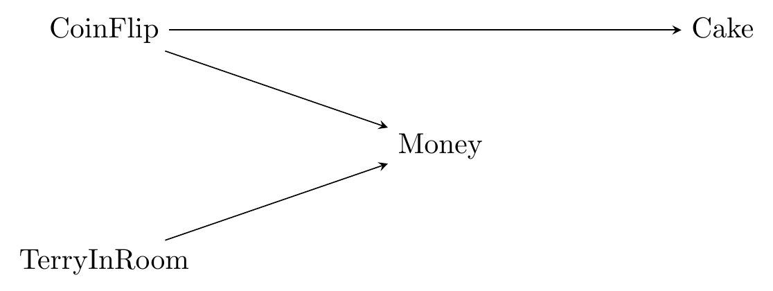
Now that our diagram is a little more complex, there are a few more things to note:
First, keep in mind that we had to think about the causal relationships between all the variables. One variable might cause multiple things (like CoinFlip), and other variables might be caused by multiple things (like Money).
Second, when one variable is caused by multiple things, the diagram doesn’t tell us exactly how those things come together. Terry only gives us money if we lost the coin flip. So Money isn’t so much “caused by Terry” as it is “caused by a combination of CoinFlip and Terry.” But on the diagram we just have TerryInRoom \(\rightarrow\) Money and CoinFlip \(\rightarrow\) Money. Keep in mind when looking at a diagram that there might be complex interactions between the causes.107 At some points in the book, we’ll simplify by putting some of those interactions on the graphs themselves so they’re explicit. This technically breaks the causal diagram rules a bit, but it will make things much more clear. See for example the Moderators in Causal Diagrams section at the end of this chapter.
One last thing to keep in mind is that all (non-trivial) variables relevant to the DGP should be included, even if we can’t measure or see them. This pops up all the time in social science.
Unobserved/unmeasured variable. A variable that is relevant to the DGP, but that the researcher either doesn’t have access to or could never have access to.
For example, let’s say we’re trying to figure out what variables cause you to get a promotion at your job. One thing that probably causes you to get a promotion is if the clients at your job really like you. But as researchers we probably don’t have access to data about clients liking you, and even if we did, how could we measure that accurately? So “clients liking you” would be an important part of the DGP, but it would be an unobserved variable.
In this book, we will indicate unobserved variables as being a shade of gray. So now let’s say that Terry doesn’t join you in the room at random, but rather decides to come in based on their mood today. We have no way of measuring their mood, so that’s unobservable.
Figure 6.3: Terry’s Unobservable Mood
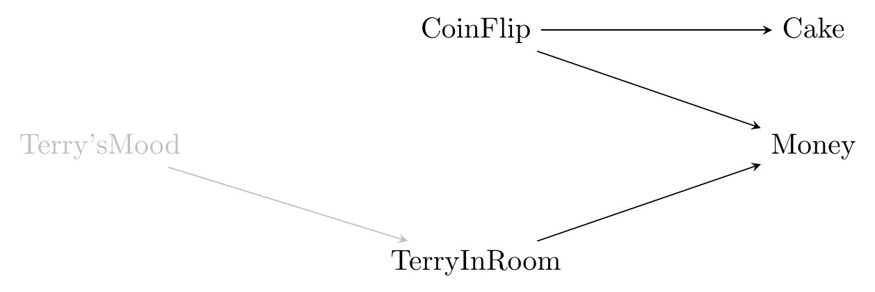
Unmeasured variables serve two purposes in causal diagrams. In addition to being key parts of the DGP, they can sometimes fill in for variables that we know must be there, but we have no idea what they are.
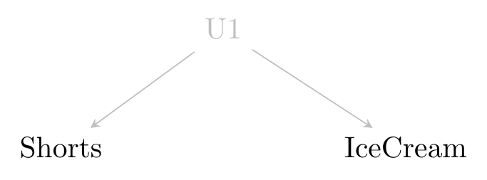
In particular, let’s say that we have two variables that are correlated but neither of them causes the other. To borrow a previous example, people are more likely to wear shorts on days they eat ice cream, but shorts don’t cause you to eat ice cream and ice cream doesn’t cause you to wear shorts.
So what do we do? There has to be something between them. Otherwise, they wouldn’t be correlated.108 In this case, it’s no mystery what’s going on. We know that temperature causes both of them. But let’s imagine we’re extremely unfamiliar with both ice cream and shorts and say we don’t know and so can’t measure it. But we can’t have an arrow from one to the other, since neither causes the other.
In these cases we imagine that there’s some sort of latent variable causing both of them, and we can put that on the diagram, perhaps labeled something like “L1” or “U1” (and if we had another unobserved variable that might be “U2”, and so on) that similarly indicates we have no idea what it is. Then we can have that “U1” variable cause both IceCream and Shorts.
Figure 6.4: Shorts and Ice Cream
Latent variable. An unobserved or unmeasurable variable, often representing a general concept. For example, in many labor economics models, a worker’s “ability” at a job is a latent variable. It certainly matters, but is too broad and ill-defined to actually be measured. Things like “IQ score” may be measurable and represent parts of ability but aren’t the same thing.
Some approaches to drawing causal diagrams will opt to leave U1 out of the picture and instead just draw a double-headed arrow between Shorts and IceCream, like Shorts \(\leftrightarrow\) IceCream, or a no-headed line between them, like Shorts - IceCream. However, I think this approach is too easily confused for “Shorts and IceCream both cause each other” and so will use the latent variable approach in this book. But if you look at materials elsewhere and see them doing this, that’s what is happening.
6.3 The Real World: On an Omission Mission
So far, causal diagrams seem pretty simple. And in a technical sense, they really are. As always seems to be the case, though, things get more complex when we take this neat theoretical object and expose it to the horror that is the real world.
Let’s take a look at a causal diagram designed to address a classic question in causal inference in the social sciences: what is the effect of police presence on crime?
You would probably expect that sending additional police out into the streets, whether you think that’s a good idea or not, would almost certainly have the effect of getting you less crime, right?
Figure 6.5: Police Presence and Crime Rate by County, North Carolina 1981-1987
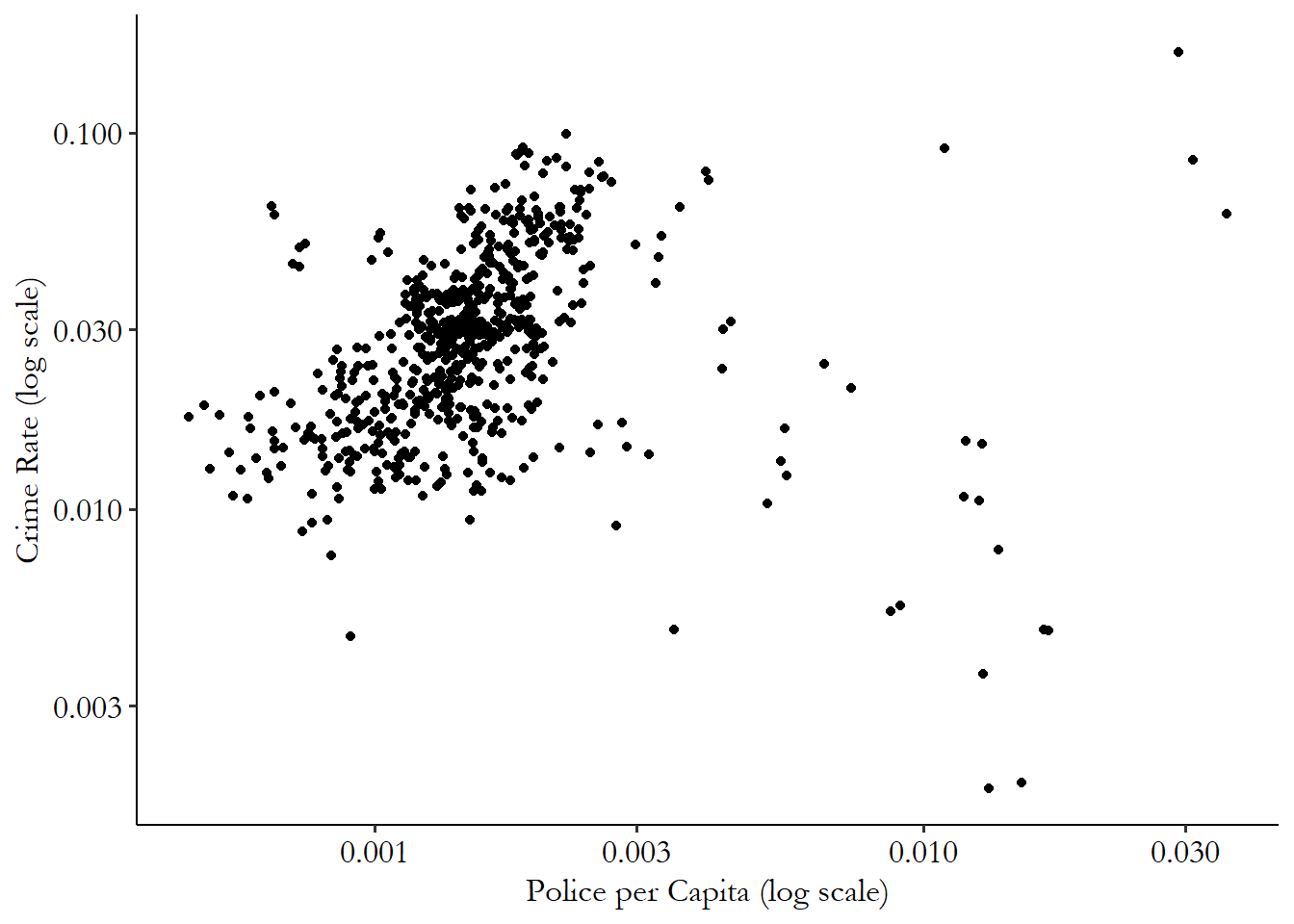
However, if you look in the data, as in Figure 6.5, additional police presence is consistently associated with more crime.109 Data is from Cornwell and Trumbull (1994Cornwell, Christopher, and William N Trumbull. 1994. “Estimating the Economic Model of Crime with Panel Data.” The Review of Economics and Statistics 76: 360–66.) via Wooldridge (2016Wooldridge, Jeffrey M. 2016. Introductory Econometrics: A Modern Approach. Nelson Education.) and Shea (2018Shea, Justin M. 2018. wooldridge: 111 Data Sets from "Introductory Econometrics: A Modern Approach, 6e" by Jeffrey M. Wooldridge. https://CRAN.R-project.org/package=wooldridge.).
Lag. The value of a variable from a previous time period.
To untangle this puzzle, let’s think about what a causal diagram for this data generating process (DGP) might look like. A key part of what might be going on is that crime in previous years (what we’ll call “lagged crime”) is likely to cause police presence now. So the raw correlation is picking up the fact that being high-crime in the first place might lead you to being assigned lots of police in response.

Figure 6.6: Police Presence and Crime
What do we have here? We’ve incorporated the effect that LaggedCrime has on PolicePerCapita and Crime. We’ve also added some other things that might be important. The unobservable ExpectedCrimePayout is how profitable a criminal might reasonably expect their crime to be before they commit it, which will be based on how many police there are (making them more likely to get caught), and the sentencing laws in their area (go to jail for longer if they are caught). Both sentencing laws and police per capita are also caused by LawAndOrderPolitics, an unmeasurable variable indicating how tough the political system in the local area wants to be on crime.
We can see very clearly the list of variables included in the diagram. We can also see the arrows that are between those variables. Hopefully, you can agree that those variables and arrows make sense.
Direct effect. \(X\) has a direct effect on \(Y\) if \(X \rightarrow Y\) is on the graph.
However, just as important as what’s on the diagram is what’s not on the diagram! Every variable and arrow that’s not on the diagram is an assumption we’re making. In particular, for every variable not on the diagram, we’re assuming that variable is not an important part of the DGP. And for every arrow not on the diagram, we’re assuming that the variables not connected by an arrow have no direct causal relationship between them.
What does this mean in the context of our police and crime graph? Some assumptions we’ve made:
- LaggedCrime doesn’t cause LawAndOrderPolitics
- PovertyRate isn’t a part of the DGP
- LaggedPolicePerCapita doesn’t cause PolicePerCapita (or anything else for that matter)
- RecentPopularCrimeMovie doesn’t cause Crime
These are some hefty assumptions. And, likely, not all of them are true.
There’s a balancing act to walk when talking about causal diagrams. On one hand, we want to omit from the diagram every variable and arrow we can possibly get away with. The simpler the diagram is, the easier it is to understand, and the more likely it is that we’ll be able to figure out how to identify the answer to our research question.
A common misstep that some people fall into when working with causal diagrams is to omit too little. They end up with a diagram with dozens of variables, every one of which seems to cause every other one.110 In my experience, this tendency is strongest in Education departments. In their defense, they probably think this whole book is a bit hopeless. But if you do that, you’re going to let some variables or arrows that may not even be very important possibly ruin your chances of answering your research question of interest!111 Item 4 on the list of assumptions is a good example of one we are probably fine omitting. Sure, maybe a big heist movie coming out might inspire a couple of random crimes. But it seems unlikely to be all that important.
On the other hand, omitting things makes the model simpler. But the real world is complex. So in our quest for simplicity, we might end up leaving out something that’s really important. Like, PovertyRate definitely belongs on this graph, right? How could it not? And if we proceed with our diagram while it’s still missing, we may end up getting our identification wrong. You’ve probably thought of some other important omissions from this graph on your own.
As discussed in Chapter 5, no study is ever perfect, and we’ll never know everything about our DGP. All we can try to do is build a diagram that’s useful - it incorporates all the most important stuff while shedding as much extraneous baggage as it possibly can. We will discuss how to pick out just the most important bits when we don’t know everything in Chapter 11.
In full, if we want to say anything about our research question, we need to have some model in mind. It’s not going to be perfect, but we’ll try to put all the most important stuff on there, while still making it simple enough to use.
The willingness to make a stand and say “yes, we really can omit that” - that’s what you need to answer your research question! It is truly necessary. Anybody trying to answer a research question who won’t do that is still making those assumptions implicitly. They just aren’t making clear what those assumptions are. Assumptions that are necessary to identify your answer are called “identifying assumptions.”
Identifying assumption. An assumption you make about your causal diagram or data that, if incorrect, means that your approach to identifying the answer to your research question doesn’t work.
That can be dangerous. That’s one of the benefits of drawing these causal diagrams. They make very explicit what your assumptions are about the DGP. That opens those assumptions up to scrutiny, which can be scary. But that scrutiny can help make our research stronger.
The causal diagram, once we have it in hand and are willing to believe it’s close enough to accurate, also gives us an extremely powerful tool for answering our research question. But how can we do that?
6.4 Research Questions in Causal Diagrams
Now that we have our causal diagram, we can use it to figure out how to identify the answer to our research question.
One way that the diagram can help us is in figuring out which parts of the variation in our data identify the answer and which parts don’t.
Let’s use our police-and-crime figure again. Even though it’s not perfect, for a moment let’s assume that it’s correct, and see how we can use it to think about how to answer the question “does additional police presence reduce crime?”

Figure 6.7: Police Presence and Crime
Looking at this diagram, we should be able to see which parts of the diagram answer our research question of interest. In particular, we should be interested in any parts of it that allow PolicePerCapita to cause Crime.
Indirect effect. \(X\) has an indirect effect on \(Y\) if \(X \rightarrow Z \rightarrow Y\) is on the graph for some \(Z\). This implies that \(X\) has an effect on \(Y\) because it has an effect on something else, \(Z\), which itself affects \(Y\). You can think of this like dominos - the first domino doesn’t directly cause the last domino to fall. But by affecting the dominos in between, it has an indirect effect.
We have an obvious one here, PolicePerCapita \(\rightarrow\) Crime. This is the direct effect. However, we also have PolicePerCapita \(\rightarrow\) ExpectedCrimePayout \(\rightarrow\) Crime, which is an indirect effect. Why might that count? Ask yourself - if the reason that police presence reduces crime is because criminals commit less crime when they expect to be caught (i.e., ExpectedCrimePayout is low), then isn’t that an example of police presence reducing crime?112 You might decide that no, it doesn’t count. That’s valid! Plenty of research questions concern only the direct effect and not any indirect effects. But make sure that’s what you want.
So the variation in our data that answers our research question has to do with PolicePerCapita causing Crime, and to do with PolicePerCapita causing ExpectedCrimePayout, which then affects Crime. To identify our answer, we have to dig out that part of the variation and block out the alternative explanations.
We can see the alternative explanations on the graph pretty easily, too, which is a benefit of using the graph. One alternate explanation is that LaggedCrime causes both PolicePerCapita and Crime, and so PolicePerCapita and Crime might be related because LaggedCrime causes both to rise. LawAndOrderPolitics also affects both PolicePerCapita and (indirectly) Crime. So PolicePerCapita and Crime might be related just because LawAndOrderPolitics drives both of them.
If we are willing to believe this diagram, then the next steps are pretty clear. We need to get rid of the variation due to LaggedCrime and LawAndOrderPolitics in order to isolate just the variation we need. We’ll start to talk more in depth about how to do this in Chapter 8.
6.5 Moderators in Causal Diagrams
The following section is an odd one in that it addresses an aspect of causal diagrams that is likely to be confusing for seasoned researchers, but that new researchers might not have a problem with at all. That is: what about moderators?
Moderating variable. The effect of \(X\) on \(Y\) is moderated by \(Z\) if the effect is different depending on \(Z\)’s value.
Moderators are variables that don’t necessarily cause another variable (although they might do that too). Instead, they modify the effect of one variable on another. For example, consider the effect of a fertility drug (\(X\)) on the chances of getting pregnant (\(Y\)). The effect is moderated by the variable “having a uterus” (\(Z\)). If you don’t have a uterus, the drug can’t do much for you. But if you do have a uterus, it can increase your chances of conceiving.
But in our causal diagrams, we only have arrows going from one variable to another. We don’t have arrows that go to other arrows, which it seems like you’d want to give a moderator effect.
Technically, those moderator effects are on the diagram. That’s because, in a causal diagram, we know that a variable is caused by all its incoming arrows, but nothing about the exact shape that influence takes, just like our example with Terry in Figure 6.2.
Figure 6.8: \(X\) and \(Z\) Cause \(Y\), But in What Way?
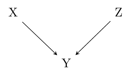
For example, consider Figure 6.8. All we know from this diagram is that \(X \rightarrow Y\) and \(Z \rightarrow Y\).113 Formally, all we know is that \(Y\) is some causal function of \(X\) and \(Z\). However, this could be consistent with any of the following data generating processes (DGPs):114 All the numbers chosen for this list are arbitrary.
- \(Y = .2X + .3Z\)
- \(Y = 4X + 3Z + 2Z^2\)
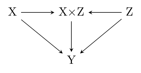
- \(Y = 1.5X + 5Z + 3XZ\)
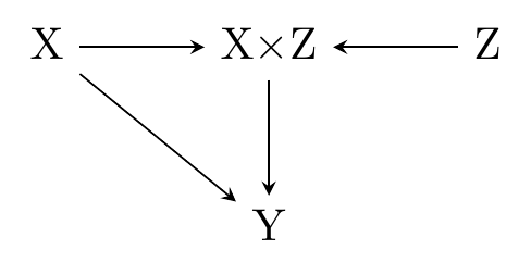
- \(Y = 2 X + 3XZ\)
and infinitely many more. Note that in item 3 on that list, \(Z\) has a moderating influence on the effect of \(X\). If \(Z = 1\), then a one-unit increase in \(X\) will increase \(Y\) by \(1.5 + 3 = 4.5\). But if \(Z = 2\), then a one-unit increase in \(X\) will increase \(Y\) by \(1.5 + 3\times2 = 7.5\). It goes the other way, too, with \(X\) moderating the effect of \(Z\) - the effect of \(Z\) is different at \(X = 3\) or \(X = 5\). In item 4, we go even further - \(Z\) has no direct effect on \(Y\), but does moderate the effect of \(X\).
Phew! We can handle moderating variables in a causal diagram. But while this satisfies a technical need for moderating variables, it’s not a very clear way of describing your DGP. After all, if you thought there was an important moderating effect, do you really think Figure 6.8 would get across that idea?
In this book, we will cheat a little bit for the sake of clarity, and include our moderated effects right on the diagram,115 I will also, on occasion, include other functional form restrictions on the diagram, like in Chapter 20. even though that’s not technically the right way to do it.116 Please don’t hurt me Judea Pearl.
In this slightly more-relaxed approach to causal diagrams, we might reflect the third DGP on our list as it’s depicted in Figure 6.9. In this diagram, \(X\) and \(Z\) both affect \(Y\) directly. However, they also combine to form \(X\times Z\), which affects \(Y\) as well, demonstrating that there is an interaction between \(X\) and \(Z\), and each moderates the other’s effect.
Figure 6.9: \(X\) and \(Z\) Cause \(Y\), Each Moderating the Other’s Effect
We can represent data generating processes (DGPs) like item 4 in our list above, where \(Z\) had no direct effect but moderated the effect of \(X\), as in Figure 6.10. Here, \(Z\) only affects \(Y\) by changing the effect of \(X\), reflected in the \(X\times Z\) node.
Figure 6.10: \(X\) Causes \(Y\) and \(Z\) Moderates That Effect
Page built: 2025-10-17 using R version 4.5.0 (2025-04-11 ucrt)