Chapter 14 - Matching

14.1 Another Way to Close Back Doors
Regression gets a lot of attention, but it’s not the only way to close back doors. Through the first half of this book I was pretty insistent about it, in fact: choosing a sample in which there is no variation in a variable \(W\) closes any open back doors that \(W\) sits on.324 As opposed to regression’s “finding all the variation related to variation in \(W\) and removing it closes any open back doors that \(W\) sits on.”
That sounds simple enough, and indeed it’s an intuitive idea. “We picked two groups that look pretty comparable, and compared them,” is a lot easier to explain to your boss than “we made some linearity assumptions and minimized the sum of squared errors so as to adjust for these back-door variables.”325 Although in reality most bosses (and audiences) are either stats-savvy enough to understand regression anyway, or stats unsavvy enough that you can just say “adjusting for differences in \(X\),” and they won’t really care how you did it. But once you actually start trying to do matching you quickly realize that there are a bunch of questions about how exactly you do such a thing as picking comparable groups. It’s not obvious! And the methods for doing it can lead to very different results. Surely some smart people have been thinking about this for a while? Yes, they have.
Matching is the process of closing back doors between a treatment and an outcome by constructing comparison groups that are similar according to a set of matching variables. Usually this is applied to binary treated/untreated treatment variables, so you are picking a “control” group that is very similar to the group that happened to get “treated.”326 You could apply matching to non-binary treatments, and there are some methods out there for doing so, for example by picking certain values, or ranges of values, of the treatment variable and matching on those. But matching is largely applied in binary treatment cases, and the rest of this chapter will focus on that case. \(^,\)327 It’s also common to match by picking a set of treated observations that are most similar to the control observations. For simplicity of explanation I’m going to completely ignore this for the first half or so of the chapter. But we’ll get there.
To suggest a very basic example of how matching might work, imagine that we are interested in getting the effect of a job-training program on your chances of getting a good job. We notice that, while the pool of unemployed people eligible for the job-training program was about 50% men/50% women, the program just happened to be advertised heavily to men. So the people actually in the program were 80% men/20% women. Since labor market outcomes also differ by gender, we have a clear back door \(Outcomes \leftarrow Gender \rightarrow JobTrainingProgram\).
The matching approach would look at all the untreated people and would construct a “control group” that was also 80% men/20% women, to compare to the already 80-20 treated group. Now, comparing the treated and untreated groups, there’s no gender difference between the groups. The \(Gender \rightarrow JobTrainingProgram\) arrow disappears, the back door closes, and we’ve identified the \(JobTrainingProgram \rightarrow Outcomes\) effect we’re interested in.328 Assuming there are no other back doors left open.
Matching and regression are two different approaches to closing back doors, and while identifying an effect using a set of control/matching variables assumes in both cases that our set of control/matching variables is enough to close all back doors, the other assumptions we rely on are different (but not better or worse) using the two approaches. To give one example, it’s fairly easy to use matching without relying on the assumption of linearity that we had to rely on or laboriously work around in Chapter 13. To give another, matching is a lot more flexible in its ability to give you the kind of treatment effect average that you want (as in Chapter 10). Neither method is necessarily better than the other, and in fact they can be used together, with their different assumptions used to complement each other (as will be discussed later in the chapter).
Ugh. If matching were purely worse, we could simply ignore it. Or if it were better, we could have skipped that whole regression chapter. But it’s neither, so we should probably learn about both. Naturally, there are a lot of details to nail down when we decide to do matching. That’s exactly what this chapter is about.329 The question of “which is more important to learn” comes down, oddly, to which field you’re in. In some fields, like economics, regression is standard and matching is very rare. In others, like sociology, you’re likely to see both. In still others, matching is very common and regression rare. You can just go ahead and learn whatever’s important in your field, and skip the other if it’s rare. Or… you can be a cool rebel and learn it all, and use whatever you think is best for the question at hand. So cool. Take that, squares. You can try to keep us down, but you’ll never kill rock n’ roll! Uh, I mean matching.
14.2 Weighted Averages
First off, what are we even trying to do with matching? As I said, we want to make our treatment and control groups comparable. But what does that mean, exactly?
Matching methods create a set of weights for each observation, perhaps calling that weight \(w\). Those weights are designed to make the treatment and control groups comparable.
Then, when we want to estimate the effect of treatment, we would calculate a weighted mean of the outcomes for the treatment and control groups, and compare those.330 There are other ways you can use the weights to estimate an effect, and I’ll get to those later in the chapter.
As you may recall from earlier chapters, a weighted mean multiplies each observation’s value by its weight, adds them up, and then divides by the sum of the weights. Take the values 1, 2, 3, and 4, for example. The regular ol’ non-weighted mean actually is a weighted mean; it’s just one where everyone gets the same weight of 1. So we multiply each value by its weight: \(1\times1=1, 2\times1=2, 3\times1=3, 4\times1=4\). Then add them up: \(1+2+3+4=10\). Finally, divide the total by the sum of the weights, \(1+1+1+1=4\) - to get \(10/4 = 2.5\).331 Some approaches to weighted means skip the “divide by the sum of the weights” step, and instead require that the weights themselves add up to 1.
Now let’s do it again with unequal weights. Let’s make the weights \(.5, 2, 1.5, 1\). Same process. First, multiply each value by its weight: \(1\times.5 = .5, 2\times2 = 4, 3\times1.5 = 4.5, 4\times1 = 4\). Then, add them up: \(.5+4+4.5+4 = 13\). Finally, divide by the sum of the weights: \(.5+2+1.5+1=5\), for a weighted mean of \(13/5 = 2.6\).
We can write the weighted mean of \(Y\) out as an equation as:
or in other words, multiply each value \(Y\) by its weight \(w\), add them all up (\(\Sigma\)), and then divide by the sum of all the weights \(\Sigma w\). You might notice that if all the weights are \(w = 1\), this is the same as taking a regular ol’ mean.
But where do the weights come from? There are many different matching processes, each of which takes a different route to generating weights. But they all do so using a set of “matching variables,” and using those matching variables to construct a set of weights so as to close any back doors that those matching variables are on. The idea is to create a set of weights such that there’s no longer any variation between the treated and control groups in the matching variables.
In the last section I gave the 80/20 men/women example. Let’s walk through that a bit more precisely.
Let’s say we have a treated group, each of whom has received job training, consisting of 80 men and 20 women. Of the 80 men, 60 end up with a job and 20 without. Of the women, 12 end up with a job and 8 without.
Now let’s look at the control group, which consists of 500 men and 500 women. Of the men, 350 end up with a job and 150 without. Of the women, 275 end up with a job and 225 without.
If we look at the raw comparison, we get that \((60+12)/100 =\) 72% of those with job training end up with jobs, while in the control group \((350+275)/1000 =\) 62.5% end up with jobs. That’s a treatment effect of 9.5 percentage points. Not shabby! But we have a back door through gender. The average job-finding rates are different by gender, and gender is also related to whether someone got job training.
There are many different matching methods, each of which might create different weights, but one method might create weights like this:
- Give a weight of 1 to everyone who is treated
- Give a weight of 80/500=.16 to all untreated men
- Give a weight of 20/500=.04 to all untreated women
With these weights, let’s see if we’ve eliminated the variation in gender between the groups. The treated group will still be 80% men - giving all the treated people equal weights won’t change anything on that side. How about the untreated people? If we calculate the proportion male, using a value of 1 for men and 0 for women, the weighted mean for them is \((.16\times500 + .04\times0)/(.16\times500 + .04\times500) =\) 80%. Perfect!332 Where do these numbers come from? \(.16\times 500\) is each man, who has a “man” value of 1, getting a weight of .16. So each man is \(.16\times1\). Add up all 500 men to get \(.16\times500\). Women have a “man” value of 0 and a weight of .04 - add up 500 of those and you get \(.04\times0\). Then in the denominator, it doesn’t matter whether you’re a man or a woman, your weight counts regardless. So we add up the 500 .16 weights for men and get \(.16\times500\), and add that to the 500 .04 weights for women, \(.04\times500\).
Now that we’ve balanced gender between the treated and control groups, what’s the treatment effect? It’s still 72% of people who end up with jobs in the treated group - again, nothing changes there. But in the untreated group it’s \((.16\times350 + .04\times 275)/(.16\times500 + .04\times500) =\) 67%,333 That’s 350 employed men with a weight of \(.16\) each, plus 275 employed women with a weight of .04 each, divided by the sum of all weights - 500 men with a weight of .16 each plus 500 women with a weight of .04 each. for a treatment effect of \(.72-.67 = 5\) percentage points. Still not bad, although not as good as the 9.5 percentage points we had before. Some of that gain was due to the back door through gender.
14.3 Matching in Concept: A Single Matching Variable
I’ve said there are many ways to do matching. So what are they? For a demonstration, we’ll start by matching on a single variable and see what we can do with it. It’s relatively uncommon to match on only one variable, but it’s certainly a lot easier to think about, and lets us separate out a few key concepts from some important details I’ll cover in the multivariate section.
This will be easier still if we have an example. Let’s look at defaulting on credit card debt. Sounds fun. I have data on 30,000 credit card holders in Taiwan in 2005, their monthly bills, and their repayment status (pay on time, delay payment, etc.) in April through September of that year (Lichman 2013Lichman, Moshe. 2013. “UCI Machine Learning Repository.” Irvine, CA, USA.). We want to know about the “stickiness” of credit problems, so we’re going to look at the effect of being late on your payment in April (\(LateApril\)) on being late on your payment in September (\(LateSept\)). There are a bunch of back doors I’m not even going to try to address here, but one back door is the size of your bill in April, which should affect both your chances of being behind in April and September. So we’ll be matching on the April bill (\(BillApril\)).
In performing our matching on a single variable, there will be some choices we’ll make along the way:
- What will our matching criteria be?
- Are we selecting matches or constructing a matched weighted sample?
- If we’re selecting matches, how many?
- If we’re constructing a matched weighted sample, how will weights decay with distance?
- What is the worst acceptable match?
(1) What will our matching criteria be? When performing matching, we are trying to select observations in the control group that are similar to those in the treated group (usually). But what does “similar to” even mean? We have to pick some sort of definition of similarity if we want to know what we’re aiming for.334 Or, more often, if we want to know what the computer should be looking for.
There are two main approaches to picking a matching criterion: distance matching and propensity score matching.
Distance matching says “observations are similar if they have similar values of the matching variables.” That’s it. You want to minimize the distance (in terms of how far the covariates are from each other) between the treatment observations and the control observations.
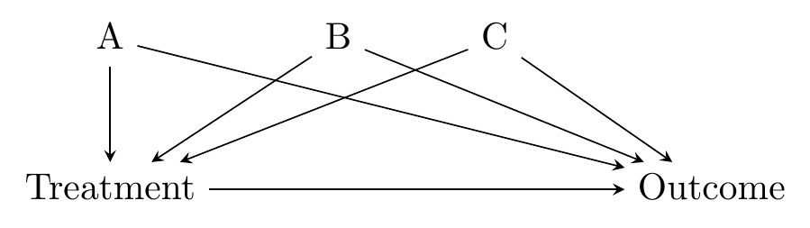
There’s a strong intuitive sense here of why this would work - we’re forcefully ensuring that the treatment and control groups have very little variation in the matching variables between them. This closes back doors. The diagram in Figure 14.1 looks familiar, and it’s exactly the kind of thing that distance matching applies to. We have some back doors. We can measure at least one variable on each of the back doors. We match on those variables. Identification!
Figure 14.1: Standard Back-door Causal Diagram for Distance Matching
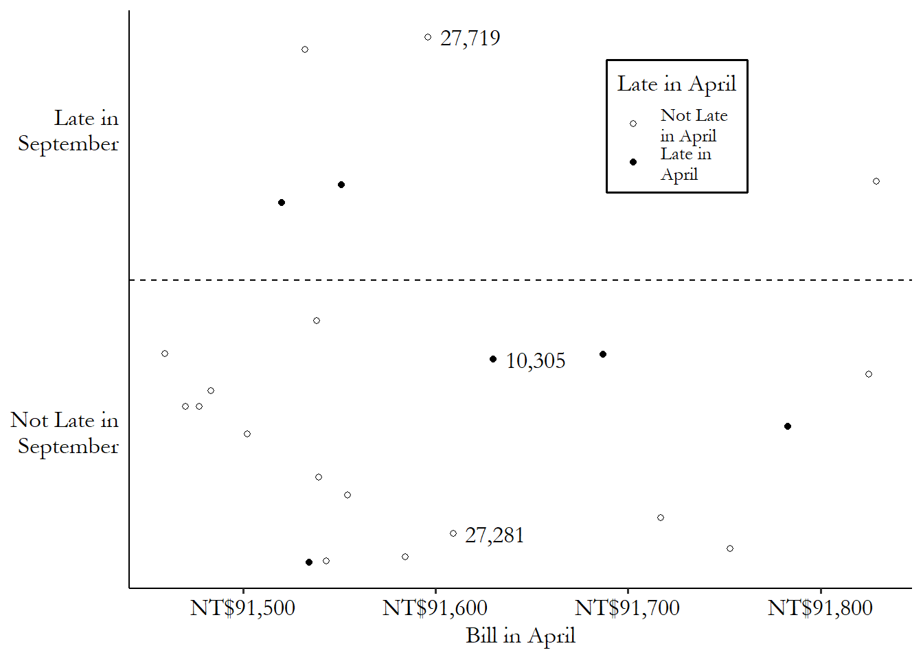
Using our credit card debt example, let’s pick one of the treated (late payment in April) observations: lucky row number 10,305. This person had a \(BillApril\) of 91,630 New Taiwan dollars (NT$), their payment was late in April (\(LateApril\) is true), but their payment was not late in September (\(LateSept\) is false).
Since our matching variable is \(BillApril\), we’d be looking for untreated matching observations with \(BillApril\) values very close to NT$91,630. A control with a \(BillApril\) of NT$113,023 (distance of \(|91,630 - 113,023| = 21,393\)) or 0 (distance of \(|91,630 - 0| = 91,630\)) wouldn’t be ideal matches for this treated observation. Someone with a \(BillApril\) value of 91,613 (distance \(|91,630 - 91,613| = 17\)) might be a very good match, on the other hand. There’s very little distance between them.
If we were to pick a single matching control observation for row number 10,305,335 And picking a single match is not the only way to match, of course - we’ll get there. we’d pick row 27,281, which was not late in April (and so was untreated), and has a \(BillApril\) of NT$91,609 (distance \(|91,630 - 91,609| = 21\)), which is the closest in the data to NT$91,630 among the untreated observations. We can see this match graphically in Figure 14.2. We have our treated observation from row 10,305, which you can see near the center of the graph. The matches are the untreated observations that are closest to it on the \(x\)-axis (our matching variable). The observation from row 27,281 is just to the left - pretty close. Only a bit further away, also on the left, is the observation from row 27,719 - we’ll get to that one soon.
Figure 14.2: Matching on April 2005 Credit Card Bill Amount in Taiwanese Data (Data Range Limited)
The other dominant approach to matching is propensity score matching. Propensity score matching says “observations are similar if they were equally likely to be treated,” in other words have equal treatment propensity.336 I recommend Caliendo and Kopeinig (2008) as a very readable guide for propensity score matching. I have taken guidance from them a few times in writing this chapter.
Like with distance matching, there’s a logic here too. We’re not really interested in removing all variation in the matching variables, right? We’re interested in identifying the effect of the treatment on the outcome, and we’re concerned about the matching variables being on back doors.337 And actually, matching on variables that don’t close back doors, even if they predict treatment, can actually harm the estimate, as in Bhattacharya and Vogt (2007Bhattacharya, Jay, and William B Vogt. 2007. “Do Instrumental Variables Belong in Propensity Scores?” NBER.). Propensity score matching takes this idea seriously and figures that if you match on treatment propensity, you’re good to go.338 As I’ll explore more in the “Checking Match Quality” section, one implication of this approach is that propensity score matching doesn’t really try to balance the matching variables. If a one-unit increase in \(A\) increases the probability of treatment by \(.1\), while a one-unit increase in \(B\) increases the probability of treatment by \(.05\), then propensity score matching says that someone with \(A = 2\) and \(B = 1\) is a great match for someone with \(A = 1\) and \(B = 3\). Distance matching would disagree. \(^,\)339 One implication of the propensity score approach is that it doesn’t work quite as well if we can only close some of the back doors. If variables on the open back doors are related to variables you’ve matched on, then the propensity score can actually worsen the match quality along those still-open paths See Brooks and Ohsfeldt (2013Brooks, John M, and Robert L Ohsfeldt. 2013. “Squeezing the Balloon: Propensity Scores and Unmeasured Covariate Balance.” Health Services Research 48 (4): 1487–507.) for a broader explanation.
The causal diagram in mind here looks like Figure 14.3. The matching variables \(A\), \(B\), and \(C\) are all on back doors, but those back doors go through \(TreatmentPropensity\), the probability of treatment. The probability of treatment is unobservable, but we can estimate it in a pretty straightforward way using regression of treatment on the matching variables.340 This innocuous line hides one of the difficulties with using propensity score as opposed to distance - we need to choose a regression model. We just covered a whole chapter on regression, so you know what kind of issues we’re inviting back.
Figure 14.3: Causal Diagram Amenable to Propensity Score Matching

Returning to our credit card example, if I use a logit regression of treatment on \(BillApril\) in thousands of New Taiwan dollars, I get an intercept of .091 and a coefficient on \(BillApril\) of .0003. If we are again looking for a match for our treated friend in row 10,305 with a \(BillApril\) of NT$91,630,341 Although in practice you probably shouldn’t pick specific matching pairs with propensity scores - I’ll get to that in a bit. we would first predict the probability of treatment for that person. Plugging in 91.630 for \(BillApril\) in thousands, we get a predicted probability of treatment of .116.342 The use of logit or probit to estimate propensity scores is extremely standard. However, propensity scores can also be estimated without the parametric restrictions of logit and probit, and in large samples this may actually make the final estimate more precise. See Hahn (1998Hahn, Jinyong. 1998. “On the Role of the Propensity Score in Efficient Semiparametric Estimation of Average Treatment Effects.” Econometrica 66 (2): 315–31.).
Now we calculate the predicted probability of treatment for all the control observations, too. We want to find matches with a very similar predicted probability of treatment. Once again we find a great match in row 27,281, also with a predicted probability of .116. Hard to get closer than that!343 With only one matching variable, the differences between distance and propensity score matching are trivial, so it’s not surprising that we got the same best match both times. If I showed Figure 14.2 again, it would look the exact same but with a relabeled \(x\)-axis. This will change when we expand to more than one matching variable.
(2) Are we selecting matches or constructing a matched weighted sample? A few times I’ve referred to the matching process in the context of “finding matches,” and other times I’ve referred to the construction of weights. Both of these represent different ways of matching the treatment and control groups. Neither is the default approach - they both have their pros and cons, and doing matching necessarily means some choices between different options, neither of which dominates the other.
The process of selecting matches means that we’re picking control observations to either be in or out of the matched control sample. If you’re a good enough match, you’re in. If you’re not, you’re out. Everyone in the matched sample receives an equal weight.344 Or at least they usually receive an equal weight, but in some methods this might not be the case. For example, if treatment observation 1 has a single matched control, but treatment observation 2 has three matched controls, some methods might give an equal weight to all four controls, but some other methods might count the control matched to treatment observation 1 three times as much as the three matched to treatment observation 2. Or, perhaps the same control is matched to multiple treatment observations and so gets counted multiple times.
In the previous section, we selected a match. We looked at the treated observation on row 10,305, and then noticed that the control observation on row 27,281 was the closest in terms of both distance between matching variables and the value of the propensity score. If we were picking only a single match to be “in,” we’d select row 27,281, and that row would get a weight of 1. Everyone else would be “out” and get a weight of 0 (at least unless they’re the best match for a different treated observation).
That’s just one method though. How else might we determine which controls are in and which are out? For that you’ll need to look at step (3).
How about the alternate approach of constructing a matched weighted sample? This process, like the process of selecting matches, entails looking at all the control observations and seeing how close they are to the treated observations. However, instead of simply being in or out, each control will receive a different weight depending on how close it is to a treated observation, or how handy it will be in making the matched control group look like the treated group.
Often, although not always, the matched-weighted-sample approach entails weighting observations more heavily the closer they are to a given treated observation, and less heavily the farther away they are. So for example we found that the difference in the matching variable between rows 10,305 and 27,281 was \(|91,630 - 91,609| = 21\). But the second-best control match is in row 27,719, with a difference of \(|91,630 - 91,596| = 34\). We might want to include both, but weight the observation with the smaller difference (27,281) more than the observation with the bigger difference (27,719). Maybe we give row 27,281 a weight of \(1/21\) and give row 27,719 a weight of \(1/34\).345 This exact weighting scheme wouldn’t be standard but it does help you get the idea.
How exactly would we construct these weights? That’s a question for step (4).
We can contrast these two approaches in Figure 14.4. On the left, we look for matches that are very near our treated observation. In this case, we’re doing one-to-one matching and so only pick the observation in row 27,281, the closest match, as being “in.” Everything else gets grayed out and doesn’t count at all. On the right, we construct our comparison estimate for 10,305 using all the untreated data (the other treated observations get dropped here, but we’d want to come back later and do matching for them too). But they don’t all count equally. Observations near our treated observation on the \(x\)-axis get counted a lot (big bubbles). As you move farther away, they count less and less. Get far enough away and the weights fall to zero.
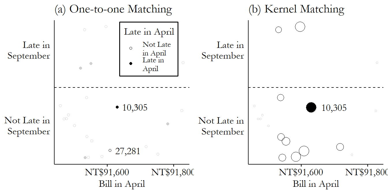
Figure 14.4: Selecting Matches or Weighting by Kernel
So which should we do? Should we select matches or should we give everyone different weights?346 Technically, selecting matches is a form of constructing a weighted matched sample - everyone getting weights of 0 or 1 is one way of making a weighted matched sample. But they still seem pretty different, so I’ll treat them as different here. Naturally, there’s not a single right answer - if there was I could skip telling you about both approaches.
The selecting-matches approach has some real intuitive appeal. You’re really just constructing a comparable control group by picking the right people. It’s also, often, a little easier to implement than something with more fine-tuned weights, and it’s easier to see what your match-picking method is doing. You also avoid scenarios where you accidentally give one control observation an astronomical weight - what if the difference between row 10,305 and row 27,281 was only .000001 instead of 21? It would receive an enormous \(1/.000001\) weight, and the weighted control group mean would be almost entirely determined by that one observation! There are, of course, ways to handle that, but it’s a concern you have to keep in mind.
On the other hand, the weighted-group approach has some nice statistical properties. It’s a little less sensitive - “in” or “out” is a pretty stark distinction, and so tiny changes in things like caliper (we’ll get to it) or measurement error can change results significantly, making the selecting-matches approach a little noisier. Varying weights also offer nice ways of accounting for the fact that different observations will simply have better or worse matches available in the data than others.
One place you should definitely use the weighted-group approach is if you’re using propensity scores. Despite the practice being very popular, propensity scores shouldn’t be used to select matches on an “in”/“out” basis (King and Nielsen 2019King, Gary, and Richard Nielsen. 2019. “Why Propensity Scores Should Not Be Used for Matching.” Political Analysis 27 (4): 435–54.). The combination of these approaches can actually serve to increase the amount of matching-variable variation between treatment and control, due to the way that different variables can both affect propensity, so you might match a high value of one with a high value of the other.
(3) If we’re selecting matches, how many? If we do decide to go with the selecting-matches approach, we need to figure out how many control matches we want to pick for each treatment observation.
One-to-one matching. A matching procedure in which only one control observation is matched to each treatment observation, as opposed to “one-to-many” in which each treated observation might be matched to multiple control observations.
k-nearest-neighbor matching. A matching procedure in which the k best control matches are used as matches for each treatment observation.
The three main approaches here are to pick the one best match (one-to-one matching), to pick the top k of best matches (k-nearest-neighbor matching), or to pick all the acceptable matches, also known as radius matching since you accept every match in a radius of acceptability.
These procedures all pretty much work as you’d expect. With one-to-one matching, you pick the single best control match for each treated observation. With k-nearest-neighbor matching, you pick the best control match… and also the second-best, and the third best… until you get to k matches (or run out of potential matches). And picking all the acceptable matches just means deciding what’s an acceptable match or not (see step 5), and then matching with all the acceptable matches.
With each of these procedures, we also need to decide if we’re matching with replacement or without replacement. What do we do if a certain control observation turns out to be the best match (or one of the k-best matches, as appropriate) for two different treated observations? If we’re matching without replacement, that control can only be a match for one of them, and the other treated observation needs to find someone different. If we’re matching with replacement, we can use the same control multiple times, giving it a weight equal to the number of times it has matched.
How can we choose between these different options? It largely comes down to a tradeoff between bias and variance.
The fewer matches you have for each treated observation, the better those matches can be. By definition, the best match is a better match than the second-best match. So comparing, for example, one-to-one matching with 2-nearest-neighbors matching, the 2-nearest-neighbors match will include some observations in the control group that aren’t quite as closely comparable to the treated group. This introduces bias because you can’t claim quite as confidently that you’ve really closed the back doors.
On the other hand, the more matches you have for each treated observation, the less noisy your estimate of the control group mean can be, and so the more precise your treatment effect estimate can be. If you have 100 treated observations, the mean of 100 matched control observations will have a wider sampling distribution than the mean of 200 matched control observations. Simple as that! More matches means less sampling variation and so lower standard errors.
So the choice of how many matches to do will be based on how important bias and precision are in your estimate, and how bad the matches will get if you try to do more matches. If you have zillions of control observations and will be able to pick a whole bunch of super good matches for each treated observation, then you’re likely not introducing much bias by allowing a bunch of matches, and you can reduce variance by doing so. So do it! But if your control group is tiny, your third-best match might be a pretty bad match and would introduce a lot of bias. Not worth it.
How about the with-replacement/without-replacement choice? A bias/variance tradeoff comes into play here, too. Matching with replacement ensures that each treated observation gets to use its best (or k best, or all acceptable) matches. This reduces bias because, again, this approach lets us pick the best matches. However, this approach means that we’re using the same control observations over and over - each control observation has more influence on the mean, and so sampling variation will be larger (what happens if one really good match is matched to 30 treatments in one sample, but isn’t there in a different sample?). In the extreme, imagine only having one control observation and matching it to all the controls - the sample mean for the controls would just be that one observation’s outcome value, and would have a standard error that’s just equal to the standard deviation of the outcome. Dividing by \(\sqrt{N}\) to get the standard error doesn’t do much if \(N = 1\).
Matching with replacement does have something else to recommend it, though, in addition to having lower bias - it’s not order-dependent. Say you’re matching without replacement. Treated observations 1 and 2 both see control observation A as their best match. But the second-best match is B for observation 1, and C for observation 2. Who gets to match with A? If observation 1 does, then C becomes part of the control group. But if observation 2 does, then B becomes part of the control group. The makeup of the control group, and thus the estimate, depends on who we decide to “award” the good control A to. There are some principled methods for doing this (like giving the good control to the treated observation with the worse backup), but in general this is a bit arbitrary.
(4) If we’re constructing a matched weighted sample, how will weights decay with distance? Both of the main approaches to matching - selecting a sample or constructing weights - have some important choices to make in terms of how they’re done. In a matched weighted sample approach, we will be taking our measure of distance, or the propensity score, and using it to weight each observation separately. But how can we take the distance or propensity score and turn it into a weight?
Once again, we have a few options. The two main approaches to using weights are kernel matching, or more broadly kernel-based matching estimators on one hand, and inverse probability weighting on the other hand.
Kernel-based matching estimators use a kernel function to produce weights. In the context of matching, kernel functions are functions that you give a difference to, and it returns a weight. The highest value is at 0 (no difference), and then the value smoothly declines as you move away from 0 in either direction.347 An exception here is the uniform kernel, which uses the same weight for anyone in a certain range, and then suddenly drops to 0. Eventually you get to 0 and then the weight stays at 0. This approach weights better matches highly, less-good matches less, and bad matches not at all.
There are an infinite number of potential kernels we could use. A very popular one is the Epanechnikov kernel.348 The Epanechnikov kernel is popular not only for kernel-based matching but also other uses of kernels like estimating density functions. The Epanechnikov kernel has the benefit of being very simple to calculate:
where \(K(x)\) means “kernel function” and this function only applies in the bounds of \(x\) being between -1 and 1. The kernel is 0 outside of that.349 In addition to being simple to calculate (plenty of kernels are simple to calculate), the Epanechnikov kernel is popular because it minimizes asymptotic mean integrated squared error, which is a measure of how different a variable’s estimated and actual densities are. You probably don’t need to know this. Figure 14.5 shows the Epanechnikov kernel graphically.
Figure 14.5: The Epanechnikov Kernel
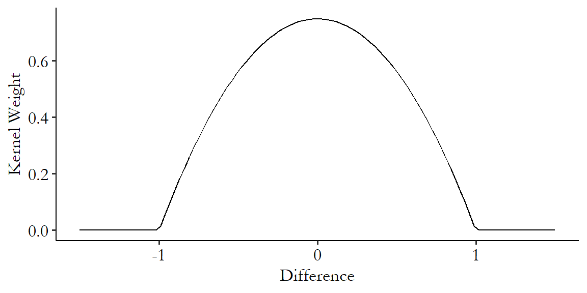
Note the hard-encoded range - this kernel only works from a difference of -1 to a difference of 1. It is standard, then, to standardize the distance before calculating differences to give to the kernel.350 Standardizing means we subtract its mean and divide by its standard deviation. In this case the part about subtracting the mean doesn’t actually matter since we’re about to subtract one value from another, so that mean would have gotten subtracted out anyway. This ensures that you don’t get different matching results just because you had a differently-scaled variable.
Once the kernel gives you back your weights,351 And if a control observation is matched to multiple treatments, you then add all its weights up. you can use them to calculate a weighted mean. Or… I did say kernel-based matching estimators. There are some other methods that start with the kernel but then use that kernel to estimate the mean in more complex ways. I’ll cover those in the “Estimation with Matched Data” section below.
How does this work in our credit card debt example?352 We’ve finally come far enough along to estimate a treatment effect! We already calculated two differences. The difference between the \(BillApril\) matching variable in rows 10,305 and 27,281 was \(|91,630 - 91,609| = 21\), and the difference between row 10,305 and row 27,719 was \(|91,630 - 91,596| = 34\). Next we standardize - the standard deviation of \(BillApril\) is 59,994, making those two differences into \(21/59,994 = .00035\) and \(34/59,994 = .00056\) standard deviations, respectively. Next we pass them through the Epanechnikov kernel, giving weights of \(\frac{3}{4}(1-.00035^2) = .9999999\) and \(\frac{3}{4}(1-.00056^2) = .9999997\), respectively (clearly, the kernel thinks both these controls are just about as good as each other). Now, we’d want to repeat this process for all the controls, but if we imagine these are the only two close enough to matter, then we compare the treated mean outcome \(LateSept\) value of 0 (false) for row 10,305 against the values of 0 for row 27,281 and 1 for 27,719, which we average together with our weights to get \((.9999999\times0 + .9999997\times1)/(.9999999+.9999997) = .4999999\). Finally we get a treatment effect of \(0 - .4999999 = -.4999999\).
How about inverse probability weighting then? Inverse probability weighting, which descends from work by Horvitz and Thompson (1952Horvitz, Daniel G., and Donovan J. Thompson. 1952. “A Generalization of Sampling Without Replacement from a Finite Universe.” Journal of the American Statistical Association 47 (260): 663–85.) via Hirano, Imbens, and Ridder (2003Hirano, Keisuke, Guido W. Imbens, and Geert Ridder. 2003. “Efficient Estimation of Average Treatment Effects Using the Estimated Propensity Score.” Econometrica 71 (4): 1161–89.), is specifically designed for use with a propensity score. Then, it weights each observation by the inverse of the probability that it had the treatment value it had. So if you were actually treated, and your estimated propensity score is .6, then your weight would be \(1/.6\). If you weren’t actually treated and your estimated propensity score was .6, then your weight would be one divided by the chance that you weren’t treated, or \(1/(1-.6) = 1/.4\).
We weight by the inverse of the probability of what you actually are to make the treated and control groups more similar. The treated-group observations that get the biggest weights are the ones that are most like the untreated group - the ones with small propensities (and thus big inverse propensities) least likely to have gotten treated who got treated anyway. Similarly, the control-group observations with the biggest weights are the ones most like the treated group, who were most likely to have gotten treated but didn’t for some reason.
Inverse probability weighting has a few nice benefits to it. You don’t have a lot of choices to make outside of specifying the propensity score estimation regression, so that’s nice. Also, you can do inverse probability weighting without doing any sort of matching at all - no need to check each treated observation against each control, just estimate the propensity score and you already know the weight. Plus, as Hirano, Imbens, and Ridder (2003) show, weighting is the most precise way to estimate causal effects as long as you’ve got a big enough sample and a flexible way to estimate the propensity score.353 Without making it seem like I’ve discovered the one true path or anything like that, when I do matching, or when people ask me how they should do matching, I usually suggest inverse probability weighting of the propensity score, or entropy balancing (described in the “Entropy Balancing” section in this chapter). As I’ve shown throughout the chapter, there are plenty of situations in which other methods would do better, but for me these are what I reach for first.
There are downsides as well, big surprise. In particular, sometimes you get a really unexpected treatment or non-treatment, and then the weights get huge. Imagine someone with a .999 propensity score who ends up not being treated - a one in a thousand chance (but with a big sample, likely to happen sometime). That person’s weight would be \(1/(1-.999) = 1,000\). That’s really big! This sort of thing can make inverse probability weighting unstable whenever propensity scores can be near 0 or 1.
There are fixes for this. The most common is simply to “trim” the data of any propensity scores too near 0 or 1. But this can make the standard errors wrong in ways that are a little tricky to fix. Other fixes include first turning the propensity score into an odds ratio (\(p/(1-p)\) instead of just \(p\)), and then, within the treated and control groups separately, scaling the weights so they all sum to 1 (Busso, DiNardo, and McCrary 2014Busso, Matias, John DiNardo, and Justin McCrary. 2014. “New Evidence on the Finite Sample Properties of Propensity Score Reweighting and Matching Estimators.” Review of Economics and Statistics 96 (5): 885–97.).
Let’s bring inverse probability weighting to our credit card debt example. We previously calculated using a logit model that the treated observation in row 10,305 had a .116 probability of treatment, as did the control observation in 27,281. Onto that we can add row 27,719, which has a propensity of .116 as well (we did pick them for being similar, after all. With such similar \(BillApril\) values, differences in predicted probability of treatment don’t show up until the fifth decimal place).
What weights does everyone get then? Row 10,305 is actually treated, so we give that observation a weight of 1 divided by the probability of treatment, or \(1/.116 = 8.621\). It gets counted a lot because it was unlikely to be treated, and so it looks like the untreated groups, but was treated!
The control rows will both get weights of 1 divided by the probability of non-treatment, or \(1/(1-.116) = 1.131\). They’re likely to be untreated, and so they aren’t like the treated group, and don’t get weighted too heavily. From here we can get weighted means on both the treated and control sides.
(5) What is the worst acceptable match? The purpose of matching is to try to make the treated and control groups comparable by picking the control observations that are most similar to the treated observations. But what if there’s a treated observation for which there aren’t any control observations that are at all like it? We can’t very well use matching to find a match for that treated observation then, can we?
Most approaches to matching use some sort of caliper or bandwidth to determine how far off a match can be before tossing it out.
The basic idea is pretty straightforward - pick a number. This is your caliper/bandwidth. If the distance, or the difference in propensity scores, is bigger in absolute value than that number, then you don’t count that as a match. If that leaves you without any matches for a given treated observation, tough cookies. That observation gets dropped.
Usually, the caliper/bandwidth is defined in terms of standard deviations of the value you’re matching on (or the standard deviation of the propensity score, if you’re matching on propensity score), rather than the value itself, to avoid scaling issues. As mentioned in the previous section, in our credit card debt example, the treated observation 10,305 had a distance of .00035 standard deviations of \(BillApril\) with control observation 27,281, and \(.00056\) standard deviations of difference with observation 27,719. If we had defined the caliper as being .0005 of a standard deviation (which would probably be a bit conservative if you ask me), then only one of those matches would count. The other one would be dropped.
Some matching approaches end up using calipers/bandwidths naturally. Any kernel-based matching approach will place a weight of 0 on any match that is far enough away that the kernel function you’ve chosen sets it to 0. For the Epanechnikov kernel that’s a distance of 1 or greater.
Another matching approach that does this naturally is exact matching. In exact matching, the caliper/bandwidth is set to 0! No ifs, ands, or buts. If your matching variables differ at all, that’s not a match. Usually, exact matching comes in the form of coarsened exact matching (Iacus, King, and Porro 2012Iacus, Stefano M., Gary King, and Giuseppe Porro. 2012. “Causal Inference Without Balance Checking: Coarsened Exact Matching.” Political Analysis 20 (1): 1–24.), which is exact matching except that whenever you have a continuous variable as a matching variable you “coarsen” it into bins first. Otherwise you wouldn’t be able to use continuous variables as matching variables, since it’s pretty unlikely that someone else has, for example, the exact same \(BillApril\) as you, down to the hundredth of a penny. Coarsened exact matching is actually a pretty popular approach, for reasons I’ll discuss in the “Matching on Multiple Variables” section.
How can we select a bandwidth if our method doesn’t do it for us by helpfully setting it to zero? Uh, good question. There is, unfortunately, a tradeoff. And yes, you guessed it, it’s a tradeoff between bias and variance.
The wider we make the bandwidth, the more potential matches we get. If we’re allowing multiple matches, we’ll get to calculate our treated and control means over more observations, making them more precise. If we’re only allowing one match, then fewer observations will be dropped for being matchless, again letting us include more observations.
However, when we make the bandwidth wider, we’re allowing in more bad matches, which makes the quality of match worse and the idea that we’re closing back doors less plausible. This brings bias back into the estimation.
There is a whole wide literature on “optimal bandwidth selection,”354 I was gonna cite some representative paper here, but honestly there isn’t one. There’s a lot of work on this. Head to your favorite journal article search service and look for “matching optimal bandwidth selection.” Go wild, you crazy kids. which provides a whole lot of methods for picking bandwidths that best satisfy some criterion. Often this is something like “the bandwidth selection rule that minimizes the squared error comparing the sample control mean and the actual control mean.” Software will often implement some optimal bandwidth selection procedure for you, but also it’s a good idea to look into what those procedures are in the software documentation so you know what’s going on.
In general, when making any sort of decision about matching, including this one, the choice is often between fewer, but better, matches that produce estimates with less bias but less precision, or more, but worse, matches that produce estimates with more bias but more precision.
And that’s just about it. While there are still some details left to go, those are the core conceptual questions you have to answer when deciding how to go about doing an estimation with matching. And maybe a few more detail-oriented questions too. This should at least give you an idea of what you’re trying to do and why. But, naturally, there are more details to come.
14.4 Multiple Matching Variables
Phew, that sure was a lot in the previous section! Distance vs. propensity, numbers of matches, bias vs. variance tradeoff… no end of it. And that was all just about matching on one variable. Now that we’re expanding to matching on multiple variables, as would normally be done, surely this is the point where we’ll get way more complex.
Well, not really. In fact, going from matching on one variable to matching on multiple variables, there’s really only one core question to answer: how do we, uh, turn those multiple variables into one variable so we can just do all the stuff from the previous section?
There are, of course, details to that question. But that’s what it boils down to. We have many variables. Matching relies on picking something “as close as possible” or weighting by how close they are, which is a lot easier to do if “close” only has one definition. So we want to boil those many variables down to a single measure of difference. How can we do that? We could do it by distance, or by propensity score, or by exact matching. We could mix it up, requiring exact matching on some variables but using distance or propensity score for the others.355 For example, maybe you’re looking at the impact of some policy change on businesses, and want to match businesses that are more similar along a number of dimensions, but require that businesses are matched exactly to others in the same industry. That way you’re not comparing a movie theater to a motorcycle repair shop, no matter how similar they look otherwise. In each case, there are choices to make. That’s what this section is about.
Throughout this section and the rest of the chapter, I’ll be adding example code using data from Broockman (2013Broockman, David E. 2013. “Black Politicians Are More Intrinsically Motivated to Advance Blacks’ Interests: A Field Experiment Manipulating Political Incentives.” American Journal of Political Science 57 (3): 521–36.). In this study, Broockman wants to look at the intrinsic movitations of American politicians. That is, what is the stuff they’ll do even if there’s no obvious reward to it? One example of such a motivation is that Black politicians in America may be especially interested in supporting the Black American community. This is part of a long line of work looking at whether politicians, in general, offer additional support to people like them.
To study this, Broockman conducts an experiment. In 2010 he sent a whole bunch of emails to state legislators (politicians), simply asking for information on unemployment benefits.356 This is a pretty good choice of topic for the email, if you ask me. Answering the email could make a material improvement in the person’s life, not just advance a policy issue. Each email was sent by the fictional “Tyrone Washington,” which in the United States is a name that strongly suggests it belongs to a Black man.
The question is whether the legislator responds. How does this answer our question about intrinsic motivation? Because Broockman varies whether the letter-writer claims to live in the legislator’s district, or in a city far away from the district. There’s not much direct benefit to a legislator of answering an out-of-district email. That person can’t vote for you! But you still might do so out of a sense of duty or just being a nice person.
Broockman then asks: do Black legislators respond less often to out-of-district emails from Black people than in-district emails from Black people? Yes! Do non-Black legislators respond less to out-of-district emails from Black people than in-district emails from Black people? Also yes! Then the kicker: is the in-district/out-of-district difference smaller for Black legislators than non-Black ones? If so, that implies that Black legislators have additional intrinsic motivation to help the Black emailer, evidence in favor of the intrinsic-motivation hypothesis and the legislators-help-those-like-themselves hypothesis.357 Even stronger evidence would repeat the same experiment but with a White letter-writer. We should see the same effect but in the opposite direction. If we don’t, then the proper interpretation might instead be that Black legislators are just more helpful people on average.
Where does the matching come in? It’s in that last step where we compare the in-/out-of-district gap between Black and non-Black legislators. Those groups tend to be elected in very different kinds of places. Back doors abound. Matching can be used to make for a better comparison group. In the original study, Broockman used median household income in the district, the percentage of the district’s population that is Black, and whether the legislator is a Democrat as matching variables.358 Specifically, he used coarsened exact matching followed by a regression. We’ll talk about both of those steps in this chapter.
14.4.1 Distance Matching with Multiple Matching Variables
Let’s start with distance measures. How can we take a lot of different matching variables and figure out which two observations are “closest?” We have to boil them down to a single distance measure.
Finally, we can wipe our brow: there’s a single, largely agreed-upon approach to doing this: the Mahalanobis distance.359 I certainly won’t say it’s the only way to do it. And data scientists are scratching their heads right now because Mahalanobis isn’t anywhere near the most common pick for them, Euclidian is (Euclidian skips the step of dividing out shared variation - we’ll get there). But come on, give a textbook author a victory where they can find one.
The Mahalanobis distance is fairly straightforward. We’ll start with a slightly simplified version of it. First, take each matching variable and divide its value by its standard deviation. Now, each matching variable has a standard deviation of 1. This makes sure that no variable ends up being weighted more heavily just because it’s on a bigger scale.
After we’ve divided by the standard deviation, we can calculate distance. For a given treated observation \(A\) and a given control observation \(B\), the Mahalanobis distance is the sum of the squares of all the differences between \(A\) and \(B\). Then, after you’ve taken the sum, you take the square root. In other words, it’s the sum of squared residuals we’d get if trying to predict the matching variables of \(A\) using the values of \(B\), if the standard deviation of each matching variable was 1. That’s it! That’s the Mahalanobis distance.
Or it’s a simplified version of it, anyway. The one piece I left out is that we’re not just dividing each variable by its standard deviation. Instead, we’re dividing out the whole covariance matrix from the squared values of the variables. If all the matching variables are unrelated to each other, this simplifies to just dividing each variable by its standard deviation. But if they are related to each other, this removes the relationships between the matching variables, making them independent before you match on them.
This requires some matrix algebra to express, but even if you don’t know matrix algebra, all you really need to know is that \(x'x\) can be read as “square all the \(x\)s, then add them up.” Then you can figure out what’s going on here if you squint and remember that taking the inverse (\(^{-1}\)) means “divide by.” The Mahalanobis distance between two observations \(x_1\) and \(x_2\) is:
where \(x_1\) is a vector of all the matching variables for observation 1, similarly for \(x_2\), and \(S\) is the covariance matrix for all the matching variables.
Why is it good for the relationships between different variables to be taken out? Because this keeps us from our matching relying really strongly on some latent characteristic that happens to show up a bunch of times. For example, say you were matching on beard length, level of arm hair, and score on a “masculinity index.” All three of those things are, to one degree or another, related to “being a male.” Without dividing out the covariance, you’d basically be matching on “being a male” three times. Redundant, and the matching process will probably refuse to match any males to any non-males, even if they’re good matches on other characteristics. If we divide out the covariance, we’re still matching on maleness, but it doesn’t count multiple times.
Returning once again to our credit card debt example, let’s expand to two matching variables: \(BillApril\) and also the \(Age\), in years, of the individuals. Comparing good ol’ treated observation 10,305 and untreated observation 27,281, we already know that the distance between them in their \(BillApril\) is \(|91,630 - 91,609| = 21\). The difference in ages is \(|23 - 37| = 14\).
Let’s calculate Mahalanobis distance first using the simplified approach where we ignore the relationship between the matching variables. The standard deviation of \(BillApril\) is NT$59,554, and so after we divide all the values of \(BillApril\) by the standard deviation, we get a new difference of \(|1.5386 - 1.5382| = .0004\) standard deviations. Not much! Then, the standard deviation of \(Age\) is 9.22, and so we end up with a distance of \(|2.49 - 4.01| = 1.52\) standard deviations.
We have our differences in standard-deviation terms. Square them up and add them together to get \(.0004^2+1.52^2 = 2.310\), and then take the square root - \(\sqrt{2.310} = 1.520\) - to get the Mahalanobis distance of 1.520. We would then compare this Mahalanobis distance to the distance between row 10,305 and all the other untreated rows, ending up in a match with whichever untreated observation leads to the lowest distance.
Let’s repeat that, but properly, taking into account the step where we divide by the covariance matrix. We have a difference of 21 in \(BillApril\) and a difference of -14 in age. We put that next to its covariance matrix and get a Mahalanobis distance of
\[\begin{multline} d(x_1,x_2) = \left(\left[\begin{array}{c} 21 \\ -14 \end{array}\right]' \left[ \begin{array}{cc} 59,544^2 & 26,138 \\ 26,138 & 85 \end{array}\right]^{-1} \left[ \begin{array}{c} 21 \\ -14 \end{array} \right]\right)^{1/2} = \\ \sqrt{.0000257 + 2.312} = 1.521 \end{multline}\]
Okay, not a huge difference from the simplified version in this particular case (1.521 vs. 1.520). But still definitely worth doing. It’s not like we knew it wouldn’t matter before we calculated it both ways.
The Mahalanobis distance has a convenient graphical interpretation, too. We’re squaring stuff, adding it up, and then taking the square root. Ring any bells? Well, for two matching variables, that’s just the distance between those two points, as we know from Pythagoras’ theorem. The Mahalanobis distance is the length of the hypotenuse of a triangle with the difference of the first matching variable for the base and the difference of the second matching variable for the height.
Figure 14.6: Mahalanobis Distance with Two Matching Variables
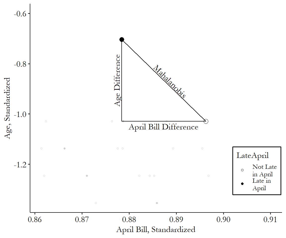
You can see the distance calculation in Figure 14.6. It’s just how long a straight line between the two points is, after you standardize the axes. That’s all! This generalizes to multiple dimensions, too. Add a third matching variable and you’re still drawing a line between two points; it’s just in three dimensions this time. Look around you at any two objects and imagine a line connecting them. That’s the Mahalanobis distance between them if you’re matching on the three spatial dimensions: width, length, and height.
And so on and so forth. Four dimensions is a bit harder to visualize since we don’t see in four dimensions, but it’s the same idea. Add as many dimensions as you like.
This does lead us to one downside of Mahalanobis matching, and distance matching generally - the curse of dimensionality. The more matching variables you add, the “further away” things seem. Think of it this way - imagine a top-down map of an office building. This top-down view has only two dimensions: north/south and east/west. Wanda on the southwest corner of the building is right next to Taylor who’s also on the southwest. A great match! Now move the camera to the side so we can see that same building in three dimensions: north/south, east/west, and up/down. Turns out Wanda’s in the southwest of the 1st floor, but Taylor’s in the southwest of the 22nd floor. No longer a great match.
The curse of dimensionality means that the more matching variables you add, the less likely you are to find an acceptable match for any given treated observation. There are a few ways to deal with this. One approach is to try to limit the number of matching variables, although that means we’re not going to be closing those back doors - no bueno. Another is to just have a whole bunch of observations. Matches being hard to find is okay if you have eight zillion observations to look through to find one. That sounds good, but also, we only have so many observations available.
A third approach is to simply be a little more forgiving about match quality, or at least the value of the caliper/bandwidth, as the number of dimensions goes up. Sometimes people will just try different bandwidths until the amount of matches looks right. One more disciplined approach is to use your normal bandwidth, but divide the Mahalanobis score by the square root of the number of matching variables (Mahony 2014Mahony, Colin. 2014. “Effects of Dimensionality on Distance and Probability Density in Climate Space.” The Seasons Alter.).
Let’s take Broockman to meet Mahalanobis! We’ll be using one-to-one nearest neighbor matching with a Mahalanobis distance measure, calculated using our three matching variables (\(medianhhincom\), \(blackpercent\), \(leg\_democrat\)). We’ll be matching districts with Black legislators to those without (\(leg\_black\)). There are two parts to the code here: the calculation of matching weights, and the estimation of the treatment effect on the outcome variable. I’ll show how to do both. In the case of the Broockman example, the outcome variable is \(responded\), whether the legislator responded to the email. Of course, the actual design was a bit more complex than just looking at the effect of \(leg\_black\) on \(responded\), but we’ll get to that later. For now, we’re just showing the relationship between \(leg\_black\) and \(responded\) after matching on \(medianhhincom\), \(blackpercent\), and \(leg\_democrat\).360 An important note about the code examples in this chapter: I’ll be showing descriptions of how to use these commands, but when it comes to matching, the default options on some important things vary quite a bit from package to package. What standard errors to use? How to handle ties in nearest-neighbor matching, where multiple observations are equally good matches? Should it try to get an average treatment effect or an average treatment on the treated? Don’t expect the different languages to produce the same results. If you want to see what details lead to the different results, and how you could make them consistent, you’ll need to dive into the documentation of these commands.
R Code
library(Matching); library(tidyverse)
br <- causaldata::black_politicians

# Outcome
Y <- br %>%
    pull(responded)
# Treatment
D <- br %>%
    pull(leg_black)
# Matching variables
# Note select() is also in the Matching package, so we specify dplyr
X <- br %>%
    dplyr::select(medianhhincom, blackpercent, leg_democrat) %>%
    as.matrix()

# Weight = 2, oddly, denotes Mahalanobis distance
M <- Match(Y, D, X, Weight = 2, caliper = 1)

# See treatment effect estimate
summary(M)

# Get matched data for use elsewhere. Note that this approach will
# duplicate each observation for each time it was matched
matched_treated <- tibble(id = M$index.treated,
                          weight = M$weights)
matched_control <- tibble(id = M$index.control,
                          weight = M$weights)
matched_sets <- bind_rows(matched_treated,
                          matched_control)
# Simplify to one row per observation
matched_sets <- matched_sets %>%
                    group_by(id) %>%
                    summarize(weight = sum(weight))
# And bring back to data
matched_br <- br %>%
    mutate(id = row_number()) %>%
    left_join(matched_sets, by = 'id')

# To be used like this! The standard errors here are wrong
lm(responded~leg_black, data = matched_br, weights = weight)
Stata Code
causaldata black_politicians.dta, use clear download

* Create an id variable based on row number,
* which will be used to locate match IDs
g id = _n

* teffects nnmatch does nearest-neighbor matching using first the outcome
* variable and the matching variables then the treatment variable.
* The generate option creates variables with the match identities
teffects nnmatch (responded medianhhincom blackpercent leg_democrat) ///
    (leg_black), nneighbor(1) metric(mahalanobis) gen(match)
* Note this will produce a treatment effect by itself
* Doing anything else with the match in Stata is pretty tricky
* (or using a caliper). If you want either of those you may want to
* look into the mahapick or psmatch2 packages
* Although these won't give the most accurate standard errors
Python Code
import pandas as pd
import numpy as np
# The more-popular matching tools in sklearn
# are more geared towards machine learning than statistical inference
from causalinference.causal import CausalModel
from causaldata import black_politicians
br = black_politicians.load_pandas().data

# Get our outcome, treatment, and matching variables
# We need these as numpy arrays
Y = br['responded'].to_numpy()
D = br['leg_black'].to_numpy()
X = br[['medianhhincom', 'blackpercent', 'leg_democrat']].to_numpy()

# Set up our model
M = CausalModel(Y, D, X)

# Fit, using Mahalanobis distance
M.est_via_matching(weights = 'maha', matches = 1)

print(M.estimates)
# Note it automatically calcultes average treatments on
# average, on treated, and on untreated/control (ATC)
Perhaps Mahalanobis doesn’t go far enough. We can forget about trying to boil down a bunch of distances into one, and really any concerns about one variable being more important than the others, by making the case that all the variables are infinitely important. No mismatch at all. We’re back to exact matching, and specifically coarsened exact matching, which I first mentioned in the section on matching concepts (Iacus, King, and Porro 2012Iacus, Stefano M., Gary King, and Giuseppe Porro. 2012. “Causal Inference Without Balance Checking: Coarsened Exact Matching.” Political Analysis 20 (1): 1–24.).
In coarsened exact matching, something only counts as a match if it exactly matches on each matching variable. The “coarsened” part comes in because, if you have any continuous variables to match on, you need to “coarsen” them first by putting them into bins, rather than matching on exact values. Otherwise you’d never get any matches. What does this coarsening look like? Let’s take \(BillApril\) from the credit card debt example. We might cut the variable up into ten deciles. So for our standby treated observation on row 10,305, instead of matching in that row’s exact value of NT$91,630 (which no other observation shares), we’d recognize that the value of NT$91,630 is between the 80th and 90th percentiles of \(BillApril\), and so just put it in the category of “between NT$63,153 (80th percentile) and NT$112,110 (90th percentile)” (which about 10% of all observations share).361 That’s a pretty big bin. We’d want to think carefully about whether we think it’s reasonable to say we’ve closed the back door through \(BillApril\) if the way we do it is comparing someone with a bill of NT$64,000 to someone with a bill of NT$112,000. Maybe we need narrower bins for this variable. Construct those bins carefully!
Once you’ve determined how to bin each continuous variable, you look for exact matches. Each treated observation is kept only if it finds at least one exact match and is dropped otherwise. Each control observation is kept only if it finds at least one exact match as well, and given a weight corresponding to the number of treated-observation matches it has, divided by the number of control observations matched to that treated observation. Then all of that is further multiplied by the total number of matched control observations divided by the total number of matched treatment observations. In other words, \((MyTreatedMatches/MyControlMatches)\) \(\times\) \((TotalControlMatches/TotalTreatedMatches)\). This process ensures, without a doubt, that there are absolutely no differences in the matching variables (after binning) between the treated and control groups.362 This doesn’t mean there are truly no differences. As mentioned above, any coarsened continuous variable matches exactly on bins, but not on the actual value, so there are differences in the value within bins. There could also be differences in the variables you don’t use for matching. And if the curse of dimensionality encourages you to leave matching variables out when using coarsened exact matching, uh oh!
Coarsened exact matching does require some serious firepower to work, especially once the curse of dimensionality comes into play. Z. Zhao (2004Zhao, Zhong. 2004. “Using Matching to Estimate Treatment Effects: Data Requirements, Matching Metrics, and Monte Carlo Evidence.” Review of Economics and Statistics 86 (1): 91–107.) looks at an example of some fairly standard data, and an attempt to match on twelve variables. This creates about six million cells after interacting all twelve variables. The data set had far fewer than six million observations. Not everyone is going to find a match.
The need for a really big sample size is no joke or something you can skim over, either. Coarsened exact matching, if applied to moderately-sized samples (or any size sample with too many matching variables), can lead to lots of treated observations being dropped. Black, Lalkiya, and Lerner (2020Black, Bernard S., Parth Lalkiya, and Joshua Y. Lerner. 2020. “The Trouble with Coarsened Exact Matching.” Northwestern Law & Econ Research Paper.) replicated five coarsened exact matching studies and found that lots of treatment observations ended up getting dropped, which made the treatment effect estimates much noisier, and can also lead the result to be a poor representation of the average treatment effect if certain kinds of treated observations are more likely to find matches than others. One of those studies was Broockman (2013) - uh oh! If you’ve been wondering why the list of matching variables in the Broockman (2013) code examples is so short, it’s because even this list already leads quite a few observations to be dropped with coarsened exact matching, and any more would worsen the problem. Black, Lalkiya, and Lerner (2020) recommend forgetting the method entirely, although I wouldn’t go that far. I would say that you should probably limit its use to huge datasets, and you must check how many treated observations you lose due to not finding any matches. If that’s a lot, you should switch to another method.
The need for a lot of observations, and the relative ease and low computational requirements of calculation,363 No square roots or logit models to calculate - it matches or it doesn’t. Plus, you don’t need to really match each observation. You can just count the number of treated and untreated observations in each “bin” and create weights on that basis. makes coarsened exact matching fairly popular in the world of big-data data science. There you might hear the exact matches referred to as “doppelgangers.”364 One other place that coarsened exact matching pops up is in missing-data imputation. Is your data set incomplete, with some data points gone missing? You could look for some exact matches on all your non-missing variables and see what value of the missing variable they have. I discuss missing-data imputation more in Chapter 23. It’s also fairly popular in the world of enormous administrative data sets, where a researcher has managed to get their hands on, say, governmental records on the entire population of a country.365 Yes, these data sets exist. You often see them for Nordic countries, where you’re really tracked cradle-to-grave. They also exist in more limited forms in other countries. For example there are a few studies that use the entire IRS database of United States tax information. And before you ask, yes of course every researcher is deeply jealous of the people who have access to this data. Would I give a finger for access to this data? Hey, I’ve got nine others.
Let’s look at Klemick, Mason, and Sullivan (2020Klemick, Heather, Henry Mason, and Karen Sullivan. 2020. “Superfund Cleanups and Children’s Lead Exposure.” Journal of Environmental Economics and Management 100: 1022–89.) as one example of coarsened exact matching at work in neither of those contexts. They are interested in the effect of the Environmental Protection Agency’s (EPA) Superfund Cleanup project on the health of children. This was a project where the EPA located areas subject to heavy environmental contamination and then cleaned them up. Did the cleanup process improve childrens’ health?
Their basic research design was to compare the levels of lead in the blood of children in a neighborhood before the cleanup to after, expecting not only that the lead level will drop after cleanup, but that it will improve more in areas very near the site (less than 2 kilometers) than it will in areas a little farther away (2-5 kilometers), which likely weren’t as affected by the pollution when it was there.366 This design is a preview of what you’ll see in Chapter 18 on difference-in-differences.
As always, there are back doors between distance to a Superfund site and general health indicators, including blood lead levels. The authors close some of these back doors using coarsened exact matching at the neighborhood level, matching neighborhoods on the basis of which Superfund site they’re near, the age of the housing in the area (what percentage of it was built before 1940), the percentage of the population receiving welfare assistance, the percentage who are African American, and the percentage of the population that receives the blood screenings used to measure the blood lead levels used as the dependent variable in the study.
They start with data on about 380,000 people living within 2 kilometers of a Superfund site, and 900,000 living 2-5 kilometers from a Superfund site. Then, the matching leads to a lot of observations being dropped. The sample after matching is about 201,000 from those living within 2 kilometers of a Superfund site, and 353,000 living 2-5 kilometers from a site.
The large drop in sample may be a concern, but we do see considerably reduced differences between those living close to the site or a little farther away. The matching variables look much more similar, of course, but so do other variables that potentially sit on back doors. Percentage Hispanic was not a matching variable, but half of the pre-matching difference disappears after matching. There are similar reductions in difference for traffic density and education levels.
What do they find? Superfund looks like it worked to reduce blood lead levels in children. Depending on specification, they find without doing any matching that lead levels were reduced by 5.1%-5.5%. With matching the results are a bit bigger, from 7.1%-8.3%.
How can we perform coarsened exact matching ourselves? Let’s head back to Broockman (2013), who performed coarsened exact matching in the original paper.
R Code
library(cem); library(tidyverse)
br <- causaldata::black_politicians

# Limit to just the relevant variables and omit missings
brcem <- br %>%
    select(responded, leg_black, medianhhincom,
    blackpercent, leg_democrat) %>%
    na.omit() %>%
    as.data.frame() # Must be a data.frame, not a tibble

# Create breaks. Use quantiles to create quantile cuts or manually for
# evenly spaced (You can also skip this and let it do it automatically,
# although you MUST do it yourself for binary variables). Be sure
# to include the "edges" (max and min values). So! Six bins each:
inc_bins <- quantile(brcem$medianhhincom, (0:6)/6)

create_even_breaks <- function(x, n) {
    minx <- min(x)
    maxx <- max(x)
    return(minx + ((0:n)/n)*(maxx-minx))
}

bp_bins <- create_even_breaks(brcem$blackpercent, 6)

# For binary, we specifically need two even bins
ld_bins <- create_even_breaks(brcem$leg_democrat,2)

# Make a list of bins
allbreaks <- list('medianhhincom' = inc_bins,
                  'blackpercent' = bp_bins,
                  'leg_democrat' = ld_bins)

# Match, being sure not to match on the outcome
# Note the baseline.group is the *treated* group
c <- cem(treatment = 'leg_black', data = brcem,
         baseline.group =  '1',
         drop = 'responded',
         cutpoints = allbreaks,
         keep.all = TRUE)

# Get weights for other purposes
brcem <- brcem %>%
    mutate(cem_weight = c$w)
lm(responded~leg_black, data = brcem, weights = cem_weight)

# Or use their estimation function att. Note there are many options
# for these functions including logit or machine-learing treatment
# estimation. Read the docs!
att(c, responded ~ leg_black, data = brcem)
Stata Code
* If necessary: ssc install cem
causaldata black_politicians.dta, use clear download

* Specify our matching variables and treatment. We can also specify
* how many bins for our variables - (#2) means 2 bins.
* We MUST DO this for binary variables - otherwise
* it will try to split this binary variable into more bins!
cem medianhhincom blackpercent leg_democrat(#2), tr(leg_black)

* Then we can use the cem_weights variable as iweights
reg responded leg_black [iweight = cem_weights]
Python Code
import pandas as pd
import statsmodels.formula.api as smf
# The cem package is iffy so we will do this by hand
from causaldata import black_politicians
br = black_politicians.load_pandas().data

# Create bins for our continuous matching variables
# cut creates evenly spaced bins
# while qcut cuts based on quantiles
br = (br.assign(inc_bins = pd.cut(br['medianhhincom'], 6)
              ,bp_bins = pd.cut(br['blackpercent'], 6)))

# Count how many treated and control observations
# are in each bin, dropping 0s created as placeholders
treated = (br.query('leg_black == 1')
           .groupby(['inc_bins','bp_bins','leg_democrat'])
            .size().to_frame('treated').query('treated > 0'))
control = (br.query('leg_black == 0')
           .groupby(['inc_bins','bp_bins','leg_democrat'])
            .size().to_frame('control').query('control > 0'))

# Merge those counts back in
br = (br.join(treated, on = ['inc_bins','bp_bins','leg_democrat'])
      .join(control, on = ['inc_bins','bp_bins','leg_democrat']))

# For treated obs, weight is 1 if there are any control matches
br['weight'] = 0
br.loc[(br['leg_black'] == 1) & (br['control'] > 0), 'weight'] = 1
# For control obs, weight depends on total number of treated and control
# obs that found matches
totalcontrols = sum(br.loc[br['leg_black']==0]['treated'] > 0)
totaltreated = sum(br.loc[br['leg_black']==1]['control'] > 0)
# Then, control weights are treated/control in the bin,
# times control/treated overall
br['controlweights'] = (br['treated']/br['control']
)*(totalcontrols/totaltreated)
br.loc[(br['leg_black'] == 0), 'weight'] = br['controlweights']

# Now, use the weights to estimate the effect
m = smf.wls(formula = 'responded ~ leg_black',
weights = br['controlweights'],
data = br).fit()

m.summary()
14.4.2 Entropy Balancing
There is a newcomer in the world of distance matching that, while it hasn’t been quite as popular in application relative to other options, seems to have some really nice properties. The newcomer is entropy balancing, which grows out of Hainmueller (2012Hainmueller, Jens. 2012. “Entropy Balancing for Causal Effects: A Multivariate Reweighting Method to Produce Balanced Samples in Observational Studies.” Political Analysis 20 (1): 25–46.).
In other matching methods, you aggregate together the matching variables in some way and match on that. Then you hope that the matching you did removed any differences between treatment and control. And as I’ll discuss in the “Checking Match Quality” section, you look at whether any differences remain and cross your fingers that they’re gone.
The basic concept of entropy balancing is this: instead of aggregating, matching, and hoping, we instead enforce restrictions on the distance between treatment and control. We say “no difference between treatment and control for these moment conditions for these matching variables,” where moment conditions are things like means, variances, skew, and so on. For example “no difference between treatment and control for the mean of \(X_1\).” You can add a lot of those restrictions. Add another restriction that the mean of \(X_2\) must be the same, and \(X_3\), and so on. The descriptive statistics don’t have to be means, either. Entropy balancing lets you require that things like the variance or skewness are the same, too, if you like.367 The way I think of entropy balancing myself is “sorta like the method of moments but for matching.” That’s a line that will be complete nonsense to most people reading this. But if it’s not nonsense to you, then it took me all of nine words to explain entropy balancing pretty accurately. People do actually use method of moments to generate matching weights in a very similar manner to entropy balancing, too.
Once you have your set of restrictions, entropy balancing gets to work searching for a set of weights that satisfies those restrictions. As long as the restrictions are possible to satisfy, you’ll get them, too.368 If you can recall your multivariate calculus, it’s really just applying a Lagrange multiplier. That’s just about it! Entropy balancing gives the assured-no-difference result that coarsened exact matching does, but without having to limit the number of matching variables or drop a bunch of treated observations. Why didn’t we do this before?
This section is short for two reasons: first, the intuitive explanation of entropy balancing is quite simple, but to go into any sort of detail would require going a lot more complex. And second, because entropy balancing is not as well-known as other approaches at the time of this writing. Perhaps this is because it requires a fair bit more technical detail than other methods.369 Also, more of that detail requires trust in your software programmer - what, are you going to code up the weight-searching method? Okay, fine, maybe you are. But for most people it’s a bit more out of their reach than the other methods in this chapter. “I enforced moment conditions” also sounds a bit more like magic than “I found people with similar values of the matching variables” if you’re trying to explain what you’re doing to someone less well-versed in statistics.
But it’s still worth learning about. Perhaps it will become more popular and expected in the future. Perhaps you’ll use it and that will make it more popular and expected in the future. Or at the very least, it can act as a stand-in for the many other matching approaches that didn’t make this book. And there are a few. What, the eight million combinations of options for the matching procedures we have aren’t enough? No! There’s genetic matching, subclassification, optimal matching, etc..
Let’s code up an entropy balance estimation. The examples will use R and Stata. There is a working Python library empirical_calibration that includes entropy balancing, but you’re in for a ride, as even installing it is not as straightforward as other packages. I’ll leave that one out for now, but you can pursue it on your own.370 See https://github.com/google/empirical_calibration.
R Code
library(ebal); library(tidyverse); library(modelsummary)
br <- causaldata::black_politicians

# Outcome
Y <- br %>%
    pull(responded)
# Treatment
D <- br %>%
    pull(leg_black)
# Matching variables
X <- br %>%
    select(medianhhincom, blackpercent, leg_democrat) %>%
    # Add square terms to match variances if we like
    mutate(incsq = medianhhincom^2,
    bpsq = blackpercent^2) %>%
    as.matrix()

eb <- ebalance(D, X)

# Get weights for usage elsewhere
# Noting that this contains only control weights
br_treat <- br %>%
    filter(leg_black == 1) %>%
    mutate(weights = 1)
br_con <- br %>%
    filter(leg_black == 0) %>%
    mutate(weights = eb$w)
br <- bind_rows(br_treat, br_con)

m <- lm(responded ~ leg_black, data = br, weights = weights)
msummary(m, stars = c('*' = .1, '**' = .05, '***' = .01))
Stata Code
* If necessary: ssc install ebalance
causaldata black_politicians.dta, use clear download

* Specify the treatment and matching variables
* And then in targets() specify which moments to match
* 1 for means, 2 for variances, 3 for skew
* Let's do means and variances for our continuous variables
* and just means for our binary matching variable (leg_democrat)
* and store the resulting weights in wt
ebalance leg_black medianhhincom blackpercent leg_democrat, ///
    targets(2 2 1) g(wt)

* Use pweight = wt to adjust estimates
reg responded leg_black [pw = wt]
14.5 Propensity Score Weighting with Multiple Matching Variables
The propensity score is probably the most common way of aggregating multiple matching variables into a single value that can be matched on. Remember, the propensity score is the estimated probability that a given observation would have gotten treated. Propensity score matching often means selecting a set of matched control observations with similar values of the propensity score. However, as previously mentioned, modern advice tends to be toward using the propensity score to conduct inverse probability weighting (King and Nielsen 2019King, Gary, and Richard Nielsen. 2019. “Why Propensity Scores Should Not Be Used for Matching.” Political Analysis 27 (4): 435–54.).
Inverse probability weights. Matching weights based on the propensity score, often one divided by the propensity of receiving the level of treatment that was actually received.
In this section I’ll focus on the estimation of the propensity score itself. Then, as suggested by the section title, you’ll go on to use these propensity scores to construct matching weights, rather than select a set of matched observations. The specific details on how those weights are constructed from the propensity score will be shown in the code examples, and also detailed further in the “Matching and Treatment Effects” section at the end of the chapter, since the calculation of weights depends on the kind of treatment effect you want.
Propensity scores are usually estimated by regression. This is highly convenient for me because I just wrote a whole dang chapter about regression, and you can just go read that.371 And if you figured you’d just read the matching chapter and skip regression because of how long the regression chapter is, gotcha.
Specifically, propensity scores are usually estimated by logit or probit regression.372 The negatives of the linear probability model are very evident here, since you’re using the predicted values, so anything outside the 0 or 1 range is unusable. So the linear probability model is out. The main work of doing propensity score estimation by regression is in constructing the regression model.
What choices are there to make in constructing the regression model? You’ve got your standard model-construction problems - anything that’s a determinant of treatment should definitely be in there. But there are also important functional form concerns. Which matching variables should be included with polynomials? Or interactions?
You’re trying to predict something here - the propensity score - but you do want to keep your thinking in the realm of causal diagrams. After all, you’re trying to close back doors. So including things as predictors if they’re on back doors, and excluding them if they’re on front doors, is still key when constructing your model.
You’re not totally in the dark (or reliant entirely on theory) for the selection of your model, though. After all, a good propensity score should serve the purpose of closing back doors, right? We can check this. Back doors in Figure 14.3 are of the form \(Treatment \leftarrow TreatmentPropensity\) \(\leftarrow A \rightarrow Outcome\). Controlling for \(TreatmentPropensity\) should close all doors between \(Treatment\) and the matching variable \(A\). So, as Dehejia and Wahba (2002Dehejia, Rajeev H., and Sadek Wahba. 2002. “Propensity Score-Matching Methods for Nonexperimental Causal Studies.” Review of Economics and Statistics 84 (1): 151–61.) suggest, you can split the propensity score up into bins. Then, within each bin (i.e., controlling for \(TreatmentPropensity\)), you can check whether each matching variable is related to treatment. If it is, you might want to try adding some more polynomial or interaction terms for the offending matching variables. This is called a “stratification test,” and is a form of balance checking, which I’ll cover more in the “Balance Checking” section below.
Once you’ve estimated the logit or probit model, you get the predicted probabilities,373 Careful! Using a standard predict function with a logit or probit won’t default to predicting the probabilities in some languages, but will instead give you the index. Check the documentation of your predict function, and also check the values of what you get to make sure it’s between 0 and 1. and that’s it! That’s your propensity score.
R Code
library(causalweight); library(tidyverse)
br <- causaldata::black_politicians

# We can estimate our own propensity score
m <- glm(leg_black ~ medianhhincom + blackpercent + leg_democrat,
         data = br, family = binomial(link = 'logit'))
# Get predicted values
br <- br %>%
    mutate(ps = predict(m, type = 'response'))
# "Trim" control observations outside of
# treated propensity score range
# (we'll discuss this later in Common Support)
minps <- br %>%
    filter(leg_black == 1) %>%
    pull(ps) %>%
    min(na.rm = TRUE)
maxps <- br %>%
    filter(leg_black == 1) %>%
    pull(ps) %>%
    max(na.rm = TRUE)
br <- br %>%
    filter(ps >= minps & ps <= maxps)

# Create IPW weights
br <- br %>%
    mutate(ipw = case_when(
    leg_black == 1 ~ 1/ps,
    leg_black == 0 ~ 1/(1-ps)))

# And use to weight regressions (The standard errors will be wrong
# here unless we bootstrap the whole process - See the code examples
# from the doubly robust estimation section or the simulation chapter)
lm(responded ~ leg_black, data = br, weights = ipw)

# Or we can use the causalweight package!
# First, pull out our variables
# Outcome
Y <- br %>%
    pull(responded)
# Treatment
D <- br %>%
    pull(leg_black)
# Matching variables
X <- br %>%
    select(medianhhincom, blackpercent, leg_democrat) %>%
    as.matrix()

# Note by default this produces average treatment effect,
# not average treatment on the treated, and trims propensity
# scores based on extreme values rather than matching treated range.
# It bootstraps your standard errors too, just how we like it.
IPW <- treatweight(Y, D, X, trim = .001, logit = TRUE)

# Estimate and SE
IPW$effect
IPW$se
Stata Code
causaldata black_politicians.dta, use clear download

* We can estimate our own propensity score with probit or logit
logit leg_black medianhhincom blackpercent leg_democrat
* Get predicted values for our propensity score
predict ps, pr

* "Trim" control observations outside of
* treated propensity score range
* (we'll discuss this later in Common Support)
summ ps if leg_black
replace ps = . if ps < r(min) | ps > r(max)

* Get inverse probability weights
g ipw = 1/ps if leg_black
replace ipw = 1/(1-ps) if !leg_black

* Use inverse weights in regression
reg responded leg_black [pw = ipw]
* (or see the bootstrap standard error example in the section on doubly
* robust estimation, or the simulation chapter) Note that simple vce(bootstrap)
* won't work since it won't bootstrap the matching process

* Or do everything in teffects
* (This will use improved standard errors,
* unless you've done bootstrap,
* but won't let us do the trim)
teffects ipw (responded) (leg_black medianhhincom ///
    blackpercent leg_democrat, logit)
Python Code
import pandas as pd
import numpy as np
import statsmodels.formula.api as sm
# The more-popular matching tools in sklearn
# are more geared towards machine learning than statistical inference
from causalinference.causal import CausalModel
from causaldata import black_politicians
br = black_politicians.load_pandas().data

# Get our outcome, treatment, and matching variables as numpy arrays
Y = br['responded'].to_numpy()
D = br['leg_black'].to_numpy()
X = br[['medianhhincom', 'blackpercent', 'leg_democrat']].to_numpy()

# Set up our model
M = CausalModel(Y, D, X)

# Estimate the propensity score using logit
M.est_propensity()

# Trim the score with improved algorithm trim_s to improve balance
M.trim_s()

# If we want to use the scores elsewhere, export them
# (we could have also done this with sm.Logit)
br['ps'] = M.propensity['fitted']

# We can estimate the effect directly (note this uses "doubly robust" methods
# as will be later described, which is why it doesn't match the sm.wls result)
M.est_via_weighting()

print(M.estimates)

# Or we can do our own weighting
br = br.assign(ipw = lambda x: x.leg_black*(1/x.ps)
               + (1-x.leg_black)*(1/(1-x.ps)))

# Now, use the weights to estimate the effect (this will produce
# incorrect standard errors unless we bootstrap the whole process,
# as in the doubly robust section later, or the Simulation chapter)
m = sm.wls(formula = 'responded ~ leg_black',
weights = br['ipw'],data = br).fit()

m.summary()
There are other ways to estimate the propensity score. Really, any method you could use to run a regression of a binary variable on multiple predictors and get a predicted value between 0 and 1 could work. That doesn’t mean that all of those methods would be good ideas.
Other approaches have turned out to be particularly useful among the bevy of alternatives. In general, the methods aside from logit and probit that are useful manage to do something that logit and probit can’t.374 Makes sense. Two things that logit and probit have trouble with are high degrees of nonlinearity and high dimensions.
High degrees of nonlinearity is a problem? Aren’t logit and probit nonlinear regression models? Well, yes, but they do require linearity in the index function, if you look back to the “Nonlinear Regression” section in Chapter 13. You can add polynomial terms, of course. But how many? Is it enough? Too many and things will start to get weird.
High dimensions occur when you have lots of matching variables. Or, alternately, when you have lots of interactions between all your matching variables in your regression. Again, this is stuff that it’s theoretically possible for regression to handle, but as the number of terms creeps higher and higher, regression ceases to be the best tool for the job.
So what is the best tool for the job? There are lots of options. One that’s relatively well-known in health fields is high-dimensional propensity score estimation (Schneeweiss et al. 2009Schneeweiss, Sebastian, Jeremy A. Rassen, Robert J. Glynn, Jerry Avorn, Helen Mogun, and M. Alan Brookhart. 2009. “High-Dimensional Propensity Score Adjustment in Studies of Treatment Effects Using Health Care Claims Data.” Epidemiology 20 (4): 512.), which just picks a set of “best” covariates from a long list based on theoretical importance, and which seem to predict really well, before running logit.
A bit further afield, but seeing good results, are machine learning methods. Machine learning is great at predicting stuff given data that has a lot of dimensions. And predicting treatment using a lot of dimensions is exactly what we want to do.
Two popular approaches to propensity score estimation using machine learning methods are regularized regression, as discussed in Chapter 13, where you toss everything in and let a penalty parameter decide what to down-weight or throw out, and boosted regression.
Boosted regression is an iterative method that starts with a binary regression model (like a logit), checks which observations are particularly poorly predicted, and then runs itself again, weighting the poorly-estimated observations more heavily so the prediction model pays more attention to them, reducing their prediction error. Then it continues doing this a bunch of times. In the end, you combine all the different models you ran to produce some sort of aggregated score. In the context of propensity scores, this leads to pretty good estimates of the propensity score (Griffin et al. 2017Griffin, Beth Ann, Daniel F. McCaffrey, Daniel Almirall, Lane F. Burgette, and Claude Messan Setodji. 2017. “Chasing Balance and Other Recommendations for Improving Nonparametric Propensity Score Models.” Journal of Causal Inference 5 (2).).
14.6 Assumptions for Matching
14.6.1 Conditional Independence Assumption
As with any statistical method, however well thought-out our methods are, they always rely on assumptions. Using matching can relax some assumptions, like linearity (unless we’re using a regression to estimate a propensity score). But that certainly doesn’t make it assumption-free.
Some assumptions carry over from our other work. The main one of those is the conditional independence assumption. Remember in Chapter 13 where I talked about omitted variable bias being the regression lingo for “open back doors”? Well, the conditional independence assumption is matching lingo for “all the back doors are closed.”
In other words, the conditional independence assumption says that the set of matching variables you’ve chosen is enough to close all back doors. The entirety of the relationship between treatment and outcome is either one of the causal front-door paths you want, or is due to a variable that you’ve measured and included as a matching variable.
That’s just new lingo for an assumption we’ve already covered. What else do we need to think about?
14.6.2 Common Support
The matching process, no matter how you do it, assumes that there are appropriate control observations to match with. But what if there aren’t? Chaos ensues! This is called a failure of common support.
Why is this a problem? Let’s take an extreme example. You’re interested in the effect of early-release programs on recidivism. These are programs that allow people who have been sentenced to prison time to leave before their sentence is up, often under certain terms and conditions.375 Parole is an example of an early-release program. You’ve got a group of treated ex-prisoners who were released early, and a group of untreated ex-prisoners who served their full sentence, and information on whether they committed any additional crimes in the ten years after they got out.
You figure that the prisoner’s behavior while in prison might be related both to getting an early release and to their chances of recidivism. So you match on a “behavior score” given by the prison review board that decides whether someone gets early release.
But uh-oh! Turns out that the review board score, which goes from 1 to 10, translates too directly to early release. Everyone with an 8-10 gets early release, and everyone with a 1-7 doesn’t. So when you go looking for matches for your treated observations, you end up trying to find ex-prisoners who got a score of 8-10 but didn’t get early release. And there aren’t any of those. The analysis lacks common support - there simply aren’t any comparable control observations.
Or imagine that instead of trying to select matches, you’re constructing weights. What weight do you give to the 1-7s so that the control group is comparable to the treatment group? Uh, zero I guess. So everything gets a weight of zero and… you again have nothing to compare.
The problem is still there even if it isn’t quite as stark. Maybe all 9-10s get early release, while some 8s do and other 8s don’t. We still don’t have any good matches for the 9-10s. Or maybe there are a handful of 9s and 10s that don’t get early release. Now we have matches, but how heavily do we want to rely on that tiny number of matches?
The assumption of common support says that there must be substantial overlap in the distributions of the matching variables comparing the treated and control observations. Or in the context of propensity scores, there must be substantial overlap in the distribution of the propensity score.
Common support is fairly easy to check for, and there are a few ways to do it.
The first approach to checking for common support is simply to look at the distribution of a variable for the treated group against the distribution of that same variable for the untreated group, as in Figure 14.7 (a), which shows the distribution of the percentage Black in district (\(blackpercent\)) matching variable in our Broockman (2013) study.
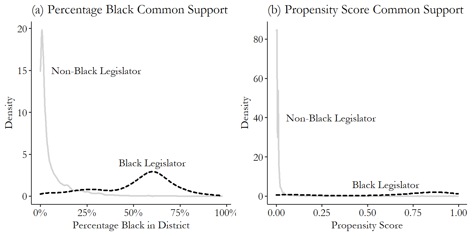
Figure 14.7: Common Support of the Percentage Black Variable and the Propensity Score in Broockman (2013) Data
Is there good common support for this variable? It’s a bit iffy. It’s not a problem that the distributions are different - we can use matching or reweighting to scale up the parts of the control distribution until they’re the same as the treated distribution… assuming that those parts of the control distribution exist to be scaled up. If there’s nobody home at that part of the distribution, not much we can do. And there are certainly some regions here where there’s not much to compare to. There aren’t that many districts with a more than 50% Black population but a non-Black legislator. That’s a problem for common support, as many of the Black legislators we do have represent areas with a 50-80% Black population.
If there are areas with a 50-80% Black population but a non-Black legislator, then those areas will receive huge weights and increase noise in the estimate. Or if there aren’t any, then those areas with 50-80% Black population and a Black legislator will have to be dropped. And that’s the bulk of the treated data! The comparison won’t be all that representative of the actual groups with Black legislators.
This same approach of contrasting the distribution works for propensity scores. In Figure 14.7 (b) you can see the distribution of the propensity score for the treated and control groups. As you would expect, the distribution is further to the right for the treated group than the control group.376 If it weren’t that would be weird, as it would imply that the untreated group was more likely to be treated than the treated group. That’s not a problem. The problem arises if there are big chunks of the distribution for one group (particularly the treated group) where there is no or very very little weight in the control group. Again, we do have some issues here, where there simply aren’t that many districts with non-Black legislators but high propensity scores. In fact, the propensity is so bunched down near 0 for that group that the density in that region is enormous, squashing down the rest of the graph and making it hard to see.
In the context of propensity scores, we may as well take this opportunity to check something else, too - in propensity score estimation we need to assume that the true propensity score is never exactly 0 or 1.377 Why? It’s easy to see why when we’re weighting - if you’re a treated observation with a 100% probability of treatment, then your weight would be \(1/0\). Oops! Divide by 0. Similarly, an untreated observation with 0% probability of treatment would get \(1/0\). If we see big parts of the distribution right around 0 or 1, this should raise a concern.
Another way to check for common support when you’re selecting matches is simply to see how successful you are at finding matches. If 1% of your treated observations fail to find an acceptable match, that’s pretty good. If 90% of your treated observations fail to find an acceptable match, then you lack common support.
What to do about support? The first step we can take in dealing with support is to avoid trying to match where we don’t have any support. That is, we want to drop observations that don’t match well.
Some matching methods do this for us. If we’re picking matches with a caliper, then bad matches won’t be selected as matches. Observations without common support won’t make it to the matched sample. Done!
Other methods require a little extra work after the fact. Propensity score approaches, especially inverse probability weighting, won’t automatically drop observations outside the range of common support. For this reason it’s common to “trim” the propensity score. For the treated and control groups separately, look for the range of values of the propensity score where the density distribution is zero (or close to zero, below some cutoff value). Then, drop all observations in the other group that have propensity scores in the range that doesn’t exist in your group (Caliendo and Kopeinig 2008Caliendo, Marco, and Sabine Kopeinig. 2008. “Some Practical Guidance for the Implementation of Propensity Score Matching.” Journal of Economic Surveys 22 (1): 31–72.). In other words, limit the data to the range of common support.
Figure 14.8 repeats Figure 14.7 (b), but then trims to the region of common support, requiring at least ten control observations in a given propensity score bin .02 wide.378 This “minimum to count as common support” approach I have here is arbitrary. I made it up. There’s not really a rule-of-thumb on how much is enough support if it’s nonzero. In the data we have left, every observation has at least a few observations that have comparable propensity scores. We now know that when we weight to make each group more like the other, we’re not trying to jam in truly incomparable observations. Only the ones we can use to build a comparable group.
Figure 14.8: Propensity Scores After Trimming to Common Support
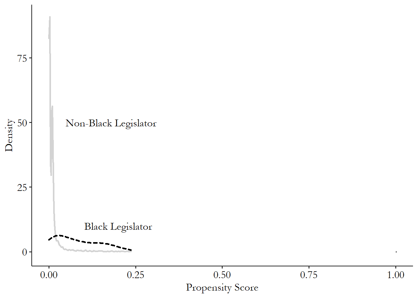
This is not the only way to trim for common support. A common approach is to trim outliers - any observation with a propensity score in the top or bottom X% gets trimmed. Or instead of working with percentiles, simply trim anything near 0 or 1, maybe anything from \(0-.01\) and \(.99-1\) - remember, we are assuming we don’t have any true 0 or 1 propensities anyway. Another is to just look for any match, rather than a sufficient number of matches in the region. So for example, look at the minimum and maximum propensity score for the treated observations, and get rid of any control observations outside that range.
All of these approaches to enforcing common support entail dropping data. This brings us to the stinging welt of the whole thing - if this process leads to us dropping a lot of observations, especially treated observations, then at best we can say that we’ll be able to generate an estimate of the treatment effect among the individuals that match well, whatever that means, and at worst we can say the matching has failed. Matching relies on the existence of comparable observations, and those might not be around. Maybe a different matching method would work, but more likely matching isn’t going to be able to close your back doors.
14.6.3 Balance
The goal of matching is to close back doors through the matching variables. So, uh, did it? Balance is the assumption that our approach to selecting a matched group has closed back doors for the variables we’re interested in. In theory (and in a perfect world), the weights we select should lead to treated and control groups with the exact same values of the back-door variables. No variation between treatment and control for that back-door variable means there’s no back door any more. It has been closed.
“The exact same values” isn’t really going to happen though. So how can we check if we have acceptable levels of balance? And what happens if we don’t?379 Most of this section also applies to other contexts in which there shouldn’t be any differences between two groups in a set of variables. You could apply these tools to, for example, a randomized experiment, where we’d expect the randomization to lead to balance. Or something like Regression Discontinuity in Chapter 20, where there should be balance for a certain subset of the data. Like anything else that allows for worse matches, bad balance leads to bias. If the balance is bad, the back doors aren’t being closed, so the treatment effect gets contaminated with all those nasty back doors.
Thankfully we don’t have to do much theorizing about whether there’s a problem. We can check in the matched data we have whether there are meaningful differences between the treated and control groups in variables for which there should be no differences - variables that should be balanced.
And if we find that we do have a balance problem, by any of these methods? Then it’s back to the matching procedure. It’s not uncommon for matching-based estimation to be iterative. Match the data, check balance, and if it’s bad, change something about the matching procedure (more variables, different functional form for a propensity score model, a tighter caliper, etc.) and repeat the process.380 This is one of the selling points for methods like coarsened exact matching and entropy balancing, which by construction avoid balance problems, to the point where the seminal coarsened exact matching paper is titled “Causal Inference Without Balance Checking.” No iterative matching/balance checking!
A common way of checking for balance is a balance table. Balance tables are pretty straightforward. Take a bunch of variables that should have balance. Then, show some of their summary statistics (usually, mean and standard deviation, maybe some other stuff) separately for the treated and control groups. Finally, do a difference-of-means test for each of the variables to see if the treated and control groups differ.381 If you managed to make your way this far in the book without having taken basic statistics, well, I’m not sure how I feel about that. But in any case, if you did, you might not have done a difference-in-means test. It’s just a test of whether the mean of a variable is different in two groups. You can even do it using regression by regressing the variable on a treatment indicator. Done. You might add some other bells and whistles like a standardized difference in means, where the difference between treated and control groups is divided by their shared standard deviation - fancy! There’s also a variant on standardized difference-in-means called “standardized bias,” a measure you might see on some balance tables, which is standardized difference-in-means with a slightly different standardization.382 Specifically this is the difference in means divided by a shared variance term, which you get by adding up the variance in the treatment group with the variance in the control group, multiplying the result by .5, and then taking the squared root (see Rosenbaum and Rubin (1985)).
Often, the balance table is created twice: once with the raw, unmatched data to show the extent of the balance problem that matching is to solve, and then again with the matched data to ideally show that the balance problem is gone. What does good balance look like? It looks like no meaningfully large differences in means. And if you’re doing a test, you should find no statistically significant differences in means, or at least no more than you’d expect by chance.383 If you’ve got a huge long list of variables on your balance table, then it’s likely not a problem if a couple have significant differences, especially if the difference-of-means itself is meaningfully small.
Balance tables are often fairly easy to code. In R, there are many good options in MatchBalance in the Matching package and sumtable in the vtable package, both of which can either be run both without and with matching weights, or with the output from Match, to compare balance before and after matching. In Stata you can follow a teffects analysis with tebalance summarize (although this won’t do significance tests). For a more standard balance table in Stata you can use the balancetable package, adding weights to check the post-matching balance. In Python, if you’ve created a CausalModel() called M using the causalinference package, you can get a balance table using print(M.summary_stats).
We can see an example of a balance table for Broockman (2013), which is a subset of the output produced by MatchBalance in R following the Mahalanobis matching from earlier in this chapter. Importantly, there’s no one standard way to present a balance table, so the format that your software gives you may not match this one. For each variable, before and after matching, it shows the mean of the variable for the treated group, the mean of the variable for the control group, the standardized difference (a.k.a. standardized bias from earlier in this section), and a p-value from a \(t\)-test for the mean being different in the treated and control groups.
Table 14.1: Broockman (2013) Balance Table Before and After Mahalanobis Matching
| Before Matching | After Matching | |
|---|---|---|
| Median Household Income | ||
| Mean Treatment | 3.33 | 3.333 |
| Mean Control | 4.435 | 3.316 |
| Std. Mean Diff | -97.057 | 1.455 |
| t-test p-value | <.0001 | 0.164 |
| Black Percent | ||
| Mean Treatment | 0.517 | 0.515 |
| Mean Control | 0.063 | 0.513 |
| Std. Mean Diff | 224.74 | 1.288 |
| t-test p-value | <.0001 | 0.034 |
| Legislator is a Democrat | ||
| Mean Treatment | 0.978 | 0.978 |
| Mean Control | 0.501 | 0.978 |
| Std. Mean Diff | 325.14 | 0 |
| t-test p-value | <.0001 | 1 |
What do we see here? First, before matching takes place, there’s a serious amount of imbalance. The mean values are both meaningfully and statistically significantly different between the treatment and control groups. How about after matching? Balance looks pretty good. There’s no meaningfully large difference in the means between treatment and control for any of the three variables we’re looking at. For “Legislator Is a Democrat” (\(leg\_democrat\) in the code), there’s literally zero difference in the mean.
We do see a statistically significant (at the 95% level) difference in the percentage of the district that is Black after matching, with a \(t\)-statistic p-value below \(.05\). However, this goes along with a meaningfully very close mean value (.515 vs. .513). Additionally, to see if we should be concerned, we might want to look at the full distributions and see whether those are different.384 The full table also contains a Kolmogorov-Smirnov test in addition to a \(t\)-test. This test checks whether two distributions are the same. The p-value for this test for Black percentage is very high.
Figure 14.9: Distribution of a Matching Variable After Matching in the Treated and Control Groups
Balance tables tend to focus on the mean. Is the mean the same in the treated and control groups? Sure, you could use a balance table to check if other things are the same, but you don’t see that a lot.
And that’s a problem! Would you really believe that you’d closed a back door if the treated and control groups had distributions of a matching variable that looked like Figure 14.9? Sure the means are the same. But there’s clearly a difference there.
How can we check for differences between the treated and control groups in the distribution of a variable? Well… I already sorta answered that with Figure 14.9. Just plot the distribution of the variable for both the (matched) treated and control groups, and see how badly they differ. The only difference from Figure 14.9 is that you’d typically overlay the distributions on top of each other so you can more easily see any differences. Overlaying the distributions from Figure 14.9 in Figure 14.10 makes it pretty easy to spot the problem.
Figure 14.10: Overlaid Distribution of a Matching Variable After Matching in the Treated and Control Groups
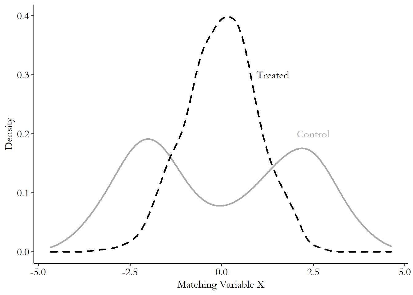
We wouldn’t necessarily throw out matching for any mismatch between the distributions, but egregious mismatches like the one in Figure 14.10 might be a cause to go back to the drawing board. You can make these graphs for any continuous matching variable, and you can use the tools for discrete distributions from Chapter 3 to do the same for categorical or binary matching variables.
One place that this overlaid density graph is almost mandatory is when you’re working with propensity scores. You’ve only got one real matching variable that matters - the propensity score - so you’d better hope the density lines up pretty well.
You can see this in action in Figure 14.11, which shows overlaid density plots for the Broockman study for the matching variable “Black percentage in district,” and for the propensity score, both after applying inverse probability weights (and trimming any propensity scores from \(0\) to \(.02\) or from \(.98\) to \(1\)).
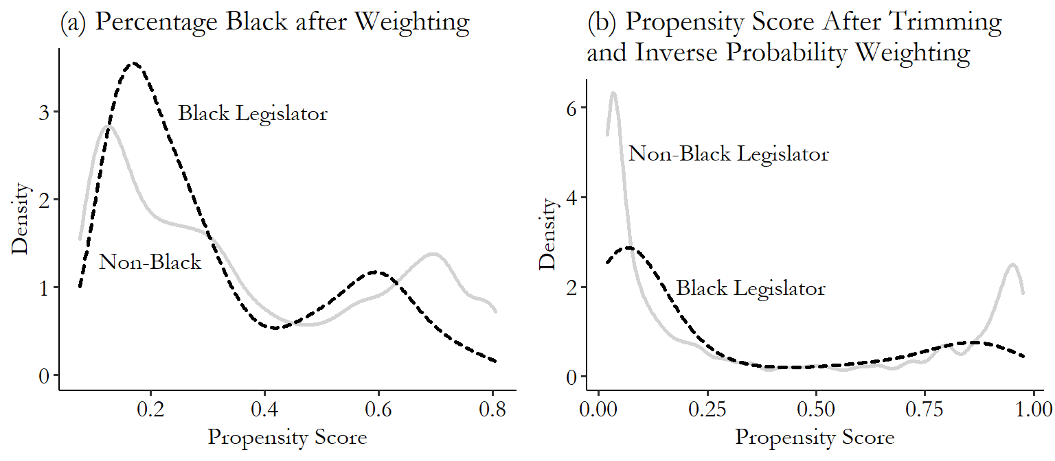
Figure 14.11: Percentage Black in District and Propensity Score Distributions Before and After Inverse Probability Weighting
How do these look now? They’re… not perfect. With a really good propensity score model, the propensity score distributions for treated and control observations should really be nearly identical. These are a lot better than they were before the matching, but they’re still pretty dissimilar. The same thing goes for percentage Black in district. This might be a good indication to go back to the propensity score model and try adding some things to it to improve the balance we see.
Overlaid density plots are fairly easy to create by hand, but in some cases there are prepackaged versions we can go with.
R Code
library(tidyverse)
br <- causaldata::black_politicians

# We can estimate our own propensity score
m <- glm(leg_black ~ medianhhincom + blackpercent + leg_democrat,
    data = br, family = binomial(link = 'logit'))
# Get predicted values
br <- br %>%
    mutate(ps = predict(m, type = 'response'))

# Create IPW weights
br <- br %>%
    mutate(ipw = case_when(
    leg_black == 1 ~ 1/ps,
    leg_black == 0 ~ 1/(1-ps)))

# Let's check the raw pre-matching balance of a given matching variable
ggplot(br, aes(x = medianhhincom, color = factor(leg_black))) +
    geom_density()

# And using our matching weights
ggplot(br, aes(x = medianhhincom, color = factor(leg_black),
    weight = ipw)) + geom_density()
Stata Code
causaldata black_politicians.dta, use clear download

* If we start with teffects...
teffects ipw (responded) (leg_black medianhhincom ///
    blackpercent leg_democrat, logit)

* We can check the balance of a given matching variable
* using tebalance, density which shows both raw and weighted balance
tebalance density medianhhincom
Python Code
import pandas as pd
import numpy as np
import seaborn as sns
from causaldata import black_politicians
br = black_politicians.load_pandas().data

# Let's check the raw pre-matching balance of a given matching variable
fig1 = sns.kdeplot(data = br,
x = 'medianhhincom',
hue = 'leg_black',
common_norm = False)
fig1.plot()

# Start the new plot
fig1.get_figure().clf()

# Add weights from any weighting method to check post-matching density
# Here we have the ipw variable from our propensity score matching
# in previous code blocks (make sure you run those first!)
fig2 = sns.kdeplot(data = br, x = 'medianhhincom',
hue = 'leg_black', common_norm = False, weights = 'ipw')
fig2.plot()
The use of a propensity score allows us to test another aspect of balance. In particular, if our sample is properly balanced and the matching has worked to close back doors, then controlling for the propensity score, we should also see no relationship between the matching variables and treatment status, i.e., balance. This is evident from our propensity score causal diagram, reproduced in Figure 14.12. Shut down \(TreatmentPropensity\) and there should be no path from \(A\), \(B\), or \(C\) to \(Treatment\).
Figure 14.12: Causal Diagram Amenable to Propensity Score Matching
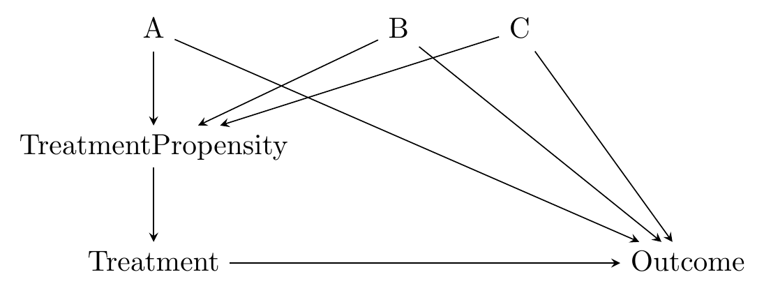
Dehejia and Wahba (2002Dehejia, Rajeev H., and Sadek Wahba. 2002. “Propensity Score-Matching Methods for Nonexperimental Causal Studies.” Review of Economics and Statistics 84 (1): 151–61.) offer a way of testing this implication of our diagram using a stratification test. In a stratification test we repeatedly look within limited ranges of the propensity score. By limiting ourselves to a narrow chunk of the propensity score, we are in effect controlling for it. So split the whole range of propensity scores up into chunks and check whether the matching variables and treatment are related within each chunk.385 How many chunks? They should be narrow enough that the propensity score itself should be balanced within each chunk. If it’s not, go narrower. But not so narrow that there aren’t enough observations within each strata to do a test.
14.7 Estimation with Matched Data
14.7.1 Estimating Mean Differences
We’re nearly to the end of the chapter, and we’re just now getting to estimating a treatment effect? Well, yeah. When it comes to matching, most of the work - picking a matching method, doing the matching and making the weights, checking common support and balance, and maybe going back to tweak the matching method if the balance is bad - is already done before we need to estimate anything. But now we’ve done that stuff, and it’s time.386 Sound the alarm!
With a set of matching weights in hand, how can we estimate the effect of treatment? Get the weighted mean of the outcome for the treated and control groups and compare them. Okay, that’s it, bye.
All right, well, that’s not really it. That is quite a lot of it, though. If all you’re interested in doing is getting the effect of treatment on the mean of the outcome, comparing the weighted means will do it.
One important detail to keep in mind is that while the treatment effect is that simple to estimate, the standard errors on that treatment effect won’t be quite as simple. Calculating the standard error of a weighted mean is easy. But the standard error you calculate won’t remember that the weights had to be estimated and perhaps that some observations were dropped in the matching process. The step of preprocessing the data to match observations and create weights introduces some uncertainty, and so increases the standard errors. Incorporating this uncertainty into your standard errors is important.
There are a few different ways to calculate the appropriate standard error adjustments, most of them having to do with figuring out the variance of the outcome variable conditional on treatment and on the matching variables (or on the weights that come from the matching variables). However, they’re all quite complex, and not really the aim of this book. Until you’re ready to delve into the econometric papers that describe the standard error adjustments you’d want to do,387 Once again, Caliendo and Kopeinig (2008) pops up as a good place to start. you’re probably going to be using software that does it for you. So the key takeaway here is “unless you’re willing to put in the time to do it right, don’t calculate your own standard errors for treatment effects under matching, let matching-based estimation software do it for you.”
One exception is the use of bootstrap standard errors, as discussed in Chapter 13 on regression. Bootstrap standard errors can be applied to matching estimates. In application of a bootstrap to matching, you first randomly resample the data with replacement (so you get the same sample size you started with, but some observations are replaced with multiple copies of others), then re-perform the matching from scratch, and finally estimate the treatment effect in your bootstrap sample. Repeat this process many, many times, and the standard deviation of the treatment effect across all the bootstrap samples is the standard error of your treatment effect. You can see how this process naturally incorporates any uncertainty we get from the matching process - it allows that uncertainty to feed right into our treatment effect distribution.
Both intuitively (because you are actively incorporating how the matching process affects the sampling distribution) and mechanically (because bootstrap standard errors are fairly simple to do yourself by hand, it takes only a little coding if it’s not already in the command you’re using), bootstrap standard errors can be a great option for matching estimates. That said, bootstrap standard errors can only be used with the “constructing a weighted matched sample” approach to matching. They simply don’t work properly for the “selecting matches” approach, because the sharp in/out decisions that process makes don’t translate into the bootstrap having the proper sampling distribution (Abadie and Imbens 2008Abadie, Alberto, and Guido W. Imbens. 2008. “On the Failure of the Bootstrap for Matching Estimators.” Econometrica 76 (6): 1537–57.). So if you’re using a weighting approach, go for it. If not, either go with an appropriate standard error adjustment in your software, or if you’re feeling real spicy you can go find one of the bootstrap variants designed to work properly with selecting-matches approaches.
Bootstrapping a matching process can be a little tricky to code up if you’re not using a command that offers it already, since you aren’t just bootstrapping a single command (or asking for the “bootstrap standard error” option in a regression). You need to bootstrap the whole matching process from start to finish. I offer some coding examples later in the chapter in application to doubly robust estimation, and also in Chapter 15. Slight tweaks on this code should help you provide bootstrap standard errors for all kinds of matching processes.
14.7.2 Combining Matching and Regression
In many cases we want to do something a little more complex than comparing means between the treated and control groups. For example, maybe our research design depends on a specific functional form of the relationship between treatment and outcome, which would be difficult to capture with matching but easy with regression. But we still want to close back doors by matching.388 This will come back in Chapter 18 on difference-in-differences, which relies on comparing a treated and control group (which might be matched), and pinpointing a particular discontinuity in the relationship between outcome and time. What then? We can combine our matching weights with a regression model to do regression adjustment.
The approach here is pretty straightforward. We already have a set of selected matched observations, or a set of matching weights, from our matching procedure. We can apply that subsample, or those weights, to our regression model, just as we did with sample weights in Chapter 13.
In fact, we’ve already done this procedure - the basic difference in weighted means we talked about before can be achieved by applying matching weights to a regression with only treatment as a predictor, i.e., \(Outcome = \beta_0 + \beta_1Treatment + \varepsilon\). The estimate of the effect would be \(\hat{\beta}_1\). This is the method I’ve been using in the code examples. It’s not a big jump to start adding other things to that regression.
Using weights isn’t the only way to go (and may not be ideal if you already have other plans for those weights, like survey sample weights). Another approach to using matching with regression is to think carefully about what the propensity score is - it’s a variable that, if controlled for, should block all back doors from \(Treatment\) to \(Outcome\). So… control for it! The propensity score (or the inverse probability weight based on the propensity score) can be added to regression as a control.
In fact, now that we’re at this section we can finally come back around and run the analysis that Broockman (2013) actually ran. He didn’t just do matching and estimate a treatment effect from that. No! He took those matching weights and used them in a regression that let him not just see the difference in response rates between Black legislators and others, but see whether the difference between in-district vs. out-of-district response rates for these letters from Black people was different between Black legislators and others. That calls for an interaction term in a regression. Not to mention we can add plenty of other controls.
R Code
library(cem); library(tidyverse); library(modelsummary)
br <- causaldata::black_politicians

# This copies the CEM code from the CEM section
# See that section's code for comments and notes

# Limit to just the relevant variables and omit missings
# (of which there are none in this data)
brcem <- br %>%
    select(responded, leg_black, medianhhincom,
    blackpercent, leg_democrat) %>%
    na.omit() %>%
    as.data.frame()

# Create breaks
inc_bins <- quantile(brcem$medianhhincom, (0:6)/6)

create_even_breaks <- function(x, n) {
    minx <- min(x)
    maxx <- max(x)
    return(minx + ((0:n)/n)*(maxx-minx))
}

bp_bins <- create_even_breaks(brcem$blackpercent, 6)
ld_bins <- create_even_breaks(brcem$leg_democrat,2)

allbreaks <- list('medianhhincom' = inc_bins,
    'blackpercent' = bp_bins,
    'leg_democrat' = ld_bins)

c <- cem(treatment = 'leg_black', data = brcem,
    baseline.group =  '1', drop = 'responded',
    cutpoints = allbreaks, keep.all = TRUE)

# Get weights for other purposes.  Note this exact code only
# works because we didn't have to drop any NAs. If we did,
# lining things up would be trickier
br <- br %>%
    mutate(cem_weight = c$w)
m1 <- lm(responded~leg_black*treat_out + nonblacknonwhite +
    black_medianhh + white_medianhh + statessquireindex +
    totalpop + urbanpercent, data = br, weights = cem_weight)
msummary(m1, stars = c('*' = .1, '**' = .05, '***' = .01))
Stata Code
causaldata black_politicians.dta, use clear download

* Use any matching method to get weights
* We'll use coarsened exact matching like in the original
cem medianhhincom blackpercent leg_democrat(#2), tr(leg_black)

reg responded i.treat_out##i.leg_black nonblacknonwhite leg_democrat ///
    leg_senator south blackpercent black_medianhh white_medianhh ///
    statessquire totalpop urbanpercent [iweight=cem_weights]
Python Code
import pandas as pd
import statsmodels.formula.api as smf
from causaldata import black_politicians
br = black_politicians.load_pandas().data

# This copies the CEM code from the CEM section
# See that section's code for comments and notes
br = (br.assign(inc_bins = pd.qcut(br['medianhhincom'], 6),
                bp_bins = pd.qcut(br['blackpercent'], 6)))
treated = (br.query('leg_black == 1')
           .groupby(['inc_bins','bp_bins','leg_democrat'])
            .size().to_frame('treated').query('treated > 0'))
control = (br.query('leg_black == 0')
           .groupby(['inc_bins','bp_bins','leg_democrat'])
            .size().to_frame('control').query('control > 0'))

# Merge the counts back in
br = (br.join(treated, on = ['inc_bins','bp_bins','leg_democrat'])
      .join(control, on = ['inc_bins','bp_bins','leg_democrat']))

# Create weights
br['weight'] = 0
br.loc[(br['leg_black'] == 1) & (br['control'] > 0), 'weight'] = 1
totalcontrols = sum(br.loc[br['leg_black']==0]['treated'] > 0)
totaltreated = sum(br.loc[br['leg_black']==1]['control'] > 0)
br['controlweights'] = (br['treated']/br['control']
)*(totalcontrols/totaltreated)
br.loc[(br['leg_black'] == 0), 'weight'] = br['controlweights']

# Now, use the weights to estimate the effect
m = smf.wls(formula = '''responded ~ leg_black*treat_out +
nonblacknonwhite + black_medianhh + white_medianhh +
statessquireindex + totalpop + urbanpercent''',
weights = br['weight'],
data = br).fit()
m.summary()
From these regressions we get a coefficient of -.142 on \(leg\_black\), -.351 on \(treat\_out\), and .229 on \(leg_black\times treat\_out\). Recalling what we learned about interpreting a model with interaction terms from Chapter 13, we know that this means that Black legislators were 14.2 percentage points less likely than White legislators to respond to in-district emails, and out-of-district emails were 35.1 percentage points less likely to get a response than in-district emails from White legislators. But the in-district vs. out-of-district gap is 22.9 percentage points smaller for Black legislators than White ones, which is evidence in favor of the idea that Black legislators have an intrinsic motivation to help Black people.
Doubly robust estimation. An estimation method that identifies the effect even if one of the regression or matching models is misspecified.
If we play our cards right, regression and matching can combine to be more than the sum of their parts. Doubly robust estimation is a way of combining regression and matching that works even if there’s something wrong with the matching or something wrong with the regression - as long as it’s not both.
What do I mean by “something wrong”? It doesn’t cover everything - you still need to, you know, actually measure for and include the variables that allow you to close back doors.389 Failing to do this would make neither method work - remember, at least one needs to work. Doubly robust estimation won’t let you get around that. But regression and matching both rely on assumptions. For example, perhaps your regression model is misspecified - you’ve got all the right variables in there, but maybe the functional form isn’t quite right. The same thing can happen when specifying the model you use to estimate your propensity score.
Doubly robust estimation is any method that still works as long as one of those two models is properly specified. The other one can be wrong.
Double-robustness is a thing that some estimators have rather than being a specific estimator. So there are actually lots of methods that are doubly robust.390 How do we know if a particular estimator is doubly robust? Someone writes a paper with a lot of equations proving that it is. There are a lot of these papers. I could list a dozen right here without even thinking too hard. But we don’t have all day. So we’ll look at three, the first one in detail.
The first estimator we’ll look at is the one described in Wooldridge (2010, chapter 21.3.4). This one is appealing because the process of doing it is almost like you’d guess doubly robust estimation works on your own if you’d just heard about it and had to come up with it yourself. And it actually does work!
The steps are fairly straightforward:
- Estimate the propensity score \(p\) for each observation using your matching variables
- Use the propensity score to produce the inverse probability weights: \(1/p\) for treated observations and \(1/(1-p)\) for untreated observations
- Using only treated observations, estimate your regression model, using the matching variables as predictors (and perhaps some other predictors too, depending on what you’re doing), and inverse probability weights
- Repeat step (3) but using only untreated observations
- Use the models from steps (3) and (4) to produce “treated” and “untreated” predicted observations for the whole sample
- Compare the “treated” means to the “untreated” means to get the estimate of the causal effect
- To get standard errors, use bootstrap standard errors, or the heteroskedasticity-robust errors described in Wooldridge (2010) (not just the same as asking for regular heteroskedasticity-robust standard errors)
While there are a lot of steps here, none of them are particularly complex, and all are fairly easy to do by hand. In fact, let’s work through the code for this approach.
R Code
library(boot); library(tidyverse)
br <- causaldata::black_politicians

# Function to do IPW estimation with regression adjustment
ipwra <- function(br, index = 1:nrow(br)) {
    # Apply bootstrap index
    br <- br %>% slice(index)

    # estimate and predict propensity score
    m <- glm(leg_black ~ medianhhincom + blackpercent + leg_democrat,
             data = br, family = binomial(link = 'logit'))
    br <- br %>%
        mutate(ps = predict(m, type = 'response'))

    # Trim control observations outside of treated PS range
    minps <- br %>%
        filter(leg_black == 1) %>%
        pull(ps) %>%
        min(na.rm = TRUE)
    maxps <- br %>%
        filter(leg_black == 1) %>%
        pull(ps) %>%
        max(na.rm = TRUE)
    br <- br %>%
        filter(ps >= minps & ps <= maxps)

    # Create IPW weights
    br <- br %>%
        mutate(ipw = case_when(
        leg_black == 1 ~ 1/ps,
        leg_black == 0 ~ 1/(1-ps)))

    # Estimate difference with IPW weights
    w_means <- br %>%
        group_by(leg_black) %>%
        summarize(m = weighted.mean(responded, w = ipw)) %>%
        arrange(leg_black)

    return(w_means$m[2] - w_means$m[1])
}


b <- boot(br, ipwra, R = 200)
# See estimate and standard error
b
Stata Code
causaldata black_politicians.dta, use clear download

* Wrap this in a program so we can bootstrap
capture program drop ipwra
program def ipwra, rclass
quietly{
    * Estimate propensity
    logit leg_black medianhhincom blackpercent leg_democrat
    * Get predicted values for our propensity score
    predict ps, pr

    * "Trim" control observations outside of
    * treated propensity score range
    summ ps if leg_black
    replace ps = . if ps < r(min) | ps > r(max)

    * Get inverse probability weights
    g ipw = 1/ps if leg_black
    replace ipw = 1/(1-ps) if !leg_black

    * Regress treated and nontreated separately,
    * then predict for whole sample
    regress responded medianhhincom blackpercent ///
        leg_democrat [pw = ipw] if !leg_black
    predict untreated_outcome
    regress responded medianhhincom blackpercent ///
        leg_democrat [pw = ipw] if leg_black
    predict treated_outcome

    * Compare means
    summarize untreated_outcome
    local unt_mean = r(mean)
    summarize treated_outcome
    local tr_mean = r(mean)

    local diff = `tr_mean' - `unt_mean'
}

drop ps ipw untreated_outcome treated_outcome
return scalar diff = `diff'
end

* And a version for bootstrapping
capture program drop ipwra_b
program def ipwra_b, rclass
    preserve
    * Create bootstrap sample
    bsample
    * Estimate
    ipwra
    * Bring back original data
    restore
    return scalar diff = r(diff)
end

* Run once with original data
ipwra
local effect = r(diff)
* Then boostrap
simulate diff = r(diff), reps(2000): ipwra_b
local N = _N
bstat, stat(`effect') n(`N')

* Or skip all that and just use teffects ipwra (no trim here though)
causaldata black_politicians.dta, use clear download
teffects ipwra (responded medianhhincom blackpercent leg_democrat) ///
    (leg_black medianhhincom blackpercent leg_democrat, logit)
Python Code
import pandas as pd
import numpy as np
import statsmodels.formula.api as smf
from causaldata import black_politicians
br = black_politicians.load_pandas().data

# As mentioned, est_via_weighting from causalinference already does
# doubly robust estimation but it's a different kind!
# Let's do Wooldridge here.
def ipwra(br):
    # Estimate propensity
    m = smf.logit('leg_black ~ medianhhincom + blackpercent + leg_democrat',
    data = br)
    # Get fitted values and turn them into probabilities
    m = m.fit().fittedvalues
    br['ps'] = np.exp(m)/(1+np.exp(m))

    # Trim observations outside of treated range
    minrange = np.min(br.loc[br['leg_black']==1, 'ps'])
    maxrange = np.max(br.loc[br['leg_black']==1, 'ps'])
    br = br.loc[(br['ps'] >= minrange) & (br['ps'] <= maxrange)]

    # Get inverse probability score
    br = br.assign(ipw = lambda x: x.leg_black*(1/x.ps)
                   + (1-x.leg_black)*(1/(1-x.ps)))

    # Regress treated and nontreated separately,
    # then predict for whole sample
    mtreat = smf.wls('''responded ~ medianhhincom +
    blackpercent + leg_democrat''',
    weights = br.loc[br['leg_black'] == 1, 'ipw'],
    data = br.loc[br['leg_black'] == 1])
    mcontrol = smf.wls('''responded ~ medianhhincom +
    blackpercent + leg_democrat''',
    weights =  br.loc[br['leg_black'] == 0, 'ipw'],
    data = br.loc[br['leg_black'] == 0])

    treat_predict = mtreat.fit().predict(exog = br)
    con_predict = mcontrol.fit().predict(exog = br)

    # Compare means
    diff = np.mean(treat_predict) - np.mean(con_predict)
    return diff

    # And a wrapper function to bootstrap
def ipwra_b(br):
    n = br.shape[0]
    br = br.iloc[np.random.randint(n, size=n)]
    diff = ipwra(br)
    return diff

# Run once on the original data to get our estimate
est = ipwra(br)

# And then a bunch of times to get the sampling distribution
dist = [ipwra_b(br) for i in range(0,2000)]

# Our estimate
est
# and its standard error
np.std(dist)
How about the other two methods I mentioned? I’ll talk about these briefly. Just a tour of the space.
One is the Augmented Inverse Probability Weighted Estimator (AIPWE) (Tan 2010Tan, Zhiqiang. 2010. “Bounded, Efficient and Doubly Robust Estimation with Inverse Weighting.” Biometrika 97 (3): 661–82.). Like the Wooldridge approach, AIPWE has both a matching model to estimate, with treatment as a dependent variable, and a regression model, with the outcome as a dependent variable. The basic idea of AIPWE is that it includes an augmentation term (surprise) in the regression model that adjusts the results based on the degree of misspecification in the matching model.
AIPWE has some nice properties. It does okay in some settings even with mild misspecification in both models (although again, you would prefer at least one being correct). Plus, if it turns out that there isn’t any misspecification in the model for treatment, AIPWE will produce lower standard errors in the outcome model. Neat!
The third and final method can be discussed briefly because I’ve already discussed it. Entropy balancing, which showed up back in the “Distance Matching” section, is itself doubly robust (Q. Zhao and Percival 2017Zhao, Qingyuan, and Daniel Percival. 2017. “Entropy Balancing Is Doubly Robust.” Journal of Causal Inference 5 (1).). Despite not directly including a regression, entropy balancing’s focus on removing differences in means between treatment and control turns out to work a lot like regression’s focus on removing differences in means. Double robustness!
14.8 Matching and Treatment Effects
As with any design and estimation approach, we have to ask what kind of treatment effect average (as in Chapter 10) we are getting.
When it comes to matching, that turns out to be a very interesting question. One of the coolest things about matching is that, unlike with regression, it’s super easy to have a matching estimator give you just about any treatment effect average you want.391 Or at least it is in cases where you’re identifying the effect by closing back doors. When combining matching with front-door isolating methods, it gets a bit more complex. Still more flexible than regression, though.
How is that possible? Well, first let’s start by thinking about the matching procedures I’ve been talking about this whole time throughout this chapter - what kind of treatment effect average do these give us?
We can think it through logically.392 This explanation doesn’t apply to methods that also weight the treated group, like inverse probability weighting as I’ve described it - I’ll get to that. We’re using matching to produce a group of control observations that are comparably similar to the treated group. They’re supposed to be just like the treated group if the treated group hadn’t been treated.
So… comparing our estimate of what the treated group would have gotten without treatment against what the treated group actually got? Using the rule-of-thumb logic from Chapter 10, that sounds like the average treatment on the treated to me. And indeed, that’s what most of the methods I’ve described so far in this chapter will give you.393 At least most of the methods as I’ve described them. Some of the code examples give average treatment effects instead, because the defaults for those commands are to produce average treatment effects. Check the documentation! I talk about this in the next section as well.
Or at least pretty close to what they’ll give you. Matching doesn’t give you exactly the average treatment on the treated. Like with regression, it gives you an average that is affected by its approach to closing back doors. Just like regression gave variance-weighted treatment effects, matching gives distribution-weighted treatment effects, where each observation’s treatment effect is weighted more heavily the more common its mix of matching variables is.
To give a basic example of this in action, let’s imagine some types of people like we did back in Chapter 10. Table 14.2 shows two different types of people we might be sampling.
Table 14.2: Individual Hypothetical Outcomes
| Name | Gender | Unreated Outcome | Treated Outcome | Treatment Effect |
|---|---|---|---|---|
| Alfred | Male | 2 | 4 | 2 |
| Brianna | Female | 1 | 5 | 4 |
Now, imagine that we happen to end up with a sample with 500 untreated Alfreds and 500 untreated Briannas, as well as 1,000 treated Alfreds and 200 treated Briannas. And we’re matching on Gender.
In the treated group we’d see an average outcome of \((1,000\times 4 + 200\times 5)/(1,200)\approx 4.17\). How about in the matched untreated group? Well, if we did one-to-one matching with replacement, for example, we’d end up with, just like in the treated group, 1,000 Alfreds and 200 Briannas, but they’re untreated this time. So the average among the untreated group is \((1,000\times 2 + 200\times 1)/(1,200) \approx 1.83\). This gives us a treatment effect of \(4.17 - 1.83 = 2.34\). This is much closer to the male treatment effect of 2 than the female treatment effect of 4 because there are far more men in the treated sample than women - it’s weighted by how common a given observation’s matching variable values are.394 This one is weighted by the distribution among the treated because it’s an average-treatment-on-the-treated method. But distribution weighting applies to matching variable distributions among other relevant groups when doing average treatment effect, average treatment on the untreated, and so on.
14.8.1 Getting Other Treatment Effects from Matching
Ah, but I have buried the lede.395 Yes, that’s how it’s spelled. The average treatment on the treated is not the only thing that matching can give you. We can get the average treatment effect, or even the average treatment on the untreated.396 Granted, subject to the distribution-weighting thing I just talked about. How can we do that?
It’s actually fairly straightforward. If you want average treatment on the treated, as we’ve been getting, then construct a control group that is as similar to the treated group as possible.
Want average treatment on the untreated? Simple! Just reverse things. Instead of matching control observations to treated observations, instead match treated observations to control observations. Same procedure, but reverse which group is which. The result gives you a treated group that is as much like the untreated group as possible. Comparing that to the untreated group compares what you actually got from no treatment against what we think that group would have gotten if treated. Average treatment on the untreated!397 This does all assume that the variables that predict variation in the treatment effect are included as matching variables. And if you’re using a propensity score to match, it further assumes that the variables that predict variation in the treatment effect are the same ones that predict treatment itself.
From here you can get to the average treatment effect fairly easily. If the average among your treated group is the average treatment effect on the treated (ATT), and the average among your untreated group is the average treatment effect on the untreated (ATUT), then what’s the overall average, also known as the average treatment effect? Well, if a proportion \(x\) of people are getting treated, then it’s just \(ATE = (x\times ATT) + ((1-x)\times ATUT)\). You’re just averaging the average from each “side,” weighted by how big each side is, to get the overall average.
The use of matching to get average treatment effects is fairly common, and sometimes is even the default option in software commands designed to do treatment effects by matching. Stata’s teffects is an example of this - the teffects examples in this chapter produce average treatment effects by default (and all of them have an atet option for getting average treatment on the treated).
How does this apply to inverse probability weighting? After all, when you’re doing inverse probability weighting you aren’t really matching to anything, you’re just weighting on the basis of the inverse propensity weight.
It turns out that the specific way you choose to turn the propensity score into an inverse propensity weight determines the kind of treatment effect average you get. Weighting to make the control group look like the treatment? Average treatment on the treated! Doing the reverse? Average treatment on the untreated! Doing both? Average treatment effect!
In fact, the approach to inverse probability weighting I’ve been talking about this whole time - with a weight of \(1/p\) for the treated group and \(1/(1-p)\) for the untreated group, where \(p\) is the propensity score - serves to both upweight the members of the untreated group that are most like the treated group and upweight the members of the treated group that are most like the untreated group. This actually gives us the average treatment effect, not the average treatment on the treated.
What if we do want one of those other averages? We just use different weights.
What if we want average treatment on the treated? Intuitively here we want to make the untreated group like the treated group. So first we give all of the treated group the same weight of 1. We don’t need to adjust them to be like anyone else - we want to adjust everyone else to be like them so the others can serve as a comparison. Sounds like average treatment on the treated to me.
The treated group gets a weight of 1. How about the untreated group? Instead of a weight of \(1/(1-p)\), they get \(p/(1-p)\). The \(1/(1-p)\), which we did before, sort of brings the representation of the untreated group back to neutral, where everyone is counted equally. But we don’t want equal. We want the untreated group to be like the treated group, which means weighting them even more based on how like the treated group they are. And thus \(p/(1-p)\), which is more heavily responsive to \(p\) than \(1/(1-p)\) is.
From there, average treatment on the untreated is pretty easy to figure out and works for largely the same reason. The untreated group in this case gets a weight of 1, and the treated group, instead of the \(1/p\) that gave us the ATE, gets \((1-p)/p\), which makes things match the untreated group properly and gives us the ATUT we want.
Page built: 2025-10-17 using R version 4.5.0 (2025-04-11 ucrt)