Chapter 18 - Difference-in-Differences
18.1 How Does It Work?
18.1.1 Across Within Variation
There are plenty of examples of treatments that occur at a particular time. We can see the world before the treatment is applied, and after. We want to know how much of the change in the world is due to that treatment. That’s the causal inference task we have set before us.
This sounds like I’m setting myself up to do Chapter 17 on event studies again. And in a sense, event studies will be our jumping-off point. Just like with an event study, we will be identifying a causal effect by comparing a group that received treatment before they received the treatment to after. We are focusing on the within variation here.
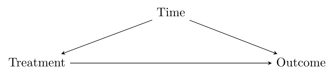
Also just like with an event study, the obvious back door we have to deal with can be summed up as “time.” As in Figure 18.1, identifying the effect of \(Treatment\) on \(Outcome\) requires us to close the back door that goes through \(Time\). But we can’t do this entirely, because all of the variation in \(Treatment\) is explained by \(Time\). You’re either in a before-treatment time and untreated, or in an after-treatment time and treated.
Figure 18.1: A Basic Time Back Door
Event studies get around this problem by trying to use before-treatment information to construct a counterfactual after-treatment untreated prediction. Difference-in-differences (DID)500 Some people say “difference-in-difference” instead of “difference-in-differences.” Some people abbreviate it DD or Diff-in-Diff instead of DID. Let me be clear that I do not care. takes a different approach. Instead, it brings in another group that is never treated. So now in the data we have both the group that receives treatment at a certain point, and another group that never receives treatment. At first, this seems counterintuitive - that untreated group may be different from the treated group! We have introduced a second back door, as in Figure 18.2.
Figure 18.2: A Causal Diagram Suited for Difference-in-differences
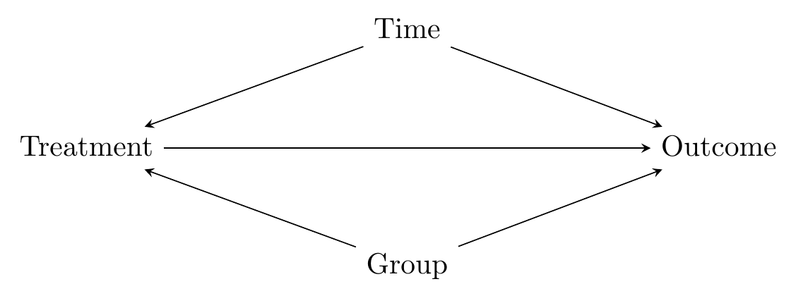
Seems like we’ve made things worse by introducing the control group. The key is this, though: now that we have that untreated group, even though we’ve added a new back door, we can now close both back doors. How is this possible?
- Isolate the within variation for both the treated group and untreated group. Because we have isolated within variation, we are controlling for group differences and closing the back door through \(Group\) (the “differences’’).
- Compare the within variation in the treated group to the within variation in the untreated group. Because the within variation in the untreated group is affected by time, doing this comparison controls for time differences and closes the back door through \(Time\) (the “difference” in those differences).
In other words, we are looking for how much more the treated group changed than the untreated group when going from before to after. What we want is this: (treated group after \(-\) treated group before) \(-\) (untreated group after \(-\) untreated group before). The change in the untreated group represents how much change we would have expected in the treated group if no treatment had occurred. So any additional change beyond that amount must be the effect of the treatment.
18.1.2 Difference-in-Differences and Dirty Water
Let’s walk through an example of difference-in-differences with data from probably its first, and almost certainly its most famous, application: John Snow’s 1855 findings that demonstrated to the world that cholera was spread by fecally-contaminated water and not via the air (Snow 1855Snow, John. 1855. On the Mode of Communication of Cholera. John Churchill.).501 His underlying theory was not widely accepted at the time, but they did buy the result and shut down the guilty water pump. Also his method certainly wouldn’t have been called “difference-in-differences” back then. \(^,\)502 My apologies if you’re a fan of causal inference already, in which case you’ve almost certainly heard this story before. Sort of a cliché. But, hey, we tell it because it works.
Before the germ theory of disease became standard, medical thinkers of the world had a wide variety of ideas as to how disease spread. A popular one in Europe in the 19th century was “miasma theory” which held that disease spread through bad air coming from rotting material. This included cholera, which had routine outbreaks in many European cities. Other explanations for cholera besides miasma also abounded - bad breeding, low elevation, poverty, bad ground.503 You can imagine how they might reasonably come to a conclusion like miasma theory. Rotting stuff does spread disease and also smells bad! And they were right that some diseases are airborne. Of course, they were wrong that masking those smells with nice smells would protect you. We can only imagine the Febreze commercials we’d get to see if we all still believed that. In any case, the correlations were definitely there. All of these things, including bad smell, were definitely correlated with cholera outbreak. The miasma theory is another reason why proper causal inference to understand the underlying data generating process is important.
John Snow, however, had reason to believe that cholera instead spread by dirty drinking water. He had a few ways of providing evidence, one of which is very similar to a modern-day difference-in-differences research design, and can be easily discussed in those terms (Coleman 2019Coleman, Thomas. 2019. “Causality in the Time of Cholera: John Snow as a Prototype for Causal Inference.” Available at SSRN 3262234.).
Snow’s “before” and “after” periods were 1849 and 1854, respectively. London’s water needs were served by a number of competing companies, who got their water intake from different parts of the Thames river. Water taken in from the parts of the Thames that were downstream of London contained everything that Londoners dumped in the river, including plenty of fecal matter from people infected with cholera. Between those two periods of 1849 and 1854, a policy was enacted - the Lambeth Company was required by an Act of Parliament to move their water intake upstream of London.
Lambeth moving their intake source gives us the Treated group: anyone in an area where the water came from the Lambeth company, and an Untreated group: anyone in an area without Lambeth.504 It’s a bit more complex because the areas with Lambeth water were really a mix of Lambeth with other companies. Since the “Treated” group is really a mix of treated and untreated people, our estimate will actually be an understatement of the effect of the clean water (why an understatement instead of an overstatement? An exercise for you…).
So then the question is: did areas getting water from Lambeth see their Cholera numbers go down from 1849 to 1854 relative to areas getting no water from Lambeth?
Table 18.1: London Cholera Deaths per 10,000
| Region Supplier | Death Rates 1849 | Death Rates 1854 |
|---|---|---|
| Non-Lambeth Only (Dirty) | 134.9 | 146.6 |
| Lambeth + Others (Mix Dirty and Clean) | 130.1 | 84.9 |
Note: Death rates are deaths per 10,000 for the 1851 population, from Snow (1855).
We can see the death rates in these areas in Table 18.1. First, we can see that in the pre-treatment period, the cholera death rates were fairly similar in the Lambeth and non-Lambeth areas. This isn’t necessary for difference-in-differences, but does lend a bit of credibility to the assumption that these groups are comparable. Then, we can see that from 1849 to 1854, the cholera problem in non-Lambeth areas got worse, rising from 135 to 147, while the problem in the Lambeth areas got better, dropping from 130 to 84.9.
Pretty convincing. Of course, looking at the Lambeth areas alone wouldn’t be convincing - maybe cholera just happened to be going away at the time. We really need the non-Lambeth comparison to drive it home. The specific DID estimate we can get here is the Lambeth difference minus the non-Lambeth difference, or \((84.9-130) - (147-135) = -57.1\). The movement of the Lambeth pump reduced cholera mortality rates by 57.1 per 10,000 people. That’s quite a lot!
18.1.3 How DID Does?
Let’s work through the mechanics of difference-in-differences using a slightly more modern example, albeit one still on the topic of health. Specifically we’ll be looking at a paper by Kessler and Roth (2014Kessler, Judd B., and Alvin E. Roth. 2014. “Don’t Take ’No’ for an Answer: An Experiment with Actual Organ Donor Registrations.” National Bureau of Economic Research.), which studies the rate at which people sign up to be organ donors.505 Alvin Roth, the second author on that paper, is pretty well-known for talking about organ donation, as economists go. Won an econ Nobel for it, in fact! Check out his book Who Gets What and Why. It’s not about causal inference, but it is deeply interesting despite that one major flaw.
In the United States, people are not signed up to be organ donors by default. In most states, you are assumed to not be an organ donor. When you sign up for a driver’s license, you can choose to opt in to the organ donation program. Check the organ donation box and - poof! - you’re a donor. It’s probably not surprising that organ donation rates in the US are considerably lower than in other countries where organ donation is opt-out - you’re assumed to be a donor unless you actively choose not to be.
Outside of the opt-in and opt-out varieties of organ donation, there’s also “active choice.” Under active choice, when you sign up for a driver’s license, you are asked to choose whether or not to be a donor. You can choose yes or no, but now the “no” option is actively checking the “no” box rather than skipping the question entirely as you can with opt-in approaches. Some policymakers have been advocating for active choice, with a goal of increasing donation rates, and active choice is the way things work in many states.
So does active choice work? In July 2011, the state of California switched from opt-in to active choice. Kessler and Roth decided to compare California against the twenty-five states that either have opt-in or a verbally given question with no fixed response (difference). Specifically, they compared the states on the basis of how their organ donation rates changed from before July 2011 to after (in differences).
We can see the kernel of the idea in Figure 18.3, which shows the raw data on organ donation rates in each state in each quarter.
Figure 18.3: Organ Donation Rates in California and Other States
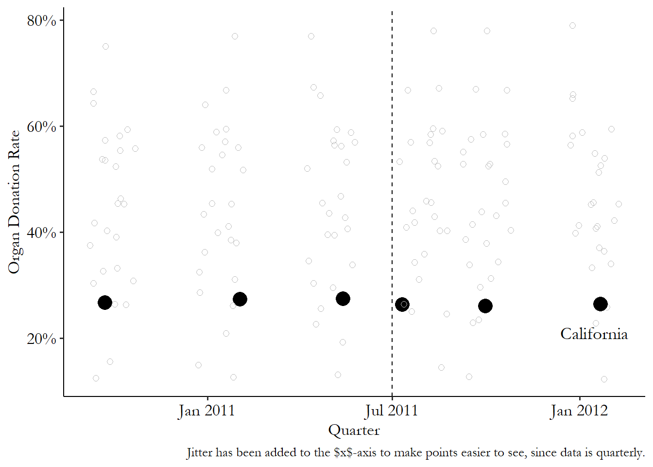
What can we see in the raw data? First, we can see that California already doesn’t have a great organ donation rate, sitting near the bottom of the pack. Second, you can see that California’s rate didn’t rise much after the policy went into effect - in fact, it seems to have dropped slightly. But maybe it just dropped because everyone’s rates were dropping at that time? Nope - if anything, the other states seem to increase slightly.
Off the bat, this already isn’t looking too good for active choice. But how would difference-in-differences actually handle the data to tell us that?
We can see the steps in Figure 18.4. First, we calculate four averages: before-treatment in the treated group (California), after-treatment in the treated group, before-treatment in the untreated group, and after-treatment in the untreated group. We can see these averages in Figure 18.4 (a).
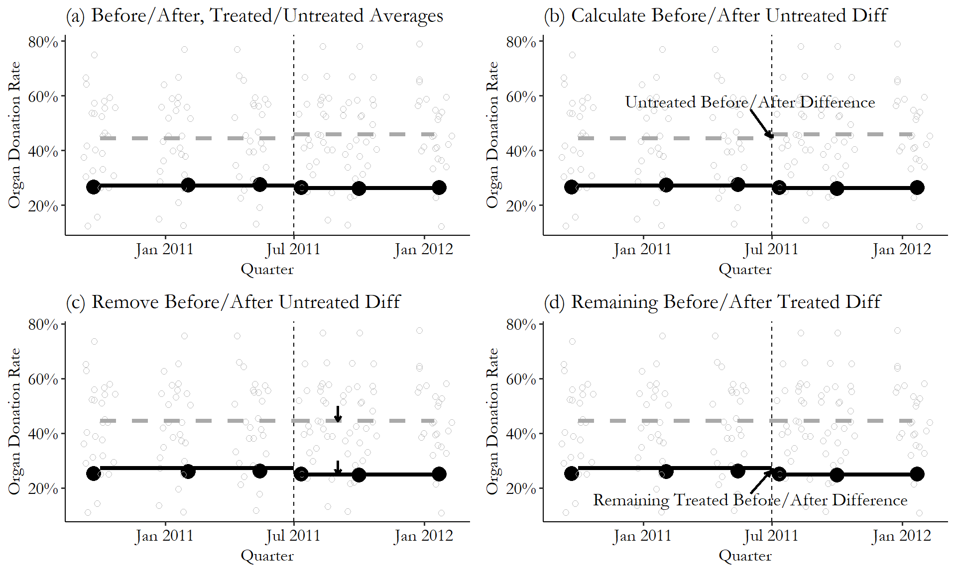
Figure 18.4: The Difference-in-Differences Effect of Active-Choice Organ Donation Phrasing
Second, we figure that any pre-/post-difference in the untreated group is the time effect. So we look at how that average changed from before to after for the untreated group (from 44.5% to 45.9%, an increase of 1.4 percentage points), in Figure 18.4 (b). We want to get rid of that time effect, so in Figure 18.4 (c) we subtract it out. Importantly, we subtract it out of both the untreated and the treated group, lowering the treated after-treatment values by 1.4 percentage points.
Finally, in Figure 18.4 (d), any remaining before/after difference in the treated (California) group is the difference-in-difference effect. The raw difference is 26.3% \(-\) 27.1%, or a reduction of .8 percentage points. Take out the 1.4-percentage-point reduction from the untreated group, and we see a DID effect of -2.2 percentage points of the active-choice phrasing on organ donor rates. Not great!
In this particular example, the before/after difference we see for the untreated group isn’t that large, meaning there’s not actually much of a time effect at all. This is actually nice - if there’s a huge time effect we have to wonder if that time effect really should affect the treated and untreated groups differently. In any case, we can see how DID uses the data to come to its conclusion.
18.1.4 Untreated Groups and Parallel Trends
For all of this to work, we have to have an unaffected group, which we call the untreated group.506 You might also see them called the “comparison” group or the “control” group. I’ll use “comparison” group occasionally in the chapter. Can’t do difference-in-differences without them. So what do we need in an untreated group?
I can talk about a lot of good features we can look for in an untreated group. But all of these are just observable pieces of the unobservable thing we really want to be true: We want our untreated group to be something that satisfies the parallel trends assumption with the treated group.
Parallel trends assumption. In a difference-in-differences design, the assumption that, had no treatment occurred, the gap between treated and untreated groups would have remained constant.
The parallel trends assumption says that, if no treatment had occurred, the difference between the treated group and the untreated group would have stayed the same in the post-treatment period as it was in the pre-treatment period.
Parallel trends is inherently unobservable. It’s about the counterfactual of what would have happened if treatment had not occurred.
As an example of a clear failure of parallel trends, imagine you’re looking at the effect of building additional roads on the popularity of its downtown restaurants. You find that Chicago built a bunch of additional roads in 2018, but Los Angeles did not. So you use Los Angeles as your untreated group.
You look at Chicago and Los Angeles in 2017 (pre-roads) and 2018 (post-roads), and use difference-in-differences to find that the roads somehow made downtown restaurants less popular in Chicago. What happened? Well, you might find that in 2018, a bunch of new highly-hyped restaurants opened in Los Angeles’ downtown. So the 2017/2018 change in the Chicago/LA gap reflects both the new Chicago roads and the new Los Angeles restaurants. Obviously, we can’t take this as a good estimate of the impact of the roads alone. We haven’t properly identified the effect of the roads. We should have picked a city that didn’t build a bunch of new restaurants at the time.
Unfortunately, any other city we may pick as our untreated comparison group for Chicago may have other things changing. There may not even be anything obvious to pin it on. Maybe we pick New York as a comparison, and find that the roads really improved traffic to Chicago restaurants. Then we look at the New York data and notice that restaurant popularity has been trending down for years. Nothing special about 2018 in particular, but given the existing trend, the Chicago/New York gap likely would have grown in Chicago’s favor even without the roads. The effect we get is clearly a combination of the long-term trend in New York with the roads in Chicago. Again, not identified.507 Parallel trends is pretty poorly-named, making it easy to get confused. The problem with this New York example isn’t that the Chicago and New York trends were diverging pre-treatment, but rather that the trends would have continued to diverge post-treatment. It’s easy to look at how pre-treatment trends are changing, see that they’re parallel or non-parallel, and think of that as the “parallel trends” you’re interested in. This mistake is extra easy to make because it’s the basis for some suggestive tests for parallel trends use observed trends in the pre-treatment period. But you’re really interested in the counterfactual trend from pre-treatment to post-treatment in the absence of treatment. If Chicago and New York had suddenly stopped trending apart in 2018 (other than because of the roads), that would have satisfied parallel trends despite the divergence before. Similarly, parallel pre-treatment trends could be broken at the moment of treatment, as in the Los Angeles example.
Remember, the entire plan behind a difference-in-differences design is to use the change in the untreated group to represent all non-treatment changes in the treated group. That way, once we subtract the untreated group’s change out, all we’re left with is the treated group’s change. Parallel trends is necessary for us to assume that works. If, without a treatment, the gap between the two groups would have changed from the pre-period to the post-period for any reason, or for no reason at all, then that non-treatment-related change will get mixed up with the treatment-related change, and we won’t be able to tell them apart.
We can put this in mathematical terms:
- The difference between pre-treatment and post-treatment in the treated group is \(EffectofTreatment\) + \(OtherTreatedGroupChanges\)
- The difference between pre-treatment and post-treatment in the untreated group is \(OtherUntreatedGroupChanges\)
- Difference-in-difference subtracts one from the other, giving us \(EffectofTreatment\) + \(OtherTreatedGroupChanges\) - \(OtherUntreatedGroupChanges\)
For DID to identify just \(EffectofTreatment\), it has to be the case that \(OtherTreatedGroupChanges\) exactly cancels out with \(OtherUntreatedGroupChanges\). That’s what parallel trends is really about. This is the assumption that we need to identify the effect. So think carefully about whether it’s true in your case.
So if what we want is parallel trends, how should we pick an untreated comparison group? What we want in an untreated group is for it to change by the same amount as the treated group (if treatment had occurred) from before the treatment is applied to afterward.
This means that there are a few good signs we can look for. While none of these things are requirements, exactly, they are all things someone would look for when thinking about whether your DID design is believable:
- There’s no particular reason to believe the untreated group would suddenly change around the time of treatment.
- The treated and untreated groups are generally similar in many ways.
- The treated and untreated groups had similar trajectories for the dependent variable before treatment.
The first tip - that there’s no reason to believe the untreated group would suddenly change at the time of treatment - we’ve already covered with the Chicago/Los Angeles roads example. If there’s something obviously changing in the untreated group at the same time, DID will mix up the effects of the treatment and whatever was changing in the untreated group.
Looking for an untreated group that is generally similar in many ways makes sense. We are relying on an assumption that, in the absence of treatment, the treated and untreated groups would have changed over time in the same way. Groups that are similar seem likely to have changed in similar ways over time. Say we’re looking at the impact of an event that considerably increased immigration to Miami, Florida, in the United States, as in the classic DID Mariel Boatlift study (Card 1990Card, David. 1990. “The Impact of the Mariel Boatlift on the Miami Labor Market.” ILR Review 43 (2): 245–57.), where a policy change in Cuba led to a huge wave of immigrants coming to Miami all at the same time, allowing us to look at the effects of immigration on the labor market. In looking at how immigration affected the Miami labor market, our results would be more plausible if using a demographically or geographically similar city like, say, Atlanta or Tampa, as opposed to something far-off and very different like Reykjavik in Iceland.508 There would be nothing technically wrong with Reykjavik as an untreated group. Any differences that were consistent over time would already be handled by the within variation, as described in Chapter 16. But we do need the changes over time to be the same, which is more plausible with a more similar city.
We may also want to look for an untreated group that has a similar trajectory for the dependent variable before treatment. That is, the outcome variable was growing or shrinking at about the same rate in both the treated and untreated groups in the pre-treatment period. If the two groups were trending similarly before treatment went into effect, that’s a good clue that they would have continued to trend similarly if no treatment had occurred.
How can we check if our untreated group is appropriate? There are a few common ways to evaluate the parallel trends assumption, so core to our use of DID, and see whether it’s plausible. I want to emphasize that these are not tests of whether parallel trends is true. “Passing” these tests does not mean that parallel trends is true. In fact, no test of the data could possibly confirm or disprove the parallel trends assumption, since it’s based on a counterfactual we can’t see. These tests are more along the lines of suggestive evidence. If these tests fail, that makes the parallel trends assumption less plausible. And that’s about it.
Hedging aside, there are some things we can do. One of them is the test of prior trends. This test simply looks to see whether the treated and untreated groups were trending similarly before treatment. For example, Figure 18.5 shows an example of a treated and untreated group that were heading in the same direction, and a pair that weren’t. On the left, the distance between the treated and untreated group stays roughly constant in the leadup to treatment, even though both are trending upwards. This implies that, had the treatment not occurred, they likely would have continued having similar trends, lending more credibility to the parallel trends assumption. On the right, the fairly large gap between the two has already shrunk by the time treatment goes into effect, with the untreated group starting lower but gaining on the treated group. That trend likely would have continued without treatment, and so parallel trends is unlikely to hold.
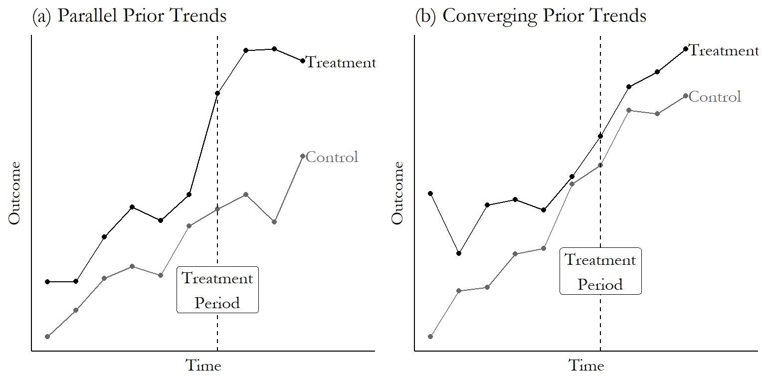
Figure 18.5: A Graph Where the Prior Trends Test Looks Good for DID, and a Graph Where It Doesn’t
Finding that the trends weren’t identical doesn’t necessarily disprove that DID works in your instance, but you’ll definitely have some explaining to do as to why you think that the gap from just-before to just-after treatment didn’t change even though it did change from just-just-before to just-before!509 One nice thing about looking at prior trends is it encourages you to look at how both treated and untreated are changing. If you get a big, significant difference-in-difference effect, but it’s because your untreated group dropped down at the treatment time while the treated group just kept on-trend… well… maybe parallel trends holds, but it doesn’t seem likely.
Placebo test. Applying a research design to a case where treatment was actually not applied, to (ideally) show that the design already eliminates the influence of non-treatment influences.
The second test we can perform is the placebo test. In a placebo test for difference-in-differences, we’d take a situation where a treatment was applied in, for example, March 2019. Then, we’d use data only from before March 2019, ignoring all the data from the periods where treatment was actually applied.
Then, using the pre-March 2019 data, we’d pick a few different periods and pretend that the treatment was applied at that time. We’d estimate DID using that pretend treatment date. If we consistently find a DID “effect” at those pretend treatment dates, that gives us a clue that something may be awry about the parallel trends assumption.
Certainly, a nonzero DID effect at a period where there is no actual treatment tells us that the non-treatment changes in the treated group don’t exactly cancel out the non-treatment changes in the untreated group at the pretend-treatment time. So again, you’d have some explaining to do as to why we should believe that they exactly cancel out at the actual treatment time.
What if you come to the sad conclusion that parallel trends probably doesn’t hold for you? Well, you don’t have to give up the game entirely. If you think that you have some violation of parallel trends but it probably isn’t too bad, you can say stuff like “if parallel trends were violated by .1, then my estimate is biased by .1, and I can just correct for that.” Taking a range of plausible parallel trends violation amounts and turning that into a range of plausible effects estimates is a form of partial identification. See Chapter 21.
One final note about parallel trends that is too often overlooked: parallel trends means we have to think very carefully about how our dependent variable is measured and transformed. That’s because parallel trends isn’t just an assumption about causality, it’s an assumption about the size of a gap remaining constant, which means something different depending on how you measure that gap.510 There are some conditions under which parallel trends holds regardless of how you transform your dependent variable, but they’re a pretty demanding set of assumptions Roth and Sant’Anna (2023Roth, Jonathan, and Pedro H. C. Sant’Anna. 2023. “When Is Parallel Trends Sensitive to Functional Form?” Econometrica 91 (2): 737–47.)! Most of the time you’ll need to think about whether parallel trends holds for your particular transformation.
The most common way this pops up is when thinking about a dependent variable with a logarithm transformation. If parallel trends holds for dependent variable \(Y\), then it doesn’t hold for \(\ln(Y)\), and vice versa - if it holds for \(\ln(Y)\), it doesn’t hold for \(Y\).
For example, say that in the pre-treatment period \(Y\) is 10 for the control group and 20 for the treated group. In the post-treatment period, in the counterfactual world where treatment never happened, \(Y\) would be 15 for the control group and 25 for the treated group. Gap of \(20-10 = 10\) before, and \(25-15 = 10\) after. Parallel trends holds!
What about for \(\ln(Y)\)? The gap before treatment is \(\ln(20)-\ln(10) = .693\), but the gap after treatment is \(\ln(25)-\ln(15) = .511\). Parallel trends doesn’t hold!511 This isn’t specific to the logarithm. If parallel trends holds, then any sort of nonlinear transformation (or removing a nonlinear transformation) will break parallel trends.
This is the kind of thing that’s obvious if you think about it for a second, but many of us never think about it for a second. So think carefully about exactly what form of the dependent variable you think parallel trends holds for, and use that form of the dependent variable.
18.2 How Is It Performed?
18.2.1 Two-Way Fixed Effects
The classic approach to estimating difference-in-differences is very simple. The goal here is to control for group differences, and also control for time differences. So… easy. Just control for group differences and control for time differences.512 Please only use this equation if treatment occurs at the same time across all your treated groups. If that’s not true… read on later in the chapter. The regression is
where \(\alpha_g\) is a set of fixed effects for the group that you’re in - in the simplest form, just “Treated” or “Untreated” - and \(\alpha_t\) is a set of fixed effects for the time period you’re in - in the simplest form, just “before treatment” and “after treatment.” \(Treated\), then, is a binary variable indicating that you are being treated right now - in other words, you’re in a treated group in the after-treatment period. The coefficient on \(Treated\) is your difference-in-differences effect.513 This interpretation is specific to OLS. \(Treated\) is an interaction term (as will become clear in the next equation), and the meaning of interaction terms is a bit different in nonlinear models like logit or probit. So the difference-in-differences effect isn’t just the coefficient on \(Treated\) in logit or probit. See Puhani (2012Puhani, Patrick A. 2012. “The Treatment Effect, the Cross Difference, and the Interaction Term in Nonlinear ‘Difference-in-Differences’ Models.” Economics Letters 115 (1): 85–87.) for detail on the calculation. This complexity, by the way, is one reason why you often see people use OLS for DID even when they have a binary outcome (plus, OLS isn’t so bad with a model that’s just a bunch of binary variables).
How about getting some control variables in that equation? Well, maybe. Any control variables that vary over group but don’t change over time are unnecessary and would drop out - we already have group fixed effects (remember Chapter 16?). But what about control variables that do change over time? We may well think that parallel trends only holds conditional on some variables - perhaps the untreated group dropped relative to treatment because some predictor \(W\) unrelated to treatment just happened to drop at the same time treatment went into effect, but we can control for \(W\). However, the inclusion of time-varying controls imposes some statistical problems related to whether those controls impact treated and untreated similarly, and, importantly, the assumption that treatment doesn’t affect later values of covariates. If you need to include covariates, it’s often a good idea to show your results both with and without them.514 Or spring ahead to the “How the Pros Do It” section.
Another way to write the same difference-in-difference equation if you have only two groups and two time periods is
where \(TreatedGroup\) is an indicator that you’re in the group being treated (whether it’s before or after treatment is actually implemented), and \(AfterTreatment\) is an indicator that you’re in the “post’’-treatment period (whether or not your group is being treated).515 Notice that these are, in effect, fixed effects for group and time, as in the last equation. But since there are only two groups and two time periods, we only need one coefficient for each. The third term is an interaction term, in effect an indicator for being in the treated group AND in the post-treatment period, i.e., you’re actually being treated right now. This third term is equivalent to \(Treated\) in the last equation, and \(\hat{\beta}_3\) is our difference-in-differences estimate. This interaction-term version of the equation is attractive because it makes clear what’s going on. By standard interaction-term interpretation, \(\beta_3\) tells us how much bigger the \(TreatedGroup\) effect is in the \(AfterTreatment\) than in the before-period. That is, how much bigger the treated/untreated gap grows after you implement the treatment. Difference-in-differences!
Whichever way you write the equation, this approach is called the “Two-way fixed effects difference-in-difference estimator” since it has two sets of fixed effects, one for group and one for time period. This model is generally estimated using standard errors that are clustered at the group level.516 Clustering at the group level accounts for the fact that we expect errors to be related within group over time, which can make standard errors a little overconfident (i.e., too small) if not accounted for. Other ways of dealing with this, discussed in Bertrand, Duflo, and Mullainathan (2004Bertrand, Marianne, Esther Duflo, and Sendhil Mullainathan. 2004. “How Much Should We Trust Differences-in-Differences Estimates?” The Quarterly Journal of Economics 119 (1): 249–75.), include pre-aggregating the data to just one pre-treatment and one post-treatment period per group, or using a cluster bootstrap, as discussed in Chapter 15.
Two-way fixed effects (TWFE) has some desirable properties in the sense that it is highly intuitive - we want to control for group and time differences, so we, uh… do exactly that. It also lets us apply what we already know about fixed effects. It gives us the exact same results as directly calculating (treated group after \(-\) treated group before) \(-\) (untreated group after \(-\) untreated group before). It also lets us account for multi-group designs where we have multiple groups, some of which are treated and some are not, rather than just one treated and untreated group.
There are some downsides of the TWFE approach, though. In particular, it doesn’t work very well for “rollout designs,” also known as “staggered treatment timing,” where the treatment is applied at different times to different groups. Researchers used TWFE for these cases for a long time, but it turns out to not work very well - more on that later in the chapter. But if you have a single treatment period, TWFE can be an easy way to estimate difference-in-differences.
How can we estimate difference-in-differences with two-way fixed effects in code? The following code chunks apply the same fixed effects code we learned in Chapter 16 to the Kessler and Roth organ donation study discussed earlier, with clustered fixed effects applied at the state level.517 In Stata there is also the didregress suite of functions that could replace several of the by-hand Stata code chunks in this chapter. But I will skip it, as it is only available in Stata 17+. Also be aware that as of this writing, these functions do not handle rollout designs. Following the code, we’ll look at a regression table and interpret the results.
R Code
library(tidyverse); library(modelsummary); library(fixest)
od <- causaldata::organ_donations

# Treatment variable
od <- od %>%
     mutate(Treated = State == 'California' &
            Quarter %in% c('Q32011','Q42011','Q12012'))

# feols clusters by the first
# fixed effect by default, no adjustment necessary
clfe <- feols(Rate ~ Treated | State + Quarter,
           data = od)
msummary(clfe, stars = c('*' = .1, '**' = .05, '***' = .01))
Stata Code
Python Code
import pandas as pd
import linearmodels as lm
from causaldata import organ_donations
od = organ_donations.load_pandas().data

# Create Treatment Variable
od = (od.assign(After = lambda x: x.Quarter_Num > 3,
    California = lambda x: x.State == 'California',
    Treated = lambda x: 1*(x.California & x.After)))
# Set our individual and time (index) for our data
od = od.set_index(['State','Quarter_Num'])

mod = lm.PanelOLS.from_formula('''Rate ~
Treated + EntityEffects + TimeEffects''',od)

# Specify clustering when we fit the model
clfe = mod.fit(cov_type = 'clustered', cluster_entity = True)
print(clfe)| Organ Donation Rate | |
|---|---|
| Treatment | −0.022*** |
| (0.006) | |
| Num.Obs. | 162 |
| RMSE | 0.02 |
| FE: State | X |
| FE: Quarter | X |
| * p < 0.1, ** p < 0.05, *** p < 0.01 | |
| Standard errors clustered at the state level. |
Table 18.2 shows the result of this two-way fixed effects regression, with the fixed effects themselves excluded from the table and only the coefficient on the \(Treated\) variable (“treated-group” and “after-treatment” interacted) shown. Notice at the bottom of the table a row each for the state and quarter fixed effects. The “X” here just indicates that the fixed effects are included. It’s fairly common to skip reporting the actual fixed effects - there are so many of them!
The coefficient is \(-.022\) with a standard error of .006. From this we can say that the introduction of active-choice phrasing in California saw a reduction in organ donation rates that was .022 (or 2.2 percentage points) larger in California than it was in the untreated states. The standard error is .006, so we have a \(t\)-statistic of \(-.022/.006 = 3.67\), which is high enough to be considered statistically significant at the 99% level. We can reject the null that the DID estimate is 0.
18.2.2 Treatment Effects in Difference-in-Differences
As with any research design, we want to think carefully about what our result actually means. When we estimate difference-in-differences, who are we getting the effect for?
The chapter on treatment effects, Chaper 10, gives us some clues. What are we comparing here? Difference-in-differences compares what we see for the treated group after treatment against our best guess at what the treatment group would have been without treatment.
We are specifically isolating the difference between being treated and not being treated for the group that actually gets treated. So, we are getting an average treatment effect among that group. In other words, it’s the “average treatment on the treated.’’
So, the estimate that standard difference-in-differences gives us is all about how effective the treatment was for the groups that actually got it. If the untreated group would have been affected differently, we have no way of knowing that.518 Another way of coming to this same conclusion is to notice that we never see any variation in treatment for the untreated group, since they’re never treated. How could we possibly see the effect of treatment on them if there’s no variation in treatment in that group?
18.2.3 Supporting the Parallel Trends Assumption
The parallel trends assumption says that, if no treatment had in fact occurred, then the difference in outcomes between the treated and untreated groups would not have changed from before the treatment date to afterward. It’s okay that there is a difference,519 Although one does wonder whether we have a good comparison group if the outcomes are very different. but that difference can’t change from before treatment to after treatment for any reason but treatment.
This assumption, though it’s completely crucial for what we’re doing with difference-in-differences, must remain an assumption. It relies directly on a counterfactual observation - what would have happened without the treatment.
We can’t prove or even really test parallel trends, but in the last section I discussed two tests that can provide some evidence that at least makes parallel trends look more plausible as an assumption. Those are the test of prior trends and the placebo test.
The test of prior trends looks at whether the treated and untreated groups already had differing trends in the leadup to the period where treatment occurred. There are two good ways to actually perform this test. The first is to graph the average outcomes over time in the pre-treatment period and see if they look different, as we already did in Figure 18.5.
The second is to perform a statistical test to see if the trends are different, and if so, how much different. The simplest form of this uses the regression model
estimated using only data from before the treatment period, where \(\beta_2Time\times Group\) allows the time trend to be different for each group. A test of \(\beta_2 = 0\) provides information on whether the trends are different.520 Finding that \(\beta_2 = 0\) is unlikely shows that the trends are different. This is the simplest specification, and you could look for more complex time trends by adding polynomial terms or other nonlinearities to the model.
If you do find that the trends are different, you’ll want to look at how different, exactly. Are the trends barely different, but the difference is statistically significant because of a large sample? Are the trends different because they were mostly consistent with each other, but there was a brief period of deviation a few years back? Think about it! Don’t just use the significance test to answer the question. In general, this test suffers from low statistical power, so if you are going to use a significance test you may want to check whether you even have enough observations to do it using the pretrends package in Stata or R (Roth 2022Roth, Jonathan. 2022. “Pretest with Caution: Event-Study Estimates After Testing for Parallel Trends.” American Economic Review: Insights 4 (3): 305–22.).
When failing a prior trends test, some researchers will see this as a reason to add “controls for trends” to salvage their research design by including the \(Time\) variable in their difference-in-differences model directly, rather than the time fixed effects \(\alpha_t\). If you’re willing to make the probably-untrue assumption that the treatment effect doesn’t vary over groups, this changes your parallel trends assumption from being about the difference between treated and control groups in the outcome to being about the difference between treated and control groups in the outcome variable’s trend.521 There are also ways of estimating group-specific time trends without neeing to make that probably-untrue treatment effects assumption. Strezhnev (2024Strezhnev, Anton. 2024. “Group-Specific Linear Trends and the Triple-Differences in Time Design.” Center for Open Science.) offers one way. However, this approach can have the unfortunate effect of controlling away some of the actual treatment effect, especially for treatments with effects that get stronger or weaker over time (Wolfers 2006Wolfers, Justin. 2006. “Did Unilateral Divorce Laws Raise Divorce Rates? A Reconciliation and New Results.” American Economic Review 96 (5): 1802–20.). There are also ways to control only for prior trends, sort of like running an event study separately for the treated and untreated groups, but this can make things worse in its own way unless it’s done precisely (and you’re definitely at the “How the Pros Do It” stage there) (Roth 2018Roth, Jonathan. 2018. “Should We Adjust for the Test for Pre-Trends in Difference-in-Difference Designs?” arXiv Preprint arXiv:1804.01208.).
Next we can consider the placebo test. Placebo tests are good ways of evaluating untestable assumptions in a number of different research designs, not just difference-in-differences, and they pop up a few times in this book.
For the difference-in-differences placebo test, we can follow these steps:
- Use only the data that came before the treatment went into effect.
- Pick a fake treatment period.522 There are many ways to do this, depending on context. It could be a specific alternative that makes sense, or it could be at random, or you could try a BUNCH of random treatment periods and see where the true treatment fits in the sampling distribution of the fake effect. This latter approach is called “randomization inference.’’
- Estimate the same difference-in-differences model you were planning to use (for example \(Y = \alpha_t + \alpha_g + \beta_1Treated + \varepsilon\)), but create the \(Treated\) variable as equal to 1 if you’re in the treated group and after the fake treatment date you picked.
- If you find an “effect” for that treatment date where there really shouldn’t be one, that’s evidence that there’s something wrong with your design, which may imply a violation of parallel trends.
Another way to do this if you have multiple untreated groups is to use all of the data, but drop the data from the treated groups. Then, assign different untreated groups to be fake treated groups, and estimate the DID effect for them. This approach is less common since it doesn’t address parallel trends quite as directly (and it’s not really a problem if parallel trends fails among your untreated groups), but this is a very common placebo test for the synthetic control method (which will be discussed later in this chapter, and in Chapter 22).
We can put the fake-treatment-period placebo method to work in code form in the following examples. We will continue to use our organ donation data, although this process tends to work better when you have a lot of pre-treatment periods, rather than just the three we have here:
R Code
library(tidyverse); library(modelsummary); library(fixest)
od <- causaldata::organ_donations %>%
    # Use only pre-treatment data
    filter(Quarter_Num <= 3)

# Create our fake treatment variables
od <- od %>%
    mutate(FakeTreat1 = State == 'California' &
           Quarter %in% c('Q12011','Q22011'),
           FakeTreat2 = State == 'California' &
           Quarter == 'Q22011')

# Run the same model we did before but with our fake treatment
clfe1 <- feols(Rate ~ FakeTreat1 | State + Quarter,
    data = od)
clfe2 <- feols(Rate ~ FakeTreat2 | State + Quarter,
  data = od)

msummary(list(clfe1,clfe2), stars = c('*' = .1, '**' = .05, '***' = .01))
Stata Code
causaldata organ_donations.dta, use clear download

* Use only pre-treatment data
keep if quarter_num <= 3

* Create fake treatment variables
g FakeTreat1 = state == "California" & inlist(quarter, "Q12011","Q22011")
g FakeTreat2 = state == "California" & quarter == "Q22011"

* Run the same model as before
* But with our fake treatment
reghdfe rate FakeTreat1, a(state quarter) vce(cluster state)
reghdfe rate FakeTreat2, a(state quarter) vce(cluster state)
Python Code
import pandas as pd
import linearmodels as lm
from causaldata import organ_donations
od = organ_donations.load_pandas().data

# Keep only pre-treatment data
od = (od.query('Quarter_Num <= 3')
    # Create fake treatment variables
    .assign(California = lambda x: x.State == 'California',
            FakeAfter1 = lambda x: x.Quarter_Num > 1,
            FakeAfter2 = lambda x: x.Quarter_Num > 2,
            FakeTreat1 = lambda x: 1*(x.California & x.FakeAfter1),
            FakeTreat2 = lambda x: 1*(x.California & x.FakeAfter2)))

# Set our individual and time (index) for our data
od = od.set_index(['State','Quarter_Num'])

# Run the same model as before
# but with our fake treatment variables
mod1 = lm.PanelOLS.from_formula('''Rate ~
FakeTreat1 + EntityEffects + TimeEffects''',od)
mod2 = lm.PanelOLS.from_formula('''Rate ~
FakeTreat2 + EntityEffects + TimeEffects''',od)

clfe1 = mod1.fit(cov_type = 'clustered', cluster_entity = True)
clfe2 = mod2.fit(cov_type = 'clustered', cluster_entity = True)

print(clfe1)
print(clfe2)| Second-Period Treatment | Third-Period Treatment | |
|---|---|---|
| Treatment | 0.006 | −0.002 |
| (0.005) | (0.003) | |
| Num.Obs. | 81 | 81 |
| RMSE | 0.01 | 0.01 |
| FE: State | X | X |
| FE: Quarter | X | X |
| * p < 0.1, ** p < 0.05, *** p < 0.01 | ||
| Standard errors clustered at the state level. |
In Table 18.3, we see that if we drop all data after the actual treatment (which occurs between the third and fourth period in the data), and then pretend that the treatment occurred either between the first and second, or second and third periods, we find no DID effect. That’s as it should be! There wasn’t actually a policy change there, so there shouldn’t be a DID effect.
18.2.4 Long-Term Effects
The way we’ve been talking about time so far with difference-in-differences has basically assumed we’re dealing with two time periods - “before treatment” and “after treatment.” Sure, the two-way fixed effect model allows for as many time periods as you like, but in talking about it I’ve lumped all those time periods into those two big buckets: before and after, and we’ve only estimated a single effect that’s implied to apply to the entire “after” period.
This can leave out a lot of useful detail. We’re interested in the effect of a given treatment. Certain treatments become more or less effective over time, or take a while for the effect to show up. And if you think about it, “after” is sort of an arbitrary time period. If we were looking at only one “after” period, when is that? The day after treatment? The month? The year? Four years?523 If you include all the time periods, you get the average effect over all the post-treatment periods. That’s not precisely accurate if you also have control variables in the model, but that’s the general idea. Well, dang, why not just check all those “after” periods?
Dynamic treatment effect. A treatment effect that is allowed to vary over time, either in absolute terms or relative to the time the treatment was implemented.
We can do that! Difference-in-differences can be modified just a bit to allow the effect to differ in each time period. In other words, we can have dynamic treatment effects. This lets you see things like the effect taking a while to work, or fading out.524 You’ll notice many similarities to Chapter 17, and indeed this is often referred to as “event study difference-in-differences.’’
A common way of doing this is to first generate a centered time variable, which is just your original time variable minus the treatment period. So time in the last period before treatment is \(t = 0\), the first period with treatment implemented is \(t = 1\), the second-to-last period before treatment is \(t = -1\), and so on.
Then, interact your \(Treatment\) variable with a set of binary indicator variables for each of the time periods. Done!
Where there are \(T_1\) periods before the treatment period, and \(T_2\) periods afterwards. Do note that there’s no \(\beta_0\) coefficient for the last period before treatment here - that needs to be dropped or else you get perfect multicollinearity.525 While more broadly used, application of this method often refers to Autor (2003Autor, David H. 2003. “Outsourcing at Will: The Contribution of Unjust Dismissal Doctrine to the Growth of Employment Outsourcing.” Journal of Labor Economics 21 (1): 1–42.).
This setup does a few things for you. First, you shouldn’t find effects among the before-treatment coefficients \(\beta_{-T_1}, \beta_{-(T_1-1)}, ..., \beta_{-1}\). These should be close to zero (and insignificant, if doing statistical significance testing). This is a form of placebo test - it gives difference-in-differences an opportunity to find an effect before it should be there, and hopefully you find nothing.526 Do keep in mind that if you have a lot of pre-treatment periods, then by sheer chance alone some might show effects anyway, even if things are actually fine. So if you have a lot of pre-treatment periods and you find the rare occasional large effect, don’t freak out.
Second, the after-treatment coefficients \(\beta_1, ... \beta_{T_2}\) show the difference-in-difference estimated effect in the relevant period: the effect one period after treatment is \(\beta_1\), and so on.
This approach is additionally easy to implement with a good ol’ interaction term. Adjust your time variable time such that the last period before treatment is 0. Then just add interactions between being in a treated group and every time-period fixed effect to your model. In R this is factor(time)*treatedgroup (or, if you’re using fixest, i(time, treatedgroup)). In Stata it’s i.time##i.treatedgroup. In Python, C(time)*treatedgroup. The code may have to be a bit fancier if you want to pick which time period to drop, or graph the results. See the below code for that.
There are a few important things to keep in mind when using a dynamic difference-in-differences approach.
First, regular difference-in-differences takes advantage of all the data in the entire “after” period to estimate the effect. As you might guess, each period’s effect estimate in the dynamic treatment effects approach relies mostly on data from that one period. That’s a lot less data. So you can expect much less precision in your estimates. And don’t be surprised if your confidence intervals exclude 0 in the overall difference-in-differences estimate but don’t do so here (i.e., the overall effect is statistically significant but the individual-period effects aren’t).
Second, when interpreting the results, everything is relative to that omitted time-0 effect. As always, when we have a categorical variable, everything is relative to the omitted group. So the \(\beta_2\) coefficient, for example, means that the effect two periods after treatment is \(\beta_2\) higher than the effect in the last period before treatment. Of course, there should be no actual effect in period 0. But if there was (oops), it will make your results wrong, but you’ll have a hard time spotting the problem.
Third, a good way to present the results from a dynamic estimate like this is usually graphically, with time across the \(x\)-axis, and with the difference-in-difference estimates and (usually) a confidence interval on the \(y\)-axis. This lets you see at a glance much easier than a table how the effect evolves over time, and how close to 0 those pre-treatment effects are.
The following code examples show how to run the dynamic treatment effect model and then produce these graphs, again using our organ donation data.
R Code
library(tidyverse); library(fixest)
od <- causaldata::organ_donations

# Treatment variable
od <- od %>% mutate(California = State == 'California')

# Interact quarter with being in the treated group using
# the fixest i() function, which also lets us specify
# a reference period (using the numeric version of Quarter)
clfe <- feols(Rate ~ i(Quarter_Num, California, ref = 3) |
            State + Quarter_Num, data = od)

# And use coefplot() for a graph of effects
coefplot(clfe)
Stata Code
causaldata organ_donations.dta, use clear download
g California = state == "California"

* Interact being in the treated group with Qtr,
* using ib3 to drop the third quarter (the last one before treatment)
reghdfe rate California##ib3.quarter_num, ///
    a(state quarter_num) vce(cluster state)

* There's a way to graph this in one line using coefplot
* But it gets stubborn and tricky, so we'll just do it by hand
* Pull out the coefficients and SEs
g coef = .
g se = .
forvalues i = 1(1)6 {
    replace coef = _b[1.California#`i'.quarter_num] if quarter_num == `i'
    replace se = _se[1.California#`i'.quarter_num] if quarter_num == `i'
}

* Make confidence intervals
g ci_top = coef+1.96*se
g ci_bottom = coef - 1.96*se

* Limit ourselves to one observation per quarter
keep quarter_num coef se ci_*
duplicates drop

* Create connected scatterplot of coefficients
* with CIs included with rcap
* and a line at 0 from function
twoway (sc coef quarter_num, connect(line)) ///
  (rcap ci_top ci_bottom quarter_num) ///
    (function y = 0, range(1 6)), xtitle("Quarter") ///
    caption("95% Confidence Intervals Shown")
Python Code
import pandas as pd
import matplotlib.pyplot as plt
import seaborn.objects as so
import linearmodels as lm
from causaldata import organ_donations
od = organ_donations.load_pandas().data

# Create Treatment Variable
od = od.assign(California = lambda x: x.State == 'California')

# Create our interactions by hand, skipping last one before treatment
for i in [1, 2, 4, 5, 6]:
    name = 'INX'+str(i)
    od[name] = 1*od['California']
    od.loc[od['Quarter_Num'] != i, name] = 0

# Set our individual and time (index) for our data
od = od.set_index(['State','Quarter_Num'])

mod = lm.PanelOLS.from_formula('''Rate ~ INX1 + INX2 +
INX4 + INX5 + INX6 + EntityEffects + TimeEffects''',od)

# Specify clustering when we fit the model
clfe = mod.fit(cov_type = 'clustered', cluster_entity = True)

# Get coefficients and CIs
res = pd.concat([clfe.params, clfe.std_errors], axis = 1)
# Scale standard error to CI
res['ci_top'] = res['parameter'] + res['std_error']*1.96
res['ci_bottom'] = res['parameter'] - res['std_error']*1.96

# Add our quarter values
res['Quarter_Num'] = [1, 2, 4, 5, 6]
# And add our reference period back in
reference = pd.DataFrame([[0,0,0,3]],
columns = ['parameter', 'ci_bottom', 'ci_top', 'Quarter_Num'])
res = pd.concat([res, reference])

# For plotting, sort and add labels
res = res.sort_values('Quarter_Num')
res['Quarter'] = ['Q42010','Q12011','Q22011',
          'Q32011','Q42011','Q12012']

# Plot the estimates as connected lines with error bars
fig = plt.figure()
(so.Plot(res, x = 'Quarter', y = 'parameter',
         ymin = 'ci_bottom', ymax = 'ci_top')
.on(fig).add(so.Line()).add(so.Range()).plot())
fig.axes[0].axhline(0, linestyle = '--')
Figure 18.6: The Dynamic Effect of Active-Choice Phrasing on Organ Donation Rates
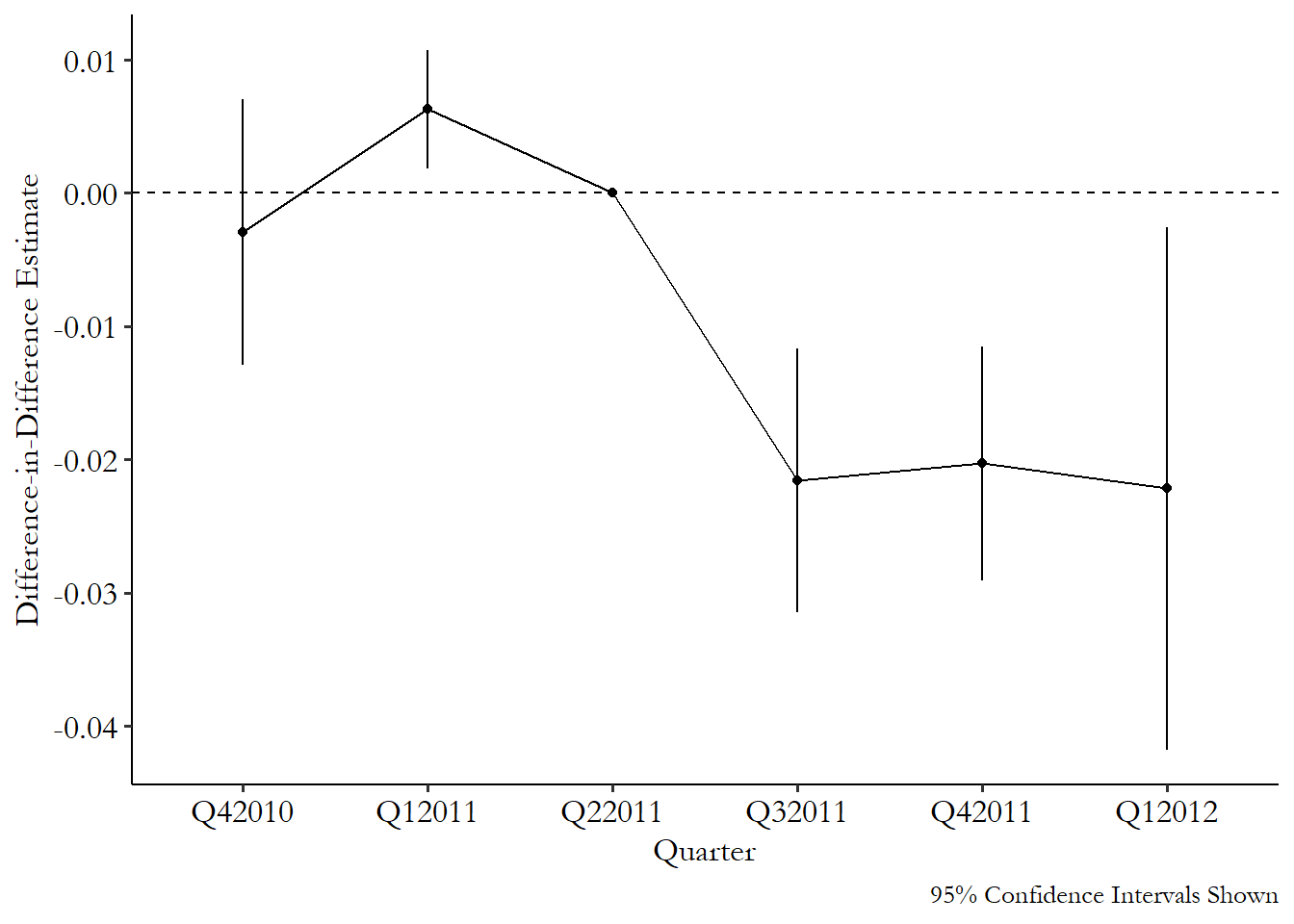
From Figure 18.6 we can see effects near zero in the three pre-treatment periods - always good, although the confidence interval for the first quarter of 2011 is above zero. That’s not ideal, but as I mentioned, a single dynamic effect behaving badly isn’t a reason to throw out the whole model or anything, especially when the deviation is fairly small in its actual value. We also see three similarly negative effects for the three periods after treatment goes into effect. The impact appears to be immediate and consistent, at least within the time window we’re looking at.
18.2.5 Control Variables in Difference-in-Differences
You may be tempted, as in many causal inference cases, to add control variables to your difference-in-differences estimation. This is certainly possible, but you can’t just do it unthinkingly. You have to pick your controls carefully, in a somewhat different way than you normally would, and you’ll often have to use a specialized estimator designed to use covariates.
Before thinking about how we can add control variables, it’s important to think about what they’re actually for. We’re used to adding covariates to close back doors between treatment and outcome. However, in a DID setting, the research design itself is supposed to do that for you, using within variation to account for differences between treated and control groups, and comparing that within variation across groups to account for changes over time. In DID, then, covariates really only serve the purpose of supporting the parallel trends assumption. Including a covariate is making a “conditional parallel trends” claim that “I don’t think parallel trends holds in my setting, but it does hold after you account for the influence of this covariate.* If that’s not what you’re saying, then you don’t want the control! Don’t just add control variables because it feels like you should. That’s not a good reason.
How could it be that parallel trends only holds conditional on something? The most obvious is when you have multiple possible control groups to use, and you suspect that parallel trends is most likely to hold if we compare the treated groups to the control groups most like the treated groups, with the most-similar characteristics. It may feel plausible that more-similar groups have more-similar trends, even if there’s no particular reason to think that a specific covariate makes trends deviate. This isn’t the greatest reason to control for stuff, but I see why people do it.
Another reason might be that we think that there are specific variables where different starting values really do lead to differences in trend. For example, let’s say we’re looking at the influence of a new government nutrition policy on height. If you’re 5 years old at the time the policy is introduced, it’s likely you’re going to grow by more inches in the first year of the policy than someone who is 23 years old at the time the policy is introduced. The use of within variation in DID itself accounts for the fact that the 23-year-old starts out taller than the 5-year-old. But within variation won’t account for the fact that, in the absence of treatment, the 5-year-old would have grown by more*. If the treated group has a different age profile than the control group, parallel trends violation! But if we can control for age, parallel trends is restored.
Alright, so we’ve got some variables that we’re pretty sure we want to control for, for the reasons just outlined. How do we do it? Just toss them in the regression model like we’d normally do, right?
No! If only it were so easy! But tossing controls into a two-way fixed effects regression or a dynamic difference-in-differences model doesn’t do what you want it to do. If you’re controlling for something because you think more-similar groups have more-similar trends, you end up with a weird average treatment effect that heavily weights the least-common kinds of groups. And if you’re controlling because you think different starting values lead to differences in trend, two-way fixed effects only accounts for the differences in levels, not in trend, so it doesn’t control like you want it to (Callaway and Sant’Anna 2021Callaway, Brantly, and Pedro H. C. Sant’Anna. 2021. “Difference-in-Differences with Multiple Time Periods.” Journal of Econometrics 225 (2): 200–230.).
Alright, so adding control variables to a regression doesn’t work. What does? Common ways of incorporating control variables into difference-in-differences use covariates that are fixed over time, or measured only pre-treatment, and then either matches on them (as in Chapter 14), or includes them in a regression with an interaction between the control and time, so you can allow the control to influence the outcome’s trend, not just its level.
One additional approach that seems promising, and likely to be used heavily in the future, is synthetic difference-in-differences by Arkhangelsky et al. (2021Arkhangelsky, Dmitry, Susan Athey, David A. Hirshberg, Guido W. Imbens, and Stefan Wager. 2021. “Synthetic Difference-in-Differences.” American Economic Review 111 (12): 4088–118.), which combines difference-in-differences with synthetic control (Chapter 22). This approach doesn’t actually require covariates, but instead adjusts for differences between treated and control groups using the prior trends themselves.
These methods are all covered in the “How the Pros Do It” section below, both in “Doing Multiple Treatment Periods Right!” and “Picking an Untreated Group with Matching.”
So we’re using covariates that are fixed over time. We are really allowing covariate-specific trends that will allow us to account for how different starting covariates might encourage the untreated group to grow at a different rate, and thus break parallel trends. Once we have this, there are two important checks we need to perform.527 This part of the section was added following Pedro Sant’Anna’s “difference-in-differences checklist,” which is examined in great detail in a blog post series by Cunningham (2024Cunningham, Scott. 2024. “Pedro’s Diff in Diff Checklist.” https://substack.com/@causalinf/p-145357441.).
First, we need to make sure that we actually fixed the problem. Remember, the whole point of this was to fix violations of parallel trends. We’re adding covariates because we think that parallel trends doesn’t naturally hold, but we do think that it conditionally holds.
We probably established that parallel trends doesn’t naturally hold by looking at a graph or doing a test or prior trends, right? So… let’s make sure we fixed the problem by looking at that graph again! After you’ve added your control variables, you’ll want to reexamine your prior trends tests. This will entail estimating the effect of treatment in the pre-treatment periods (like in the “Dynamic Difference-in-Differences” section), but with your control variables included this time, and making sure the violations have gone away. If you’re using a staggered-rollout design, that means checking prior trends for every treatment cohort you’re looking at.
Second, you’ll want to look to make sure your comparison groups are actually comparable after you add your control variables. If you are using matching to add your control variables, the methods described in Chapter 14 for looking for common support will apply here. If you’re using regression, then you’ll still want to check how many control observations you even have with similar values on the covariates as your treated observations have. If that’s a small number, then technically you can proceed, but you’re relying pretty heavily on your regression being able to extrapolate outside the range of your data. A little iffy!
What if none of it works? Your original prior trends test looked bad. Then you added covariates and the new prior trends test also looks bad, or your sample size of appropriate-match control observations is tiny. In that case, you may want to finally give up the ghost. Difference-in-differences may not be able to help you, and you should try looking for another design.
But we’ve left something out. Our reasons-for-controlling and also the estimators I just mentioned only account for covariates that are measured entirely before treatment. If different levels of a covariate at the outset influence the trend, we’re good to go. But what about covariates that break parallel trends because the covariate itself changes over time?
Let’s go back to that government nutrition policy. Say that rich people are taller on average, and after the policy is introduced they like the look of the treated areas and move there. Health should improve because there are just more treated rich people now! So it’s not so much that initial wealth levels in the area drove parallel trends to break, but rather changes in wealth levels broke parallel trends. So we want to control for changes in wealth levels!
There’s a problem, though, and that problem is , or closing a front door path in the language of Chapter 8. Any covariate measured after treatment occurred may itself have been influenced by the treatment, like how in this case wealth levels in treated areas went up because wealthy people wanted to get treated. Controlling for wealth may shut off part of the actual effect of treatment, for one. We might not worry about that in particular case, since we don’t want to count ``causes rich people to move there’’ as a part of the effect anyway. However, in many settings we worry about that (what if treatment makes people taller because it makes them richer? Wouldn’t want to control that effect away!). And even if we don’t want the effect to count, controlling may introduce collider bias issues. No good!
So in general, even if you have a reason why you’d want to control for a time-varying covariate, it’s advised against, and most of the methods we have for adding covariates actually forbid it. What do we do then, when we need to control for time-varying covariates? There are some methods, like in Callaway and Sant’Anna (2021Callaway, Brantly, and Pedro H. C. Sant’Anna. 2021. “Difference-in-Differences with Multiple Time Periods.” Journal of Econometrics 225 (2): 200–230.), but they only work in very specific circumstances. Aw, shucks.
18.2.6 Rollout Designs and Multiple Treatment Periods
And now we come to the secret shame of econometrics,528 The most recent one, at least. which concerns the issue of rollout designs. It’s one thing to have a difference-in-difference setup with multiple groups in the “treated” category. That’s fine. A rollout design is when you have all that, but also the groups get treated at different times.
For example, say we wanted to know the impact of having access to high-speed Internet on the formation of new businesses. We know that King County got broadband in 2001, Pierce County got it in 2002, and Snohomish County got it in 2003. They each have a before and after period, but those treatment times aren’t all the same.
What’s the problem? Well, from a research design perspective, there’s no problem. You’re just tossing a bunch of valid difference-in-difference designs together. But from a statistical perspective, this makes our two-way fixed effects regression not work any more (Goodman-Bacon 2021Goodman-Bacon, Andrew. 2021. “Difference-in-Differences with Variation in Treatment Timing.” Journal of Econometrics 225 (2): 254–77.). The problem can actually be so bad that, in some rare cases, you can get a negative difference-in-differences estimate even if the true effect is positive for everyone in the sample. And thus the secret shame: for decades researchers were basically unaware of this problem and used two-way fixed effects anyway. Only recently is the tide beginning to turn on this.
Why doesn’t two-way fixed effects work when we have multiple treatment periods? It’s a little complex, but the real problem occurs because this setup leads already-treated groups to get used as an untreated group. Think about what fixed effects does - it makes us look at variation within group.529 As per Chapter 16. And in a sense, “no treatment last period, no treatment this period” is the same amount of within-group variation in treatment as “treatment last period, treatment this period.” No change either way. So groups that stick with “still treated” get used as comparisons just as groups that stick with “not treated” do.
And why is that a problem? Sure, it’s a little weird to use a continuously-treated group as your comparison, but why wouldn’t parallel trends hold there anyway? It might, but also, if the effect itself is dynamic, as I discussed in the previous section, or if the treatment effect varies across groups, as in Chapter 10, then you’ve set your estimation up in a way so that parallel trends won’t hold. If you have a treatment effect that gets stronger over time, for example, then the “treated comparison group” should be trending upwards over time in a way that the “just-now treated group” shouldn’t. Parallel trends breaks and the identification fails.530 The problems can get even stranger when it comes to things like the dynamic treatment effects estimator discussed in the last section. The effects in the different periods start “contaminating” each other! This is described in Sun and Abraham (2021Sun, Liyang, and Sarah Abraham. 2021. “Estimating Dynamic Treatment Effects in Event Studies with Heterogeneous Treatment Effects.” Journal of Econometrics 225 (2): 175–99.).
If you are using a balanced panel (each group is observed in every time period) and you’re not using control variables, you can check how much of a problem the use of two-way fixed effects is in a difference-in-differences given study using the Goodman-Bacon decomposition, as described in Goodman-Bacon (2018). The decomposition shows how much weight the just-treated vs. already-treated comparisons are getting relative to the cleaner treated vs. untreated comparisons. The decomposition can be performed in R or Stata using their respective bacondecomp packages.
What to do, then, when we have a nice rollout design? Don’t use two-way fixed effects, but also don’t despair. You’re not out of luck, you’re just moving into the realm of what the pros do.
18.3 How the Pros Do It
18.3.1 Doing Multiple Treatment Periods Right!
An area of active research presents to the textbook author both the purest terror and the sweetest relief. Whatever I say will almost certainly be outdated by the time you read it. But the inevitability of failure, dang, that’s some real freedom.
When it comes to ways of handling multiple treatment periods in difference-in-differences, where some groups are treated at different times than others (rollout designs), “active area of research” is right! Because concern over the failure of the two-way fixed effects model for rollout designs is relatively recent, at least on an academic time scale, the approaches to solving the problem are fairly new, and it’s not yet clear which will become popular, or which will be proven to have unforeseen errors in them.
I will show three ways of addressing this problem. First, I’ll discuss the method described in Callaway and Sant’Anna (2021Callaway, Brantly, and Pedro H. C. Sant’Anna. 2021. “Difference-in-Differences with Multiple Time Periods.” Journal of Econometrics 225 (2): 200–230.). Second, I will show how our approach to dynamic treatment effects can help us fix the staggered rollout problem. Finally I’ll discuss the “imputation estimator” described in Borusyak, Jaravel, and Spiess (2024Borusyak, Kirill, Xavier Jaravel, and Jann Spiess. 2024. “Revisiting Event-Study Designs: Robust and Efficient Estimation.” The Review of Economic Studies 91 (6): 3253–85.). More technical details are in Roth et al. (2023Roth, Jonathan, Pedro HC Sant’Anna, Alyssa Bilinski, and John Poe. 2023. “What’s Trending in Difference-in-Differences? A Synthesis of the Recent Econometrics Literature.” Journal of Econometrics 235 (2): 2218–44.).
The first thing Callaway and Sant’Anna do is focus closely on when each group was treated. What’s one way to deal with all those different treatment periods giving your estimation a hard time? Consider them separately! They consider each treatment period just a little different, and instead of estimating an average treatment-on-the-treated for the whole sample, they estimate “group-time treatment effects,” which are average treatment effects on the group treated in a particular time period, so you end up with a bunch of different effect estimates, one for each time period where the treatment was new to someone.
Now dealing with the treated groups separately by when they were treated, they compare \(Y\) between each treatment group and the untreated group, and use propensity score matching (as in Chapter 14) to improve their estimate. So each group-time treatment effect is based on comparing the post-treatment outcomes of the groups treated in that period against the never-treated groups that are most similar to those treated groups.
Once you have all those group-time treatment effects, you can summarize them to answer a few different types of questions. You could carefully average them together to get a single average-treatment-on-the-treated.531 I say “carefully” because you’ll want to do a weighted average with some specially-chosen weights, as described in the paper. You could compare the effects from earlier-treated groups against later-treated groups to estimate dynamic treatment effects. Plenty of options.
The Callaway and Sant’Anna method can be implemented using the R package did. In Stata you can use the csdid package (or hdidregress if you have Stata 18), and in Python there is differences or the more narrowly dedicated csdid (see https://d2cml-ai.github.io/csdid)..
Models for dynamic treatment effects, modified for use with staggered rollout, can help in the case of staggered difference-in-differences in a few ways.
First, they separate out the time periods when the effects take place. Since our whole problem is overlapping effects in different time periods, this gives us a chance to separate things out and fix our problem.
Second, they’re just plain a good idea when it comes to difference-in-differences with multiple time periods. As described in the “Long-Term Effects” section, we can check the plausibility of prior trends, and also see how the effect changes over time (and most effects do).
Third, because they do let us see how the treatment effect evolves, and because treatment effects evolving is one of the problems with two-way fixed effects, that gives us another opportunity to separate things out and fix them.
What do I mean by “modified for use with staggered rollout,” then? A few things, all described in Wooldridge (2021Wooldridge, Jeffrey M. 2021. “Two-Way Fixed Effects, the Two-Way Mundlak Regression, and Difference-in-Differences Estimators.” SSRN.).
You know how the dynamic treatment effect model just tosses together a whole bunch of interactions? Well, Wooldridge asks “those interactions seemed to solve some problems for us… let’s toss in a bunch more and see if that solves all our other problems!” And they kind of do!
In addition to your standard group and time fixed effects plus an interaction between a treatment indicator and indicators for periods-since-treatment (as in the dynamic treatment effect model, which also includes periods-until-treatment indicators we omit here), you also interact all those interactions with a set of cohort indicators for when the treatment was first applied, sort of like in Callaway and Sant’Anna. So you might have a single coefficient just for the effect of treatment in 2006 of people who started getting treated in 2004, since you’re interacting “started in 2004” with “it’s been two years,” and similarly for every other combination. You can average those coefficients together in a way that gives you a time-varying treatment effect. Points for simplicity! Conveniently, this approach works for nonlinear models like logit or Poisson regression, too.
The Wooldridge “extended two-way fixed effects” estimator can be estimated in R using the etwfe package, or in Stata using the jwdid package.
Borusyak, Jaravel, and Spiess take a pleasantly intuitive approach. The whole idea of difference-in-differences, and its parallel trends assumption, is that our control group gives us a good proxy of what would have happened to the treated group if treatment had not occurred. The imputation estimator takes that quite literally. It uses untreated data to produce a prediction (an “imputation”) of what the treated data would have looked like if it were untreated. Then, compare what you actually got to that prediction. Similarly to Callaway and Sant’Anna, you now have a whole bunch of estimates for different groups and at different times, which you can average together to get treatment effects.
And, although it doesn’t quite sound like it, you can view this as an extension of our “modified models of dynamic treatment effects” we just discussed. In fact, this is a more general version of the Wooldridge estimator we already discussed, except that it can handle covariates that change over time and unbalanced panels, in addition to a few other differences.
The Borusyak, Jaravel, and Spiess method can be implemented using the R package didimputation or the Stata package did_imputation.
18.3.2 Picking an Untreated Group with Matching
Difference-in-differences only works if the comparison group is good. You really need parallel trends to hold. And since you can’t check parallel trends directly, you need to pick an untreated group (or a set of untreated groups) good enough that the assumption is as plausible as it can be. So however you’re doing your difference-in-differences, you want to be sure that you can really justify why your untreated group makes sense and parallel trends should hold.
That said, what do you do when you have a bunch of potential untreated groups? You can choose between them (or aggregate them together) by matching untreated and treated groups, as Callaway and Sant’Anna did in the previous section.
The idea here is pretty straightforward. Pick a set of predictor variables \(X\) from the pre-treatment period,532 Definitely don’t use any data from the post-treatment period. Remember, matching is one way of closing a path, and picking data from after the treatment goes into place is a great way to close a front door we don’t want to close. and then use one of the matching methods from Chapter 14 to match each treated group with an untreated group, or produce a set of weights for the untreated groups based on how similar they are to the treated groups.
Then, run your difference-in-difference model as normal, with the matching groups/weights applied. Done! Make sure to adjust your standard errors for the uncertainty introduced by the matching process, perhaps using bootstrapped standard errors, as discussed in Chapter 14.
You can go even further and look into the synthetic control method, which is further discussed in Chapter 22. In synthetic control, you match your treated group to a bunch of untreated groups based not just on prior covariates but also prior outcomes. If the synthetic control matching goes well, then prior trends are just about forced to be the same because you’ve specifically chosen weights for your untreated groups that have the same average outcomes as your treated group in each prior period. Why don’t we just call this a form of difference-in-differences with matching? There are some differences, like the way the result is calculated and how the matches are made. Plus, you can make it into a form of difference-in-differences with matching! Synthetic difference-in-differences (Arkhangelsky et al. 2021Arkhangelsky, Dmitry, Susan Athey, David A. Hirshberg, Guido W. Imbens, and Stefan Wager. 2021. “Synthetic Difference-in-Differences.” American Economic Review 111 (12): 4088–118.) extends this weight-finding approach into something more specific to the difference-in-differences case. It creates a set of control-unit weights as well as time-period weights such that you end up not just comparing your treated group to the control groups most like the treated group, but also balancing time periods before and after the treatment. With the weights in place, you can more or less just run two-way fixed effects.
This combined matching/difference-in-differences approach satisfies a few nice goals. First, we have difference-in-differences. Since DID has group fixed effects, it already controls for any differences between treated and untreated groups that are constant over time. However, what DID doesn’t do is say anything about why certain groups come to be treated and others don’t.
If there’s some back door between “becomes a treated group” and “evolution of the outcome in the post-treatment period,” as it seems likely there would be, then we still aren’t identified. That’s where matching comes in. If we can pick a set of matching variables \(X\) that close the back doors between which groups become treated and when and the outcome, we get parallel trends back.
If you like, you can go even further and use doubly robust difference-in-differences, which applies both matching and regression in ways that identify the effect you want even if one of those two methods has faulty assumptions (although you’re still in trouble if both are faulty) (Sant’Anna and Zhao 2020Sant’Anna, Pedro H. C., and Jun Zhao. 2020. “Doubly Robust Difference-in-Differences Estimators.” Journal of Econometrics 219 (1): 101–22.). You can apply this method in R with the DRDID package or in Stata with the drdid package.
When thinking about matching with difference-in-differences generally, there is one thing to be concerned about, and that is regression to the mean. Regression to the mean is a common problem whenever you are looking at data that varies over time. The basic idea is this: if a variable is far above its typical average this period, then it’s likely to go down next period, i.e., regress back towards the mean.533 This has nothing to do with regression as in “running a regression” or OLS. This is because a far-above-average observation is, well, far above average. In a random period, you’re likely to be closer to the mean than far-above-average. So typically an extreme observation (either above or below) will be followed by something closer to the mean.
Another way to think about it is this: the day you win the ten-million-dollar lottery is likely to be followed by a day where you make way less than ten million dollars.
What does this have to do with difference-in-differences and matching? The problem arises if the pre-period outcome levels are related to the probability of treatment. For example, say there are two cities with similar covariates. Policymakers are planning to put a job training program in place and want to know the effects of the program on unemployment. They choose City A for the program since unemployment is currently really bad in City A. Then they use A as the treated group and B as the untreated group, since B has similar covariates.
What happens then? After the policy goes into effect, unemployment might get better in City A for two reasons: the effect of the policy, or regression to the mean, if A was just having an unusually bad period when policymakers were choosing where to put the training program. Difference-in-differences can’t tell the two apart, so the estimate is wrong (Daw and Hatfield 2018Daw, Jamie R., and Laura A. Hatfield. 2018. “Matching and Regression to the Mean in Difference-in-Differences Analysis.” Health Services Research 53 (6): 4138–56.).
Strangely, this is only a problem because we matched A and B. If we’d just used a bunch of untreated cities, or a random city from a set of potential comparisons, the bias wouldn’t be there. That’s because B was selected as a good match for an unusually bad time in A’s history. Heck, maybe B’s unemployment is usually way worse, and this is an unusually good time for them. The matching emphasizes comparisons that are especially subject to regression to the mean.534 I’ve described this as though they’re being matched on their pre-treatment outcome levels, which is something that some researchers do. But this also applies whenever you’re matching on pre-treatment values of time-varying covariates for the same reason - those covariates are related to the prior outcomes.
That said, this applies specifically when outcome levels are strongly related to whether your group gets treated, and is worse the more different your treated and untreated group’s typical outcome levels are. Treatment being related to outcome trends is less of an issue. This also isn’t an issue if you’re matching on covariates that don’t change much over time. Plus, if this outcome-level-based-assignment thing isn’t an issue, then matching can really help. So this isn’t a reason to throw out matching in difference-in-differences, just a reason to think carefully about it.
18.3.3 The Unfurling Logic of Difference-in-Differences
At its core, beyond all the calculation details, difference-in-differences is extremely simple. We see a difference - a gap in outcome levels - and see how that difference changes from before a policy change to afterward. But then who says we have to be limited to looking at how a gap in outcome levels changes? We could look at how a gap in just about anything changes.
What do I mean? For example, maybe we want to see how a difference in a relationship changes from before to after. Let’s consider a teacher training program that is introduced in some districts but not others. The goal of this training program is to help ease educational income disparities. That is, the relationship between parental income and student test scores should be weaker with the introduction of the training program.
So, what can we do? We already know how to get the effect of \(Income\) on \(TestScores\):
Now, we want to do difference-in-differences but on \(\beta_1\) instead of on \(Y\). In other words \((\beta_1^{Treated,After} - \beta_1^{Treated, Before}) -\) \((\beta_1^{Untreated, After} - \beta_1^{Untreated, Before})\). That looks like difference-in-differences to me!535 This logic is very similar to what we covered in the Oster paper way back in “Describing Relationships,” Chapter 4.
We can get at these sorts of effects with interaction terms. If we want to know the “within” variation in the effect, we interact \(After\) with what we have:
Estimate that model for the treated group, and \(\beta_3\) gives us
Estimate it for the untreated group and we get
We can combine everything into one regression with a triple-interaction term:
Let’s walk through the logic carefully here. \(\beta_7\) looks at the effect of \(Income\), and sees how that effect changes from before to after (\(Income\times After\)), and then sees how that before-after change is different between the treated and untreated groups (\(Treated\times Income\times After\)). This is difference-in-differences but on a relationship rather than the average of an outcome.
This approach works for basically any kind of research design. We’ve done it here for a basic correlation, but with the right setup you could see how an instrumental variables (Chapter 19) or regression discontinuity (Chapter 20) estimate changes from before to after. As long as you want to know the effect of some policy on the strength of some other effect, you can do what you like.
Aside from applying DID to effects themselves (relationships), you can also apply difference-in-differences logic to other kinds of summary descriptions of a single variable rather than the mean (like DID would do). One application of this is in using DID with quantile regression - a form of regression that looks at how predictors affect the entire distribution of a variable. This lets you use a DID research design to see how a policy affects, say, values at the tenth percentile.
We can even apply this to difference-in-differences itself and get the difference-in-difference-in-differences model, also known as triple-differences or DIDID!536 Really! You could even do DIDIDID or DIDIDIDID or DIDLDIDI or… DIDID could be used to see how a newly implemented policy changes a DID-estimated effect. However, DIDID is also used to help strengthen the parallel trends assumption by finding a treated group that shouldn’t be affected at all, and subtracting out their effect. This works using the same triple-interaction regression we just discussed.
For example, imagine a new environmental policy that increases funding to remove trash from marshes. The policy is implemented in some prefectures but not others. You want to run DID to see if the policy actually reduced trash levels. But what if you ran DID on parks instead of marshes and found an effect? That tells you there’s something going on that breaks parallel trends - trash levels in the treated and untreated groups are trending apart even in places that shouldn’t be affected by the policy.537 Okay, sure, maybe they should be affected if there are budget spillovers. But let’s ignore that for now. What can we do? Well, just run DID on marshes, and also run DID on parks, and take the difference of them (difference-in-DID or DIDID). This hopefully subtracts out the violation of parallel trends we saw, leaving us with a better estimate of the effect on marshes.
To see how this might work in action, take Collins and Urban (2014Collins, J. Michael, and Carly Urban. 2014. “The Dark Side of Sunshine: Regulatory Oversight and Status Quo Bias.” Journal of Economic Behavior & Organization 107: 470–86. https://doi.org/10.1016/j.jebo.2014.04.003.). This paper looks at a policy enacted in the state of Maryland in 2008 intended to help reduce home foreclosure rates. When someone misses payments on their mortgage, the loan servicer could foreclose on them, or they could do nothing and just wait to see if they start paying again, or they could help the mortgage holder modify their loan so they might be able to get back on track with payment. All the policy did was require mortgage servicers to report what sorts of loan-modification activities they’d done to help people. Collins and Urban wanted to know whether the policy got loan servicers to modify more loans and reduce foreclosures.
They could have just run DID. Simply compare loan modifications and foreclosures in Maryland and some untreated state before and after the policy. However, it might be tricky to believe that parallel trends would hold. After all, 2008 was heading right into the Great Recession, and all sorts of things were changing all over the place, especially in regards to loan delinquencies and foreclosures. Maryland and whatever untreated state got picked might trend apart for no reason other than pure unbridled financial chaos.
However, Collins and Urban were in luck: the policy only applied to some loan servicers but not others. So they added that third difference in: see how different the DID effect is between servicers subject to the new policy and those that weren’t. After all, the servicers not subject to the policy shouldn’t be affected at all, so any DID effect we do see is more on the “financial chaos” side of things rather than the “effect of the policy” side, and we can subtract that out.
What did they find? They found that the policy did get loan servicers to modify more loans to make them easier to pay, even though the underlying financial reality of the loan stayed exactly the same. However, they also found that the policy led to more foreclosures, contrary to the intent of the policy.538 How could this policy possibly lead to more foreclosures? Collins and Urban suggest that this may be because it encourages loan servicers away from a “don’t do anything, wait and see” approach to the loan. Modifying a loan is one way to “do something,” but, uh… foreclosing on the house is another. These results can be seen in Figure 18.7 - on the left, the number of loans that get modified is the dependent variable, and on the right, it’s the foreclosure rate. Each point is the difference between Maryland and other states (difference), and the different lines represent the ESRR loan servicers affected and the not-ESRR servicers not affected by the policy (in difference). You can see how the gap grows by quite a bit after the policy goes into effect (in difference).539 Licensed from the Journal of Economic Behavior and Organization.
Figure 18.7: Differences Between Maryland and Other States from Collins and Urban (2014)
Page built: 2025-10-17 using R version 4.5.0 (2025-04-11 ucrt)