Chapter 20 - Regression Discontinuity
20.1 How Does It Work?
San Diego is a large city in the United States that covers a fairly wide geographic area of more than 300 square miles. It’s pretty well-off too, with an average annual household income above $85,000 as of 2019, about 50% above the US national average. As you move south through the area, the scene changes a bit. There’s a little less money in some southern parts of the city. By the time you get to San Ysidro, the district of the city just on the Mexican border, household income has dropped to more like $50,000 or $55,000. The further south you go, the lower you can expect incomes to be.
But our trip through the city has nothing on what happens when we cross that border into Tijuana, Mexico. It took us 16 miles to drive from downtown to San Ysidro and watch incomes drop by 25%. But you could get out of the car in an area with $50,000 household income and just walk a few feet over the border into Tijuana. Suddenly and sharply, household income drops to $20,000.
Sure, there may be something different about the people, the opportunities, or the geography that is different in south San Diego as opposed to the downtown area that could explain some of the difference in incomes. But there’s no way that just going south explains what happens when we take one step over the border and see incomes crash. From downtown to San Ysidro there’s continuous change. But at the border it jumps. Something is fundamentally different. We have a cutoff.
Whenever some treatment is assigned discontinuously - people just on one side of a line get it, and people just on the other side of the line don’t, we can be pretty sure that the differences we see aren’t just because there’s something different about how far south they are. Without the line they might be a little different, but not that different. The big change we can attribute to that line separating Mexico and the US.
This is the idea behind regression discontinuity. Compare people just on either side of a cutoff. Without the cutoff, they’d likely be pretty similar. So if they’re different, we can probably attribute the difference to whatever it is that happens at that cutoff.602 In the San Diego/Tijuana case, it’s really multiple treatments since so many things change at the border. But the border is clearly doing something!
Regression discontinuity focuses on treatment that is assigned at a cutoff. Just to one side, no treatment. Just to the other, treatment!603 Regression discontinuity is almost always used in reference to a binary treatment variable. This chapter will not bother hedging its wording to imply any other use, although regression discontinuity with non-binary treatments is out there, and you’ll see a tiny hint of it in the “Regression Kink” section in “How the Pros Do It” below.
It’s worth establishing some terminology here:
- Running variable. The running variable, also known as a forcing variable, is the variable that determines whether you’re treated or not. For example, if a doctor takes your blood pressure and will assign you a blood-pressure-reducing medicine if your systolic blood pressure is above 135, then your blood pressure is the running variable.
- Cutoff. The cutoff is the value of the running variable that determines whether you get treatment. Using the same blood pressure example, the cutoff in this case is a systolic blood pressure of 135. If you’re above 135, you get the medicine. If you’re below 135, you don’t.604 In this example, and many examples, you get treatment if you’re above the cutoff, and not if you’re below. But in many scenarios you would get treatment if you were below the cutoff. The same logic works.
- Bandwidth. It’s reasonable to think that people just barely to either side of the cutoff are basically the same other than for the cutoff. But people farther away (say, downtown San Diego vs. further inside of Mexico) might be different for reasons other than the cutoff. The bandwidth is how much area around the cutoff you’re willing to consider comparable. Ten feet to either side of the US/Mexico border? 1000 feet? 80 miles?
The core of the research design of regression discontinuity is to (a) account for how the running variable normally affects the outcome, (b) focus on observations right around the cutoff, inside the bandwidth, and (c) compare the just-barely-treated against the just-barely-untreated to get the effect of treatment.
There are plenty of cutoffs like this in the world. Quite a few policies are designed with explicit cutoffs in mind. Make just slightly too much money? You might not qualify for some means-tested program. Or have a test score just slightly too low? You might not qualify for the gifted-and-talented program.
These cutoffs could be geographic - we already had the San Diego/Tijuana example. But also, live just to one side of a time zone border or another? You might be getting up an hour earlier. Or if you’re just to one side of a police jurisdiction’s border, you may be experiencing different policing policies.
Politics is another place where we have hard cutoffs. In an election and win 49.999% of the vote among the top two in your election? You don’t get the office. But win 50.001%? Enjoy your office! Now we can see what the effect of you is.
In each of these cases, we can pretty reasonably imagine that cases that are just barely to either side of the cutoff are comparable, and any differences between them are really the fault of treatment. In other words, we’ve identified the effect of treatment.
The goal of this approach is to carefully select the variation that lets us ignore all sorts of back doors without actually having to control for them.
When can we apply regression discontinuity? What we’re looking for is some sort of treatment that is assigned based on a cutoff. There’s the running variable that determines treatment. And there’s some cutoff value. If you’re just to one side of the cutoff value, you don’t get treated. If you’re to the other side, you do get treated.605 Or at least your chances of treatment change dramatically - we’ll get to this variant when we talk about fuzzy regression discontinuity. Plus, since our strategy is going to be assuming that people close to the cutoff are effectively randomly assigned,606 More precisely, we need continuity of the relationship between the outcome and the running variable. If, for example, there’s a positive relationship between the outcome and the running variable, we’d expect a higher outcome to the right of the cutoff than to the left. That’s totally fine, even though the two groups aren’t exactly comparable. As long as there wouldn’t be a discontinuity in that positive relationship without the treatment. Roughly, you can think of this as “after we adjust for the overall relationship between the outcome and the running variable, the two sides are basically randomly assigned.” there shouldn’t be any obvious impediments to that randomness - people shouldn’t be able to manipulate the running variable so as to choose their own treatment, and also the people who choose what the cutoff is shouldn’t be able to make that choice in response to finding out who has which running variable values.
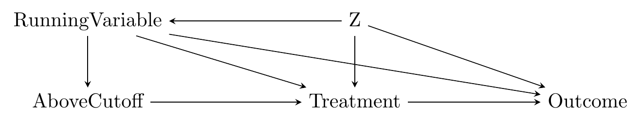
This gives us a causal diagram that looks like Figure 20.1. Here we have a \(RunningVariable\) with a back door through \(Z\) (which perhaps we can’t control for). \(RunningVariable\) also has a direct effect on the \(Outcome\).
Figure 20.1: A Causal Diagram That Regression Discontinuity Works For
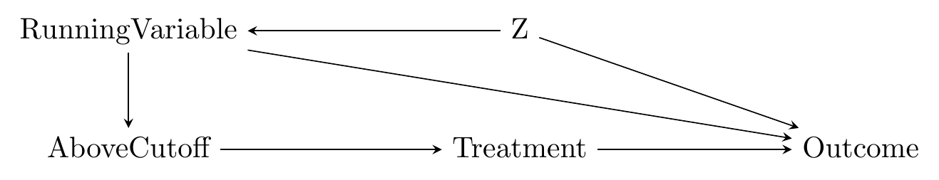
Now, we aren’t actually interested in the effect of \(RunningVariable\). We’re interested in the effect of \(Treatment\). \(Treatment\) has a back door through \(RunningVariable\). However, if we control for all the variation in \(RunningVariable\) except for being above the cutoff, then we can close that back door, identifying the effect of \(Treatment\) on \(Outcome\).607 As has popped up a few times in this book, this diagram isn’t exactly a kosher causal diagram. An arrow allows any sort of shape for the relationship, and so “\(RunningVariable\) affects \(Treatment\) only at the cutoff” could be handled by a \(RunningVariable \rightarrow Treatment\) arrow, with the cutoff incorporated using a “limiting diagram” where \(RunningVariable\) is replaced by \(RunningVariable\rightarrow Cutoff\) as a node in itself. I think this is more complex than the way I’ve done it, though, so here we are. If you keep working with causal diagrams, the more proper version will pop up.
Based on the diagram, it sort of seems like regression discontinuity is just a case of controlling for a variable (\(RunningVariable\)) and saying we’ve identified the effect. But it’s a bit more interesting than that. We’re actually isolating a front-door path, as in Chapter 9 (Finding Front Doors) or Chapter 19 (Instrumental Variables), not closing back doors. By only looking right around the cutoff we are getting rid of any variation that doesn’t lie on the \(AboveCutoff \rightarrow Treatment \rightarrow Outcome\) path. Nothing else should really be varying once we limit ourselves to that cutoff, so all the other variables go away!
So, sure, in Figure 20.1 we could identify the effect by doing regular ol’ statistical adjustment for \(RunningVariable\). But what if there were other back doors? Perhaps even back doors for \(Treatment\) itself, for example if \(Z \rightarrow Treatment\) were on the graph? Controlling for \(RunningVariable\) wouldn’t solve the problem, but regression discontinuity would, by isolating \(AboveCutoff \rightarrow Treatment \rightarrow Outcome\) and letting us ignore any other arrows heading into \(Treatment\).608 You may have noticed the similarity between Figure 20.1 and the causal diagram in Chapter 17 for event studies. They are, indeed, nearly the same, except event studies have \(Time\) as a running variable. You will notice other similarities to event studies, especially interrupted time series, throughout the chapter. The main difference is that a lot of the necessary assumptions become more plausible with a non-\(Time\) running variable, for reasons that hopefully will become evident.
So how does regression discontinuity do all this cool stuff, exactly? We can perform regression discontinuity by making only a few basic choices. Once we’ve done that, the process is pretty straightforward.
- Choose a method for predicting the outcome on each side of the cutoff
- Choose a bandwidth (optional)
That’s it!609 Although the estimation will usually be more complex than I have it here - we’ll get to it in the “How Is It Performed” section. Let’s put these choices to work on some simulated data. You can see the process all worked out in Figure 20.2.
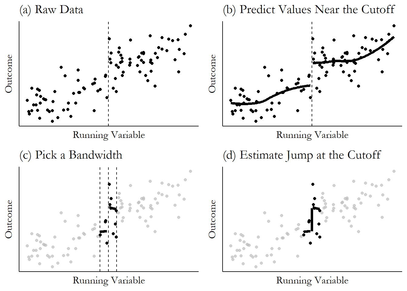
Figure 20.2: Regression Discontinuity, Step by Step
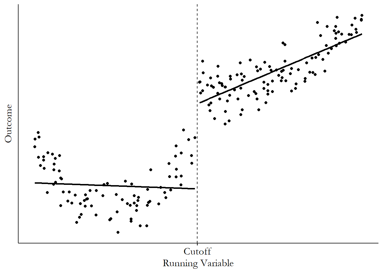
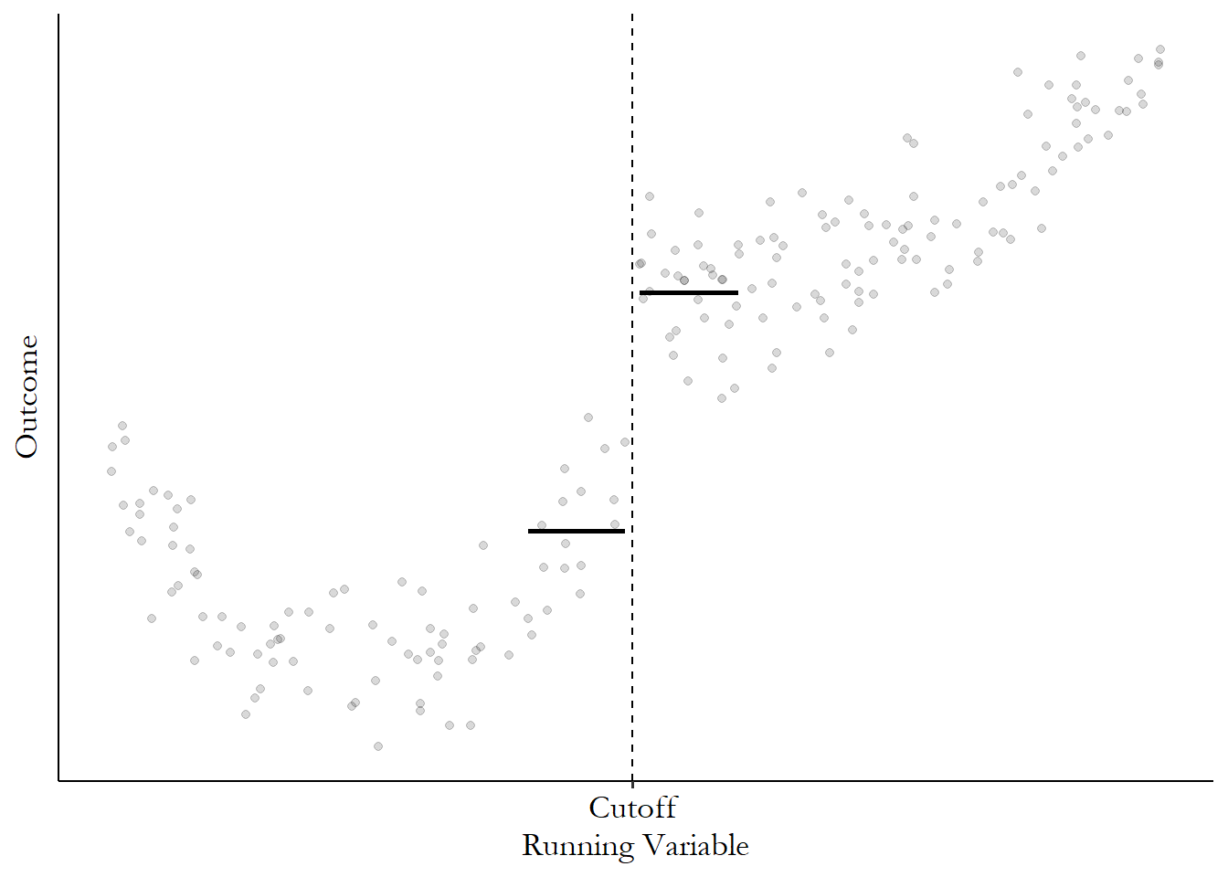
In part (a), we see a setup that’s pretty typical for regression discontinuity: a running variable along the \(x\)-axis. The running variable does seem to be related to the outcome even when we’re not around the cutoff, which is fine. We have a clear upward slope here. We also have a cutoff value at which treatment was applied. And we see a jump in the outcome at that cutoff! That’s exactly what we want to see.
Moving on to part (b), we need a way of predicting what the outcome will be just to either side of the cutoff. There are a bunch of different prediction methods we could use - regression, local means, and so on.610 Shoot, we could just guess what we think the values will be based on gut instinct. Journals tend to frown on this practice though. Ivory tower snobs, the lot of them. In this case, we’re using local means with LOESS, which is just a smoothed line based on the prediction from a regression that uses only points within a certain range of each \(x\)-axis value.
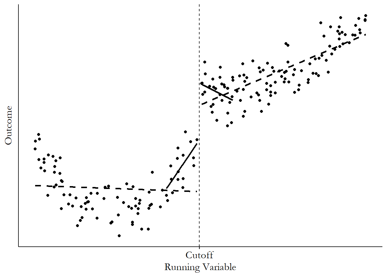
In part (c) we can see our bandwidth being applied (which will modify the predictions that our method in (b) makes). We are really only interested in the values right around the cutoff. Values far away from the cutoff still have value - we can use them to figure out trends and lines that let us better predict the values at the cutoff. But get too far away and you’re allowing in a bunch of back-door variation that we’re doing regression discontinuity to avoid in the first place. But maybe we plan to account for that problem by adjusting for the relationship between the outcome and the running variable in the regression, and we can skip the bandwidth step. We’ll get to the details of this later,611 The basic struggle of the choice of bandwidth is this: the farther out your bandwidth, the less certain you can be about your identifying assumption that people are comparable on either side of the cutoff. But the closer-in your bandwidth, the fewer observations you have, making your estimate less precise. but for now let’s opt to use a bandwidth. Here we’re using only data that’s really close to the cutoff to calculate our prediction around the cutoff. Everything else gets ignored.
Finally, based on our bandwidth and prediction method, we have our predictions for what the outcome is just on either side of the cutoff. Our regression discontinuity estimate is then just how much the prediction jumps at the cutoff. We can see that in part (d), where the estimate is the vertical line going from the prediction just-on-the-left to the prediction just-on-the-right.
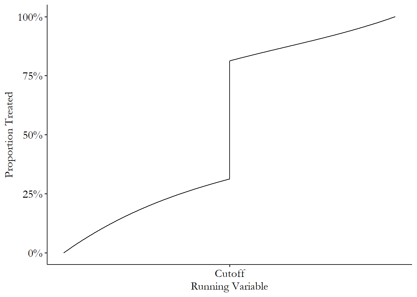
So far, I’ve shown examples where the cutoff is the only determinant of treatment. Often this isn’t the case. In a lot of regression discontinuity applications, being on one side or another of the cutoff only changes the probability of treatment. In these cases we have what’s called a fuzzy regression discontinuity, as opposed to a “sharp” regression discontinuity where treatment rates jump from 0% to 100%.
Fuzzy regression discontinuity. A regression discontinuity design in which treatment is not completely determined by being on one side or another of the cutoff.
Figure 20.3 shows how treatment rates might change in sharp and fuzzy designs.612 Pay attention to the fact that the \(y\)-axis on these graphs is the proportion of observations that are treated, not the average outcome. While each shows a jump in the rate of treatment at the cutoff, the sharp design shows no action at all anywhere but the cutoff.
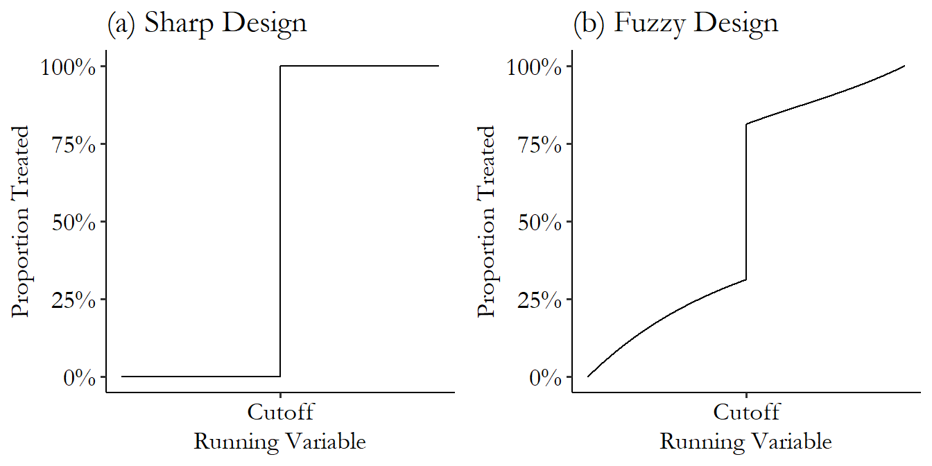
Figure 20.3: Proportion Treated in Sharp and Fuzzy Regression Discontinuity Designs
One example of a topic where fuzzy regression discontinuity is applied a lot is in looking at the impact of retirement. In many occupations and countries, there are certain ages, or number of years you’ve been at your job, where a new policy kicks in - pension income, access to retirement funds - and the retirement rate jumps significantly at these points. Not everyone retires as soon as they’re able to, though, and some retire earlier, making this a fuzzy discontinuity.
Battistin et al. (2009Battistin, Erich, Agar Brugiavini, Enrico Rettore, and Guglielmo Weber. 2009. “The Retirement Consumption Puzzle: Evidence from a Regression Discontinuity Approach.” American Economic Review 99 (5): 2209–26.) are one paper of many that apply fuzzy regression discontinuity to retirement. In their paper, they look at consumption and how it changes at the point of retirement. Specifically, they want to know if retirement causes consumption to immediately drop.613 Finding such a drop is a “puzzle” to economists, as standard models predict that people would rather not experience big sudden drops in their consumption, and retirement is a case where they should be able to avoid that drop if they want to, by adjusting consumption before retirement. This is the kind of thing that feels like a very silly and unrealistic prediction on the part of economists but makes more sense the more you think about it. And if it does drop, why?
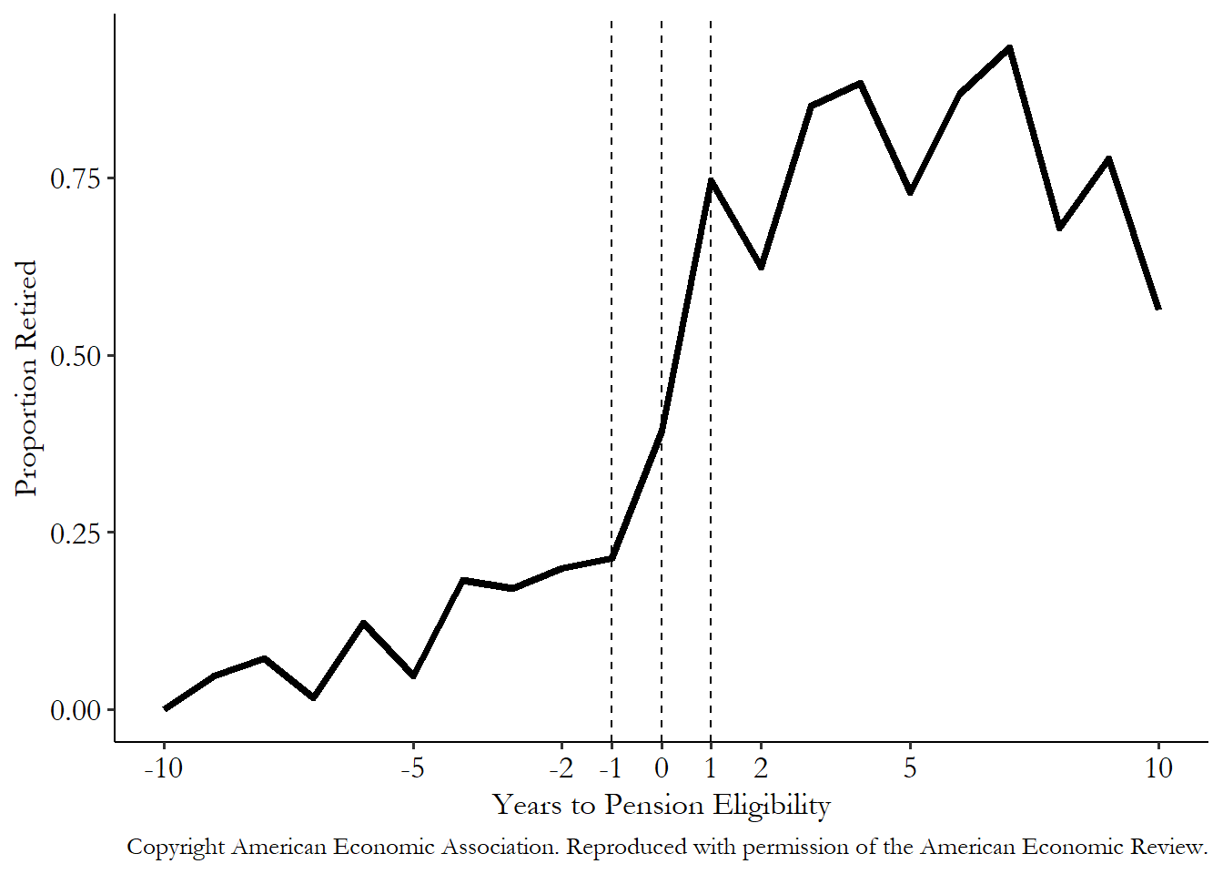
They look at data from Italy in 1993-2004, where they have information on when people become eligible for their pension. At the exact age of eligibility, there’s a more than 30 percentage point jump in the proportion of men who are retired. That’s not a 0% to 100% jump (and thus is fuzzy), but a 30 percentage point jump is something we can work with! We can see the jump in one of the years they studied in Figure 20.4. There’s clearly something going on at that cutoff.
Figure 20.4: The Proportion of Household Heads Retired by Years to Pension Eligibility in 2000, from Battistin, Brugiavini, Rettore, and Weber (2009)
They want to look at how consumption changes at that cutoff, just as you normally would with a non-fuzzy RDD. But if they just treated it as normal, their results would be way off. They’d be acting as though the cutoff made everyone retire, when actually it only increased the retirement rate by 30 percentage points. A 30-percentage point change in retirement will change consumption less than a 100-percentage point change will, so the effect we estimate will naturally be disappointing! But it’s only disappointing because our estimate expects a 100 percentage point change.
The authors want to properly temper the estimator’s expectations. So they scale by the effect of the cutoff. Roughly,614 And we’ll get into more specifics in the “How Is It Performed?” section. they scale the effects they see by dividing them by the 30 percentage point jump (dividing by .3) to see how big the change would have been if everyone got treated.
What do they find? They do indeed find a drop in consumption at the moment someone retires. But conveniently, their regression discontinuity design doesn’t just identify the effect of retirement on overall consumption, it identifies the effect of retirement on just about anything, in this case specific types of consumption and the number of kids at home. They find that consumption drops resulting from retirement are largely due to things like using your extra leisure time to cook rather than order from a restaurant, not needing nice work clothes any more, and adult children tending to move out of the house. Not so bad as a drop in consumption might seem.
Surely there’s a catch. Well, sort of. As with anything, we need to ask ourselves what assumptions need to be made for all of this to work, what the pros and cons are, and what exactly we end up estimating.
First, as with any other method where we isolate just the part of the variation where we can identify the effect, we need to assume that nothing fishy is going on in that variation. We’re estimating the effect of treatment, sure, but really we’re estimating the effect of the cutoff and attributing that (or part of that, if it’s fuzzy) to the treatment. So if anything else is changing at the cutoff, we’re in trouble. The assumption we need to make is that the outcome is smooth at the cutoff. That is, if treatment status actually hadn’t changed at the cutoff (if nobody near the cutoff had gotten treated, or everyone had, or everyone had the same chance of being treated), then there would be no jump or discontinuity to speak of.615 This is an assumption about a counterfactual - we can’t really check it. We just need to understand the context we’re studying very well and think carefully about what else might have changed at the cutoff.
Say we want to know the effect of a gifted-and-talented school program that requires a score of 95 out of 100 on a math test to get in. Does getting a 95 or more on your math test both get you into the gifted-and-talented program and the science-museum-field-trip program? Well, then you can’t use regression discontinuity to get just the effect of the gifted-and-talented program. No way to separate it from those field trips.
This is a problem even if there isn’t another explicit treatment happening at the cutoff. Maybe gifted-and-talented is the only program assigned with a 95-score cutoff, but if it just so happens that the proportion of tall people is way different for people with 94s as opposed to people with 96s. Even if getting a 94 vs. a 96 is completely random and the height difference was happenstance, it’s hard to distinguish the effect of gifted-and-talented from the effect of being tall.
Second, the whole crux of this thing is that people are basically randomly assigned to either side of the cutoff if we zoom in close enough.616 After correcting for “trend.” \(^,\)617 There are ways to think about regression discontinuity without it actually needing to be “random around the cutoff.” But this is such a simple way to think about it that it will remain the focus in this chapter. So we need to assume that the running variable is randomly assigned around the cutoff and isn’t manipulated. If teachers want more students in gifted-and-talented, so they take kids with scores of 94 and secretly regrade their tests so they get 96s instead, then suddenly it’s not really random whether you get a 94 or a 96. We can’t say that a comparison between the 94s and 96s identifies the effect any more!
Plus, since this is based on being able to zoom in far enough that assignment to either side of the cutoff is random, we need to have a running variable that’s precisely measured enough to let us zoom in to the necessary level. Sure, maybe the 94s and 96s are comparable. But what if the test data is only reported in 5-point bins, so we have to compare the 90-94s against the 95-100s? We might trust our random-assignment assumption a lot less then.
Moving on from the key assumptions, our third concern is about statistical power. Regression discontinuity by necessity focuses in on a tiny slice of the data - the people just around the cutoff. There simply aren’t that many people with a 94, 95, or 96. Alternately, in Figure 20.2 (c) you can see how much data we’re graying and throwing out. So, in comparing just the people on either side, we’re severely limiting our sample size and so making our estimate noisier. We can fix this by incorporating more data from people farther away from the cutoff, but this reintroduces the bias we were trying to get rid of.618 It’s a good idea to do a power analysis (as in Chapter 15) before doing a regression discontinuity to see if you’ll have sufficient observations to estimate anything precisely enough to care. In R, Stata, and Python, the rdpower package does this specifically for regression discontinuity. In R and Python you can install the package as normal, but in Stata there’s a different rdpower package that does something else, so you’ll want to visit https://rdpackages.github.io/rdpower/ to get installation instructions.
Finally, if we do this all, what kind of treatment effect are we estimating (Chapter 10)? Regression discontinuity is fairly easy to figure out on this front. We’re using variation only from just around the cutoff. So we get the effect of treatment for people who are just around the cutoff. This is a local average treatment effect, getting the weighted average treatment effect for those just on the margin of being given treatment.
There are pros and cons to getting the local average treatment effect in regression discontinuity. As a pro, if we were to use the information from our study to expand treatment to more people, we’d probably do it by shifting the cutoff a bit to allow for more people. The newly treated people are very similar to the at-the-cutoff people we just estimated the effect for. After all, knowing the effect of a gifted-and-talented program on someone who gets a 5 out of 100 on their math test isn’t too useful - they’re unlikely to ever be put in the program anyway. Knowing the local effect could be more useful than knowing the overall average treatment effect.
Of course, in other situations we might rather have the average treatment effect. In plenty of cases we’re looking at the effect of a treatment that could be applied to everyone, but we just got lucky enough to be able to identify the effect in a place where it was assigned based on a cutoff. For example, imagine a relief program that sends $1,600 relief checks to major portions of the populace, with an income cutoff of $75,000. If we were to analyze the effect of these checks using regression discontinuity, we’d get the effect for people who earn very close to $75,000. But we’ll never know what the effect would have been for people who earn $100,000. More concerning, we’d have no idea what the effect was for people who earn closer to $20,000 - they’re the ones who would probably need the most help. But even though the $20,000-earners got checks, we can’t use regression discontinuity to see the effect of checks for them since they’re not near the cutoff.
20.2 How Is It Performed?
20.2.1 Regression Discontinuity with Ordinary Least Squares
Thus far, I’ve written about regression discontinuity in terms of discontinuities but have left out the regression. Seems inappropriate, so let’s fix it. There are many ways to predict the outcome just on either side of the regression, but we’ll start with a very simple interaction-term-based approach:
This is a simple linear approach to regression discontinuity, where \(Running\) is the running variable, which we’ve centered around the cutoff by using \((Running - Cutoff)\). \((Running - Cutoff)\) takes a negative value to the left of the cutoff, zero at the cutoff, and a positive value to the right. We’re talking about a sharp regression discontinuity here, so \(Treated\) is both an indicator for being treated and an indicator for being above the cutoff - these are the same thing,619 They no longer will be identical once we get to estimating a fuzzy regression discontinuity. and you could easily write the equation with \(AboveCutoff\) instead of \(Treated\). The model is generally estimated using heteroskedasticity-robust standard errors, as one might expect the discontinuity and general shape of the line we’re fitting to exhibit heteroskedasticity in most cases.620 How exactly to do heteroskedasticity-robust standard errors does get a bit trickier here. You might see papers out in the wild using standard errors that are clustered on the running variable - we used to think this was a good idea but no longer do. I’ll get to that one in the “How the Pros Do It” section. We’ll ignore the issue of a bandwidth for now and come back to it later - this regression approach can be applied whether you use all the data or limit yourself to a bandwidth around the cutoff.
Notice the lack of control variables in Equation (20.1). In most other chapters, when I do this it’s to help focus your attention on the design. Here, it’s very intentional. The whole idea of regression discontinuity is that you have nearly random assignment on either side of the cutoff. You shouldn’t need control variables because the design itself should close any back doors. No open back doors? No need for controls. Adding controls implies you don’t believe the assumptions necessary for the regression discontinuity method to work, and it makes the whole thing becomes a bit suspicious to any readers.621 That said, sometimes the addition of controls can help improve the precision of the estimate by reducing the amount of unexplained variation. The process of adding controls can get a bit tricky if you’re doing local regression, though, as I’ll describe soon. There are methods for it, though, such as Calonico et al. (2019Calonico, Sebastian, Matias D. Cattaneo, Max H. Farrell, and Rocio Titiunik. 2019. “Regression Discontinuity Designs Using Covariates.” Review of Economics and Statistics 101 (3): 442–51.), which are implemented in pre-packaged regression discontinuity commands.
It’s not that adding controls is wrong, but you should think carefully about whether you need them if you think that treatment is completely assigned by the cutoff - where’s the back door you’re closing in that case? You’d have to think there are some back doors just around the cutoff (which isn’t impossible, just not a given). Controls may be more necessary in fuzzy regression discontinuity, where there definitely are determinants of treatment other than the cutoff, so maybe there are back doors to be worried about. And maybe you have reason to believe that you do you have random assignment but only conditional on your controls, especially if to increase your effective sample size you had to accept more observations further from the cutoff. As always, you could still add controls to try to reduce the size of the residuals and so shrink standard errors.
We end up with two straight lines - one with the intercept \(\beta_0\) and the slope \(\beta_1\), to the untreated side of the cutoff, and another with the intercept \(\beta_0 + \beta_2\) and the slope \(\beta_1 + \beta_3\) to the treated side of the cutoff. Applying this regression to some simulated data gives us Figure 20.5.
Figure 20.5: Regression Discontinuity Estimated with Linear Regression with an Interaction
Ah, but don’t forget - since we centered the running variable to be 0 at the cutoff, the intercept of each of these lines is our prediction at the cutoff.622 You must center the running variable for this to be true. If you forget to center the running variable, you can still get a regression discontinuity estimate out of the model, but it gets way harder. So center the running variable! So our estimate of how big the jump is from one line to the other at the cutoff is simply the change in intercepts, or \((\beta_0 + \beta_2) - (\beta_0) = \beta_2\). \(\beta_2\) gives us our estimate of the regression discontinuity effect.
What are some of the pros and cons of this approach? An obvious pro is that this is easy to do, but that’s probably not a great reason to pick an estimation method.
The real pros and cons are sort of wrapped up together, and it has to do with the fact that we’re using a fitted shape to predict the outcome at the cutoff. There are some clear benefits to this, especially in the form of statistical precision. Using a shape lets us incorporate information from points further from the cutoff to inform the trajectory that the outcome is taking as you get closer and closer to the cutoff. See that clear positive trend to the right of the cutoff in Figure 20.5? There’s a bit of a flat, or even downward-sloping area in the data before the trend becomes obvious - it would be difficult to pick that trend up cleanly without incorporating the data further from the cutoff, which could lead us to overestimate the value at the cutoff coming from the right, as shown in Figure 20.6.
Figure 20.6: Regression Discontinuity Estimated with Linear Regression with an Interaction, both Without and With a Bandwidth Restriction
However, applying a fitted shape only works if we are applying the right fitted shape. If we pick the wrong one, as we clearly have in Figure 20.5 to the left of the cutoff, the prediction we get from our shape will be wrong.
That’s always the case when we use ordinary least squares and fitted shapes, of course. But the problem is especially bad here because fitted shapes tend to be at their most wrong at the edges of the available data. As you get to the very edge of your data, the prediction may just veer off in a strange direction because the shape you’ve chosen forces it to keep going in that direction. Again, we see this in Figure 20.6 on the left, comparing the dashed line (which veers off) to the solid line showing the actual slope near the cutoff.
An obvious instinct is to just try a more flexible shape. We can do this using the exact same idea as Equation (20.1), but we use some more flexible function for \((Running-Cutoff)\):
where \(f()\) is some nonlinear function of \(Running-Cutoff\), with one version for \(Treated = 0\) and another for \(Treated = 1\). For example, this might be a second-order polynomial:
Equation (20.3) again produces two lines - a parabola to the left of the cutoff, and a parabola to the right. Like before, the coefficient on \(Treated\) (here \(\beta_3\)) shows us how the prediction jumps at the cutoff, giving us the regression discontinuity estimate.
However, we need to be careful with more flexible OLS lines. It’s hard to fix the “wrong shape” problem in RDD by making the shape more flexible, because more-flexible shapes make even weirder predictions and hard-left-turns-to-infinity than simpler shapes near the edges of the data. Figure 20.7 shows regression discontinuity estimated for the same data using (a) the second-order polynomial from Equation (20.3), as well as (b) a fourth-order polynomial and (c) an 25th-order polynomial. Adding all those polynomials, we get stranger and stranger results, with huge swings near the cutoff that don’t even seem to track the data all that well.
Figure 20.7: Regression Discontinuity with Different Polynomials
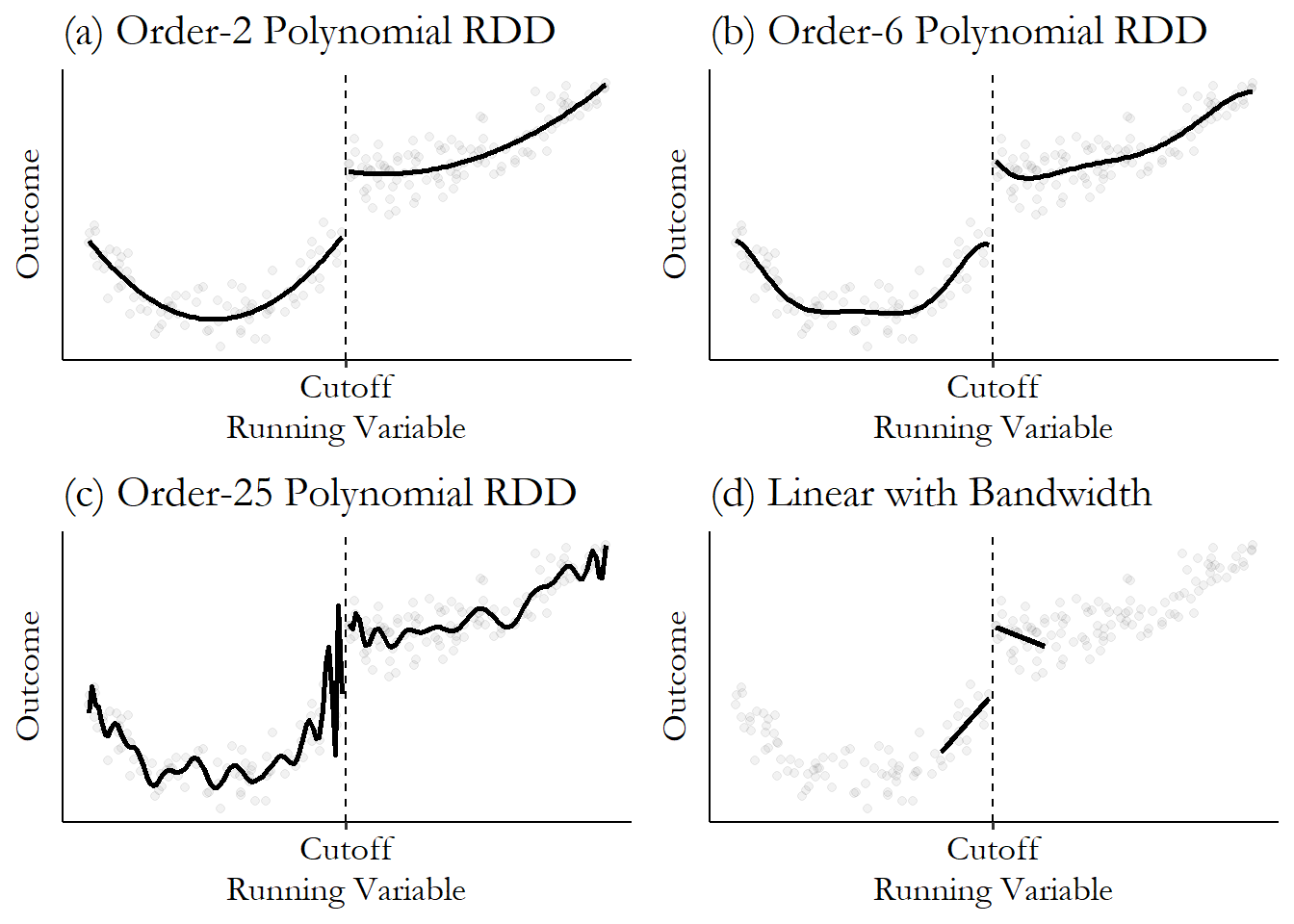
Because the data is simulated, I can tell you that the true effect is .15 and the true model is an order-2 polynomial. The linear model gives an effect of .29. The second, sixth, and 25th-order polynomial models give .17, .26, and… even if that 25th-order polynomial happened to get close to the true effect it would just be luck. Look how wild that curve is near the cutoff! Flexibility isn’t always so good.
Local regression. A regression that is fit differently for different values of the predictor variable, weighting observations based on how close they are to that value of the predictor.
Because of this problem, it’s not a great idea to go above the second-order term when performing regression discontinuity with ordinary least squares (Gelman and Imbens 2019Gelman, Andrew, and Guido W. Imbens. 2019. “Why High-Order Polynomials Should Not Be Used in Regression Discontinuity Designs.” Journal of Business & Economic Statistics 37 (3): 447–56.). If there’s a complex shape that needs fitting, instead try limiting the range of the data with a bandwidth and use a simpler shape. All those twists and curves tend to go away when you zoom in close with a bandwidth, anyway, and a straight line may be just fine. This can be seen in Figure 20.7 (d), which gives an effect of .19, as compared to the true effect of .15. It did just about as well as the order-2 polynomial, but without having to use the knowledge that the true underlying model is order-2.
We can think of this “zoom-in-and-go-simple” approach as a local regression. A local regression is one that estimates the relationship between some predictor \(X\) and some outcome \(Y\) as normal, but allows that relationship to vary freely across the range of \(X\).623 Local regression is also known as a form of “non-parametric regression” since it does not force a given shape on the entire range of data. However, I will point out that it does force a shape on subsets of the data. So it’s more “less-parametric regression” if you ask me. Local regression of some kind is how most researchers choose to implement their regression discontinuity design, at least if they have a large sample.624 The flexibility and focus on the cutoff is the upside, but (as with nearly any time you toss out data or drop assumptions), by imposing less structure on the data you get less precision in your estimates. If the assumptions you’d need to impose would be very wrong, that’s a great tradeoff! But you’d better have lots of observations near the cutoff if you want to use local regression, or else the estimate isn’t going to be precise enough to use.
Kernel. A function that describes how values are weighted. In the context of local regression, it describes how they are weighted based on how close they are to the local value of interest.
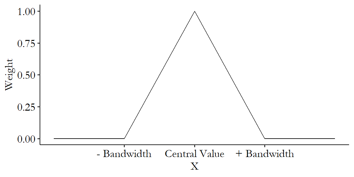
What local regression does in particular is: for each value of \(X\), say, \(X = 5\), it gets its estimate of \(Y\) by running its own special \(X = 5\) regression. This \(X = 5\) regression fits some sort of regression shape specific to \(X = 5\). How is it specific? When estimating the regression, it weights observations more heavily the closer they are to \(X = 5\). The specific form of weighting is called the kernel. Sometimes the kernel is a cutoff - the weight is 1 if you’re close and 0 if you’re too far away. Other times it’s more gradual - your weight goes down and down the farther you get until finally, slowly, you reach zero. A very commonly-used kernel in regression discontinuity is the triangular kernel, which in Figure 20.8 looks just like it sounds - a full weight right at the value you’re looking at, and a linearly declining weight as you move away, until you get to 0 at a certain point. That point is the “bandwidth” - i.e., how far away you can get and still count. This draws a neat lil’ triangle.
Figure 20.8: Example of a Triangular Kernel Weight Function
Computationally, local regression takes a lot of computing firepower. But conceptually this is very simple. Just roll along that \(x\)-axis, making a bunch of new regressions along the way based on the observations closest at hand at the time. Then predict values from it, and that’s your curve.
What kind of regression should be run at each point, though?
We might just take the average instead of running a regression, in which case we end up with kernel regression. Kernel regression can give us problems in the case of regression discontinuity, especially if there’s any sort of trend in the outcome in the lead-up to the cutoff. Since it’s just taking the average, it tends to flatten out the trend, leading to an at-the-cutoff prediction that attributes some of the trend that’s really there to the jump at the cutoff. Figure 20.9 shows an exaggerated example of how this can occur. Notice that the prediction to the left of the cutoff is way lower than all the actual data, because it’s missing the upward trend.
Figure 20.9: Regression Discontinuity with Means at the Cutoff
More commonly, in application to regression discontinuity, we’ll do local regression, the most common form of which is LOESS, which we already discussed in Chapter 4 on “Describing Relationships,” and earlier in this chapter in Figure 20.2. Instead of taking a local mean, LOESS estimates a linear (“local linear regression”) or second-order polynomial (“local polynomial regression” or “local quadratic regression”) regression at each point.
The local regression approach allows for the relationship between \(X\) and \(Y\) to not be totally flat. Depending on how curvy it is, the linear or second-order polynomial function we’ve chosen might not be quite enough to capture the relationship. However, since we’ve zoomed in so far, it’s unlikely that anything will be that highly nonlinear over such a narrow range of the \(x\)-axis.
Of course, given our plans to use local regression, we don’t actually have to do anything special. While applying a local regression estimator across the whole range of the data will give us a great idea of what the overall relationship between running variable and outcome is, if we’re just interested in estimating regression discontinuity, well… we’re only really interested in two local points - just to the left of the cutoff, and just to the right. So if we estimate a regular-ol’ interacted linear regression like in Equation (20.1) (for local linear regression) or Equation (20.3) (for local polynomial regression), but with a bandwidth (or perhaps some weighting for a slow-fade-out kernel), we’ve got it.
Let’s code up some regression discontinuity! I’m going to do this in two ways. First, I’m going to run a plain-ol’ ordinary least squares model with a bandwidth and kernel weight applied, with heteroskedasticity-robust standard errors. However, there are a number of other adjustments we’ll be talking about in this chapter, and it can be a good idea to pass this task off to a package that knows what it’s doing. So we’ll be using those specialized commands as well, and I’ll talk later about some of the extra stuff they’re doing for us.
For this example we’re going to use data from Government Transfers and Political Support by Manacorda, Miguel, and Vigorito (2011Manacorda, Marco, Edward Miguel, and Andrea Vigorito. 2011. “Government Transfers and Political Support.” American Economic Journal: Applied Economics 3 (3): 1–28.). This paper looks at a large poverty alleviation program in Uruguay which cut a sizeable check to a large portion of the population.625 The Plan de Atención Nacional a la Emergencia Sociál, or PANES. These were big payments, too - about $70 per month, which is about half what the typical beneficiary had been earning beforehand. On top of that, anyone with kids got a food card. There were some other goodies too. They are interested in whether receiving those funds made people more likely to support the newly-installed center-left government that sent them.
Who got the payments? You had to have an income low enough. But they didn’t exactly use income as a running variable; that might have been too easy to manipulate. Instead, the government used a bunch of factors - housing, work, reported income, schooling - and predicted what your income would be from that. Then, the predicted income was the running variable, and treatment was assigned based on being below a cutoff. About 14% of the population ended up getting payments.
The researchers polled a bunch of people near the income cutoff to check their support for the government afterwards. Did people just below the income cutoff support the government more than those just above?
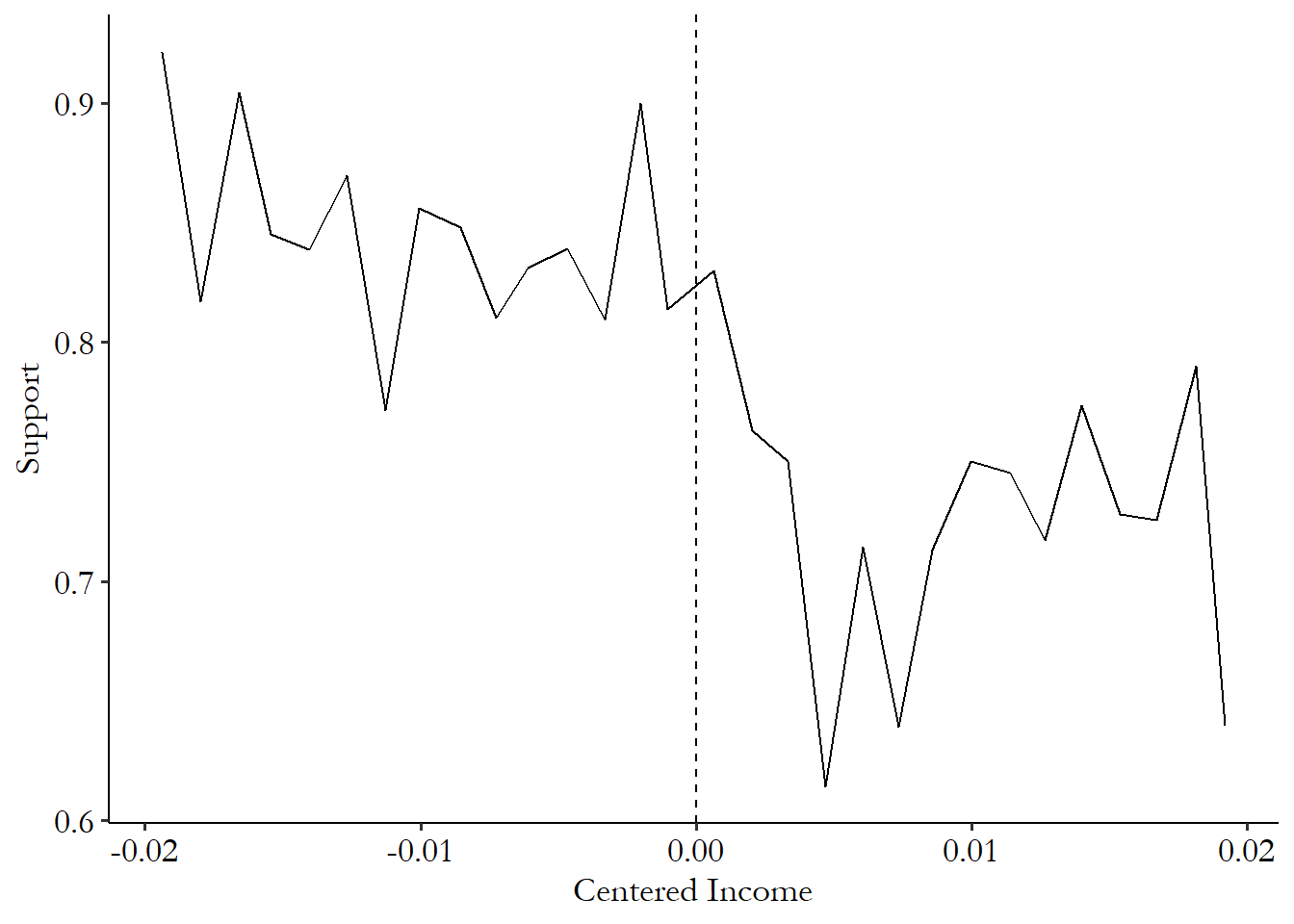
The data set we have on government transfers comes with the predicted-income variable pre-centered so the cutoff is at zero. Then, support for the government takes three values: you think they’re better than the previous government (1), the same (1/2) or worse (0). The data only includes individuals near the cutoff - the centered-income variable in the data only goes from -.02 to .02.626 Some of the results here will differ slightly from the original paper so as to simplify the data-preparation process or highlight some potential things you could do that they didn’t.
Before we estimate our model, let’s do a nearly-compulsory graphical regression discontinuity check so we can confirm that there does appear to be some sort of discontinuity where we expect it.627 Have you noticed how many graphs there are in this chapter? RDD is a lovingly visual design. This is a “plot of binned means.” There are some pre-programmed ways to do this like rdplot in the rdrobust package (all three languages) or binscatter in Stata from the binscatter package, but this is easy enough that we may as well do it by hand and flex those graphing muscles.
For one of these graphs, you generally want to (1) slice the running variable up into bins (making sure the cutoff is the edge between two bins), (2) take the mean of the outcome within each of the bins, and (3) plot the result, with a vertical line at the cutoff so you can see where the cutoff is. Then you’d generally repeat the process with treatment instead of the outcome to produce a graph like Figure 20.3.
R Code
library(tidyverse)
gt <- causaldata::gov_transfers

# Use cut() to create bins, using breaks to make sure it breaks at 0
# (-15:15)*.02/15 gives 15 breaks from -.02 to .02
binned <- gt %>%
    mutate(Inc_Bins = cut(Income_Centered,
           breaks = (-15:15)*(.02/15))) %>%
    group_by(Inc_Bins) %>%
    summarize(Support = mean(Support),
    Income = mean(Income_Centered))
# Taking the mean of Income lets us plot data roughly at the bin midpoints

ggplot(binned, aes(x = Income, y = Support)) +
    geom_line() +
    # Add a cutoff line
    geom_vline(aes(xintercept = 0), linetype = 'dashed')
Stata Code
causaldata gov_transfers.dta, use clear download

* Create bins. 15 bins on either side of the cutoff from
* -.02 to .02, plus 0, means we want "steps" of...
local step = (.02)/15
egen bins = cut(income_centered), at(-.02(`step').02)

* Means within bins
collapse (mean) support, by(bins)

* And graph with a cutoff line
twoway (line support bins) || (function y = 0, horiz range(support)), ///
 xti("Centered Income") yti("Support")
Python Code
import pandas as pd
import numpy as np
import matplotlib.pyplot as plt
import seaborn.objects as so
from causaldata import gov_transfers
d = gov_transfers.load_pandas().data

# cut at 0, and 15 places on either side
edges = np.linspace(-.02,.02,31)
d['Bins'] = pd.cut(d['Income_Centered'], bins = edges)

# Mean within bins
binned = d.groupby(['Bins']).agg('mean')

# And plot
fig = plt.figure()
(so.Plot(binned, x = 'Income_Centered', y = 'Support')
 .on(fig).add(so.Line()).plot())
fig.axes[0].axvline(0)
A little extra theming gets us Figure 20.10.628 Specifically from the R version, as with all the graphs in this book I added the theme_pubr() theme from ggpubr, and some additional text options in the theme function. It’s very much worth your time and effort to learn how to use the graphing package of your choice to make graphs look nice. There’s definitely a break at the cutoff there, and some higher support to the left of the cutoff (treatment is to the left here since you need low income to get paid) that isn’t what we’d expect by following the trend on the right of the cutoff.
Figure 20.10: Government Support by Income with Policy Cutoff
Now that we have our graph in mind, we can actually estimate our model. We’ll start doing it with OLS and a second-order polynomial, and then we’ll do a linear model with a triangular kernel weight, limiting the bandwidth around the cutoff to .01 on either side. The bandwidth in this case isn’t super necessary - the data is already limited to .02 on either side around the cutoff - but this is just a demonstration.
It’s important to note that the first step of doing regression discontinuity with OLS is to center the running variable around the cutoff. This is as simple as making the variable \(RunningVariable - Cutoff\), translated into whatever language you use. The second step would then be to create a “treated” variable \(RunningVariable < Cutoff\) (since treatment is applied below the cutoff in this instance). But in this case, the running variable comes pre-centered (\(IncomeCentered\)) and the below-cutoff treatment variable is already in the data (\(Participation\)), so I’ll leave those parts out.
R Code
library(tidyverse); library(modelsummary)
gt <- causaldata::gov_transfers

# Linear term and a squared term with "treated" interactions
m <- lm(Support ~ Income_Centered*Participation +
       I(Income_Centered^2)*Participation, data = gt)

# Add a triangular kernel weight
kweight <- function(x) {
    # To start at a weight of 0 at x = 0, and impose a bandwidth of .01,
    # we need a "slope" of -1/.01 = 100,
    # and to go in either direction use the absolute value
    w <- 1 - 100*abs(x)
    # if further away than .01, the weight is 0, not negative
    w <- ifelse(w < 0, 0, w)
    return(w)
}

# Run a linear version of the but with the weight
mw <- lm(Support ~ Income_Centered*Participation, data = gt,
         weights = kweight(Income_Centered))

# See the results with heteroskedasticity-robust SEs
msummary(list('Quadratic' = m, 'Linear with Kernel Weight' = mw),
    stars = c('*' = .1, '**' = .05, '***' = .01), vcov = 'robust')
Stata Code
causaldata gov_transfers.dta, use clear download

* Include the running variable, its square (by interaction with itself)
* and interactions of both with treatment, and robust standard errors
reg support i.participation##c.income_centered##c.income_centered, robust

* Create the triangular kernel weight. To start at a weight of 0 at x = 0,
* and impose a bandwidth of .01, we need a "slope" of -1/.01 = 100
* and to go in either direction use the absolute value
g w = 1 - 100*abs(income_centered)
* if further away than .01, the weight is 0, not negative
replace w = 0 if w < 0

reg support i.participation##c.income_centered [aw = w], robust
Python Code
import numpy as np
import statsmodels.formula.api as smf
from causaldata import gov_transfers
d = gov_transfers.load_pandas().data

# Run the polynomial model
m1 = smf.ols('''Support~Income_Centered*Participation +
I(Income_Centered**2)*Participation''', d).fit()

# Create the kernel function
def kernel(x):
    # To start at a weight of 1 at x = 0,
    # and impose a bandwidth of .01, we need a "slope" of -1/.01 = 100
    # and to go in either direction use the absolute value
    w = 1 - 100*np.abs(x)
    # if further away than .01, the weight is 0, not negative
    w = np.maximum(0,w)
    return w

# Run the linear model with weights using wls
m2 = smf.wls('Support~Income_Centered*Participation', d,
weights = kernel(d['Income_Centered'])).fit()

m1.summary()
m2.summary()
From this, we get the results in Table 20.1. In the second-order polynomial model, our estimate is that receiving payments increased support for the government by 9.3 percentage points - not bad!629 Using the specific methods from the original paper, their estimates were more like 11 to 13 percentage points. The version with the kernel weight shows a statistically insignificant effect of 3.3 percentage points. The first model is more plausible to me - the bandwidth was already fairly narrow since the data only included observations near the cutoff anyway, so limiting the data further isn’t necessary. You can also see the reduction in sample size from 1948 to 937 - this occurs because it’s not counting anyone who gets a weight of 0 as being a part of the sample. The potential for reduced bias (by taking fewer people farther from the cutoff) comes with the price of a reduced sample and less precision.
| Quadratic | Linear with Kernel Weight | |
|---|---|---|
| Constant | 0.769*** | 0.819*** |
| (0.034) | (0.015) | |
| Income (Centered) | −11.567 | −23.697*** |
| (8.101) | (3.219) | |
| Participation | 0.093** | 0.033 |
| (0.044) | (0.021) | |
| Income (Centered) x Participation | 19.300* | 26.594*** |
| (10.322) | (4.433) | |
| Income (Centered) Squared | 562.247 | |
| (401.982) | ||
| Income (Centered) Squared x Participation | −101.103 | |
| (502.789) | ||
| Num.Obs. | 1948 | 937 |
| R2 | 0.036 | 0.041 |
| RMSE | 0.31 | 0.34 |
| Std.Errors | HC3 | HC3 |
| * p < 0.1, ** p < 0.05, *** p < 0.01 |
Now that we have our by-hand version down, we can try things out using some pre-packaged commands, both for estimating the model effects and for making regression discontinuity-style plots. For all three languages, there is the rdrobust package, which is a part of the “RD packages” universe that contains a bunch of useful tools I’ll be including throughout this chapter.630 See https://rdpackages.github.io/, and the many econometrics papers cited therein.
The rdrobust function in the rdrobust package does a few things for us. First, we don’t have to choose the bandwidth. It will do an optimal bandwidth selection procedure for us. More on how that works in the “How the Pros Do It” section.
Second, it will properly implement local regression with your polynomial order of choice (linear by default) and a triangular kernel.
Third, as implied by the name, it will apply heteroskedasticity-robust standard errors. Specifically, it uses a robust standard error estimator that takes into account the structure of the regression discontinuity problem. It looks for each observation’s nearest neighbors along the running variable, and uses that information to figure out the amount of heteroskedasticity and how to correct for it.
Fourth, it applies a bias correction. Methods for optimal bandwidth choice tend to select bandwidths that are wide, so as to help increase the effective sample size and improve precision. However, estimates of standard errors rely on our idea of what the distribution of the error term is. And those wide bandwidths futz up what those distributions look like. So there is a method here to correct for that bias, improving the estimate of the standard error. More on this in the “How the Pros Do It” section.
R Code
library(tidyverse); library(rdrobust)
gt <- causaldata::gov_transfers

# Estimate regression discontinuity and plot it
m <- rdrobust(gt$Support, gt$Income_Centered, c = 0)
summary(m)
# Note, by default, rdrobust and rdplot use different numbers
# of polynomial terms. You can set the p option to standardize them.
rdplot(gt$Support, gt$Income_Centered)
Stata Code
* STATA CODE
* If necessary: ssc install rdrobust
causaldata gov_transfers.dta, use clear download

* Run the RDD model and plot it. Note, by default,
* rdrobust and rdplot use different
* numbersof polynomial terms.
* You can set the p() option to standardize them.
rdrobust support income_centered, c(0)
rdplot support income_centered, c(0)
Python Code
import pandas as pd
from rdrobust import rdrobust, rdplot
from causaldata import gov_transfers
gt = gov_transfers.load_pandas().data

# Estimate regression discontinuity and plot it
m = rdrobust(gt['Support'], gt['Income_Centered'], c = 0)
print(m)
# Note, by default, rdrobust and rdplot use different numbers
# of polynomial terms. You can set the p option to standardize them.
rdplot(gt['Support'], gt['Income_Centered'])
If you run this code, you’ll find a fairly different rdrobust output as opposed to when we did it by hand. Results are insignificant and in the opposite direction of the original paper.631 Coefficients are positive, but it’s assuming that treatment is to the right of the cutoff, so this translates into a negative effect of being treated, which occurs here on the left of the cutoff. This comes down to rdrobust selecting a narrow bandwidth - if you force the bandwidth to be the entire range, as might be reasonable given how narrow it already is - you get results that are nearly identical to the quadratic-model results from Table 20.1. Making these decisions is hard! Just because we have a premade package doesn’t mean we can let it make all the decisions. Use that head of yours, and explore the options in the functions you use by reading the documentation.
20.2.2 Fuzzy Regression Discontinuity
How many treatments are there really that are completely determined by a cutoff in a running variable? Some, certainly. But we live in the real world. Even in cases where a policy is supposed to be assigned based on a cutoff, surely there might be a few people above or below who manage to get the “wrong” treatment. Forgetting that, there are plenty of scenarios where the policy isn’t necessarily supposed to be assigned based on a cutoff, but still for some reason the chances of treatment jump significantly at a cutoff. Perhaps you wanted to evaluate the effect of holding a high school degree on some outcome. The chances that you hold a high school degree jump significantly in the summer following your 18th birthday. But there are quite a few people who graduate at 17, or 19, or not in the summer, or never graduate at all. There’s a jump in the treatment rate at that summer cutoff, but it’s not from 0% to 100%. We can see how the treatment rate might look across the running variable in Figure 20.11.
Figure 20.11: An Example of Treatment Rates in a Fuzzy Regression Discontinuity
I already covered the basic concept in the “How Does It Work” section. But how can we actually implement a fuzzy regression discontinuity design?
We can figure it out by modifying the causal diagram we had in Figure 20.1. The only changes we need to account for is that there’s some other way for \(RunningVariable\) and \(Treatment\) to be related other than the cutoff, which is why we see changes in the treatment rate at non-cutoff points in Figure 20.11. We also might have some non-\(RunningVariable\) determinants of \(Treatment\).
Figure 20.12: A Causal Diagram That Fuzzy Regression Discontinuity Works For
We get our modified causal diagram in Figure 20.12.632 In this diagram, \(Z\) might represent a bunch of different variables here - it might even be different variables with arrows to \(RunningVariable\) and to \(Treatment\). The logic still holds up. What can we get out of this diagram?
Well, one thing to note is that the idea for identifying the effect is still basically the same. If we control for \(RunningVariable\), then there is no back door from \(AboveCutoff\) to \(Outcome\). By cutting out any variation driven by \(RunningVariable\) anywhere but the cutoff, we’re left only with variation that has no back doors and identifies the effect of \(Treatment\) on \(Outcome\).
The only real change is this: we can no longer simply limit the data to the area around the cutoff and call that a day on controlling for \(RunningVariable\). Doing that would lead us to understate the effect. If we’re only getting a jump in treatment rates of, say, 15 percentage points, then we should only expect to see 15% of the effect. We have to scale it back to the full size.
Thankfully, this can be done by applying instrumental variables, as in Chapter 19, using basically the same regression discontinuity equations as for the sharp RDD, like Equation (20.1) or Equation (20.3). Except these equations now become our second-stage equations. Our first stage uses \(AboveCutoff\) as an instrument for \(Treated\) (and interactions with \(AboveCutoff\) as instruments for the interactions with \(Treated\)).
This scales the estimate exactly as we want it to. In its basic form, instrumental variables divides the effect of the instrument on the outcome by the effect of the instrument on the endogenous/treatment variable.633 Because of those interactions we’re doing something not quite the same as the basic form, but the logic carries over very well. In other words, we’re scaling the effect of being above the cutoff on the outcome (i.e., what we’d get from a typical sharp-regression-discontinuity model) to account for the fact that being above the cutoff only led to a partial increase in treatment rates.
Just like with sharp regression discontinuity, we can implement fuzzy regression discontinuity in code either using our standard tools (the same instrumental variables estimators we used in Chapter 19), or specialized regression-discontinuity specific tools. Let’s do both here.
For this, we’ll be using data from Fetter (2013Fetter, Daniel K. 2013. “How Do Mortgage Subsidies Affect Home Ownership? Evidence from the Mid-Century GI Bills.” American Economic Journal: Economic Policy 5 (2): 111–47.). Fetter also gives us an opportunity to see regression discontinuity performed in a slightly less-clean setting. Fetter’s main question of interest is how much of the increase in the home ownership rate in the mid-century US was due to mortgage subsidies given out by the government.
How does he get at this question? He looks at people who were about the right age to be veterans of major wars like World War II or the Korean War. Anyone who was a veteran of these wars received special mortgage subsidies.
What does this have to do with regression discontinuity? There’s an age requirement to join the military. If you were born one year too late to join the military to fight in the Korean War, then you won’t get these mortgage subsidies (or at least far fewer veterans were eligible). Born just in time? You can join up and get subsidies! So there’s a regression discontinuity here based on birth year. Born just in time, or a bit too late?
Of course, not everybody born in a given year joins the military.634 Some wouldn’t be allowed. They weren’t taking a whole lot of women at the time, for example. But even among eligible men, not everyone would choose to enlist or end up drafted. So the “treatment” of being eligible for mortgage subsidies would only apply to some people born at the right time. Treatment rates jump from 0% to… above 0% but not 100%. That’s fuzzy!
And why do I say this is “less clean” than some of other examples? Because this isn’t an explicitly designed cutoff. There’s a lot more choice in terms of who gets treated, and, heck, some people were probably getting into the military underaged. We have to think very carefully here about whether we believe the assumptions necessary to use regression discontinuity. I think the design here is pretty reasonable, but my opinion on that is not as rock-solid as it might be for something for which the assignment of treatment had fewer moving parts.635 But limiting ourselves only to the cleanest analyses would leave us with a lot of stuff we couldn’t study at all.
The author also has to go through some checks and tests that someone with a simpler story might not have to. For example, while I won’t show it in the code below, he performs a placebo test by repeating the analysis using data from other eras, where veteran status wouldn’t have an effect on receiving mortgage subsidies, finding no effect at those times. You’re about to see the analysis include control variables for season of birth, race, and the US state in which they were born - controls generally aren’t necessary for sharp regression discontinuity, but it makes sense to include them here. If the design itself won’t do all the work for you, then geez I guess you’re gonna have to work a little harder.
Let’s code up the analysis. First we’ll do it ourselves using the instrumental variables code we used in Chapter 19. We’re using the running variable quarter of birth (qob), which has been centered on the quarter of birth you’d need to be eligible for a mortgage subsidy for fighting in the Korean War (qob_minus_kw). This determines whether you were a veteran of either the Korean War or World War II (vet_wwko). All of this is to see if veteran status (and its accompanying mortgage subsidies) affects your home ownership status (home_ownership) - remember, the goal here is looking for the effect of those mortgage subsidies. There are also controls for being white or nonwhite, and your birth state.
To keep things simple, we’ll apply a bandwidth before doing estimation, we’ll skip the kernel weighting, and we’ll just do a linear model. The code we did before for incorporating these things still works here, though, if you want to add them.
R Code
library(tidyverse); library(fixest); library(modelsummary)
vet <- causaldata::mortgages

# Create an "above-cutoff" variable as the instrument
vet <- vet %>% mutate(above = qob_minus_kw > 0)

# Impose a bandwidth of 12 quarters on either side
vet <- vet %>% filter(abs(qob_minus_kw) < 12)

m <- feols(home_ownership ~
    nonwhite + qob_minus_kw  | # Control for race and the running variable
    bpl + qob | # fixed effect controls
    vet_wwko + qob_minus_kw:vet_wwko ~ # Instrument our standard RDD
    above + qob_minus_kw:above, # with being above the cutoff
    se = 'hetero', # heteroskedasticity-robust SEs
    data = vet)
# NOTE the paper-published version of the book uses code that
# no longer works with newer versions of fixest.
# We now need to make interactions ourselves explicitly
# using ":" instead of "*" to include *just* the interaction term.
# qob_minus_kw is in as a control because it's in both the first
# and second stages of the model

# And look at the results
msummary(m, stars = c('*' = .1, '**' = .05, '***' = .01))
Stata Code
* We will be using ivreghdfe,
* which must be installed with ssc install ivreghdfe
* along with ftools, ranktest, reghdfe, and ivreg2
causaldata mortgates.dta, use clear download

* Create an above variable as an instrument
g above = qob_minus_kw > 0

* Impose a bandwidth of 12 quarters on either side
keep if abs(qob_minus_kw) < 12

* Regress, using above as an instrument for veteran status.
* Note that qob_minus_kw  by itself doesn't need instrumentation
* so we separate it. Usually I advise against it,
* but in this case this is easier if we just make our
* own interaction with g (generate)
g interaction_vet = vet_wwko*qob_minus_kw
g interaction_above = above*qob_minus_kw
ivreghdfe home_ownership nonwhite qob_minus_kw ///
    (vet_wwko interaction_vet = above interaction_above),  ///
    absorb(bpl qob) robust

* We can also use regular ol' ivregress but it will be slower
encode bpl, g(bpl_num)
ivregress 2sls home_ownership nonwhite qob_minus_kw i.bpl_num i.qob ///
    (vet_wwko interaction_vet = above interaction_above), robust
Python Code
import pandas as pd
from linearmodels.iv import IV2SLS
from causaldata import mortgages
d = mortgages.load_pandas().data

# Create an above variable as an instrument
# Apply a bandwidth of 12 quarters on either side
d = (d.assign(above = d['qob_minus_kw'] > 0)
     .query('abs(qob_minus_kw) < 12'))

# Now we estimate!
# Add nonwhite, bpl, qob controls
# and instrumnet for the vet_wwko interaction
# with the above-cutoff interaction
m = IV2SLS.from_formula('''home_ownership ~
nonwhite + C(bpl) + C(qob) +
[qob_minus_kw*vet_wwko ~ qob_minus_kw*above]''', data = d)

# With robust standard errors
m.fit(cov_type = 'robust')
These show that veteran status at this margin increases home ownership rates by 17 percentage points. Not bad. We could also apply the exact same regression discontinuity plot code from last time (there’s no special “fuzzy” plot, although now we’d call the typical regression discontinuity plot the “second stage” plot), and also apply that plot code using the treatment variable as an outcome (the “first stage”), to make sure that the assignment variable is working as expected. This gives us Figure 20.13.636 Another way to think about it is grabbing hold of both graphs at the top and bottom and stretching them taller until the jump in Figure 20.13 (a) goes from 0% to 100%. The jump you’d end up with in Figure 20.13 (b) is the fuzzy RDD estimate - it’s how much of a jump you’d expect if everybody went from untreated to treated (0% to 100%). It looks good! We definitely see a sharp change in the rate of eligible veterans around the cutoff, and we see a discontinuity in the rate of home ownership at the same point. The fuzzy RDD estimate is the jump at the cutoff in Figure 20.13 (b) divided by the jump at the cutoff in Figure 20.13 (a).
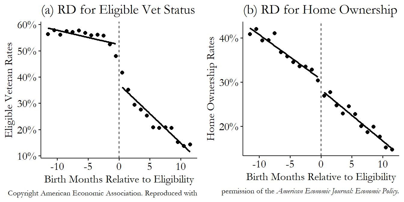
Figure 20.13: Eligibility for Mortgage Subsidies for being a Korean War Veteran and Home Ownership from Fetter (2013)
Next we can, as before, use the rdrobust function to do local polynomial regression, kernel weighting, easy graphs, all that good stuff. We just need to use vet_wwko as our “treatment status indicator” and give that to the fuzzy option.
R Code
library(tidyverse); library(rdrobust)
vet <- causaldata::mortgages

# It will apply a bandwidth anyway, but having it
# check the whole bandwidth space will be slow. So let's
# pre-limit it to a reasonable range of 12 quarters
vet <- vet %>%
    filter(abs(qob_minus_kw) <= 12)

# Create our matrix of controls
controls <- vet %>%
    select(nonwhite, bpl, qob) %>%
    mutate(qob = factor(qob))
# and make it a matrix with dummies
conmatrix <- model.matrix(~., data = controls)

# This is fairly slow due to the controls, beware!
m <- rdrobust(vet$home_ownership, vet$qob_minus_kw,
              fuzzy = vet$vet_wwko, c = 0,
              covs = conmatrix)

summary(m)
Stata Code
* This uses rdrobust, which must be installed with ssc install rdrobust
causaldata mortgages.dta, use clear download

* It will apply a bandwidth anyway, but having it
* check the whole bandwidth space will be slow. So let's
* pre-limit it to a reasonable range of 12 quarters
keep if abs(qob_minus_kw) <= 12

* And run rdrobust
rdrobust home_ownership qob_minus_kw, c(0) fuzzy(vet_wwko) covs(nonwhite bpl qob)
Python Code
import pandas as pd
from rdrobust import rdrobust
from causaldata import mortgages
vet = mortgages.load_pandas().data

# It will apply a bandwidth anyway, but having it
# check the whole bandwidth space will be slow. So let's
# pre-limit it to a reasonable range of 12 quarters
vet = vet.query('abs(qob_minus_kw) <= 12')

# Create our matrix of controls with dummies
controls = pd.concat([d[['nonwhite']],
                  pd.get_dummies(d[['bpl']])], axis = 1)

d['qob'] = pd.Categorical(d['qob'])
# Drop one since we already have full rank with bpl
# (we'd also drop_first with bpl if we did add_constant)
controls = pd.concat([controls, pd.get_dummies(d[['qob']],
                  drop_first = True)], axis = 1)

# As of this writing, actually adding those controls is
# unworkably slow. But maybe by the time you read this
# you can add them with covs = controls
m = rdrobust(vet['home_ownership'], vet['qob_minus_kw'],
              fuzzy = vet['vet_wwko'], c = 0)
print(m)
It’s not included in the code, but we could easily apply rdplot (and maybe apply it with the treatment as the dependent variable as well, just to make sure it looks like we expect).
The rdrobust estimate is quite different from the linear instrumental variables estimate we did earlier, with veteran status increasing home ownership rates by 51.8 percentage points, as opposed to 17.0! That’s quite a difference. It’s useful to know when estimation methods differ like this. Which should we trust? Well, let’s think through why they differ: rdrobust uses a second-order polynomial rather than a linear regression, it uses local regression, and it uses a narrower bandwidth (it picks 3.39 birth quarters on either side of the cutoff, rather than 12).
Our first step in thinking which to trust would have to ask if one of the models is making assumptions that are much more likely to be accurate. These are the sorts of things you’d have to defend when describing your research design. If we think linearity is reasonable, for example, then the linear model might be less noisy and a more precise estimate than the second-order polynomial. Does Figure 20.13 look linear? If we think that the wider bandwidth is likely to contain too many noncomparable people, then we might think the narrower bandwidth is better. Do we think 12 months on either side of the cutoff is too far away to be comparable?
Often these days, researchers performing regression discontinuity will see how sensitive the estimate is to different bandwidths, running the model many times and reporting how the effect changes, letting the reader of the study think about how close to the cutoff things should be limited.637 In general, for any parameter you have to pick for your analysis, like a bandwidth, it’s not a terrible idea to try a few different ones and report how the results change. Maybe it doesn’t change much, which is reassuring. Or maybe it does, and that’s still good to know, and honest to report. The Bana, Bedard, and Rossin-Slater (2020Bana, Sarah H., Kelly Bedard, and Maya Rossin-Slater. 2020. “The Impacts of Paid Family Leave Benefits: Regression Kink Evidence from California Administrative Data.” Journal of Policy Analysis and Management 39 (4): 888–929.) paper I discuss in the “Regression Kink” section does this.
20.2.3 Placebo Tests
The astonishing thing about regression discontinuity is that it closes all back doors, even the ones that go through variables we can’t measure. That’s the whole idea - since we’re isolating variation in such a narrow window of the running variable, it’s pretty plausible to claim that the only thing changing at the cutoff is treatment, and by extension anything that treatment affects (like the outcome).
Even more convenient is that this extremely-nice result from regression discontinuity gives us a fairly straightforward way to test if it’s true. Simply run your regression discontinuity model on something that the treatment shouldn’t affect. Anything we might normally use as a control variable should serve for this purpose.638 As long as it’s not something that treatment should affect. But then, we know from Chapter 8 that we wouldn’t usually want to control for something treatment would affect anyway. If we do find an effect, our original regression discontinuity design might not have been quite right. Perhaps things weren’t as random at the cutoff as we’d like, for some reason.
There’s not too much to say here. The equations, code, everything is the exact same for this test as for regular regression discontinuity. We just swap out the actual outcome variable for some other variable that the treatment shouldn’t affect. In many cases we can try it with a long list of variables that might serve as control variables.
Figure 20.14 shows this test with two variables from the Government Transfers and Political Support paper. No effects here! Exactly what we were hoping for.
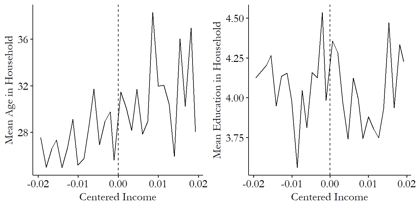
Figure 20.14: Performing Regression Discontinuity with Controls as Outcomes for a Placebo Test
One important thing to keep in mind with these placebo tests is that, since you can run them on a long list of potential placebo outcomes, you’re likely to find a few nonzero effects just by random chance. It happens. If you test a long list of variables and find a few differences, that’s not a fatal problem with your design. In these cases, you may want to add the variables with the failed placebo tests to the model as control variables. Adding controls can be tricky if you’re using local regression, but there are methods for doing it (Calonico et al. 2019Calonico, Sebastian, Matias D. Cattaneo, Max H. Farrell, and Rocio Titiunik. 2019. “Regression Discontinuity Designs Using Covariates.” Review of Economics and Statistics 101 (3): 442–51.), and pre-packaged regression discontinuity commands often incorporate them.
20.2.4 The Density Discontinuity Test
For regression discontinuity to work, we need a situation where people just on either side of the cutoff are effectively randomly assigned to treatment. That won’t happen if someone’s thumb is on the scale!
There are two ways manipulation could happen. First, whoever (or whatever) is in charge of setting the cutoff value might do so with the knowledge of exactly who it will lead to getting treated. Imagine the track and field coach during tryouts who conveniently decides that anyone on the team must run a mile in 5 minutes and 37 seconds or better just after his son clocks in at 5 minutes and 35 seconds.
Second, individuals themselves might have some control over their running variable. Sometimes they have direct control - if my local supermarket offers me a discounted price on tuna when I buy 12 or more cans, then I can choose exactly what my running variable (number of cans of tuna I buy) is, and it’s not really plausible to say that someone buying 12 cans is comparable to someone buying 11 so I can identify the effect of the discount.
More often, they have indirect control - if I’m trying out for that track-and-field team, I can decide to take it easy or push myself really hard to run faster. Or maybe the person keeping time really likes me and decides to shave a few seconds off of the time they write down for me. This is a problem if we have indirect control and also know what the cutoff is. If I know the cutoff is 5:37 and I usually run a 5:40, I know I have to push extra hard to get a chance at the team and so will try very hard, whereas someone who normally runs 4:30 would just take it easy. Or maybe the person keeping time might see that I actually ran a 5:38, and figure I came so close it wouldn’t hurt to cheat a little and write down 5:36 instead so I can get on the team. The person who runs 6:30 isn’t likely to get a whole minute chopped off, though; that would be too much to ask.
In all of these cases, we want to be sure we understand how the running variable is determined. Are we in a cans-of-tuna situation? A slyly-choose-the-cutoff situation? A situation where we know the cutoff and may manipulate our behavior for it? For any of these, we may be worried that manipulation of the cutoff, or of the running variable near the cutoff, makes people on either side incomparable. If my friendly run-timer shaves off a few seconds for me so I get on the team, but not for Denny who also runs a 5:38 but the run-timer doesn’t like,639 Denny probably had it coming. then treatment assignment wasn’t random, it was based on who the run-timer liked, which has all sorts of back doors.
In the case of indirect control we do have a test we can perform to check whether manipulation seems to be occurring at the cutoff. Conceptually, it’s very simple. We just look at the distribution of the running variable around the cutoff. It should be smooth, as we might expect if the running variable were being randomly distributed without regard for the cutoff.
But if we see a distribution that seems to have a dip just to one side of the cutoff, with those observations sitting just on the other side, that looks a lot like manipulation. If you looked at the run times at track-and-field tryouts and there was only Denny with a time anywhere from 5:38 to 5:45, but ten people just a second or two below the cutoff, that looks pretty fishy! That run-timer seems to be up to no good.
The idea of putting this intuition into action comes from McCrary (2008McCrary, Justin. 2008. “Manipulation of the Running Variable in the Regression Discontinuity Design: A Density Test.” Journal of Econometrics 142 (2): 698–714.), although there have been improvements to the basic idea since then, with better density estimation and power. While, just like with nearly everything else in this book, these tests continue to evolve for better performance in certain situations (for example, see Bugni and Canay (2021Bugni, Federico A., and Ivan A. Canay. 2021. “Testing Continuity of a Density via g-Order Statistics in the Regression Discontinuity Design.” Journal of Econometrics 221 (1): 138–59.)), the instructions in the code below are for Cattaneo, Jansson, and Ma (2020Cattaneo, Matias D., Michael Jansson, and Xinwei Ma. 2020. “Simple Local Polynomial Density Estimators.” Journal of the American Statistical Association 115 (531): 1449–55.).
The McCrary plan is this:
- Calculate the density distribution of the treatment variable
- Allow that density to have a discontinuity at the cutoff
- See if there is a significant discontinuity at the cutoff
- Also, plot the density distribution and look at it, and see if it looks like there’s a discontinuity
A big discontinuity is not a good sign. It implies manipulation.
We can code up a density test using pre-packaged commands. The code will still use the example data from Government Transfers and Political Support.
Before running our code, we can ask ourselves about the potential for manipulation here. The government assigned treatment on the basis of not just one characteristic, but a sum of a whole bunch of things. It determined that process before knowing exactly who would qualify (making it hard for the government to manipulate). The whole process wasn’t fully obvious (making it hard for people to manipulate), and it would be difficult to know beforehand exactly how close to the cutoff you were (making it hard to know if you should bother trying to manipulate).
So it seems unlikely that this particular study will show evidence of manipulation. But you never know! Let’s see. This test uses a slightly expanded version of the data including people who weren’t surveyed at the right time to be included in the study, and those outside the bandwidth used in estimation (so we limit to the bandwidth ourselves).
R Code
Stata Code
Python Code
As expected, we find no statistically significant break in the distribution of income at the cutoff. Hooray!
Of course, we are more interested in seeing whether our assumption of no manipulation is plausible than we are in seeing whether we can reject it to a statistically significant degree. Does it pass the sniff test? We can check this by plotting the distribution of the (binned) running variable, as in Figure 20.15. It certainly doesn’t look like there’s any sort of discontinuity in the distribution at the cutoff. You can make a very similar graph to this one with rdplotdensity in the rddensity package in R or Python. In Stata it’s a plot option on the regular rddensity command.
Figure 20.15: Distribution of the Binned Running Variable
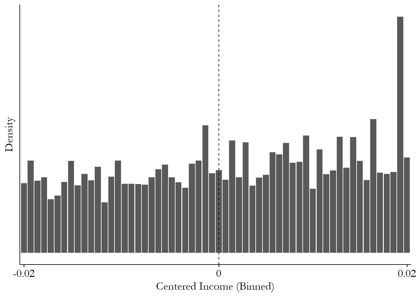
What can we do if we find manipulation? There are ways to estimate a range of plausible effect estimates that allow for a little bit of manipulation. See the final section of Chapter 21.
20.3 How the Pros Do It
20.3.1 Regression Kink
Regression discontinuity looks for a change in the mean outcome at the cutoff. Why not look for a change in something else? Why not, indeed? You could theoretically look for a change in just about anything. Why not a change in the standard deviation of the outcome? Or the median? Or an \(R^2\) of a regression of the outcome on a whole bunch of predictors?640 Each of these would require some careful thought about how exactly to estimate them, but conceptually they should work. I went looking to see if a finance paper has ever used the standard deviation version of regression discontinuity and was surprised not to find one. There’s an opportunity for you finance students out there. (Or perhaps I just didn’t look hard enough.)
The most common “other thing” to look at, though, is a change in the slope of the relationship between the outcome and the running variable. The treatment administered at the cutoff doesn’t make the outcome \(Y\) itself change/jump - instead, the treatment changes the strength of the relationship between \(Y\) and \(RunningVariable\). The resulting graph might look something like Figure 20.16 - no jump at the cutoff, but there’s sure something happening.
Figure 20.16: A Regression Kink on Simulated Data
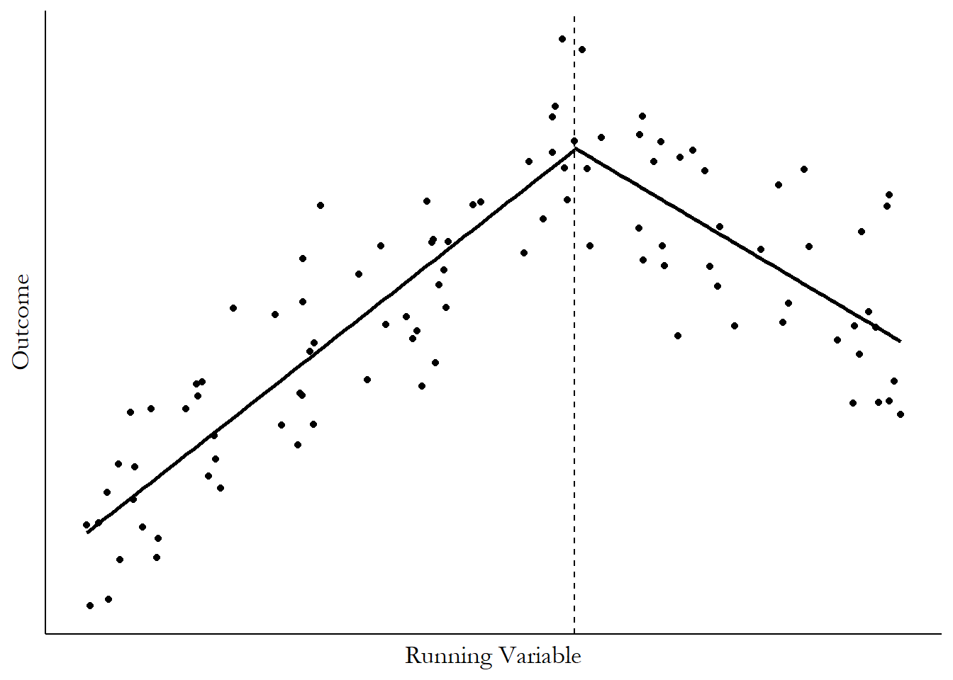
Why might a treatment change the relationship? There are two main ways it might pop up. One might be that a treatment literally changes the relationship. For example, say we were running a regression discontinuity with time as our running variable,641 In other words, an event study as in Chapter 17. The design mentioned here would be ill-advised as it doesn’t really satisfy all the event study assumptions from Chapter 17, but it still works to get the idea across. and the amount of employment in tech companies as the outcome. Then, at a particular time (our cutoff), a new policy goes into place that encourages more investment in tech companies. We wouldn’t see tech employment rise right away (no jump), but we’d expect tech employment to start increasing more quickly than it did before (increase in the slope).
A more common application of regression kink is when treatment itself has a kink, like Figure 20.16 but with “Treatment level/rate” on the \(y\)-axis instead of “Outcome.” Lots of government policies work this way. Take unemployment insurance, for example, which is a common regression kink application. I’ll cite Card et al. (2015Card, David, David S. Lee, Zhuan Pei, and Andrea Weber. 2015. “Inference on Causal Effects in a Generalized Regression Kink Design.” Econometrica 83 (6): 2453–83.) as one example of many, picking it largely because I was already going to cite it for another reason below. They look at data from Austria, where unemployment insurance benefits are 55% of regular earnings, up to the point where you hit the maximum amount of generosity, and then you get no more. So your regular earnings (running variable) positively affect the amount of unemployment insurance you get (treatment), up to the cutoff, at which point the effect of regular earnings on your unemployment insurance payment becomes zero.
So if you think, for example, that more-generous unemployment benefits make people take longer to find a new job, then you should expect to find a positive relationship between your regular earnings (running variable) and time-to-find-a-new-job (outcome) up to the point of the cutoff, and then it should be flat after the cutoff. That’s exactly what they found.
One example of treatment-has-a-kink regression kink design is in Bana, Bedard, and Rossin-Slater (2020Bana, Sarah H., Kelly Bedard, and Maya Rossin-Slater. 2020. “The Impacts of Paid Family Leave Benefits: Regression Kink Evidence from California Administrative Data.” Journal of Policy Analysis and Management 39 (4): 888–929.). They look at the impact of paid family leave in California. Paid family leave is a policy where pregnant mothers can take an extended paid time off of work so they can, you know, give birth and care for a newborn without having to reply to emails. In California, the state pays 55% of regular earnings up to a maximum benefit amount. So the paid family leave payment (treatment) increases with regular earnings (running variable), until you get to the level of earnings (cutoff) where you’re being paid the maximum benefit amount. After that, additional regular earnings don’t increase your family leave payment. The setup is very similar to the unemployment insurance case I discussed from Card et al. (2015Card, David, David S. Lee, Zhuan Pei, and Andrea Weber. 2015. “Inference on Causal Effects in a Generalized Regression Kink Design.” Econometrica 83 (6): 2453–83.), down to the 55% reimbursement rate, coincidentally.
The first thing to check is whether or not they actually see a change in the slope of treatment at the cutoff, and they definitely do. Figure 20.17 shows the average amount of paid family leave received in the sample based on the base-period earnings that their benefits were figured on. Even without a regression line slapped on top of it, that looks like a change in slope to me.
Figure 20.17: Paid Family Leave Benefits (Treatment) and Pre-Leave Earnings (Running Variable) from Bana, Bedard, and Rossin-Slater (2020)
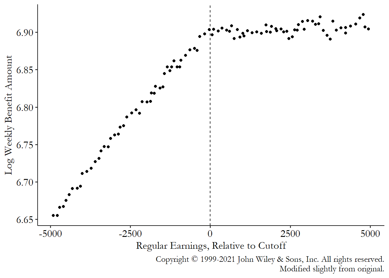
Next we can replace treatment on the \(y\)-axis with some outcomes to see whether those outcomes also change slope. If they do, that’s evidence of an effect.642 Then, you can divide the change in slope you see in the outcome by the change in slope you see in treatment, i.e., run instrumental variables, to get the effect of treatment. They look at a number of outcomes in their paper, but I’ve specifically picked out two: how long the mothers stay on family leave, and whether they use family leave again in the next three years, conditional on going back to work. I’ve picked these two because you can see an effect on one of them, but no effect on the other, shown in Figure 20.18.
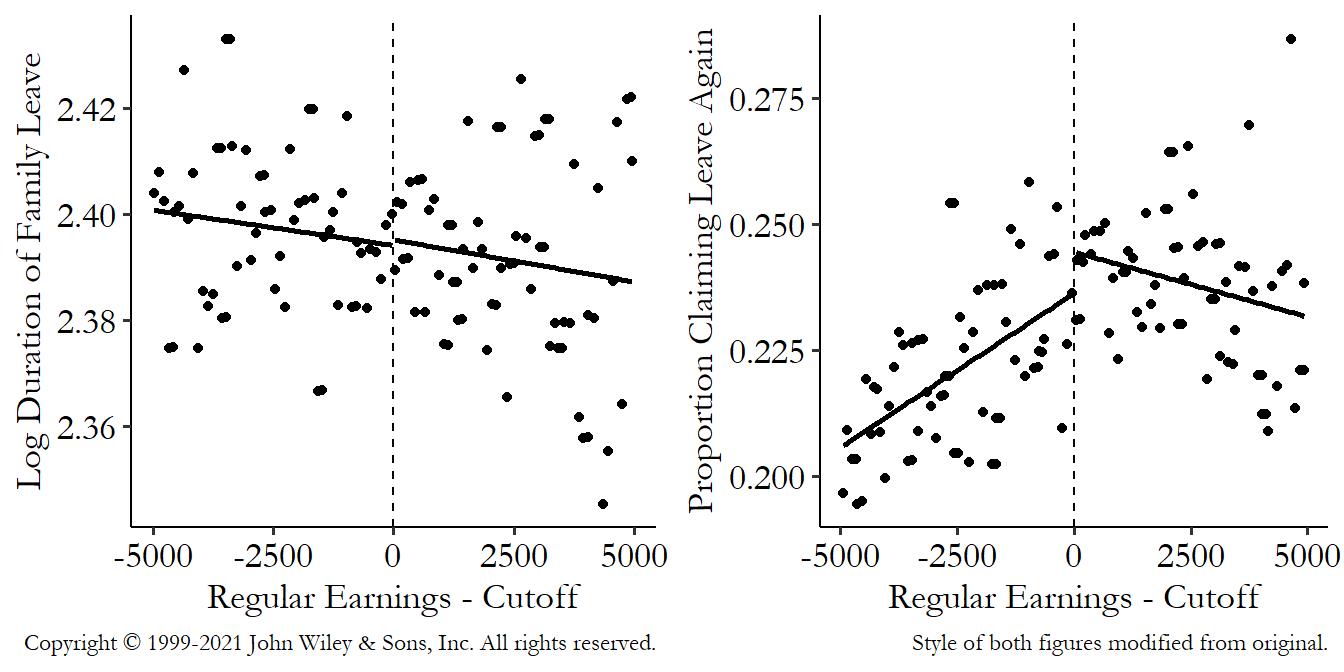
Figure 20.18: Log Leave Duration or Proportion Claiming Leave Again (Outcomes) and Pre-Leave Earnings (Running Variable) from Bana, Bedard, and Rossin-Slater (2020)
What do we see in Figure 20.18? On the left we see basically nothing. No change in slope at the cutoff at all! This tells us that additional family leave payments didn’t affect how long the family leave ends up being - if it did, we’d expect the slope to change when the payments stopped increasing. In contrast, on the right, there’s a big change in slope at the cutoff. This tells us that bigger leave payments do increase the chances of claiming family leave again (i.e., having another kid), since the chance of doing so is increasing while benefits are increasing, but then that stops as soon as the benefit increases stop.
The graph on the right doesn’t just change slope though; it jumps! What can we make of that? Uh-oh, that might be a cause for concern. Treatment didn’t jump; it just changed slope. So if the outcome jumps, rather than just changing slope, that implies that an assumption may be wrong.
Or at least it would be if that’s what the original paper actually found. In the original paper there was no jump at all, just a nice change in slope. I just did regular ol’ straight-lines-on-either side, but they did some stuff that was a little fancier.643 Their model doesn’t actually allow for the jump, forcing it away. But they include several other details in estimation that make that assumption reasonable. In any case, the jump isn’t big enough to be convincingly nonzero. I just included it myself to have a reason to talk about this, and to emphasize the importance of gut-checking your results.
Actually performing a regression kink isn’t too hard once you have the concept of regression discontinuity down. You’re just adding one layer of complexity on top of that. Most of the stuff I already covered still applies here - kernels, bandwidths, polynomials, local regression, and whatnot. The same placebos largely apply - there shouldn’t be a change in the slope if you estimate the regression kink model with a control variable as the outcome, for example, and you’ll want to make sure the running variable isn’t discontinuous at the cutoff. The code doesn’t change much - just set the deriv (which “deriv”ative of the regression equation do you want) option to 1 in your rdrobust code.
Even the underlying regression equation isn’t changing much. The idea is that you’re still just estimating a line to the left and right of the cutoff, just like way back in Equation (20.1):
There is sometimes a difference in the equation: some researchers will allow a slope change but not allow any sort of jump, i.e., dropping \(Treated\) by itself from the model, setting \(\beta_2 = 0\). Dropping \(Treated\) helps reduce the influence of noise around the cutoff (and regression kink can use the noise-reducing help), although if there actually should be a jump there you wouldn’t notice it.644 You could estimate it once allowing for the jump to see if it’s there, and if it’s nothing major, estimate it without the jump to improve precision. The other difference is that now, instead of focusing on the coefficient representing the jump, \(\beta_2\) (if it’s even still in the model), you’re instead focusing on the coefficient representing the change in slope, \(\beta_3\).
Of course, if you’re using a setting where you’ve got a kink because the treatment level has a kink, you’d be using the cutoff as an instrument for treatment just like you did before with fuzzy regression discontinuity.645 Although now there’s an additional level of “fuzziness” to consider - what if the kink in treatment itself isn’t perfectly applied? There are notes on this in Card et al. (2015Card, David, David S. Lee, Zhuan Pei, and Andrea Weber. 2015. “Inference on Causal Effects in a Generalized Regression Kink Design.” Econometrica 83 (6): 2453–83.), cited above. Told you I’d cite it down here.
So is anything else different? Some things, sure. Optimal bandwidth selection procedures are different, for one. You also might be more likely to use a uniform kernel rather than a triangular one (which conveniently makes calculation way easier - just drop observations outside the bandwidth and go!) (Card et al. 2017Card, David, David S. 2017. “Regression Kink Design: Theory and Practice.” In Advances in Econometrics, 38:341–82. Bingley: Emerald Publishing Limited.). See the “uniform” option for kernel in rdrobust. Also, as you might expect, since we’re interested in the slope now instead of just a jump in the outcome, failing to properly model a nonlinear relationship is more of a problem here than for regression discontinuity (Ando 2017Ando, Michihito. 2017. “How Much Should We Trust Regression-Kink-Design Estimates?” Empirical Economics 53 (3): 1287–1322.).
One big difference to watch out for is that the statistical power issue, which was already there with regression discontinuity, gets a lot more pressing. Estimating a change in relationship (slope) precisely takes a lot more observations than estimating a jump in a mean. You’re trying to estimate that slope only using the observations you have right around the cutoff. You’d better hope you have a lot of observations near that cutoff.
20.3.2 Cutoffs Cut Off
Sharp cutoffs, fuzzy cutoffs, slope-changing cutoffs. Who can handle all these cutoffs? I hope it’s you because you’re about to be buried in cutoffs. Of course there’s such a thing as a multi-cutoff design.
And if that wasn’t enough, there are actually several different kinds of multi-cutoff designs. Multi multi-cutoff designs. This is exhausting. Let’s talk about them, at least briefly.
Sometimes, cutoffs are a moving target. A given treatment might have a cutoff that’s different depending on where it is, who you are… you name it! This is fairly common. For example, a college admissions office might have one entrance-exam cutoff score for most students, and a different cutoff for students applying for positions on the major sports teams. Or, speaking of exams, in the US if you want a GED (an alternative to a high school degree) you have to take an exam and get above a certain minimum score. But the cutoff score is different for each state. Or maybe you want to use regression discontinuity to analyze elections where third parties are prevalent. In some elections you might need 50.1% of the vote to win, but in others you might be able to win with, say, 42.7%.
Or maybe there is only one cutoff, but it changes over time. The Bana, Bedard, and Rossin-Slater (2020) paper on paid family leave from the last section is an example of this. The quarterly income at which you max out your family leave payments went up over time, from a little under $20,000 in 2005 to a little over $25,000 in 2014.
So the cutoff changes by group, or across regions, or across time, but presumably we want to gather all that data together - observations are at a premium in low-powered regression discontinuity, after all. What can we do?
The most common approach is to simply center the data and pretend there’s nothing different. As you normally would, estimate your model using \(RunningVariable - Cutoff\), but simply allow each person’s \(Cutoff\) to be different depending on their scenario. Easy fix. This is exactly what Bana, Bedard, and Rossin-Slater did.
But is that all we can do? No. Centering the data works, but what exactly it’s working on is a little different, especially once you consider treatment effect averages (Cattaneo et al. 2016Cattaneo, Matias D., Rocío Titiunik, Gonzalo Vazquez-Bare, and Luke Keele. 2016. “Interpreting Regression Discontinuity Designs with Multiple Cutoffs.” The Journal of Politics 78 (4): 1229–48.). Regular regression discontinuity gives us a local average treatment effect - the average treatment effect among those just around the cutoff. So what do we get if we have multiple cutoffs? It’s not exactly the average of those local effects. Instead you get weighted averages of those effects, weighted by how many observations are close to the respective cutoffs. That’s a bit more complex than just “average of those at the cutoff,” which may impact how useful your results would actually be for policy.
Additionally, by lumping everything together, you’re throwing out some useful information. Why settle for some weird average when you can use the different cutoffs to try to get at treatment effects away from the cutoff? Perhaps you have group A with a low cutoff for treatment, and group B with a high cutoff. With a few assumptions about how much extrapolating we can do, we can produce an estimate for the treatment effect for people in group A who are far away from the group A cutoff, but near the group B cutoff (Cattaneo et al. 2020Cattaneo, Matias D., Luke Keele, Rocío Titiunik, and Gonzalo Vazquez-Bare. 2020. “Extrapolating Treatment Effects in Multi-Cutoff Regression Discontinuity Designs.” Journal of the American Statistical Association, 1–12.).(For another approach to the same idea, see Bertanha 2020Bertanha, Marinho. 2020. “Regression Discontinuity Design with Many Thresholds.” Journal of Econometrics 218 (1): 216–41..)$, $646 Notice how this “Cattaneo” guy keeps popping up? Now, instead of the multiple cutoffs giving us a treatment effect average the equivalent of mashed potatoes, we get estimates that are even more informative than the straightforward single-cutoff version. Is this french fries in this analogy? I’ve lost the thread.
Conveniently, these approaches to multiple cutoffs make it into the family of regression-discontinuity software packages alongside rdrobust, rddensity, and rdpower, in the form of rdmulti in all three languages. The rdmulti package contains the rdmc function, which can be used to evaluate multi-cutoff settings.647 The rap-themed causal inference textbook Causal Inference: The Mixtape by Scott Cunningham does cover the use of the rdrobust and rddensity packages, but skips rdmulti and its rdmc function, missing the opportunity for an excellent Run-DMC reference.
The rdmulti package also offers the rdms function, which can be used for yet another way in which you can have multiple cutoffs - when everyone is subject to the same cutoffs, but different cutoffs of the same running variable give different kinds or levels of treatment. For example, consider a blood pressure medication, where you’re given a low dose if your blood pressure rises into a range of “potential concern,” but a strong dose if your blood pressure becomes “dangerously high.” The intuition here isn’t wildly different from the idea of just running regression discontinuity twice, once at each cutoff.
Of course, that’s all if your multiple cutoffs come from only one running variable. How dinky! Over here, us cool kids have TWO running variables. There are a fair number of cases where a treatment is assigned not on the basis of a cutoff of one running variable, but a cutoff on each of two (or more) running variables.
One place this is common is in geographic regression discontinuity. In a regression discontinuity based on geography, treatment occurs on one side of the border or another (like in our San Diego/Tijuana example from the start of this chapter). In many applications of geographic regression discontinuity, to cross from an untreated region into a treated one, you have to cross both a certain latitude and a certain longitude. Two running variables!648 Keele and Titiunik (2015Keele, Luke J., and Rocio Titiunik. 2015. “Geographic Boundaries as Regression Discontinuities.” Political Analysis 23 (1): 127–55.) discuss the two-running-variable nature of geographic regression discontinuity (which could be a whole section of this chapter on its own), as well as some other features of geographic regression discontinuity. These include the very high chance of manipulation in the running variable (people tend to sort themselves by choice on one side of a border or another), and the fact that crossing a border almost always applies multiple treatments, not just one (the effects of crossing from San Diego to Mexico can’t be pinned on, say, switching from dollars to pesos; there’s plenty else going on there).
While there are applications of multiple running variables everywhere, one place where this seems to be fairly common is in education (Reardon and Robinson 2012Reardon, Sean F., and Joseph P. Robinson. 2012. “Regression Discontinuity Designs with Multiple Rating-Score Variables.” Journal of Research on Educational Effectiveness 5 (1): 83–104.). For example, perhaps to progress to the next grade, a student needs to meet minimum scores on the math exams and on the English exams. Or to get a bonus, a teacher needs their students to meet a certain standard in both of the classes they teach. Or a school may be designated as failing to meet state standards only if it falls below multiple performance thresholds.
This is a problem, because now we have, in effect, infinite cutoffs. Or at least multi-dimensional ones. Say you need a 60 in both math and English to go to the next grade. It’s not just that there’s a cutoff at 60 for math and a cutoff at 60 for English. There’s a cutoff at 60 for math when English is 61, and a cutoff at 60 for math when English is 61.1, and a cutoff at 60 for math when English is 73.7, and a cutoff…
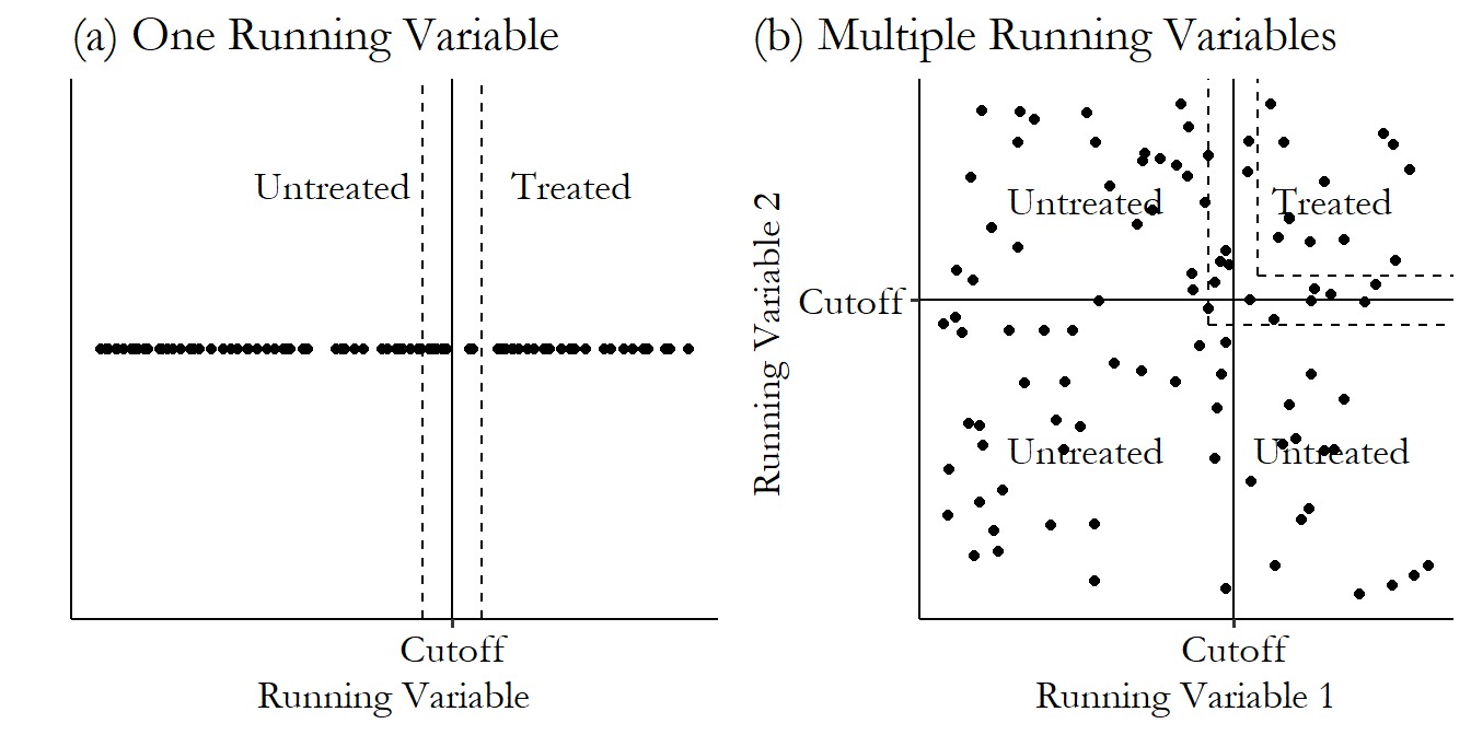
Figure 20.19: A Comparison of Single vs. Multiple Running Variables
The problem is illustrated in Figure 20.19. With a single running variable, it’s easy to figure out who you’re comparing - those within the bandwidth near the cutoff. But with two running variables, you still want to compare people near the cutoff, but who are you comparing them to? The cutoff is L-shaped! You probably don’t want to compare people at the top-left of the L to people in the bottom-right - they’re probably not that similar. And if some parts of the L are more populated than others, just going for it may not give you what you want. So you have to figure out how to do an appropriate comparison.
Not only might the groups not be comparable, but the effect of treatment is probably not the same for all parts of the L. Being held back a grade may have very different effects for someone failing math as opposed to someone failing English. So you have to decide which part(s) of the L you want to estimate the effect at.
There are a few approaches to estimation in these cases, with Reardon and Robinson (2012Reardon, Sean F., and Joseph P. Robinson. 2012. “Regression Discontinuity Designs with Multiple Rating-Score Variables.” Journal of Research on Educational Effectiveness 5 (1): 83–104.) covering five of them. There are also versions, such as the one discussed in Papay, Willett, and Murnane (2011Papay, John P., John B. Willett, and Richard J. Murnane. 2011. “Extending the Regression-Discontinuity Approach to Multiple Assignment Variables.” Journal of Econometrics 161 (2): 203–7.), specifically designed for cases where the treatment you get differs depending on which part of the L you cross - perhaps instead of being held back a grade, kids failing math take remedial math while kids failing English take remedial English.
One potential approach, and the one taken by the rdms function in rdmulti, is to pick specific points on the L and estimate what amounts to a fairly normal regression discontinuity using the other running variable. Do this with enough points on the L and you can get an idea of the effect and how it varies depending on where you cross the border.
20.3.3 When Running Variables Misbehave
Regression discontinuity is nice. It’s like a vacation. The treatment variable has few or no arrows heading into it on the causal diagram in the region around the cutoff. Things are simple and results are believable. We’re laying back, sipping vodka from a coconut, and idly wondering whether to use a linear model or a second-order polynomial.
Then the rain clouds roll in. Vacation ruined. The running variable isn’t behaving.
The main thing that a running variable needs to do in a regression discontinuity, other than be responsible for assigning treatment, is be nice and continuous and smooth, like a gently ebbing tide on the beach.
We’ve already talked about the problems that can come from manipulation of the running variable. But two other potential issues are the running variable being too granular - measured at a very coarse level, or the running variable exhibiting heaping - having some values that are suspiciously much more common than others. Either of these can cause problems.
Granularity is when a variable is measured at a coarse level. For example, if we were measuring annual income, we could say that you earned $40,231.36 last year, or we could say that you earned $40,231, or we could say that you earned $40,000. Or we could even say that you earned “$40 to 50,000.” Or, heck, we could say “less than $100,000.” These are measurements of your income in decreasing order of granularity.
You can imagine why this might be a problem for regression discontinuity. The whole idea of regression discontinuity is that people just on each side of the cutoff should be pretty easily comparable, with treatment the only real difference between them. That might be pretty believable if the cutoff is $40,000 and we’re comparing you at $40,231.36 against someone at $39,990.32. But what if we only have you measured as $40 to 50,000? Then we’re comparing not only you against the $39,990.32 person. We’re also comparing someone who earns $49,999 against someone who earns $30,001. Not so easy to say that treatment is the only thing separating them.
How granular is granular enough? It’s subjective, of course, but as long as you can measure the variable precisely enough that you can distinguish who you think is comparable from who you think isn’t, you’re good to go.
That said, even if you can distinguish well enough to do that, but still don’t have a variable that’s finely measured, you might not be able to properly model the shape of the relationship between the outcome and the running variable leading up to the cutoff. If the outcome is increasing with income from $30,000 to $40,000, but you’ve only got the bin $30 to 40,000, then you’ll get the predicted value at the cutoff wrong, and so your estimate will be wrong too. At the very least, your inability to model that trend will increase your sampling variation.
The real solution here is “find a running variable that’s granular enough.” But no variable is infinitely granular. So if you’re worried about granularity, you may want to pick an estimator that will account for that granularity.
A few papers springing from Kolesár and Rothe (2018Kolesár, Michal, and Christoph Rothe. 2018. “Inference in Regression Discontinuity Designs with a Discrete Running Variable.” American Economic Review 108 (8): 2277–2304.) do this. Kolesár and Rothe build better estimates of the sampling variation of the regression discontinuity estimator by making some assumptions about the relationship between the outcome and the running variable within that big coarse $30 to 40,000 bin we can’t look inside. One of their estimates assumes that the relationship isn’t too nonlinear, and the other assumes that you won’t get the shape any more wrong than you do at the cutoff. These estimators are available in R in the RDHonest package.
One thing Kolesár and Rothe (2018) point out is that you shouldn’t try to solve the problem by clustering your standard errors on the different values of the running variable. This was standard practice for a long time, but it turns out to be worse in many cases than not addressing the problem at all. Oops! Don’t do it.
Nonrandom heaping happens when the running variable is much more likely to take certain values than others. Often this can come in the form of rounding. Ask people how old they are, and the vast majority of them are going to give you a round number, like “36 years old.” However, some of them will be more precise and say “36 years, eight months, and two days.” The canonical example is from Almond, Doyle, Kowalski, and Williams (2010), where they found that baby birth weights were highly likely to be reported as being rounded to the nearest 100 grams.
Either of these processes might result in the distribution of your running variable looking like the simulated data in Figure 20.20 (a). You can see how, every time the running variable hits a certain value (here, a round number), the proportion of observations with that value jumps sky-high. These are the “heaps.”
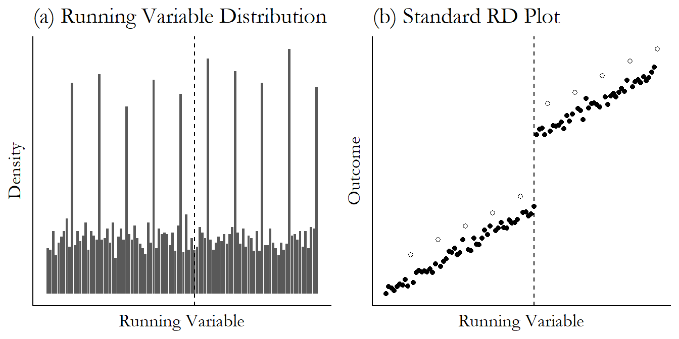
Figure 20.20: Regression Discontinuity Data That Shows Nonrandom Heaping
Now, this might not be a huge problem by itself. Having huge numbers of observations at certain points on the \(x\)-axis will heavily influence the regression line you fit. But on average, no harm, no foul. The real problem comes when the heaping is nonrandom. Notice in Figure 20.20 (b) that not only are the heaps very common, they’re also different. The heaps are the non-filled circles, and they have on average higher outcome values than the others.
Nonrandom heaping is likely to occur whenever there’s heaping. After all, is it really the same kind of person (or hospital) who rounds their answer as opposed to not rounding it?
With nonrandom heaping, we have highly influential values of the running variable (because they’re way more common than the other values) that are also not representative. This can pull our estimate away from the true effect and can even flip its sign! You can imagine how this might be especially bad if the cutoff is at one of the heaps - one side of the cutoff would be a heap, and the other side wouldn’t. When heaps are inherently different, that’s a recipe for bias.
A common approach to this is “donut hole regression discontinuity,” where you simply drop observations just around the cutoff so as to clear out heaps near the cutoff. Seems counterintuitive to drop near-cutoff observations in regression discontinuity, which is all about really wanting those near-cutoff observations. But that’s the problem we face.
However, Barreca, Lindo, and Waddell (2016Barreca, Alan I., Jason M. Lindo, and Glen R. Waddell. 2016. “Heaping-Induced Bias in Regression-Discontinuity Designs.” Economic Inquiry 54 (1): 268–93.) examine the problem of heaping and the donut-hole fix. They show that heaping is a problem even when it’s away from the cutoff. So donut-hole won’t fix the problem unless you’ve gotten rid of the only heap. Instead, they recommend splitting the sample by whether a value is a heap or not, and analyzing each side separately. This gets rid of the problem of there being a clear back door between “being in a heap” and the outcome.
20.3.4 Dealing with Bandwidths
How far away from the cutoff can you get and still have comparable observations on either side of it? It’s an important question, and there’s a real tradeoff at play. Pick a bandwidth around the cutoff that’s too wide, and you bring in observations that aren’t comparable (and rely more on the idea that you’ve picked the correct functional form), making your estimates less believable and more biased. Pick a bandwidth that’s too narrow, and you’ll end up estimating your effect on hardly any data, resulting in a noisy estimate. This is the “efficiency-robustness tradeoff.”649 Which, surprise, is just a regression-discontinuity renaming of the good ol’ bias-variance tradeoff we’ve discussed in other chapters. Do you want a precise (efficient) estimate with lots of observations? Well, you’re inviting in some bias which will make your estimate less robust to the presence of back doors or poorly-chosen functional form.
What should the bandwidth be? There are three main approaches you can take:
1: Just pick a bandwidth. This is a pretty common approach. Although perhaps it is becoming less common over time. For this one, you just look at your data and think about how far out you can go without feeling iffy about how far out you’ve gone. Ideally you can justify why that bandwidth makes sense. Or maybe you just take all the data you have and figure that the range you’ve got is good enough.
2: Pick a bunch of bandwidths. This sensitivity test-based approach is also fairly common - both the Fetter (2013) and the Bana, Bedard, and Rossin-Slater (2020) papers mentioned earlier in this chapter do it (in addition to a little of option 3 below). For this approach, you pick the biggest bandwidth you think makes any sense for the research design, and then you start shrinking it. Each time, estimate your regression discontinuity model.
Once you’ve got your estimates from each bandwidth, you’d present all the results, potentially in a graph like Figure 20.21, which I made using a very basic non-local linear regression discontinuity with the Fetter (2013) data, varying the size of the bandwidth. We can see the risks of the noise that comes from a too-small bandwidth on the graph. Actually, you can’t… I had to cut the tiniest bandwidths (1-3 months) off of the graph because their estimates were so wild, and the confidence intervals so large, that you couldn’t really see the other estimates. What you can see is that the confidence interval shrinks as the bandwidth expands. Makes sense - a bigger bandwidth means more observations means smaller standard errors.
Figure 20.21: Estimating the Effect of Veteran Mortgage Subsidy Eligibility on Home Ownership Rate with Different Bandwidths
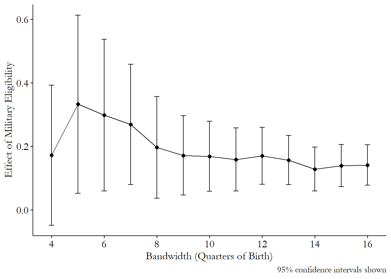
Figure 20.21 is largely what you want to see when using this method. The estimate doesn’t seem to change that much as I use a wider and wider bandwidth, within reason. So it probably doesn’t matter that much which one we choose (in the original paper, 12 was the bandwidth in the primary analysis).
3: Let the data pick the bandwidth for you. Or, rather, pick an objective of “what a good bandwidth looks like” and then use your data to figure out how wide a bandwidth is the best one by that criterion.
There are a few ways to do this. The first, discussed in Imbens and Lemieux (2008Imbens, Guido W., and Thomas Lemieux. 2008. “Regression Discontinuity Designs: A Guide to Practice.” Journal of Econometrics 142 (2): 615–35.), is cross-validation. I introduced cross-validation in Chapter 13. The basic idea is that you’re trying to get the best out-of-sample predictive power. So you split your data into random chunks. For each chunk, you estimate your model using all the other chunks, and then make predictions for the now out-of-sample chunk you left out. Repeat this for every chunk, and then see overall how well your out-of-sample prediction went. Then, repeat that whole process for each potential bandwidth and see which one does the best.
The cross-validation approach was very popular and you still see it often. This is what the Fetter (2013) paper did. However, what we really want is good prediction at the cutoff. The standard cross-validation method can give a little too much attention to trying to fit points farther away from the cutoff.
The second approach is the “optimal bandwidth choice” approach, originating in Imbens and Kalyanaraman (2012Imbens, Guido W., and Karthik Kalyanaraman. 2012. “Optimal Bandwidth Choice for the Regression Discontinuity Estimator.” The Review of Economic Studies 79 (3): 933–59.). This approach takes as its goal getting the best prediction right at the cutoff, just on either side. Of course, we don’t know what the true value is right at the cutoff, so we estimate it the best we can.
The processes for several different methods of picking the optimal bandwidth are described in Cattaneo and Vazquez-Bare (2016Cattaneo, Matias D., and Gonzalo Vazquez-Bare. 2016. “The Choice of Neighborhood in Regression Discontinuity Designs.” Observational Studies 3 (2): 134–46.), which is not too difficult a read as these sorts of papers go. In short, by pursuing the goal of getting the best prediction at the cutoff, you end up wanting a bandwidth that is smaller for bigger samples (since you can afford to lose the observations), bigger the more polynomial terms you use (since you can better fit any nonlinearities you introduce by going wider), and beyond that is based on the extent of bias that is introduced from having the wrong functional form, as well as plenty of other details.
The Cattaneo and Vazquez-Bare (2016) paper also points out that using the optimal bandwidth choice approach messes up the standard errors and confidence intervals. The fix for this is to apply a bias correction, estimating how big the bias from having the wrong functional form is, and adjusting both the estimate of the effect and the estimate of the variance for it.
They go even further, to talk about bandwidth selection procedures that, instead of trying to get the best prediction at the cutoff, try to minimize coverage error - the mismatch between the estimated sampling distribution and the actual sampling distribution. This process tends to lead to narrower bandwidths, and is what you’ll get as of this writing from running rdrobust from the rdrobust package.
These bandwidth selection procedures matter a fair amount. Taking Fetter (2013) again as an example, the cross-validation approach in the original paper led to choosing a bandwidth of 12 quarters, which with our method gave an estimate of .170 (.177 using the methods in the original paper). We also saw that the rdrobust approach chose a bandwidth of 3.39 quarters, and gave an estimate of .518 - very different. And in this case, it really is the bandwidth selection that makes the difference. Forcing rdrobust to use the 12-quarter bandwidth brings the estimate to .200, very close to the original paper.
Page built: 2025-10-17 using R version 4.5.0 (2025-04-11 ucrt)