Chapter 17 - Event Studies
17.1 How Does It Work?
17.1.1 An Event as Old as Time
The event study is probably the oldest and simplest causal inference research design. It predates experiments. It predates statistics. It probably predates human language. It might predate humans. The idea is this: at a certain time, an event occured, leading a treatment to be put into place at that time. Whatever changed from before the event to after is the effect of that treatment. Like in Chapter 16 on fixed effects, we are using only the within variation. Unlike Chapter 16, we are looking only at treatments that switch from “off” to “on,” and (usually) instead of using panel data we use time series data where we track only one “individual” across multiple periods.
So when someone has a late-night beer, immediately falls asleep, and concludes the next day that beer makes them sleepy, that’s an event study. When you put up a “no solicitors” sign on your door, notice fewer solicitors afterwards, and conclude the sign worked, that’s an event study. When your dog is hungry, then finds you and whines, and becomes fed and full, then concludes that whining leads to getting fed, that’s an event study. When a rooster concludes they’re responsible for the sun rising because it rises every morning right after they crow, that’s an event study.
Event studies are designed to work in cases where the relevant causal diagram looks like Figure 17.1. At some given time period, we move from “before-event” to “after-event” and a treatment goes into effect.479 Some event studies distinguish three time periods - before, after, and during, or “event day/period.” This is done when you expect the effect of treatment to be very short-lived. “After” here doesn’t mean “the treatment came and went” but rather “in the time after the event occurred,” so the treatment could still be in effect. By comparing the outcome when the treatment is in place to the outcome when it’s not, we hope to estimate the effect of \(Treatment \rightarrow Outcome\).
Figure 17.1: A Causal Diagram that Event Studies Work for
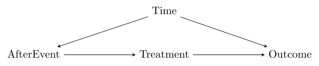
There is a back door to deal with, of course:
\[\begin{equation} Treatment \leftarrow AfterEvent \leftarrow Time \rightarrow Outcome \end{equation}\]
\(Time\) here sort of collects “all the stuff that changes over time.” We know the rooster isn’t responsible for the crowing because it was going to rise anyway.480 This is a realization the rooster comes to in the 1991 film Rock-a-Doodle, which your professor now has an excuse to show in class instead of teaching for a day. We have to close the back door somehow for an event study to work. We can’t really control for \(AfterEvent\) - that would in effect control for \(Treatment\) too. The two variables are basically the same here - you’re either before-event and untreated or after-event and treated. They’re just separated in the diagram for clarity. However, because \(Time\) only affects \(Treatment\) through \(AfterEvent\), there is the possibility that we can close the back door by controlling for some elements of \(Time\), while still leaving variation in \(AfterEvent\).
Thinking carefully about Figure 17.1 is the difference between a good event study and a bad one. And you can already imagine the bad ones in your head. In fact, many of the obviously-bad-causal-inference examples in this book are in effect poorly done event studies. Many superstitions are poorly done event studies. Maybe you have a friend who wore a pair of green sweatpants and then their sports team won, and they concluded that the sweatpants helped the team. Or maybe a new character is introduced to a TV show that has seen declining ratings for years. The show is canceled soon after, and the fans blame the new character. Those are both event studies.
But they’re event studies done poorly! Thinking carefully about the causal diagram means two things: (1) Thinking hard about whether the diagram actually applies in this instance - is the treatment the only thing that changed from before-event to after-event, or is there something else going on at the same time that might be responsible for the outcomes we see? Event studies aren’t bad, but they only apply in certain situations. Is your research setting one of them? (2) Thinking carefully about how the back door through \(Time\) can be closed.
Fans of the canceled TV show have failed in step (2) - they needed to account for the fact that ratings were already on the decline in order to understand the impact of the new character. The sweatpants-wearing sports fan has probably fallen afoul more of estimation than the causal diagram - figuring out how to handle sampling variation properly can be tricky given that we only have a single repeated measurement.
17.1.2 Prediction and Deviation
The real tricky part about event studies is the back door. The whole design of an event study is based around the idea that something changes over time - the event occurs, the treatment goes into effect. Then we can compare before-event to after-event and get the effect of treatment. However, we need that treatment to be the only thing that’s changing. If the outcome would have changed anyway for some other reason and we don’t account for it, the event study will go poorly.
This is the tricky part. After all, things are always changing over time. So how can we make sure we’ve removed all the ways that \(Time\) affects the outcome except for that one extremely important part we want to keep, the moment we step from before-event to after-event?
In short, we have to have some way of predicting the counterfactual. We have plenty of information from the before-event times. If we can make an assumption that whatever was going on before would have continued doing its thing if not for the treatment, then we can use that before-event data to predict what we’d expect to see without treatment, and then see how the actual outcome deviates from that prediction. The extent of the deviation is the effect of treatment.
For example, see Figure 17.2. There are two graphs here. In each case we have a dark black line representing the actual time series data we see. Things seem pretty well-behaved up to the date when the event occurs, at which point the time series veers off course - in Figure 17.2 (a) it juts up, and in Figure 17.2 (b) it drops down.
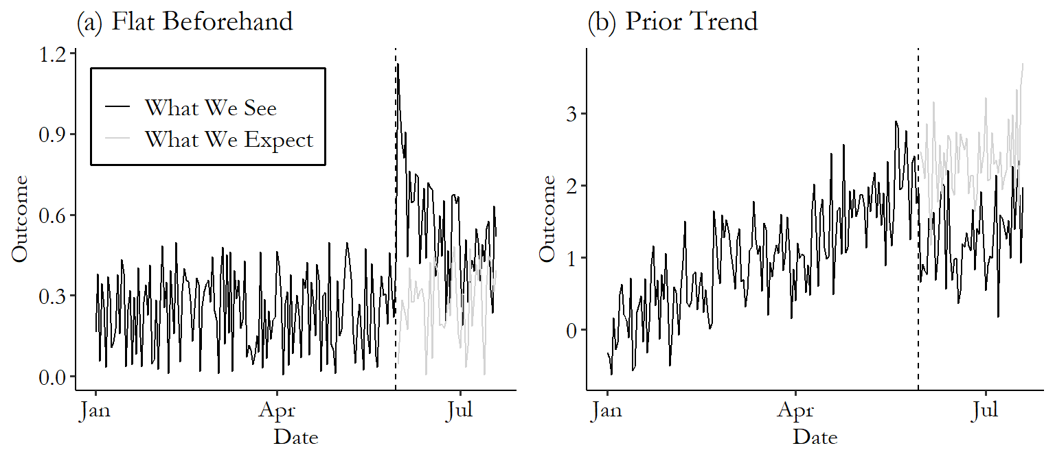
Figure 17.2: Two Examples of Graphs Representing Event Studies
For our event study to work, we need to have a decent idea of what would have happened without the event. Generally, we’ll assume that whatever pattern we were seeing before the event will continue. In the case of Figure 17.2 (a), the time series is jumping up and down on a daily basis, but doesn’t seem to be trending generally up or down or really changing at all. Seems like a safe bet that this would have continued if no event occurred. So we get the gray line representing what we might predict would have happened if that trend continued. To get the event study estimate, just compare the black line of real data to the gray line of predicted counterfactual data after the event goes into place. Looks like the treatment had an immediate positive effect on the outcome, with the black line far above the gray right after the treatment, but then that effect fades out over time and the lines come back together.
The same idea applies in Figure 17.2 (b). Here we have a clear upward trend before the event occurs. So it seems reasonable to assume that the trend would have continued. So this time, the gray line representing what we would have expected continues on that upward trend. The actual data on the black line drops down. We’d estimate a negative effect of treatment on the outcome in this case. Unlike in Figure 17.2 (a), the effect seems to stick around, with the black line consistently below the gray through the end of the data.
So how can we make those predictions? While there are plenty of details and estimation methods to consider when it comes to figuring out the gray counterfactual line to put on the graph, on a conceptual level there are three main approaches.
Approach 1: Ignore It. Yep! You can just ignore the whole thing and simply compare after-event to before-event without worrying about changes over time at all. This is actually a surprisingly common approach. But, surely, a bad approach, right?
Whether this is bad or not comes down to context. Sure, some applications of the “ignore it” approach are just wishful thinking. But if you have reason to believe that there really isn’t any sort of time effect to worry about, then why not take advantage of that situation?
There are two main ways that this can be justified. The first is if your data looks a lot like Figure 17.2 (a).481 Or if you understand the data generating process very well and can say with confidence that there’s absolutely no reason the outcome could have changed without the treatment - there is no back door. The time series is extremely flat before the event occurs, with no trend up or down, no change, no nothing. Just a nice consistent time series at roughly the same value, and ideally not too noisy. If this is the case, and also you have no reason to believe that anything besides the treatment changed when the event occurred, then you could reasonably assume that the data would have continued doing what it was already doing.
The second common way to justify ignoring the time dimension is if you’re looking only at an extremely tiny span of time. This approach is common in finance studies that have access to super high-frequency data, where their time series goes from minute to minute or second to second. Sure, a company’s stock may trend upward or downward over time, or follow some other weird pattern, but that trend isn’t going to mean much if you’re zooming way, way, way in and just looking at the stock’s price change over the course of sixty seconds.
Approach 2: Predict After-Event Data Using Before-Event Data. With this approach, you take a look at the outcome data you have leading up to the event and use the patterns in that data to predict what the outcome would be afterward. You can see this in Figure 17.2 (b) - there’s an obvious trend in the data. By extrapolating that trend, we end up with some predictions that we can compare to the actual data.
Simple! Simple in concept anyway. In execution, there are many different ways to perform such a prediction, and some ways will work better than others. I’ll discuss this later in the chapter.
Approach 3: Predict After-Event Data Using After-Event Data. This approach is very similar to Approach 2. Like in Approach 2, you use the before-event data to establish some pattern in the data. Then, you extrapolate to the after-event period to get your predictions.
The only difference here is that instead of only looking for things like trends in the outcome, you also look for relationships between the outcome and some other variables in the before-event period. Then, in the after-event period, you can bolster your prediction by also seeing how those other variables change.
A common application of this is in the stock market. Researchers doing an event study on stock X will look at how stock X’s price relates to the rest of the market, using data from the before-event period. Maybe they find that a 1% rise in the market index is related to a .5% rise in stock X’s price.
Then, in the after period, they extrapolate on any trend they found in stock X’s price, like in Approach 2. But they also check the market index. If the market index happened to rise by 5% in the after-event period, then we’d expect stock X’s price to rise by 2.5% for that reason, regardless of treatment. So we’d subtract that 2.5% rise out before looking for the effect of treatment.
Something that all three of these methods should make clear is that event studies are generally intended for a fairly short post-event window, or a “short horizon” in the event study lingo. The farther out you get from the event, the worse a job your pre-event-based predictions are going to do, and the more likely it is that the \(Time\) back door will creep in, no matter your controls. So keep it short, unless you’re in a situation where you’re sure that in your case there really is nothing else going on besides your treatment and business-as-usual in the long term, or you have a good model for handling those changes in the long term. Going for a long horizon is possible, but the time series design does a lot less for you, and you’ll need to bolster the validity of your design, be more careful about the possibility of unrelated trends, and swat away the back doors and general noisiness that will start creeping back in (Kothari and Warner 2007Kothari, Sagar P., and Jerold B. Warner. 2007. “Econometrics of Event Studies.” In Handbook of Empirical Corporate Finance, 3–36. Elsevier.).
That’s about it. The details are a bit more thorny than that, but event studies are ancient for a reason. They really are conceptually simple. The complexities come when trying to get the estimation right, which I’ll cover in the How Is It Performed section.
17.1.3 A Note on Terminology
In this chapter, I’ll be covering what I call “event studies.” However, as you might expect for such an intuitively obvious method, event studies were developed across many fields independently, and so terminology differs, sometimes with some slight variation in meaning.
For example, in health fields, you might hear about “statistical process control,” which is only intended to be used if there are no apparent pre-event trends (Approach 1 in the previous section). I’m just gonna call these, and the wide family of other similar methods, a form of event study.
Another confusing term is “interrupted time series.” This could just refer to any event-study method where you account for a before-event trend. But in practice it usually either refers to an event study that uses time series econometrics, or to a regression-based approach that fits one regression line before-event and another after-event. And, naturally, users of either method will become scared and confused if the term is used to refer to the other one.482 If this happens, encourage deep breaths and tell them to imagine their hypothesis is correct.
There are also variants of event studies that control for \(Time\) by introducing a control group that is unaffected by the event. I won’t cover this concept in the event study chapter,483 Aside from applications of Approach 3, which kinda does this. but you’ll see the idea of combining before-event vs. after-event comparisons with a control group later in the chapters on difference-in-differences (Chapter 18) and synthetic control (Chapter 22). Those cover the concept, anyway. In practice, studies calling themselves “event study with a control” or “interrupted time series with a control” will often include a bit more of the time series methodology I cover in the “How the Pros Do It” section than difference-in-differences or synthetic control approaches will.
Even more confusing, some economists use the term “event study” only to refer to studies that use multiple treated groups, all of which are treated at different times, whether or not there’s also a control group. Oy. We’ll similarly cover that in Chapter 18.
For now, just before-and-after event studies.
17.2 How Is It Performed?
It’s a bit strange to talk about “how event studies are performed.” Because it’s such a general idea of a method, and because so many different fields have their own versions of it, ways of performing event studies are highly varied.
So, instead of trying to take you on a tour of every single way that event study designs are applied, I’ll focus on three popular ones. First, I’ll take a look at event studies in finance, where a common approach is to explicitly calculate a prediction for each after-event period, and compare that to the data. Second, I’ll look at a regression-based approach.484 Economists would call this an “interrupted time series,” although see my note about terminology above. Third, in the “How the Pros Do It” section, I’ll get into methods that take the time series nature of the data a bit more seriously.
17.2.1 Event Studies in the Stock Market
Event studies are highly popular in studies of the stock market. Specifically, they’re popular when the outcome of interest is a stock’s return. Why? Because in any sort of efficient, highly traded stock market, a stock’s price should already reflect all the public knowledge about a company. Returns might vary a bit from day to day or might rise if the market goes up overall, but the only reason the price should have any sort of sharp change is if there’s surprising new information revealed about the company. Y’know, some sort of event!
Even better, the fact that stock prices reflect information about a company means that we can see the effect of that information immediately and so can look at a pretty short time window. This is good both for supporting the “nothing else changes at the same time” assumption, and for pinpointing exactly when an event is.485 Pinpointing the time of an event can be hard sometimes. Say you wanted to do an event study to look at the effect of someone being elected to office. When does that event occur? When polls indicate they’ll win? When they actually win? When they take office? When they pass their first bill? Say a company announces that they’re planning a merger. That merger won’t actually happen for quite a long time, but because investors buy and sell based on what they anticipate will happen, we’ll be able to see the effect on the stock price right away, rather than having to wait months or years for the actual merger, allowing the time back door to creep back in.
The process for doing one of these event studies is as follows:
- Pick an “estimation period” a fair bit before the event, and an “observation period” from just before the event to the period of interest after the event.
- Use the data from the estimation period to estimate a model that can make a prediction \(\hat{R}\) of the stock’s return \(R\) in each period. Three popular ways of doing this are:486 Two notes: (1) I use \(\alpha\) and \(\beta\) here instead of \(\beta_0\) and \(\beta_1\) because that’s how they do it in finance. (2) You could easily add other portfolios to the risk-adjusted model, perhaps setting up a Fama-French model or something.
- Means-adjusted returns model. Just take the average of the stock’s return in the estimation period, \(\hat{R} = \bar{R}\).
- Market-adjusted returns model. Use the market return in each period, \(\hat{R} = R_m\).
- Risk-adjusted returns model. Use the data from the estimation period to fit a regression describing how related the return \(R\) is to other market portfolios, like the market return: \(R = \alpha+\beta R_m\). Then, in the observation period, use that model and the actual \(R_m\) to predict \(\hat{R}\) in each period.
- In the observation period, subtract the prediction from the actual return to get the “abnormal return.” \(AR = R - \hat{R}\).
- Look at \(AR\) in the observation period. Nonzero \(AR\) values before the event imply the event was anticipated, and nonzero \(AR\) values after the event give the effect of the event on the stock’s return. For the same efficient-market reason that stock returns are a good candidate for event studies in the first place, effects will generally spike and then fade out quickly.
Let’s put this into action with an example. One of the nice things about event studies in finance is that you can apply them just about anywhere. So instead of borrowing an event study from a published paper, I’ll make my own.
On August 10, 2015, Google announced that they would be rearranging their corporate structure. No longer would “Google” own a bunch of other companies like Fitbit and Nest, but instead there would be a new parent company called “Alphabet” that would own Google along with all that other stuff.
How did the stock market feel about that? To find out, I downloaded data on the GOOG stock price (the stock symbol for Google before and Alphabet now) from May 2015 through the end of August 2015. I also downloaded the price of the S&P 500 index to use as a market-index measure.
Then, I calculated the daily return for GOOG and for the S&P 500 (which is the price divided by the previous day’s price, all minus 1). Why use returns instead of the price? Because we’re interested in seeing how the new information changes the price, so we may as well isolate those changes so we can look at them. Looking at returns also makes it easier to compare stocks that have wildly different prices.
Figure 17.3: Stock Returns for Google and the S&P 500
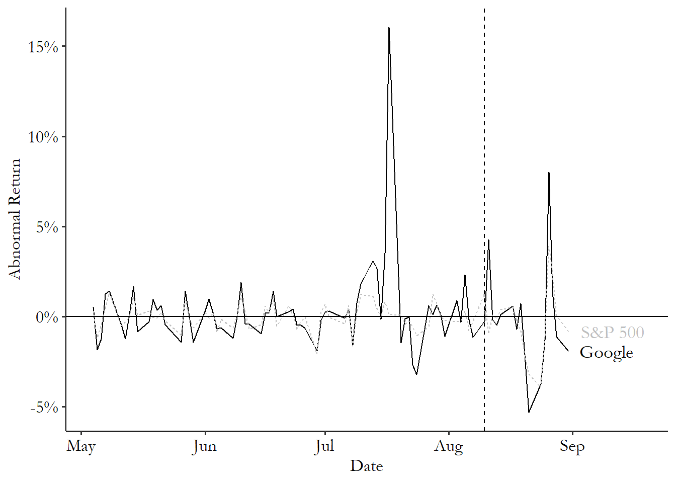
You can see those daily returns in Figure 17.3. Something worth noticing in the graph is that Google’s returns and the S&P 500 returns tend to go up and down at the same time. This is one reason why two of our three prediction methods make reference to a market index - we don’t want to confuse a market move with a stock move and think it’s just all about the stock! Also, the returns are very flat a lot of the time. There are some spikes - a big one in mid-July, for example. But in general, returns can be expected to stay at fairly constant levels a lot of the time, until something happens.
Let’s do the event study. We’ll first pick an estimation period and an observation period. For estimation I’ll go May through July,487 You could reasonably argue that I should be leaving out July and just doing May and June because of that huge spike for Google in July. This may well be right. Think carefully about whether you agree with this critique. and then for observation I’ll start a few days before the announcement, from August 6 through August 24.
Next, we’ll use the data in the observation period to construct our prediction models, and compare. The code for doing so is:
R Code
library(tidyverse); library(lubridate)
goog <- causaldata::google_stock

event <- ymd("2015-08-10")

# Create estimation data set
est_data <- goog %>%
 filter(Date >= ymd('2015-05-01') &
 Date <= ymd('2015-07-31'))

# And observation data
obs_data <- goog %>%
 filter(Date >= event - days(4) &
 Date <= event + days(14))

# Estimate a model predicting stock price with market return
m <- lm(Google_Return ~ SP500_Return, data = est_data)

# Get AR
obs_data <- obs_data %>%
 # Using mean of estimation return
 mutate(AR_mean = Google_Return - mean(est_data$Google_Return),
 # Then comparing to market return
 AR_market = Google_Return - SP500_Return,
 # Then using model fit with estimation data
 risk_predict = predict(m, newdata = obs_data),
 AR_risk = Google_Return - risk_predict)

# Graph the results
ggplot(obs_data, aes(x = Date, y = AR_risk)) +
 geom_line() +
 geom_vline(aes(xintercept = event), linetype = 'dashed') +
 geom_hline(aes(yintercept = 0))
Stata Code
causaldata google_stock.dta, use clear download

* Get average return in estimation window and calculate AR
summ google_return if date <= date("2015-07-31","YMD")
g AR_mean = google_return - r(mean)

* Get difference between Google and the market
g AR_market = google_return - sp500_return

* Estimate a model predicting stock price with market return
reg google_return sp500_return if date <= date("2015-07-31","YMD")
* Get the market prediction for AR_risk
predict risk_predict
g AR_risk = google_return - risk_predict

* Graph the results in the observation window
g obs = date >= date("2015-08-06", "YMD") & date <= date("2015-08-24", "YMD")

* Format the date nicely for graphing
format date %td

* Use the tsline function for time series plots
tsset date
tsline AR_risk if obs, tline(10aug2015)
Python Code
import pandas as pd
import numpy as np
import statsmodels.formula.api as smf
import seaborn.objects as so
import matplotlib.pyplot as plt
from causaldata import google_stock
goog = google_stock.load_pandas().data

# Create estimation data set
goog['Date'] = pd.to_datetime(goog['Date'])
est_data = goog.loc[(goog['Date'] >= '2015-05-01') &
(goog['Date'] < '2015-07-31')]

# And observation data
obs_data = goog.loc[(goog['Date'] >= '2015-08-06') &
(goog['Date'] < '2015-08-24')]

# Estimate a model predicting stock price with market return
m = smf.ols('Google_Return ~ SP500_Return', data = est_data).fit()

# Get AR
goog_return = np.mean(est_data['Google_Return'])
obs_data = (obs_data
    # Using mean of estimation return
    .assign(AR_mean = lambda x: x['Google_Return'] - goog_return,
    # Then comparing to market return
    AR_market = lambda x: x['Google_Return'] - x['SP500_Return'],
    # Then using model fit with estimation data
    risk_pred = lambda x: m.predict(x),
    AR_risk = lambda x: x['Google_Return'] - x['risk_pred']))

# Graph the results. The fig parts are necessary to add ref lines
fig = plt.figure()
(so.Plot(obs_data, x = 'Date', y = 'AR_risk').add(so.Line()).on(fig).plot())
fig.axes[0].axvline(pd.Timestamp(2015,8,10), linestyle = '--')
fig.axes[0].axhline(0)
If we plot all three lines together, we get Figure 17.4. What do we have? We certainly have a pretty big spike just after August 10, no matter which of the three methods we use. However, it’s only a one-day spike. As we might expect in an efficient market, Google reaches its new Alphabet-inclusive price quickly, and then the daily returns dip back down to zero (even though the price itself is higher than before). We also don’t see a whole lot of action before the event, telling us that this move was not highly anticipated.
Figure 17.4: Event Study Estimation of the Impact of Google’s Alphabet Announcement on its Stock Return
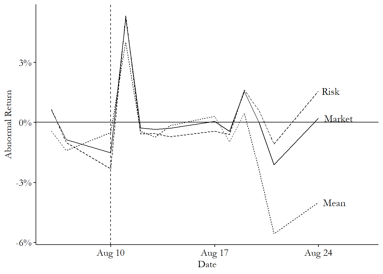
As we look out to the right in Figure 17.4, we can spot a few quirks of this methodology that remind us to keep on our toes. First, notice how around August 20, the Mean line takes a dive, while the Market and Risk lines stay near zero? That’s a spot where the Google price dipped, but so did the market. Probably not the result of the Alphabet switch, since it happened to the whole market. This is one good reason to use a method that incorporates market movements.
The graph and the movement around August 20 also nudge us toward using a narrow window and not trying to get an event study effect far after the event. Given that the Alphabet change had a one-day effect that then immediately went away, the changes a week and a half later probably aren’t because of the Alphabet change. And yet they’re showing up as effects! In the stock market, a week and a half is plenty of time for something else to change, and we’re confusing whatever that is for being an effect of the Alphabet change because our horizon is too long.
Now that we have the daily effects, there are a few things we can do with them.
The first thing we might do is first ask whether a given day shows an effect by performing a significance test on the abnormal return that day. The most commonly-applied test is pleasingly simple. Just calculate \(AR\) for the whole time window, not just the observation window. Then get the standard deviation of \(AR\). That’s your standard error. Done! Divide the \(AR\) on your day of interest by the standard error to get a \(t\)-statistic, and then check if the \(AR\) on your day of interest is greater (or less than) than some critical value, usually 1.96 or \(-1.96\) for a 95% significance test.
If I calculate the standard deviation of GOOG’s \(AR_{risk}\) for the whole time window, I get .021. The \(AR_{risk}\) the day after the announcement is .054. The \(t\)-statistic is then \(.054/.021 = 2.571\). This is well above the critical value 1.96, and so we’d conclude that the Alphabet announcement did increase the returns for GOOG, at least for that one day.
We might also be interested in the effect of the event on the average daily return, or the cumulative daily return. Calculating these is straightforward. For the average, just average all the \(AR\)s over the entire (post-event) observation period. For the cumulative, add them up.
Getting a standard error or performing a test for these aggregated measures, though, is another issue. There are lots and lots of different ways you can devise a significance test for them. These approaches generally rely on calculating the average or cumulative \(AR\) across lots of different stocks and using the standard deviation across the different stocks.
The simplest is the “cross-sectional test,” which constructs a \(t\)-statistic by taking the average or cumulative \(AR\) for each firm, dividing by the standard deviation of those average or cumulative \(AR\)s, respectively, and multiplying by the square root of the number of firms. Easy!
Of course, this simple approach leaves out all sorts of stuff - time series correlation, increased volatility, correlation between the firms, and so on. There are, as I mentioned, a zillion alternatives. These include a number of tests descended from Patell (1976Patell, James M. 1976. “Corporate Forecasts of Earnings Per Share and Stock Price Behavior: Empirical Test.” Journal of Accounting Research 14 (2): 246–76.). Patell’s test accounts for variability in whether the returns come early or late in the observation window. The Adjusted Patell Test accounts also for the correlation of returns between firms. There’s the Standardized Cross-Sectional Test, which also accounts for time series serial correlation and the possibility that the event increased volatility. And the Adjusted Standardized Cross-Sectional Test adds in the ability to account for correlation between firms. And that’s before we even get into the non-parametric tests based on rankings of the abnormal returns. Oy, so many options.
These additional tests can be implemented in R in the estudy2 package, and in Stata in the eventstudy2 package. In Python you may be on your own.
17.2.2 Event Studies with Regression
The method used in finance is purpose-built for effects that spike and then, usually, quickly disappear. Not uncommon in finance! But what about other areas? What if you’re interested in an event that changes the time series in a long-lasting way? In that case, one good tool is an event study design implemented with regression.
The basic idea is this: estimate one regression of the outcome on the time period before the event. Then estimate another time series of the outcome on the time period after the event. Then see how the two are different.
This approach can be implemented with the simple use of an interaction term (or “segmented regression” in the event-study lingo):
where \(t\) is the time period and \(After\) is a binary variable equal to 1 in any time after the event. This is just a basic linear example, of course, and forces the time trend to be a straight line. You could easily add some polynomial terms to allow the time series to take other shapes, as discussed in Chapter 13.
There are some obvious upsides and downsides to this method. As an upside, you can get a more precise estimate of the time trend than going day by day (or second by second, or whatever level your data is at). As a downside, you’re going to be limited in seeing the exact shape that the effect takes - seeing something like the one-day Google stock price bump in the previous section would be hard to do. And if you have the shape of the time trend wrong overall, your results will be bad. But if you can add the right polynomial terms to get a decent representation of the time series on either side of the event, you’re good to go on that front.
Another big downside is that you need to be very careful with any sort of statistical significance testing. If your data is autocorrelated - each period’s value depends on the previous period’s value - then you’re extremely likely to find a statistically significant effect of the event, even if it truly had no effect.488 Autocorrelation is discussed further both in Chapter 13 and in the “How the Pros Do It” section in this chapter. This occurs because the data tends to be “sticky” over time, with similar values clustering in neighboring time periods, which can make the regression a little too confident in where the trend is going. In data with a meaningful amount of autocorrelation, you can pick a fake “event” day at random, run a segmented regression, and get a statistically significant effect about half the time - much more than the 5% of the time you should get when doing a 95% significance test on a true-zero effect.
There are ways to handle this autocorrelation problem, though. Using heteroskedasticity- and autocorrelation-robust standard errors, as discussed in Chapter 13, definitely helps. Even better would be to use a model that directly accounts for the autocorrelation, as discussed in the “How the Pros” Do It section of this chapter.
There’s no new code for the segmented regression method; just run a regression of the outcome on some-order polynomial of the time period, with \(After\) as an interaction term. Then, since we’re dealing with time series data, use heteroskedasticity- and autocorrelation-consistent (HAC) standard errors. Both interaction terms and HAC standard errors are discussed in Chapter 13.
Instead of new code, let’s see how this might work in real life with an example. Taljaard et al. (2014Taljaard, Monica, Joanne E. McKenzie, Craig R. Ramsay, and Jeremy M. Grimshaw. 2014. “The Use of Segmented Regression in Analysing Interrupted Time Series Studies: An Example in Pre-Hospital Ambulance Care.” Implementation Science 9 (1): 1–4.) use a regression-based approach to event studies to evaluate the effect of a policy intervention on health outcomes. Specifically, they looked at an English policy put in place in mid-2010 to improve quality of health care received in the ambulance on the way to the hospital on the chances of heart attack and stroke afterward. A bunch of quality-improvement teams were formed, they all collaborated, they shared ideas and they informed staff. So did it help with heart attack care?
That’s what Taljaard et al. (2014) look at. They run a regression of heart attack performance (\(AMI\), or Acute Myocardial Infarction performance) on \(Week-27\) (subtracting 27 “centers” \(Week\) at the event period, which allows the coefficient on \(Week-27\) to represent the jump in the line), \(After\) (an indicator variable for being after the 27-week mark of the data where the policy was introduced), and an interaction term between the two:489 They actually use logit regression instead of ordinary least squares. But they report the results in odds-ratio terms, so the lines are still nice and straight, if harder to interpret for my tiny little brain.
Their results for heart attack can be summarized by Figure 17.5. You can see the two lines that are fit to the points on the left and right sides of the event’s starting period. That’s the interaction term at work. The line to the left of 27 weeks is \(\beta_0+ \beta_1(Week-27)\), and the line to the right is \((\beta_0 + \beta_2) + (\beta_1+\beta_3)(Week-27)\).
Figure 17.5: Effect of an Ambulance Quality Control Cooperative Policy on Heart Attack Care in Taljaard et al. (2014)
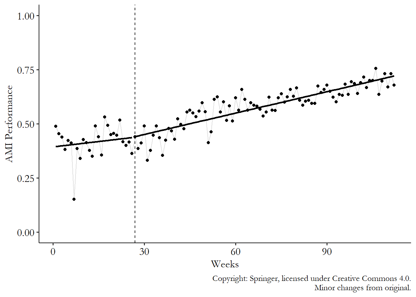
So what do we see here? We certainly don’t see any sort of jump at the cutoff. So no immediate effect of the policy on outcomes. That’s not super surprising, given that you might expect that sort of collaborative behavior-changing policy to take time to work. The jump is represented by the change in prediction at the event time, \(Week = 27\). Comparing the lines on the left and the right at that time, we get a prediction of \(\beta_0\) on the left and \(\beta_0 + \beta_2\) on the right (if \(Week = 27\), then \(Week-27 = 0\) and the \(\beta_1\) and \(\beta_3\) terms in both lines fall out). The difference is \((\beta_2+\beta_0)-\beta_0 = \beta_2\). \(\beta_2\) is the jump in the prediction at the moment the treatment goes into effect. In other words, that’s the event study estimate.
As you might expect given the lack of a visible jump on the graph, the logit regression in Table 17.1 that goes along with this result shows that the coefficient on \(After\) (\(\beta_1\)) is not significantly different from 1. As with most medical studies, coefficients are in their odds-ratio form, meaning that the effect is multiplicative instead of additive. A null effect is 1, not 0, since multiplying by 1 makes no difference.
Table 17.1: Event-Study Logit Regression of Heart Attack Performance on Ambulance Policy from Taljaard et al. (2014)
| Variable | Coefficient | 95% C.I. | p-value |
|---|---|---|---|
| (Odds ratio) | |||
| Week-27 | 1.02 | .97 to 1.07 | .362 |
| After | 1.16 | .93 to 1.44 | .199 |
| (Week - 27) x After | 1.02 | .97 to 1.08 | .346 |
Note: Odds ratios are multiplicative, so “no effect.” is 1 not 0. Copyright: Springer
It does look in Figure 17.5 like we have a change in slope, though. This is the kind of thing that a regression model can pick up well on that the finance approach would have trouble with. Maybe the policy didn’t change anything right away, but made things better slowly over time? It looks that way, except that when we look at the regression results, the change in slope is insignificant as well. The slope goes from \(\beta_1\) to \(\beta_1+\beta_3\), for a change of \((\beta_1 +\beta_3)-\beta_1 = \beta_3\). So the slope changes by \(\beta_3\), which is the coefficient on the \((Week-27)\times After\) interaction, which is insignificant in Table 17.1. Ah well, so much for that policy!
17.3 How the Pros Do It
17.3.1 Event Studies with Multiple Affected Groups
All the methods so far in this chapter have assumed that we’re talking about an event that affects only one group, or at least we’re trying to get an effect only for that group. We’re interested in the effect of the Alphabet announcement on Google’s stock, not anyone else’s, and we wouldn’t really expect there to be much of an effect anyway.
However, there are plenty of events that apply to lots of groups. The Alphabet announcement really only affects Google’s stock. But how about the announcement of something like the Markets in Financial Instruments Directive - a regulatory measure for stock markets in the European Union that should affect all the stocks traded there? How can we run an event study in a case like that?
There are a few ways we can go.
We can pretend that we actually don’t have a bunch of groups. We have a method designed for a single time series, but we have lots of different time series that matter. Just squish ’em all together! If you have ten different groups that might be affected by the event, average together their values in each time period to produce a single time series. Then do your event study estimation on that one time series.
Not really much to explain further. You’re just averaging together a bunch of time series, and then doing what you already would do for a single group. There are some obvious downsides to this simple approach. You’re losing a lot of information when you do this. Your estimate is going to be less precise than if you take advantage of all the variation you have, rather than throwing it out.
We can treat each group separately. We have event study methods for single groups. And we have lots of groups. So… just run lots of event studies, one for each group. This will give us a different effect for each group.490 Getting all the individual effects is a nice benefit of this approach. As Chapter 10 on treatment effects points out, the effect is likely to be truly different between groups, and having an effect for each group lets us see that.
At this point you have an effect for each group - and this could be an immediate effect from a single post-event time period or the coefficient on \(After\) in a regression, or an average effect over the entire post-event period, or a cumulative effect. From there you can look at the distribution of effects across all the groups. You can also aggregate them together to get an overall immediate/average/cumulative effect.
We can aggregate with regression. The regression approach to event study estimation described in the “How Is It Performed” section will happily allow you to have more than one observation per time period. So stack those event studies up! In fact, this is actually what the Taljaard et al. ambulance study was doing - it had several different hospitals’ worth of data to work with.
The regression model is nearly the same as when there’s just one time series:
Just as before, there’s a line being fit before the event (\(\beta_i + \beta_1t\)) and a line after the event (\((\beta_i+\beta_2)+(\beta_1+\beta_3)t\)) The only difference is the switch from \(\beta_0\) to a group fixed effect of \(\beta_i\) (as in Chapter 16). This isn’t always necessary, but if the different groups you’re working with have different baseline levels of \(Outcome\), the fixed effect will help deal with that. Also, as before, this equation allows you to fit a straight line on either side of the event, but you could easily add polynomial terms to make it curvy.491 Or even use some of the nonparametric methods discussed in Chapter 4 - go nuts!
This regression will produce very similar results to what you’d get if you first averaged all the data together and then estimated a regression on that single time series. But because it has all the individual data points to work with, it will know how much variation there is in each time period and will do a better job estimating standard errors.
Of course, this regression method puts us in a box of having to fit a particular shape. What if we are looking at an event that should only matter for a day? Or we want to know the full shape? In that case we can use a different kind of regression:492 Which should be estimated with standard errors that account for the time series nature of the data, like clustering at the group level (allowing for correlation across time within the same group).
What’s this stubby little equation? This is a regression of the outcome on just a set of time-period fixed effects. And we do the fixed effects in a particular way - we specifically select the last time period before the event should have an effect as the reference category (remember: any time we have a set of binary indicators, we have to leave one out as the reference).
The fixed effect for a given period is then just an estimate of the mean outcome in that period relative to the period just before the event. If we plot out the time-period fixed effects themselves, it will be a sort of single time series, just like if we’d mashed everything together ourselves by just taking the mean in each period. The only difference is that we now have standard errors for each of the periods, and we’ve made everything relative to the period just before the event.
Because we’ve made the period just before the event the reference group, we can more easily spot the event study effects. If the first post-event period is, say, period 4, and \(\hat{\beta}_4 = .3\), then we’d say that the event made the outcome increase from period 3 to period 4 by .3, and the one-day effect is .3. And if \(\hat{\beta}_5 = .2\), then we’d say that the event made the outcome increase from period 3 to period 5 by .2. You can also get average or cumulative effects by averaging, or adding up, the coefficients.
The process for doing this in code, using some fake data, is:
R Code
library(tidyverse); library(fixest)
set.seed(10)

# Create data with 10 groups and 10 time periods
df <- crossing(id = 1:10, t = 1:10) %>%
 # Add an event in period 6 with a one-period positive effect
 mutate(Y = rnorm(n()) + 1*(t == 6))

# Use i() in feols to include time dummies,
# specifying that we want to drop t = 5 as the reference
m <- feols(Y ~ i(t, ref = 5), data = df,
 cluster = 'id')

# Plot the results, except for the intercept,
# and add a line joining
# them and a space and line for the reference group
coefplot(m, drop = '(Intercept)',
 pt.join = TRUE, ref = c('t:5' = 6), ref.line = TRUE)
Stata Code
* Ten groups with ten time periods each
clear
set seed 10
set obs 100
g group = floor((_n-1)/10)
g t = mod((_n-1),10)+1

* Add an event in period 6 with a one-period effect
g Y = rnormal() + 1*(t == 6)

* ib#. lets us specify which # should be the reference
* We want 5 to be the reference, right before the event
* And exclude the regular constant (nocons)
reg Y ib5.t, vce(cluster group) nocons

* Plot the coefficients
coefplot, ///
    drop(_cons) /// except the intercept
    base /// include the 5 reference
    vertical /// rotate, then plot as connected line:
    recast(line)
Python Code
import pandas as pd
import numpy as np
import statsmodels.formula.api as smf
import seaborn.objects as so
import matplotlib.pyplot as plt
# Use a seed to make the results consistent
rng = np.random.default_rng(10)
# Ten groups with ten periods each
id = pd.DataFrame({'id': range(0,10), 'key': 1})
t = pd.DataFrame({'t': range(1,11), 'key': 1})
d = id.merge(t, on = 'key')
# Add an event in period 6 with a one-period effect
d['Y'] = rng.normal(0,1,100) + 1*(d['t'] == 6)

# Estimate our model using time 5 as reference
m = smf.ols('Y~C(t, Treatment(reference = 5))', data = d)

# Fit with SEs clustered at the group level
m = m.fit(cov_type = 'cluster',cov_kwds={'groups': d['id']})

# Get coefficients and CIs
# The original table will have an intercept up top
# But we'll overwrite it with our 5 reference
p = pd.DataFrame({'t': [5,1,2,3,4,6,7,8,9,10],
    'b': m.params, 'se': m.bse,
    'ci_top': list(m.conf_int().iloc[:,1]),
    'ci_bottom': list(m.conf_int().iloc[:,0])})
# Add our period-5 zero
p.iloc[0] = [5, 0, 0, 0, 0]

# Plot the estimates as connected lines with error bars
fig = plt.figure()
(so.Plot(p, x = 't', y = 'b', ymax = 'ci_top', ymin = 'ci_bottom')
 .on(fig).add(so.Line()).add(so.Range()).plot())
fig.axes[0].axvline(5, linestyle = '--')
fig.axes[0].axhline(0)
Random number generation makes the results for each of these a bit different, but the R results look like Figure 17.6.493 The results actually vary quite a bit if you run them multiple times without setting the seed - event studies are pretty noisy unless you have lots of groups or lots of time periods, or super well-behaved data. You can see that we’ve fixed the effect at the last pre-event period, 5, to be 0 so that everything is relative to it. And we do see the expected jump at period 6 where the effect is. The confidence interval doesn’t come anywhere near 0 - the effect is statistically significant on that day. We do also see significant effects in periods 2 and 4, though, where there isn’t actually any effect. Oops! That’s small samples for you.
Figure 17.6: Event Study with Multiple Groups
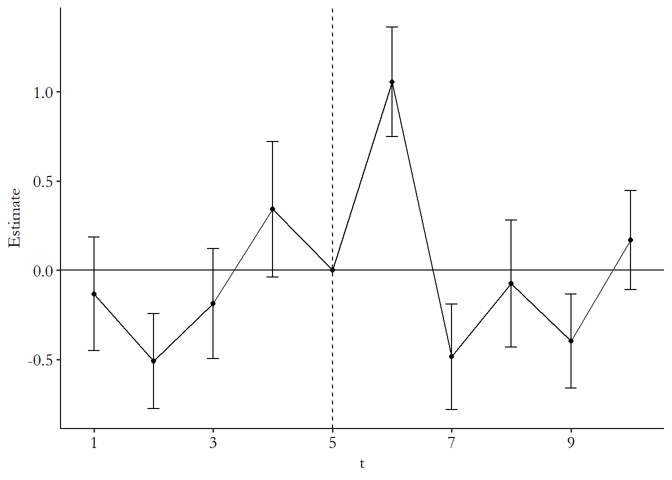
When doing an event study this way, it’s important to keep in mind exactly what it’s doing. This approach isn’t incorporating any sort of trend - it’s treating each time period separately. The predicted counterfactual in each period is purely determined by period 5 - everything is relative to that. This approach really only works if there’s no time trend to worry about.494 Or at least it doesn’t handle the trend itself. You could estimate a trend, or a relationship with some other variable, and subtract out the trend before doing this method. And even then we should carefully check the pre-event periods.
This approach assumes that all the pre-event effects should be zero. If they’re not, that implies some sort of problem. This is actually a neat bonus effect - we want to be able to spot if there’s a problem in our design, and this approach lets us do that. It could just be that it’s sampling variation (as it is here, given what we know about how the data was generated), but it could just as well be that there are some time-based back doors we aren’t accounting for properly. Hopefully, if you find nonzero effects in the pre-event period, they follow some sort of obvious trend, and then you can just build that trend into your model. But if not, it might be an indication that your research design just doesn’t work!
Whichever approach to multiple-group event studies we take, we are a little limited in how we construct our counterfactual predictions. Any approach that uses information from other groups to get a counterfactual - such as methods that use general market trends to predict what would have happened to an affected group if there were no treatment - obviously doesn’t work as counterfactuals any more, since lots of groups are treated. However, any method that doesn’t rely on using other groups to predict counterfactuals is fine - the regression methods still work, as does the “mean” \(AR\) method for stock returns that takes the mean of pre-event returns as the post-event prediction.
There is always the possibility of finding still further groups that aren’t treated and using them as a control group. But this is a task for other chapters, including Chapter 18 on difference-in-differences and Chapter 22 on synthetic control.
17.3.2 Forecasting Properly with Time Series Methods
The concept behind an event study is that you have some actual data in the after-event period and need, as a comparison, a prediction of what would have happened in the after-event period if the event hadn’t occurred. Our prediction is invariably based on the idea that, without the event, whatever was going on before the event would have continued.
In other words, we’re using the time series from before the event (and maybe some additional predictors) to predict beyond the event. This is the kind of thing that time series forecasting was designed for.
Technically, all the stuff we’ve done so far in this chapter is a form of time series forecasting, but only technically. Real time series forecasting uses methods that carefully consider the time dimension of the data. In a time series, observations are related across time. If a change happens in one period, the effects of that change can affect not just that period, but the whole pathway afterwards. This messes up both statistical estimation and prediction in an incalculable number of ways.
So if we want to get serious about predicting that counterfactual, and we aren’t in a convenient setting like a well-behaved stock return, we’re probably going to want to use a forecasting model that takes the time series element seriously.
That said, time series estimation and forecasting isn’t just an entire field of statistics, it’s a huge field in statistics and econometrics… and machine learning, and finance. And also it’s an industry. And there’s a whole parallel Bayesian version. I’m not even going to attempt to do the whole thing justice. Instead I will give you one peek into a single standard time series model used for forecasting, the ARMA, and then I’ll point you toward a resource like Montgomery, Jennings, and Kulahci (2015Montgomery, Douglas C., Cheryl L. Jennings, and Murat Kulahci. 2015. Introduction to Time Series Analysis and Forecasting. John Wiley & Sons.) if you want to get started on your very own time series estimation journey.
The ARMA model is an acronym for two common features we see in time series data. AR stands for autoregression, meaning that the value of something today influences its value tomorrow. If I put a dollar in my savings account today, that increases the value of my account by a dollar today but also by a dollar tomorrow (plus interest), and the next day (plus a little more interest), and on into the future forever. That’s autoregression. My savings account would be a model with an AR(1) process - the 1 meaning that the value of \(Y\) in the single (1) most recent period is the only one that matters for predicting \(Y\) in this period. If I want to predict my bank balance today, then knowing what it was yesterday is very important. And if I already know what yesterday was, then learning about the day before that won’t tell me anything new (if day-before-yesterday held additional information that yesterday didn’t have, we’d have an AR(2), not an AR(1)). An AR(1) model looks like
where the \(t\) and \(t-1\) indicate that the predictor for \(Y\) in a given period is \(Y\) in the previous period, i.e., the “lag” of \(Y\).
The MA stands for moving-average. Moving-average means that transitory effects on something last a little while and then fade out. If I lend my friend ten bucks from my savings account and she pays me back over the next few weeks, that’s a ten-dollar hit to my account today, a little less next week as she pays some back, a little less the week after that as she pays more back, and then when she pays it all back, the amount in my account is back to normal as though nothing had ever happened. That’s a moving-average process. An MA(1) process - where only the most recent transitory effect matters - would look like
Of course, since we can’t actually observe \(\varepsilon_t\) or \(\varepsilon_{t-1}\), we can’t estimate \(\theta\) by regular regression. There are alternate methods for that.
Given how I’ve just described it, since the amount in my savings account clearly has both AR and MA features, we’d say that the time series of my savings balance follows an ARMA process, and we’d want to use an ARMA model to forecast my savings in the future. An ARMA(2,1) model, for example, would include two autoregressive terms and one moving-average term, such that the current value of the time series depends on the previous two values, and the transitory effect in one previous period:
You can see how these things work out in Figure 17.7. In Figure 17.7 (a) we have some completely random white noise. Then in the other graphs, I start taking that exact same white noise and make it those \(\varepsilon\) terms in the above processes. First you can see the MA(1) process in Figure 17.7 (b). You can see how each period in time is a bit closer to its neighbors than before. In (c) we have an AR(1) process. Things look a lot smoother - that’s because each value directly influences the next. And finally in ARMA(1,1) the data looks more related still. Keep in mind, each of these four graphs has the exact same amount of randomness to start with. It’s just made successively more strongly organized in time.
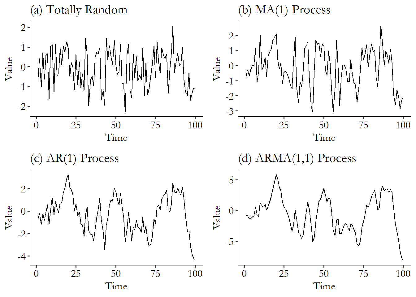
Figure 17.7: White Noise, and Different Time Series Processes
AR and MA are by no means the only features we can account for in a model, and time series analysts like to stack on all sorts of stuff. You can add an Integration term (I), which differences the data (i.e., instead of evaluating the amount in my account, you evaluate the daily change in the amount) and get an ARIMA.495 Differencing is done in an attempt to get a “stationary” process. To simplify, adding a dollar to my savings account, because of interest, affects tomorrow’s balance more than it affects today’s. Left to its own devices, that’s an upward spiral that heads to infinity over a long enough period! You can imagine why a statistical model would have trouble dealing with infinite feedback loops spiraling out. So it differences in hopes that the differenced data has no such spiral. You can add other time-varying eXogenous (X) predictors, like how much I get paid at my job, and get an ARIMAX. You can account for Seasonality (S), like how my savings dips every Christmas, and get a SARIMAX, and so on.496 Oh, and don’t forget the same sort of increasingly-complex model chain that allows for conditional heteroskedasticity (CH), where the variance of the error rises and falls over time. ARCH, GARCH, EGARCH…
The core part of time series forecasting is finding the right kind of model to fit, fitting it, and then forecasting. Very similar in concept to finding the right kind of non-time-series model. Except this time, instead of thinking about the right functional form for the relationship between variables, and which controls to include, you’re concerned with the features of that one time series. Is it seasonal? Do you need to integrate? Does it have autocorrelation, and if so, how many terms? Does it have a moving-average process, and if so, again, how many terms? How can you even tell how many terms you need?
Answering all these questions is, as I previewed before, an entire field in itself. Usually this is where I’d provide a code example of how to do this. But while I’ve introduced the concepts here, I can’t pretend to have given you enough information to actually be able to do all this properly, so I’ll refrain from leaving out the sharp knives in the form of a deficient demonstration. Go find a textbook all about time series.
I will leave you with just a few pointers, the first of which is to note that most packages will skip an ARMA function and just have ARIMA (which becomes an ARMA if you set the I term to 0). In R, estimation and forecasting for a few key models like ARIMA can be done easily in the fable package. In Stata, standard models like ARIMA are built-in with easily guessable names (arima), and you can do forecasting by adding a dynamic() option to predict. In Python, plenty of time series models are in statsmodels.tsa, and they come with .predict() methods for forecasting.
17.3.3 The Joint-Test Problem
Event study designs are highly reliant on making an accurate prediction of the counterfactual.497 To some extent, all causal inference designs are highly reliant on making accurate counterfactual predictions. For that reason, you’ll see similar placebo-test solutions like this one pop up in plenty of other chapters. That prediction is the only thing making the event study work. If you expect that, say, stock returns would have stayed the same if no treatment had occurred, but in fact they would have increased by .1%, then your event study estimates are all off by .1%, which can be a lot if you’re talking about daily portfolio returns.
This means that the results we get from an event study are a combination of two things - the actual event study effect, and the model we used to generate the counterfactual prediction. And if you, say, do a significance test of that effect, you’re not just testing the true event-study effect. You’re doing a joint test of both the true effect and whether the predictive model is right. Can’t separate ’em!
This is worrying, especially since we can never really know for sure whether we have the right model. Sure, maybe we’ve picked a model that fits the pre-event data super duper well. But that’s the rub with counterfactuals - you can’t see them. Maybe that super great fit would have stopped working at the exact same time the treatment went into effect.
What can you do to deal with this joint-test problem? The joint-test problem never really goes away. But we can help make it less scary by doing the best we can to make sure our counterfactual-prediction model is as good as possible. There is, however, something we can do to try to jimmy off one part of that joint test.
The application of placebo testing in event studies has been around a long time and the approach seems to have been largely codified by the time of Brown and Warner (1985Brown, Stephen J., and Jerold B. Warner. 1985. “Using Daily Stock Returns: The Case of Event Studies.” Journal of Financial Economics 14 (1): 3–31.).498 In the context of causal inference, a placebo test is a test performed under conditions where there should be zero effect. So if you find an effect, something is wrong.
The idea is this: when there’s supposed to be an effect, and we test for an effect, we can’t tease apart what part of our findings is the effect, and what part is the counterfactual model being wrong. But what if we knew there were no effect? Then, anything we estimated could only be the counterfactual model being wrong. So if we got an effect under those conditions, we’d know our model was fishy and would have to try something else.
So, get a bunch of different time series to test, especially those unaffected by the event. In the context of stock returns, for example, don’t just include the firm with the great announcement on a certain day, also include stocks for a bunch of other firms that had no announcement.
Then, start doing your event study over and over again. Except each time you do it, pick a random time series to do it on, and pick a random day when the “event” is supposed to have happened.499 All the code you need to do this yourself is in Chapter 15, “Simulation.”
On average, there shouldn’t be any true effect in these randomly picked event studies. Sure, sometimes by chance you’ll pick a time series and day where something did happen to make it jump, but you’re just as likely to pick one where something made it drop, or nothing happened at all. It will average out to 0. Do a bunch of these and your average should be 0. If it’s not, that means that you’re getting an effect when no effect is there. The culprit must be your counterfactual model. Better try a different one.
Page built: 2025-10-17 using R version 4.5.0 (2025-04-11 ucrt)