Chapter 3 - Describing Variables

3.1 Descriptions of Variables
This chapter will be all about how to describe a variable. That seems like an odd goal.28 And what does it even mean? We’ll get there. The opening to this book was all about setting up research questions and how empirical research can help us understand the world. And we jet right from that into describing variables? What gives?
It turns out that empirical research questions really come down entirely to describing the density distributions of statistical variables. That’s, well, that’s really all that quantitative empirical research is. Sorry.
Maybe that’s the wrong approach for me to take. Perhaps I should say that all the interesting empirical research findings you’ve ever heard about - in physics, sociology, biology, medicine, economics, political science, and so on - can be all connected by a single thread. That thread is laid delicately on top of a mass of probability. The shape it takes as it lies is the density of a statistical variable, tying together all empirical knowledge, throughout the universe, forever.
Is that better? Am I at the top of The New York Times nonfiction bestseller list yet?
Look, in order to make any sense of data we have to know how to take some observations and describe them. The way we do that is by describing the types of variables we have and the distributions they take. Part of that description will be in the form of describing how different variables interact with each other. That will be Chapter 4. In this chapter, we’ll be describing variables all on their own. It will be less interesting than Chapter 4, but, I am sorry to say, more important.
Variable. A set of observations of the same thing.
A variable, in the context of empirical research, is a bunch of observations of the same measurement - the monthly incomes of 433 South Africans, the number of business mergers in France in each year from 1984 to 2014, the psychological “neuroticism” score from interviews with 744 children, the color of 532 flowers, the top headline from 2,348 consecutive days of The Washington Post. Successfully describing a variable means being able to take those observations and clearly explain what was observed without making someone look through all 744 neuroticism scores themselves. Trickier than it sounds.
3.2 Types of Variables
The first step in figuring out how to describe a variable is figuring out what kind of variable it is.
While there are always exceptions, in general the most common kinds of variables you will encounter are:
Continuous Variables. Continuous variables are variables that could take any value (perhaps within some range). For example, the monthly income of a South African would be a continuous variable. It could be 20,000 ZAR,29 ZAR is the South African rand, the official currency in South Africa. or it could be 34,123.32 ZAR, or anything in between, or from 0 to infinity. There’s no such thing as “the next highest value,” since the variable changes continuously. 20,000 ZAR isn’t followed by 20,001 ZAR, because 20,000.5 ZAR is between them. And before you get there, you have to go through 20,000.25 ZAR, and 20,000.10 ZAR, and so on.
Count Variables. Count variables are those that, well, count something. Perhaps how many times something happened or how many of something there are. The number of business mergers in France in a given year is an example of a count variable. Count variables can’t be negative, and they certainly can’t take fractional values. They can be a little tougher to deal with than continuous variables. Sometimes, if a count variable takes many different values, then it acts a lot like a continuous variable, and so researchers often treat them as continuous.
Ordinal Variables. Ordinal variables are variables where some values are “more” and others are “less,” but there’s not necessarily a rule as to how much more “more” is. A “neuroticism” score with the options “low levels of neuroticism,” “medium levels of neuroticism,” and “high levels of neuroticism” would be an example of an ordinal variable. High is higher than low, but how much higher? It’s not clear. We don’t even know if the difference between “low” and “medium” is the same as the difference between “medium” and “high.” Another example of an ordinal variable that might make this clear is “final completed level of schooling” with options like “elementary school,” “middle school,” “high school,” and “college.” Sure, completing high school means you got more schooling than people who completed middle school. But how much more? Is that… two more school? That’s not really how it works. It’s just “more.” That’s an ordinal variable.
Categorical Variables. Categorical variables are variables recording which category an observation is in - simple enough! The color of a flower is an example of a categorical variable. Is the flower white, orange, or red? None of those options is “more” than the others; they’re just different. Categorical variables are very common in social science research, where lots of things we’re interested in, like religious affiliation, race, or geographic location, are better described as categories than as numbers.
A special version of categorical variables is binary variables, which are categorical variables that only take two values. Often, these values are “yes” and “no.” For example, “Were you ever in the military?” Yes or no. “Was this animal given the medicine?” Yes or no. Binary variables are handy because they’re a little easier to deal with than categorical variables, since they’re useful in asking about the effects of treatments (Did you get the treatment? Yes or no), and also because categorical variables can be turned into a series of binary variables. Instead of our religious affiliation variable being categorical with options for “Christian,” “Jewish,” “Muslim,” etc., we could have a bunch of binary variables - “Are you Christian?” Yes or no. “Are you Jewish?” Yes or no. Why would we want that? As you’ll find out throughout this book, it just happens to be kind of convenient. Plus, it allows for things like someone in your data being both Christian and Jewish.
Qualitative Variables Qualitative variables are a sort of catch-all category for everything else. They aren’t numeric in nature, but also they’re not categorical. The text of a Washington Post headline is an example of a qualitative variable. These can be very tricky to work with and describe, as these kinds of variables tend to contain a lot of detail that resists boiling-down-and-summarizing. Often, in order to summarize these variables, they first get turned into one of the other variable types above. For example, instead of trying to describe the Washington Post headlines as a whole, perhaps asking “how many times is a president referred to in this headline?” - a count variable - and summarizing that instead. Or, since we live in the future now, we can ask a large language model (AI) to read the text for us and tag whether a given topic is present or score it on some characteristic.
3.3 The Distribution
Once we have an idea of what kind of variable we’re dealing with, the next step is to look at the distribution of that variable.
Distribution. A description of the probability that each possible value of a variable will occur.
A variable’s distribution is a description of how often different values occur. That’s it! So, for example, the distribution of a coin flip is that it will be heads 50% of the time and tails 50% of the time. Or, the distribution of “the number of limbs a person has” is that it will be 4 most often, and each of 0, 1, 2, 3, and 5+ will occur less often.
When it comes to categorical or ordinal variables, the variable’s distribution can be described by simply giving the percentage of observations that are in each category or value. The full distribution can be shown in a frequency table or bar graph, which just shows the percentage of the sample or population that has each value.
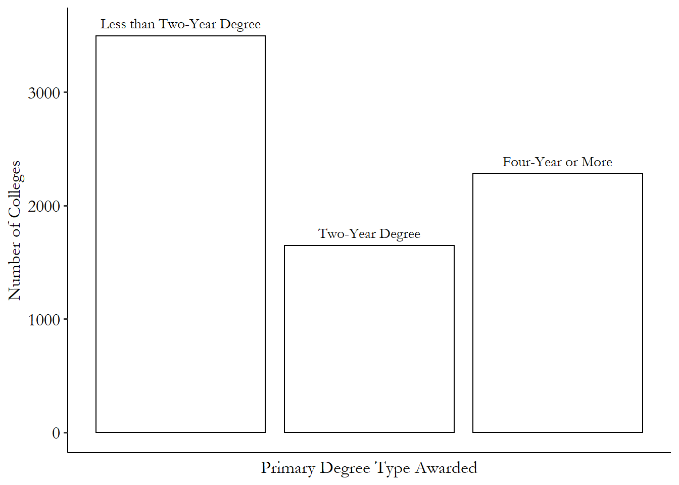
Table 3.1: Distribution of Kinds of Degrees US Colleges Award
| Variable | N | Percent |
|---|---|---|
| Primary Degree Type Awarded | 7424 | |
| … Less than Two-Year Degree | 3495 | 47% |
| … Two-Year Degree | 1647 | 22% |
| … Four-Year or More | 2282 | 31% |
| Data from College Scorecard |
Frequency table. A table that shows the proportion of the time that a variable takes a given value. A bar graph is a graphical representation of a frequency table.
These tables tell you all you need to know. From Table 3.1 we can see that, of the 7424 colleges in our data,30 Generally in statistics, as well as in this book, “N” means “number of observations.” 3495 of them (47.1%) predominantly grant degrees that take less than two years to complete, 1647 of them (22.2%) predominantly grant degrees that take two years to complete, and 2282 of them (30.7%) predominantly grant degrees that take four years or more to complete or advanced degrees. Figure 3.1 shows the exact same information in graph format.
Figure 3.1: Distribution of Kinds of Degrees US Colleges Award
There are only so many possibilities to consider, and the table and graph each show you how often each of these possibilities comes up. Once you’ve done that, you’ve fully described the distribution of the variable. There’s literally no more information in this variable to show you! If we wanted to show more detail (maybe which majors each college tends to specialize in), we’d need a different data source with a different variable.
Continuous variables are a little trickier. We can’t just do a frequency table for continuous variables since it’s unlikely that more than one observation takes any specific value. Sure, one person’s 24,201 ZAR income is very close to someone else’s 24,202 ZAR. But they’re not the same and so wouldn’t take the same spot on a frequency table or bar chart.
For continuous variables, distributions are described not by the probability that the variable takes a given value, but by the probability that the variable takes a value close to that one.
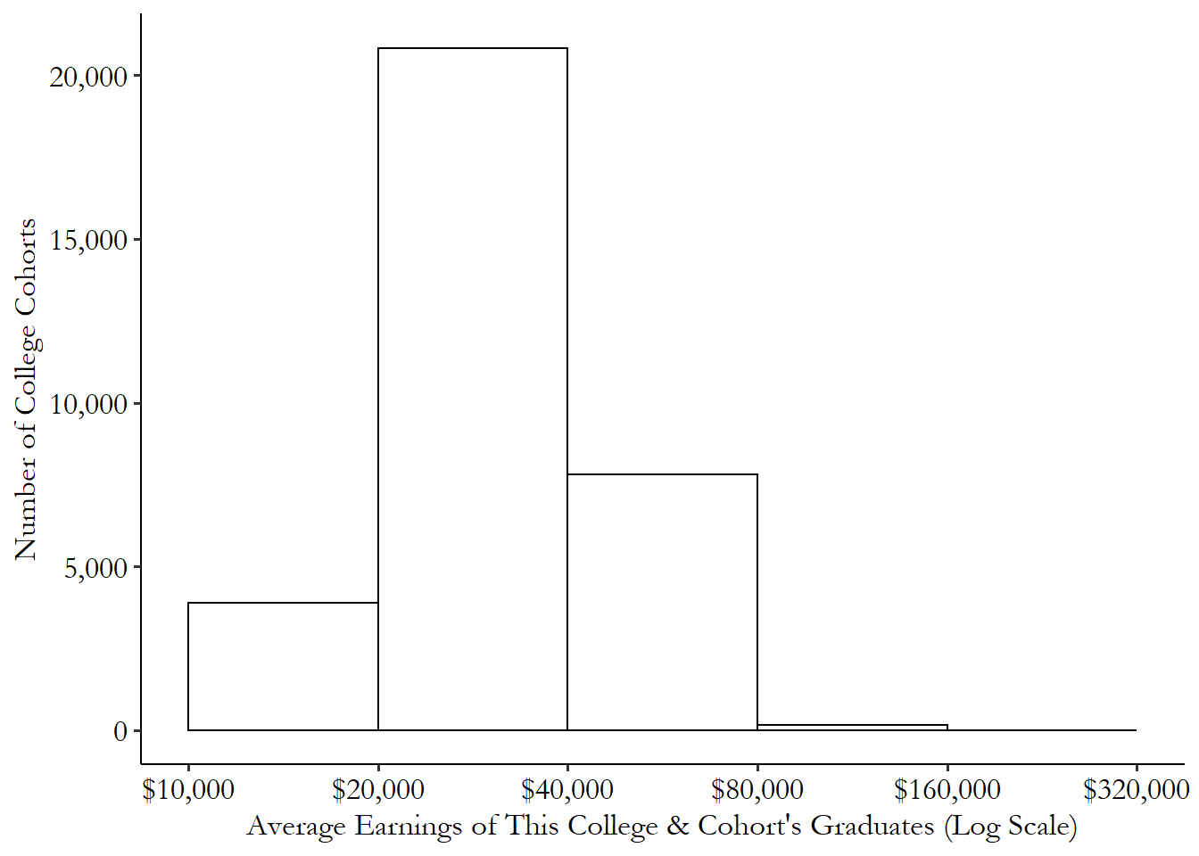
Histogram. A graph showing the proportion of the time that a variable falls into a given range between two values.
One common way of expressing the distribution of a continuous variable is with a histogram. A histogram carves up the potential range of the data into bins, and shows the proportion of observations that fall into each bin. It’s the exact same thing as the frequency table or graph we used for the categorical variable, except that the categories are ranges of the variable rather than the full list of values it could take.
For example, Figure 3.2 shows the distribution of the earnings of college graduates a few years after they graduate, with one observation per college per graduating class (“cohorts”). We can see that there are over 20,000 college cohorts whose graduates make between $20,000 and $40,000 per year. There are a smaller number - about 4,000 - making on average $10,000 to $20,000. For a very tiny number of college cohorts, the cohort average is between $80,000 and $160,000. There are so few between $160,000 and $320,000 that you can’t even really see them on the graph.
Figure 3.2: Distribution of Average Earnings across US College Cohorts
With a continuous variable, we can go one step further than a histogram all the way to a density.31 Density distribution if you’re graphing it, probability density if you’re describing it. A density shows what would happen to a histogram if the bins got narrower and narrower, as you can see in Figure 3.3.32 This only works because we have enough observations to fill in each bin. Otherwise it looks a lot choppier. Formally we need the bins to get narrower and the number of observations to get bigger.
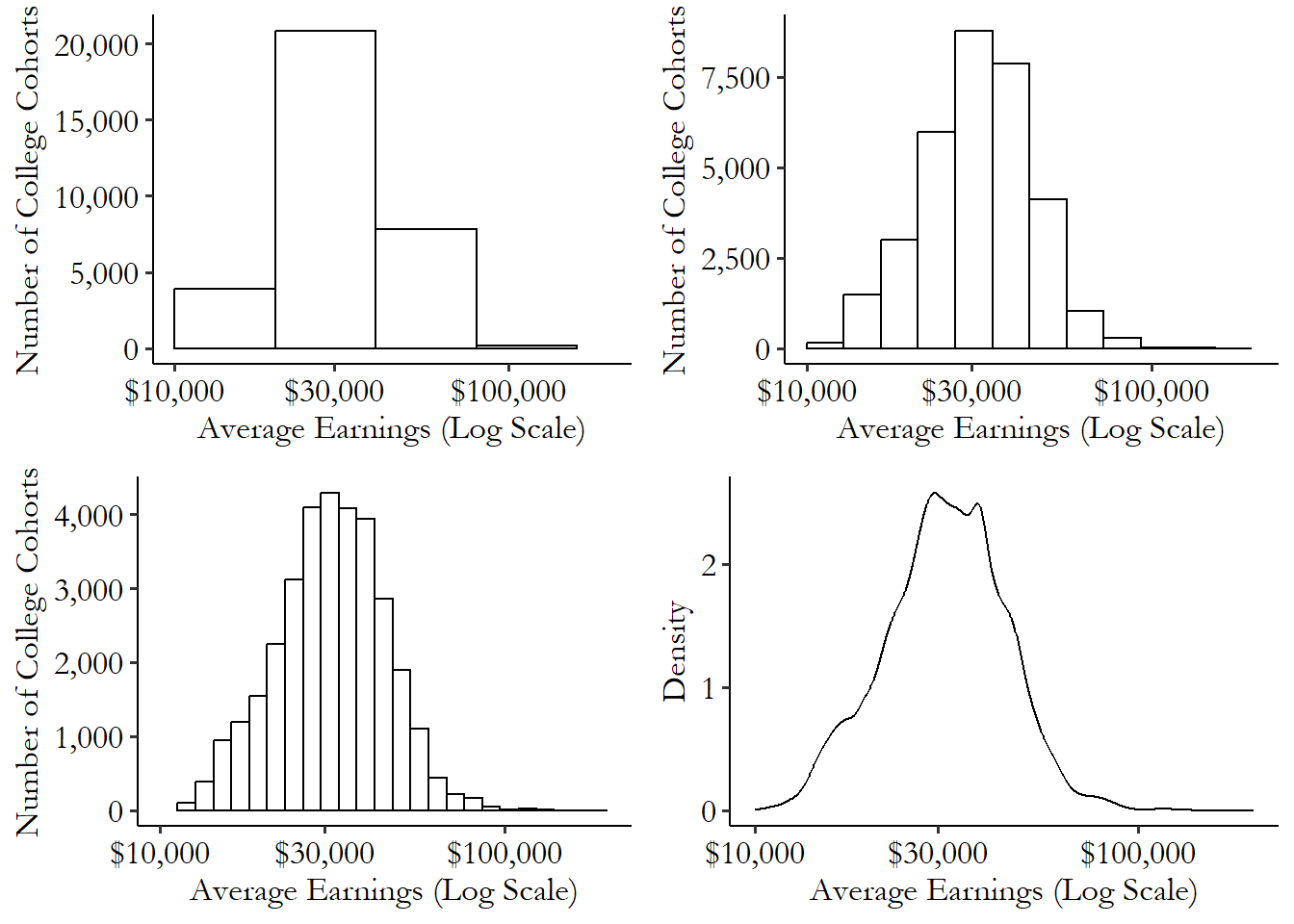
Figure 3.3: Distribution of Average Earnings across US College Cohorts
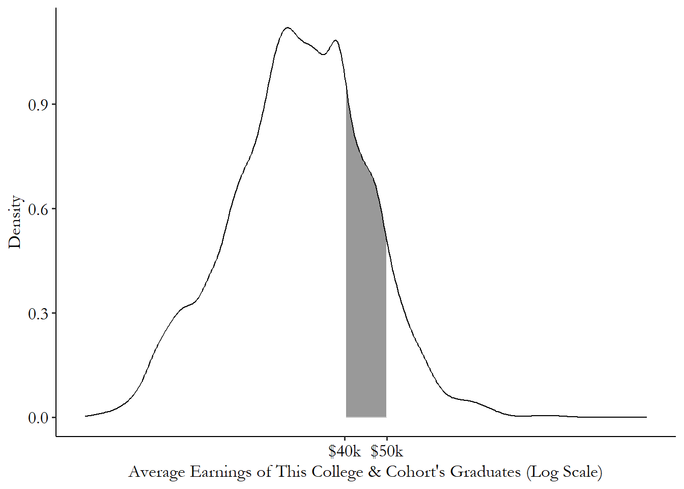
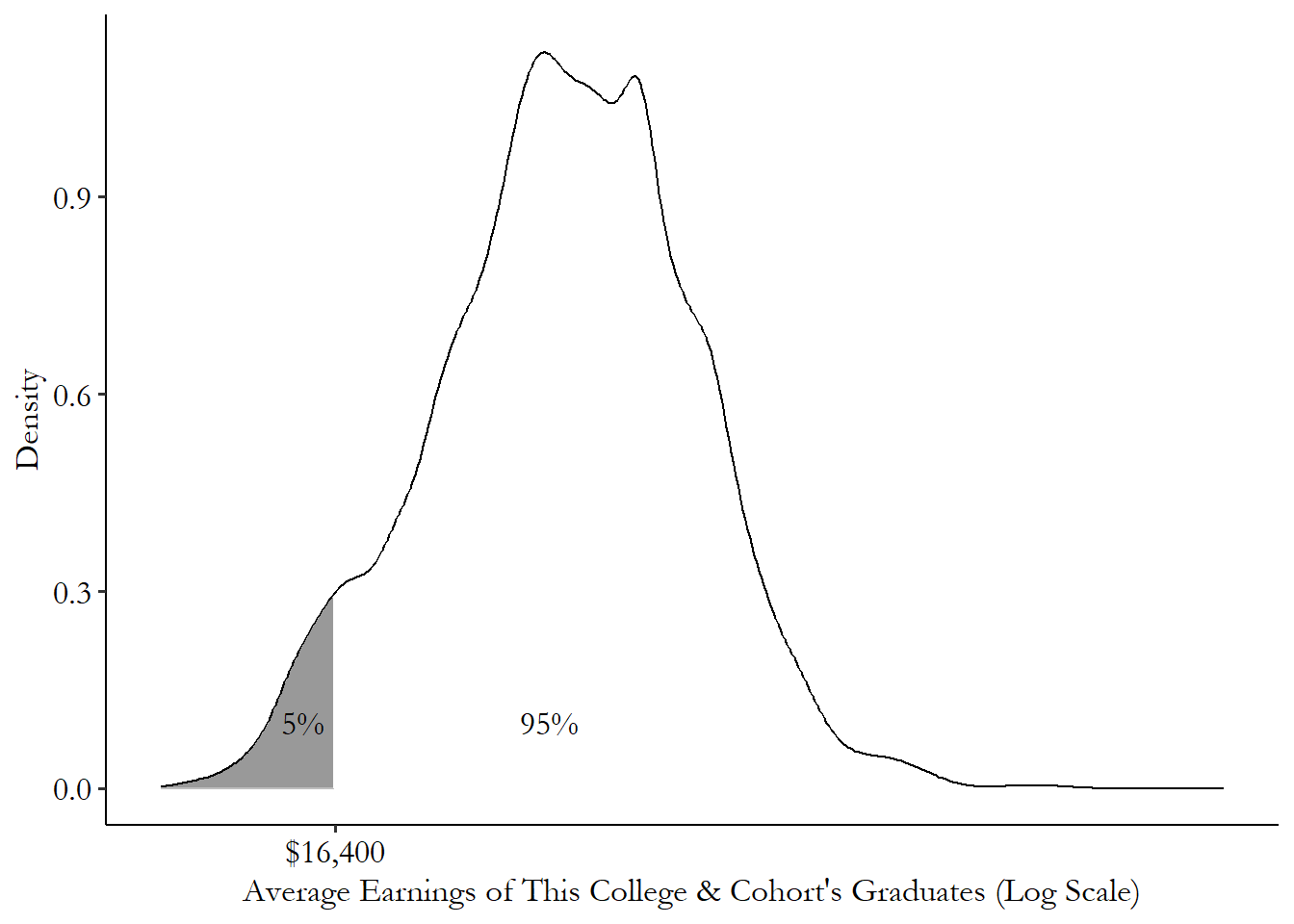
When we have a density plot, we can describe the probability of being in a given range of the variable by seeing how large the area underneath the distribution is. For example, Figure 3.4 shows the distribution of earnings and has shaded the area between $40,000 and $50,000. That area, relative to the size of the area under the entire distribution curve, is the probability of being between $40,000 and $50,000. That particular shaded area makes up about 16% of the area underneath the curve, and so 16% of all cohorts have average earnings between $40,000 and $50,000.33 Calculus-heads will recognize all of this as taking integrals of the density curve. Did you know there’s calculus hidden inside statistics? The things your professor won’t tell you until it’s too late to drop the class. We won’t be doing calculus in this book, though.
Figure 3.4: Shaded Distribution of Earnings across US College Cohorts
And that’s it. Once you have the distribution of the variable, that’s really all you can say about it.34 Until you start to incorporate how it relates to other variables, as we’ll talk about in Chapter 4. After all, what do we have? For each possible value the variable could take, we know how likely that outcome, or at least an outcome like it, is. What else could you say about a variable?
Of course, in many cases these distributions are a little too detailed to show in full. Sure, for categorical variables with only a few categories we can easily show the full frequency table. But for any sort of continuous variable, even if we show someone the density plot, it’s going to be difficult to take all that information in.
So, what can we do with the distribution to make it easier to understand? We pick a few key characteristics of it and tell you about them. In other words, we summarize it.
3.4 Summarizing the Distribution
Once we have the variable’s distribution, we can turn our attention to summarizing that variable. The whole distribution might be a bit too much information for us to make any use of, especially for continuous variables. So our goal is to pick ways to take the entire distribution and produce a few numbers that describe that distribution pretty well.
Probably the most well-known example of a single number that tries to describe an entire distribution is the mean. The mean is what you get if you add up all the observations you have and then divide by the number of observations. So if you have 2, 5, 5, and 6, the mean is \((2+5+5+6)/4 = 18/4 = 4.5\).
A little more formally, what the mean does is it takes each value you might get, scales it by how likely you are to get it, and then adds it all up. And so on! What does the distribution look like for our data set of 2, 5, 5, and 6? Our frequency table is shown in Table 3.2.
Table 3.2: Distribution of a Variable
| Variable | N | Percent |
|---|---|---|
| Observed.Values | 4 | |
| … 2 | 1 | 25% |
| … 5 | 2 | 50% |
| … 6 | 1 | 25% |
Table 3.2 gives the distribution of our variable. Now we can calculate the mean. Again, this scales each value by how likely we are to get it. In 2, 5, 5, and 6, we get 5 half the time, so we count half of 5. We get 2 a quarter of the time, so we count a quarter of 2.
Okay, so, since 2 only shows up 25% (\(1/4\)) of the time, we only count \(1/4\) of 2 to get .5. Next, 5 shows up 50% (\(1/2\)) of the time, so we count half of 5 and get 2.5. We see 6 shows up 25% (\(1/4\)) of the time as well, so we scale 6 by \(1/4\) and get 1.5. Add it all up to get our mean of \(.5 + 2.5 + 1.5 = 4.5\).
So what the mean is actually doing is looking at the distribution of the variable and summarizing it, boiling it down to a single number. What is that number? The mean is supposed to represent a central tendency of the data - it’s in the middle of what you might get. More specifically, it tries to produce a representative value. If the variable is “how many dollars this slot machine pays out” with a mean of $4.50, and it costs $4.50 to play, then if you played the slot machine a bunch of times you’d break even exactly.
Sometimes it pays to be more direct. We can certainly use the mean to describe a distribution, and in this book we will, many times. But if the goal is to describe the distribution to someone, why bother doing a calculation of the mean when we could just tell people about the distribution itself?
Xth percentile. The value for which X% of the variable’s observations are smaller.
The Xth percentile of a variable’s distribution is the value for which X% of the observations are less. So, for example, if you lined up 100 people by height, if the person in line with 5 people in front of them is 5 foot 4 inches tall, then 5 foot 4 inches tall is the 5th percentile.
We can see percentiles on our distribution graphs. Figure 3.5 shows our distribution of college cohort earnings from before. We started shading in the left part of the distribution and kept going until we’d shaded in 5% of the area underneath the curve. The point on the \(x\)-axis where we stopped, $16,400, is the 5th percentile.
Figure 3.5: Distribution of Average Earnings across US College Cohorts
We can actually describe the entire distribution perfectly this way. What’s the 1st percentile? Okay, now what’s the 2nd? And so on.35 Okay, fine, you can’t actually get it perfectly unless you also do the 1.00001th percentile and the 1.00002nd and the infinite percentiles between those two and so on. But you know what I mean. Pretty soon we’ll have mapped out the entire distribution by just shading in a little more each time. So percentiles are a fairly direct way of describing a distribution.
There are a few percentiles that deserve special mention.
The first is the median, or the 50th percentile. This is the person right in the middle - half the sample is taller than them, half the sample is shorter. Like the mean, the median is measuring a central tendency of the data. Instead of trying to produce a representative value, like the mean does, the median gives a representative observation.
For example, say you’re looking at the wealth of 10,000 people, one of whom is Amazon founder Jeff Bezos. The mean says “hmm… sure, most people don’t have much wealth, but once in a while you’re Jeff Bezos and that makes up for it. The mean is very high.” But the median says “Jeff Bezos isn’t very representative of the rest of the people. He’s going to count exactly the same as everyone else. The median is relatively low.”36 So why use the mean at all? It has a lot of nice properties too! For reasons too technical to go into here, it’s usually much easier to work with mathematically and pops up in all sorts of statistical calculations beyond just describing a variable. Besides, sometimes you do want the representative value, not the representative observation. A place for everything.
For this reason, the median is generally used over the mean when you want to describe what a typical observation looks like, or when you have a variable that is highly skewed, with a few really big observations, like with wealth and Jeff Bezos. The mean wealth of that room might be $15,000,000, but that’s almost all Jeff Bezos and doesn’t really represent anyone else. As soon as he walks out of the room, the mean drops like a stone. The mean is very sensitive to Jeff! But the median might be closer to $90,000, a fairly typical net worth for an American family,37 Yes, really. Start saving, kids. and it would stay pretty much exactly the same if Jeff left the room. The median is great for stuff like this!38 Sometimes the mean can work well with skewed data if it’s transformed first. A common approach is to take the logarithm of the data, which reins in those really big observations. We’ll talk about this more in the Theoretical Distributions section.
The other two percentiles to focus on are the minimum, or the 0th percentile, and the maximum, or the 100th percentile. These are the lowest and highest values the variable takes. They’re handy because they show you the kinds of values that the variable produces. The minimum and maximum height of a large group of people would tell you something about how tall or short humans can possibly be, for example.
Range. The difference between the maximum value of a variable and the minimum value.
Another nice thing about the minimum and maximum is that we can take the difference between them to get the range. The range is one way of seeing how much a variable varies. If the maximum and minimum are very far apart, as they would be for wealth with Jeff Bezos in the room, you know the variable can take a very wide range of values. If the maximum and minimum are close together, as they might be for “number of eyes you have,” you know the range of values that a variable can take is fairly small.
As an aside, technically there is some ambiguity when it come to percentiles. If there are 100 people lined up, is the 5th percentile the 5th person in line (since 5% of people are at or below their level, the “inclusive” percentile) or the 6th person in line (since 5% of people are below their level, the “exclusive” percentile)? What if the percentile you pick is between two people? In a group of 10 people, nobody is at the 25th percentile. So do you take the 2nd person in line? The 3rd? Typically you mix the two in some way, but in what way (Hyndman and Fan (1996Hyndman, Rob J, and Yanan Fan. 1996. “Sample Quantiles in Statistical Packages.” The American Statistician 50 (4): 361–65.) discuss nine (!) options). None of this matters much in a big sample, but in a smaller sample these decisions can matter a lot, and you should consider what makes sense for your case and which option your software package is defaulting to.
Some variables vary a little, others vary a lot. For example, take “the number of children a person has.” For many people, this is zero. The mean, for people in their thirties perhaps, is somewhere around 2. Some people have lots and lots of children, though. A few rare women have ten or more. There are men in the world with dozens of children. The number of children someone has can vary quite a bit.
Compare that to “the number of eyes a person has.” For a small number of people, this might be 0, or 1, or maybe even 3. But the vast majority of people have two eyes. The number of eyes a person has varies fairly little.
Variation. How a variable changes in value from observation to observation.
These two variables - number of children and number of eyes - have similar means and medians, but they are clearly very different kinds of variables. We need ways to describe variation in addition to central tendencies or percentiles.
The way that variation shows up in a distribution graph is in how wide the distribution is. If the distribution is tall and skinny, then all of the observations are scrunched in very close to the mean. Low variation. If it’s flat and wide, then there are a lot of observations in those fat “tails” on the left and right that are far away from the mean. High variation! See Figure 3.6 as an example. The distributions with more area “piled in the middle” have little variation - not a lot of area far from that middle point! The distributions with less “piled in the middle” and more in the “tails” on either side have plenty of observations far away from the middle.
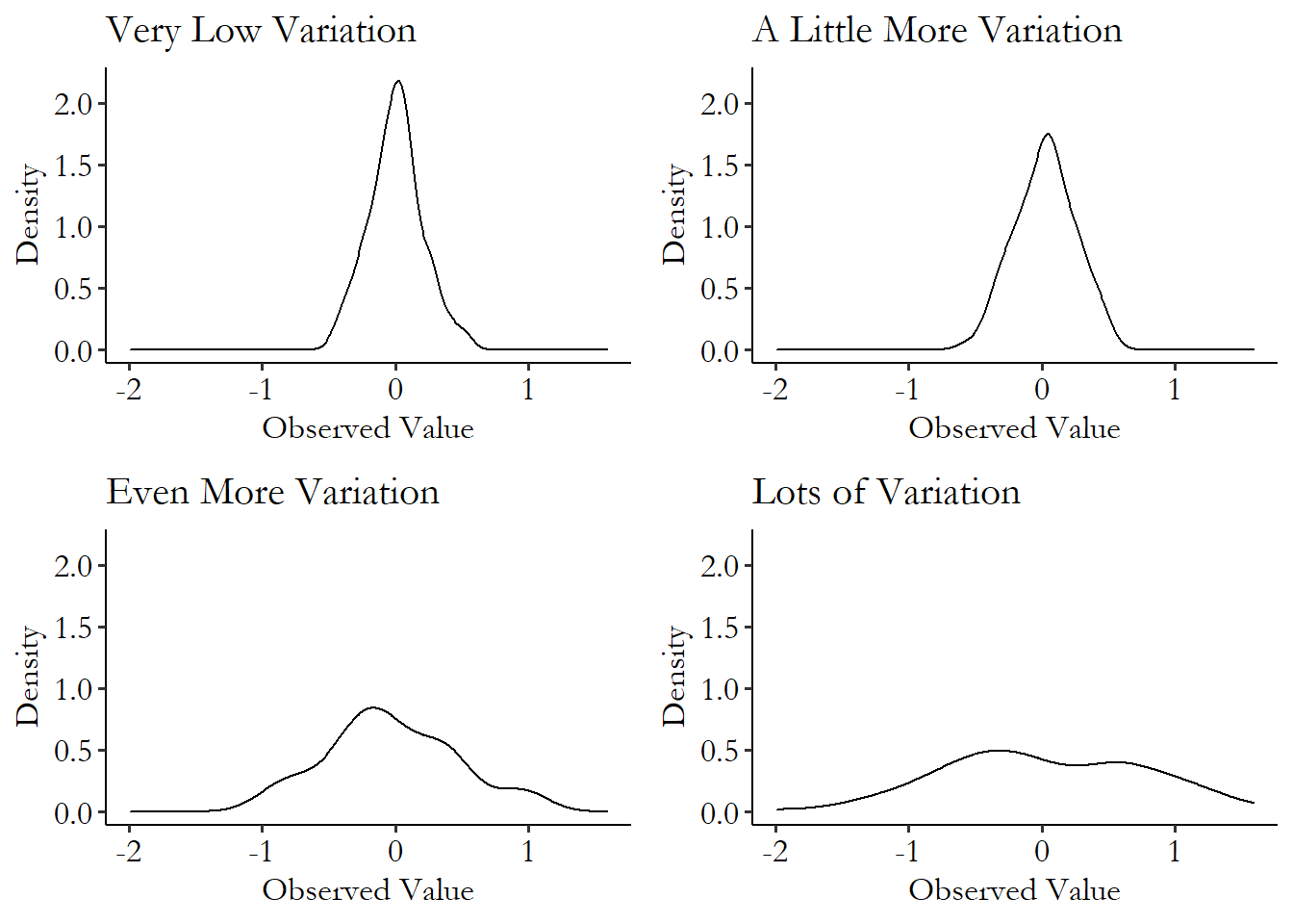
Figure 3.6: Four Variables with Different Levels of Variation
Variation around the mean. The difference between the value of an observation and the mean.
There are quite a few ways to describe variation. Some of them, like the mean, focus on values, and others, like the median and percentiles, focus on observations.
Variance is a measure of variation that focuses on values and is derived from the mean. To calculate the variance in a sample of observations of our data, we:
- Find the mean. If our data is 2, 5, 5, 6, we get \((2+5+5+6)/4 = 18/4 = 4.5\).
- Subtract the mean from each value. This turns our 2, 5, 5, 6 into -2.5, .5, .5, 1.5. This is our variation around the mean.
- Square each of these values.39 Why square? Why not something else? We could do something else! The kind of thing I’m calculating here for the variance is called a moment of the distribution. The mean is the first moment, and the variance is the second moment (this step squares), telling us about variation. The third moment (this step cubes) tells us about how lopsided the distribution is to one side or the other. The fourth moment (to the fourth power) tells us how much of the distribution is out in the “tails” (in the left and right edges). The third and fourth moments, after being “standardized,” are called skewness and kurtosis. So now we have 6.25, .25, .25, and 2.25.
- Add them up! We have \(6.25 + .25 + .25 + 2.25 = 9\).
- Divide by the number of observations minus 1.40 Why minus 1? Well, we estimated that mean already, and in different samples we might get slightly different calculations for the mean, in ways that are related to the variance. That introduces a little bias into the calculation. Specifically, if we divide by the number of observations \(n\), we’ll be off by \((n-1)/n\). So we divide by \(1/(n-1)\) instead of \(1/n\), in effect multiplying by \(n/(n-1)\) and getting rid of that bias. So our sample variance is \(9/(4-1) = 3\).
The bigger the variance is, the more variation there is in that variable. How does this work? Well, notice in steps 4 and 5 previously that we’re sort of taking a mean. But the thing we’re taking the mean of is squared variation around the actual mean. So any observations that are far from the mean get squared - making them even bigger and count for more in our mean! In this way we get a sense of how far from the mean our data is, on average.
One downside of the variance is that it’s a little hard to interpret, since it is in “squared units.” For example, the variance of the college cohort earnings variable is 153,287,962. 153,287,962… dollars squared? I’m not entirely sure what to make of that. So we often convert the variance into the standard deviation by taking the square root of it to get us back to our original units. The standard deviation of the college cohort earnings variable is \(\sqrt{153,287,962} = 12,380.95\). And that 12,380.95 we can think of in dollars, like the original variable!
If we know that the mean is $33,348.62, and we see a particular college cohort with average earnings of $38,000, we know that that cohort is \((38,000-33,348.62)/12,380.95=.376\), or 37.6% of a standard deviation above the mean. This lets us know not just how much money that cohort earned ($38,000), and how far above the mean they are ($38,000 \(-\) $33,348.62 = $4,651.38), but how unusual that is relative to the amount of variation we typically see (37.6% of a standard deviation).
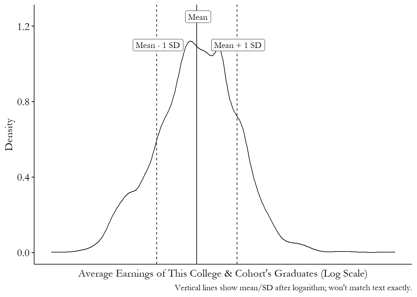
Figuring out how much variation one standard deviation is can be kind of tricky, and largely just takes practice and intuition. But a graph can help. Figure 3.7 shows how far to the left and right you have to go to find a one standard-deviation distance. It just so happens that 32.7% of the sample is under the curve between the “Mean \(-\) 1 SD” line and the “Mean” line, and another 35.5% of the sample is between the “Mean” line and the “Mean \(+\) 1 SD” line. In this case, more than 60% of the sample is closer than a single standard deviation.
So how weird is being one standard deviation away from the mean? Well, roughly a third of people are between you and the average. Make of that what you will.
Figure 3.7: Distribution of Average Earnings across US College Cohorts
We can also compare percentiles to see how much a variable varies.
This is actually quite a straightforward process. All we have to do is pick a percentile above the median, and a percentile below the median, and see how different they are. That’s it!
We’ve already discussed the range, which gives the distance between the biggest observation and the smallest. But the range can be very sensitive to really big observations - the range of wealth is very different depending on whether Jeff Bezos is in the room. So it’s not a great measure.
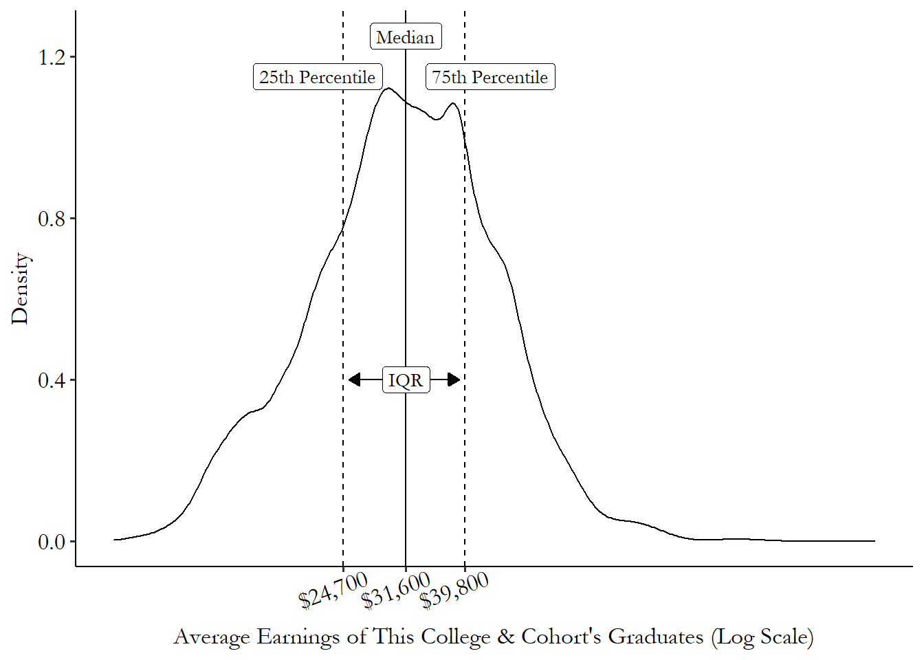
Instead, the most common percentile-based measure of variation you’ll tend to see is the interquartile range, or IQR.41 Another one you might see is the “90/10” ratio, or the 90th percentile divided by the 10th percentile. This is a measure commonly used in studies of inequality, to give a sense of just how different the top and bottom of the distribution are. This gives the difference between the 75th percentile and the 25th percentile. The IQR is handy for a few reasons. First, you know that the value given by the IQR covers exactly half of your sample. So for the half of your sample closest to the median, the IQR gives you a good sense of how close to the median they are. Second, unlike the variance, the IQR isn’t very strongly affected by big tail observations. So, as always, it’s a good way of representing observations rather than values.
Figure 3.8 shows where the IQR comes from on a distribution. In this case, the 25th and 75th percentiles are at $39,800 and $24,700, respectively, giving us an IQR of \(39,800-24,700=15,100\). So the 50% of the cohorts nearest the median have a range of average incomes of $15,100.
Figure 3.8: Distribution of Average Earnings across US College Cohorts
Beyond the variation, there are of course a million other things we could describe about a distribution. I will cover only one of them here, and that’s the skew.
Skew describes how the distribution leans to one side or the other. For example, let’s talk about annual income. Most people have an income in a relatively narrow range - somewhere between $0 and, say, $150,000. But there are some people - and a fair number of them, actually - who have enormous incomes, way bigger than $150,000, perhaps in the millions or tens or hundreds of millions.
So for annual income, the right tail - the part of the distribution on the right edge - is very big. Figure 3.9 shows what I’m talking about. Most of the weight is down near 0, but there are people with millions of dollars in income making the right tail of the distribution stretch way far out. The same isn’t true on the left side - at least in this data, we’re not seeing people with negative incomes.
Figure 3.9: Distribution of Personal Income in 2018 American Community Survey
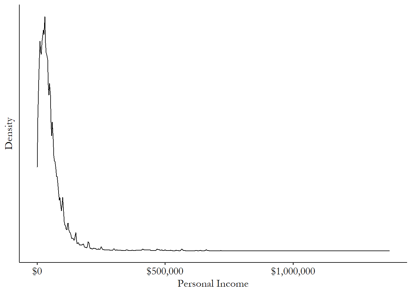
We say that distributions like this one, with a heavy right tail but no big left tail to speak of, has a “right skew” since it has a lot of right-tailed observations. Similarly, a distribution with lots of observations in the left tail would have a left skew. A distribution with similar tails on both sides is symmetric.
Right-skewed variables pop up all the time in social science. Basically anything that’s unequally distributed, like income, will have a lot of people with relatively little, and a few people with a lot, and the people with a lot have a lot.
Skew can be an important feature of a distribution to describe. It can also give us problems if we’re working with means and variances, since those really-huge values will affect any measure that tries to represent values.
One way of handling skew in data is by transforming the data. If we apply some function to the data that shrinks the impact of those really-big observations, the mean and variance work better. A common transformation in this case is the log transformation, where we take the natural logarithm of the data and use that instead. This can make the data much better-behaved.42 The “natural” logarithm uses a logarithmic base of \(e\). This is so common in statistics that if you just see “log” without any detail on what the base is, you can assume it’s base-\(e\).
Figure 3.10: Distribution of Logged Personal Income in 2018 American Community Survey
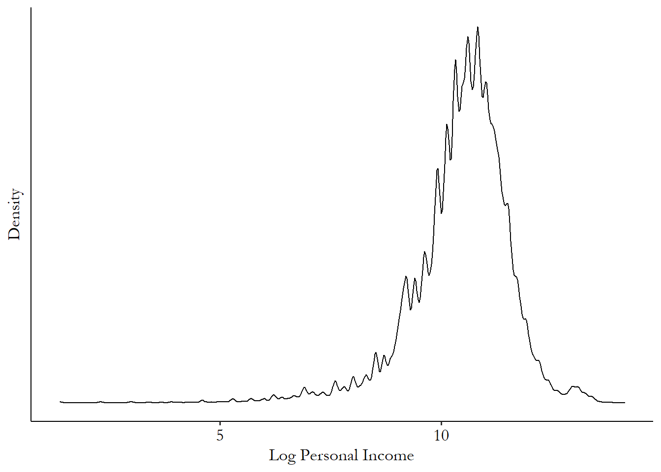
Figure 3.10 shows that once we take the log of income, there’s still a bit of a tail remaining (on the left this time!), but in general we have a roughly symmetric distribution that our mean will work a lot better with.43 How about downsides of a log transformation? It can’t handle negative values, or even 0 values, since \(\log(0)\) is undefined. There are in fact a lot of 0 incomes in this data that aren’t graphed. If we wanted to include them, we couldn’t use a log transformation. If you have negative values things get a lot trickier, but if it’s just 0s worrying you (and often it is), you might want to try the inverse hyperbolic sine transform (asinh), as that’s similar to log for large values but sets 0s to 0.
One reason the natural log transformation is so popular is that the transformed variable has an easy interpretation. A log increase of, let’s say, .01, translates to approximately a \(.01\times 100 = 1\)% increase in the original variable. So an increase in log income from 10.00 to 10.02 in log terms means a \((10.02-10.00)=.02 \approx 2\)% increase in income itself. This approximation works pretty well for small increases like .01 or .02, but it starts to break down for bigger increases like, say, .2. Anything above .1/10% or so and you should avoid the approximation.44 For bigger increases, an increase of \(p\) in the log is actually equivalent to a \((e^p-1)\times 100\)% increase in the variable. Or, a \(X\)% increase in the variable is actually equivalent to a \(\log(1+X)\) log increase. The approximation works because \(e^p-1\) and \(p\) are very close together for small values of \(p\).
There might be trouble brewing if you take the log and it still looks skewed. This can be the case when you have fat tails, i.e., observations far away from the mean are very common. When you have fat tails on one side but not the other, this can make your data very difficult to work with indeed. I’ll cover this a little bit all the way at the end of the book in Chapter 23.
3.5 Theoretical Distributions
The difference between reality and the truth is that reality is always with you, but no matter how far you walk, truth is still on the horizon. So it’s much more convenient to squint, shrug, go “eh, close enough,” and head home.
Statistics makes a very clear distinction between the truth and the data we’ve collected. But isn’t the data truly what we’ve collected? Well, sure, but what it is supposed to represent is some broader truth beyond that.
Let’s say you want to understand the average age at which children learn to share toys. So you interview 1000 parents about when their kids started doing that. You calculate a mean and get that kids in your sample start to share easily around 4.2 years old.
Of course, what you actually have is that the 1000 kids in your sample started to share easily around 4.2 years old. And you didn’t set out to learn something about those 1000 kids, right? You set out to learn something about kids in general! So the true average age at which kids in general start to share is one thing, and the average age you calculated in your data is another.
That’s the whole point of doing statistics. We can never check every kid who ever existed on the age they started sharing. So given the real data we actually have, what can we say about that true number?
Theoretical distribution. A distribution based on theoretical assumptions about the truth, rather than derived purely from data.
Figuring this out will require us to think about how data behaves under different versions of the truth. If the truth is that kids learn to share on average at 3.8 years of age, what kind of data does that generate? If the truth is that kids learn to share at 5 years of age, what kind of data does that generate? We’ll need to pair our observed distributions, the ones we’ve been talking about so far in this chapter, with theoretical distributions of how data behaves under different versions of the truth.
Some quick notation before we get much further.
If you’ve read any sort of statistics before, you may be familiar with symbols like \(\beta\), \(\mu\), \(\hat{\mu}\), \(\bar{x}\). You may have memorized what means what. But it turns out you probably don’t have to, as there’s an order to all this madness. What do these all mean?
English/Latin letters represent data. So \(x\) might be a variable of actual observed data. That’s our 1000 surveys with parents about their kids’ sharing ages.
Modifications of English/Latin letters represent calculations done with real data. A common way to indicate “mean” is to use a bar on top of the letter. So \(\bar{x}\) is the mean of \(x\) we calculated in our data. That’s the 4.2 we calculated from our survey.
Greek letters represent the truth.45 We have a system where English is the down-and-dirty real world and Greek is the lofty and perfect truth. Who designed this? \(^,\)46 It’s worth pointing out that a Greek letter in a bad model might not necessarily be “true.” But it is meant to imply the truth, even if it doesn’t actually get there. We don’t know what actual values these take, but we can make assumptions. Certain Greek letters are commonly used for certain kinds of truth - \(\mu\) commonly indicates some sort of mean,47 Technically, it represents “expected values” more often than means, but we won’t be going much into that in this book. \(\sigma\) the standard deviation, \(\rho\) for correlation, \(\beta\) for regression coefficients, \(\varepsilon\) for “error terms” (we’ll get there), and so on. But the important thing is that Greek letters represent the truth.
Modifications of Greek letters represent our estimate of the truth. We don’t know what the truth is, but we can make our best guess of it. That guess may be good, or bad, or completely misguided, but it’s our guess nonetheless. The most common way to represent “my guess” is to put a “hat” on top of the Greek letter. So \(\hat{\mu}\) is “my estimate of what I think \(\mu\) is.” If the way that I plan to estimate \(\mu\) is by taking the mean of \(x\), then I would say \(\hat{\mu} = \bar{x}\).
The theoretical distribution is what generated your data. That’s actually a good way to think about theoretical distributions. They’re the distribution of all the data, even the data you didn’t actually collect, and maybe could never actually collect! If you could collect literally an infinite number of observations, their distribution would be the theoretical distribution.48 In statistics this is known as the “limiting distribution” because in the limit (i.e., as the number of observations approaches infinity) it’s what you get. (Psst, that’s another calculus thing. The calculus is coming for you!)
This fact tells us a few things. First, it tells us why we’re interested in the theoretical distribution in the first place. Because that’s where we get our data from! If we want to learn about the average age children share at, the place that data comes from is the theoretical distribution. So if we want to know the value of that number beyond the data we actually have, we have to use that data to claw our way back to the theoretical distribution. Only then will we know something really interesting!
Remember, we don’t really care about the mean in our observed data, \(\bar{x}\). We care about the true average for everyone, \(\mu\)! The reason we bother gathering data in the first place is because it will let us make an estimate \(\hat{\mu}\) about what the theoretical distribution it came from is like. The second thing this “infinite observations” fact tells us is that the more observations we have, the better a job our observed data will do at matching that theoretical distribution. One observation isn’t likely to do us much good. But an infinite number would get the theoretical distribution exactly! Somewhere in the middle is going to have to be good enough. And the bigger our number of observations gets, the gooder-enougher we become.
This can be seen in Figure 3.11. No matter how many observations we have, the solid-line theoretical distribution always stays the same, of course. But while we do a pretty bad job at describing that distribution with only ten observations, by the time we’re up to 100 we’re doing a lot better. And by 1000 we’ve got it pretty good! That’s not to say that 1000 is always big enough to be just like the theoretical distribution. But here it worked pretty well.
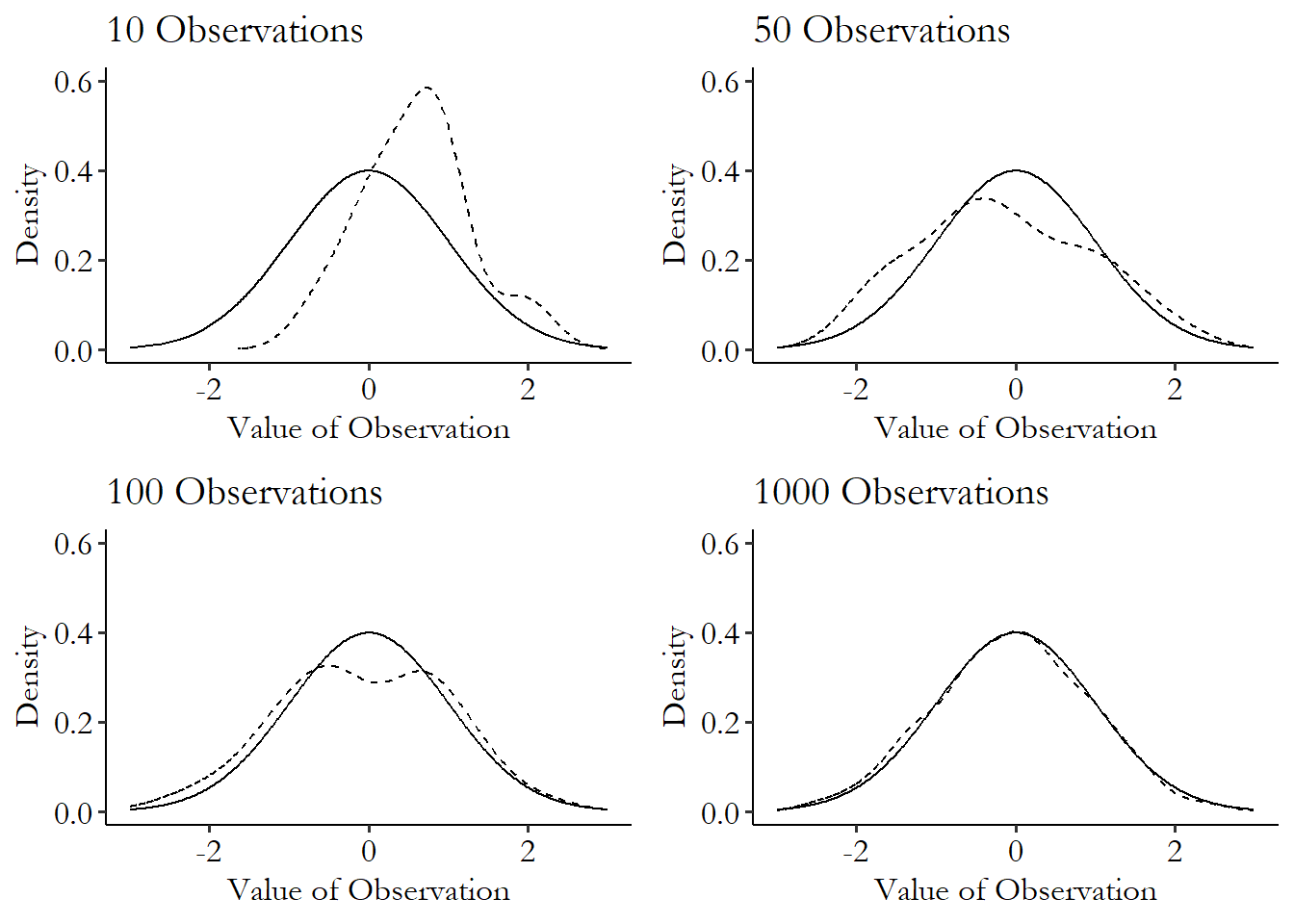
Figure 3.11: Trying to Match the Theoretical Distribution
This means as we get more and more observations, we’re going to do a better and better job of getting an observed distribution that matches the theoretical one that we sampled the data from. Since that’s the distribution we’re interested in, that’s a good thing! We just need to make sure to have plenty of observations.49 Although to be clear, the theoretical distribution we’ll get is the one our data came from. This may not be the one we’re actually interested in! Say our children-sharing data came only from children who go to daycare. Then, the distribution we’ll get as we get more and more observations is the distribution of daycare-going children. If we’re interested in all children, we won’t get the result for all children no matter how many daycare-going children we survey.
There are infinite different theoretical distributions, but some pop up in applied work often. There are some well-known distributions that are applied over and over again. If we think that our data follows one of these distributions we’re in luck, because it means we can use that theoretical distribution to do a lot of work for us!
I will cover only two that are especially important to know about in applied social science work, which are both depicted in Figure 3.12. There are many, many more I am leaving out: uniform distribution, Poisson, binomial, gamma, beta, and so on and so on. If you are interested, you may want to check out a more purely statistics-oriented book, like any of the eight zillion books I find when I search “Introduction to Statistics” on Amazon. I’m sure they’re all nearly as good as my book. Nearly.
The first to cover is the normal distribution. The normal distribution is symmetric (i.e., the left and right tails are the same size, there’s no skew/lean). The normal distribution often shows up when describing things that face real, physical restrictions, like height or intelligence.
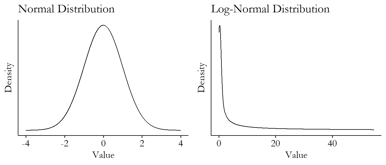
Figure 3.12: Normal and Log-Normal Distributions
The normal distribution also pops up a lot when looking at aggregated values.50 This is due to something called the “central limit theorem.” Really, read one of those eight zillion “Introduction to Statistics” textbooks I talked about! Interesting stuff. Income might have a strong right skew, but if we take the mean of income in one sample of data, aggregating across observations, and then again in another sample of data, aggregating across different observations, and then again and again in different samples, the distribution of the mean across different samples would have a normal distribution.
The normal distribution technically has infinite range, meaning that every value is possible, even if unlikely. This means that any variable for which some values are impossible (like how height can’t be negative) technically can’t be normal. But if the approximation is very good, we tend to let that slide. One reason we let that slide is that the normal distribution has fairly thin tails - observations far from the mean are extremely unlikely. Notice how quickly the distribution goes to basically 0 in Figure 3.12. So sure, maybe saying that height follows a normal distribution means you’re technically saying that negative heights are possible. But you’re saying it’s possible with a .00000001% chance, so that’s close enough to count.
The second is a bit of a cheat, and it’s the log-normal distribution. The log-normal distribution has a heavy right skew, but once we take the logarithm of it, it turns out to be a normal distribution! How handy.
The log-normal is a very convenient version of a skewed distribution, since we can take all the skew out of it by just applying a logarithm. Heavily skewed data comes up all the time in the real world. Anything that’s unequally distributed and that doesn’t have a maximum possible value is generally skewed (income, wealth…) as well as many things that tend to be “winner take all” or have some super-big hits (number of song downloads, number of hours logged in a certain video game, company sizes…). Notice how much of the weight is scrunched over to the left to make room for a very tiny number of really huge observations on the right. That’s skew for you!
When we see a skewed distribution, we tend to hope it’s log-normal for convenience reasons. However, there are of course many other skewed distributions out there. Skewed distributions with fat tails can be difficult to work with and can take specialized tools. So it’s a good idea, after taking the log of a skewed variable, to look at its distribution to confirm that the skew is gone.51 One common family of skewed distributions is “power distributions,” which pop up when you have data where big values are fairly common, like in the stock market, where days with huge upswings and downswings happen with some regularity. These can be tricky to work with - many theoretical power distributions don’t even have well-defined means or variances. If it doesn’t you may be wading into deep waters!
How can we use our empirical data to learn about the theoretical distribution?
Remember, our real reason for looking at and describing our variables is that we want to get a better idea of the theoretical distribution. We’re not really interested in the values of the variable in our sample; we’re interested in using our sample to find out about how the variable behaves in general.
We can, if we like, take our sample and look at its distribution (as well as its mean, standard deviation, and so on), figure that’s the best guess we have as to what the theoretical distribution looks like, and go from there.52 Or, if we’re using Bayesian statistics, we can take our observed distribution and combine it with our best guess for the theoretical distribution before we collected our data. Of course, we know that’s imperfect. Would we really believe that the distribution we happened to get in some data really represents the true theoretical distribution?
One thing that is a bit easier to do is to learn whether certain theoretical distributions are unlikely. Maybe we can’t figure out exactly what the theoretical distribution is, but we can rule some stuff out.
How can we figure out how likely a certain theoretical distribution is? We follow these steps:
- Choose some description of the theoretical distribution - its mean, its median, its standard deviation, etc. Let’s use the mean as an example.
- Use the properties of the theoretical distribution and your sample size to find the theoretical distribution of that description in random samples - means generally follow a normal distribution, and the standard deviation of that normal distribution is smaller for bigger sample sizes.
- Make that same description of your observed data - so now we have the distribution of our theoretical mean, and we have the actual observed mean.
- Use the theoretical distribution of that description to find out how unlikely it would be to get the data you got - if the theoretical distribution of the mean we’re looking at has mean 1 and standard deviation 2, and our observed mean is 1.5, we’re asking “how likely is it that we’d get a 1.5 or more from a normal distribution with mean 1 and standard deviation 2?”
- If it’s really unlikely, then you probably started with the wrong theoretical distribution and can rule it out. If we’re doing statistical significance testing, we might say that our observed mean is “statistically significantly different from” the mean of the theoretical distribution we started with.
Let’s walk through an example.
Say you’re interested in how many points basketball players make in each game. You collect data on 100 basketball players. Your observed data doesn’t look particularly well-behaved and doesn’t look like any sort of theoretical distribution you’ve heard of before. But you calculate its mean and standard deviation and find a mean of 102 with a standard deviation of 30.
Following step 1, you ask “could this have come from a distribution with a mean \(\mu\) of 90?” - notice we haven’t said anything here about it being from a normal distribution, or log-normal, or anything else. We are going to try to rule out distributions with means of 90, that’s all. Also notice we called the mean \(\mu\), a Greek letter (the truth!). We want to know if we can rule out that \(\mu = 90\) is the truth.
Then, for step 2, we want to get the distribution of that description. As mentioned earlier in this chapter, means are generally distributed normally, centered around the theoretical mean itself. The standard deviation of the mean’s distribution is just \(\sigma/\sqrt{N}\), or the standard deviation of the overall distribution divided by \(\sqrt{N}\), where \(N\) is the number of observations in the sample.
What’s going on here? Well, what this is saying is: if you survey \(N\) basketball players and take the mean, and then survey another \(N\) basketball players, and then another \(N\), and then another \(N\), and so on, you’ll get a different mean each time. If we take the mean from each sample as its own variable, the distribution of that variable will be normal, with a mean of the true theoretical mean, and a standard deviation of \(\sigma/\sqrt{N}\). The \(/\sqrt{N}\) is because the more players we survey each time, the more likely it is that we’ll get very close to the true mean. A mean of 10 basketball players could give you a result very far from the mean. But a mean of 1,000 basketball players is pretty likely to give you a mean close to the true mean, and thus the smaller standard deviation.
\(\sigma\) is a Greek letter, and so of course that’s the true standard deviation, which we don’t know. But our best estimate of it is the standard deviation of 30 we got in our data. So we say that the mean is distributed normally with a mean of \(\mu = 90\), and a standard deviation of \(\hat{\sigma}/\sqrt{N} = 30/\sqrt{100} = 3\) (remember, \(\hat{\sigma}\) means “our estimate of the true \(\sigma\),” which is just the standard deviation we got in our observed data).
Now for step 3, we get the same calculation in our observed data. As above, the mean in the observed data is 102.
Moving on to step 4, we can ask “how likely is it to get a 102, or even more, from a normal distribution with mean 90 and standard deviation 3?”53 Why 3 and not 30? Remember, this is the standard deviation of the sampling distribution of the mean, not the standard deviation of the variable itself. So we divide by \(\sqrt{100} = 10\). More precisely, we are generally interested in how likely it is to get a 102 or something even farther away, which could be more or less than \(\mu\).54 This is a “two-sided test.” A “one-sided test” would just ask how likely it would be to get 102 or more. So 102 is 12 away from 90, and thus we’re interested in how likely it is to get a mean of 102 or more, or 78 or less (since 78 is also 12 away from 90).
By looking at the percentiles of the normal-with-mean-90-and-standard-deviation-3 distribution, we can determine that 78 is not even the 1st percentile, it’s more like the .004th percentile. So there’s only a .004% chance of getting a mean of 78 or less in a 100-player sample if the true mean is 90 and the standard deviation is 30. Similarly, 102 is the 99.996th percentile, so again there’s only a .004% chance of getting a mean of 102 or more in a 100-player sample if the true mean is 90 and the standard deviation is 30.
For step 5, we add those up and say that there’s only a .008% chance of getting something as far off as 102 or more if the true mean is 90 and the true standard deviation is 30. That’s pretty darn unlikely. So this data very likely did not come from a distribution with a mean of 90.
We could also frame all of this in terms of hypothesis testing. Following the same steps, we can say:
- Step 1: Our null hypothesis is that the mean is 90. Our alternative hypothesis is that the mean is not 90.
- Step 2: Pick a test statistic with a known distribution. Means are distributed normally, so we might use a Z-statistic, which is for describing points on normal distributions.
- Step 3: Get that same test statistic in the data.
- Step 4: Using the known distribution of the test statistic, calculate how likely it is to get your data’s test statistic, or something even more extreme (\(p\)-value).
- Step 5: Determine whether we can reject the null hypothesis. This comes down to your threshold (\(\alpha\)) - how unlikely does your data’s test statistic need to be for you to reject the null? A common number is 5%.55 The choice of 5% is completely arbitrary and yet widely applied, like your keyboard’s QWERTY layout. If that’s your threshold, then if Step 4 gave you a lower \(p\)-value than your \(\alpha\) threshold, then that’s too unlikely for you, and you can reject the null hypothesis that the mean is 90.
This section describes what hypothesis testing actually is and what it’s for. Statistical significance is not a marker of being correct or important. It’s just a marker of being able to reject some theoretical distribution you’ve chosen. That can certainly be interesting. At the very least, we’ve narrowed down the likely list of ways that our data could have been generated. And that’s the whole point!
Page built: 2025-10-17 using R version 4.5.0 (2025-04-11 ucrt)