Chapter 23 - Under the Rug
23.1 The Light, It Burns Us
So much of this book has been dedicated to being careful. We need to be careful to create good models. We need to think about the assumptions behind our design. We need to think about sampling variation, and so on and so on and so on.
A statistician is always prepared to give you something to worry about, as though you didn’t have enough already!
This chapter is all about the assumptions and concerns that are a part of pretty much any causal inference research study, but which often get ignored or at least brushed aside. Turns out that we’re assuming a lot that we don’t even think about. By the time you’re through with this chapter, you’ll doubt you even have a strong enough research design to prove that your eyes are real.
That said, someone has been thinking about this stuff, and just because it’s uncomfortable doesn’t make it go away. I’ll tell you about tools to help think about these topics and grapple with them in regards to your own research.
This is a sort of survey chapter. I won’t be going super in-depth on any of these. But I will tell you what they’re all about and give you a few places to look in if you’re interested in learning more.
Perhaps the scariest thing I can say at this moment is that the list of topics in this chapter is only a subset of topics that could have easily been included.
23.2 How Sure Are You? Model Uncertainty
If you’ve taken the time to sit down and actually try to design an analysis to answer a research question (as I certainly hope you have by this point), you’ll very quickly come to a realization about how many choices you have to make in that process, and how many of those choices you’re unsure about. Those arrows in the causal diagram you weren’t sure about. The unnecessary control you couldn’t decide whether to include or not.
As careful as we like to be about designing our causal diagrams (and using the analyses they imply), we’re never going to be certain what the “best” model really is. We might have quite a few reasonable candidates, once we’ve pinned down the really important parts we’re sure about.696 Sometimes, even knowing the necessary controls to identify from a causal diagram, even if we’re sure about that diagram, leaves some room for interpretation. For example, what if a variable is on a back door, but likely doesn’t bias the result that much, and controlling for it would make the model way noisier? So we have model uncertainty in our analysis. Variation in our estimates comes down not just to sampling variation, but also uncertainty in the question of which statistical model is the right one to estimate.697 This is a bit different from the issue of not knowing which causal model is the right one. We talked a bit in Chapter 7 about how to narrow that down. There is some overlap between causal model uncertainty and statistical model uncertainty - for example, both might question whether a certain variable should be controlled for. But the fixes in this section are largely targeted at statistical model uncertainty.
In many cases, researchers present results from only one preferred model, either ignoring the possibility of model uncertainty or using some criterion, usually based on fit or predictive power, to pick a single best model. Maybe they’ll present a few models, checking whether the addition of a few controls that might be necessary would change the results. The idea here being that you aren’t 100% certain about the causal model - one potential causal model says variable \(Z\) must be controlled for, another says it doesn’t. If you get similar results controlling it or not, then your result is “robust” to which of the two causal models are right.
Presenting a few hand-picked models is a basic but pretty ad-hoc way to deal with the reality of model uncertainty. Can we do better?
Instead of trying a few models we could try lots of different models, often differing along the lines of which control variables are included. Then, once you have the results for those models, we both have an idea of what degree of model uncertainty we have, and can maybe use that to produce a single estimate.
Let’s say that you have a set of variables \(W_1\) that you know you have to control for to identify your effect, and a set of variables \(W_2\) that you don’t think need to be included, but you either aren’t sure or are thinking of including them anyway.
You can estimate every possible model with every possible combination of all the variables in \(W_2\). Or at least a smartly chosen subset of those models (after all, doing all the models means \(2^J\) models if there are \(J\) variables in \(W_2\) - that grows quickly!). From each model you get an estimate.
Once you have all the models you could show the distribution of all those estimates, which would show in an easy-to-understand way both what a “typical” estimate looks like (perhaps even reporting the mean of the distribution as an average effect), and also how much potential variation in the estimate model uncertainty might be responsible for. If the distribution of the estimates is fairly narrow, then model uncertainty doesn’t seem to matter too much and you’re good to go. If it’s wide, then the results from any particular model should be viewed with the knowledge that it’s highly contingent on which controls are included.
Alternately, you could go even more principled and use Bayesian model averaging (Clyde and George 2004Clyde, Merlise, and Edward I. George. 2004. “Model Uncertainty.” Statistical Science 19 (1): 81–94.). Bayesian model averaging has been around for a long time. The basic idea is that you don’t just plain take the mean of your estimates across all the models. The models should be weighted by how likely they are to be true!
How do we figure out how likely they are to be true? Well, we start by telling it how likely we think each is to be true. We pick a “prior probability” for each candidate model. Then, we estimate the models. Based on how well each model explains the data, we update those prior probabilities to get posterior probabilities. Models that fit really well are counted as more likely to be true than the prior, and models that fit poorly are counted as less likely to be true than the prior.
Then, once we have those posterior probabilities, we can use them as weights to average together the results of all of the candidate models, providing us with a good guess about the coefficients while averaging out all the model uncertainty.698 Or at least all the model uncertainty you chose to consider in selecting all the models to average over.
Demonstrating or averaging the distribution of effects across many models is handy, and a great way to deal with uncertain control-variable decisions. Of course, it can’t address the underlying problem completely - there will always be modeling uncertainties. And our methods generally don’t incorporate that kind of uncertainty into our understanding. But we really should know it’s there.
23.3 When Is The Data Not The Data? Measurement and Validity
When you open up a data set that has been prepared for you, it’s easy to forget the whole process of putting the data together in the first place. And yet!
Before you opened it up on your computer, someone had to produce that data for you. If the data comes from some sort of survey, for example,699 And keep in mind, many large-scale data sources, even government sources, are survey-based on some level. Unemployment rates, for example, involve asking someone whether they’re looking for work, at the very least. someone had to decide which questions to ask people and how, what the set of acceptable responses was, and who to sample and when. Then someone had to go out and actually ask the questions and record the answers. Then, the responses come from actual people, not some omnipotent observer of the truth.
Data doesn’t fall from the sky.700 Unless you are a meteoricist. It is produced by humans, or at the very least collected by them. The way in which it is produced affects the way we can use it, and it often runs us into problems when the theoretical or statistical model we have in mind relies on assumptions about the data that just aren’t true given how it was made.
I already discussed two issues in this vein in Chapter 13. One was the use of sample weights. Our statistical models assume that individuals are sampled randomly, but this is rarely true. Thankfully, many professional surveys provide survey weights that can be used to make the survey sample look more like the general population you’d like to generalize to.701 Many of the problems that survey designers face about samples being representative are very similar to causal inference problems. This makes sense - they have to ask what causes someone to be more or less likely to be in the sample. Survey weights are a lot like matching weights, where the survey sample is being matched to the population.
Another issue I brought up in Chapter 13 was measurement error. A lot of the time, variables are simply written down wrong, or reported incorrectly. I can’t tell you how many papers I’ve read trying to solve the problem that people often can’t even report their own level of educational attainment correctly. That’s the kind of thing you’d think someone would remember!
These two already have their own dedicated sections. What other kinds of concerns arise when we think about the difference between the data we have and what we think the data should be?
23.3.1 Construct Validity
Construct validity asks what our data actually measures. What do we want data to do, really? We have a theoretical model that we’d like to estimate some parts of. To do that, we need to get measurements of the variables in that model. If we gather some data and that data does a good job at representing that theoretical concept, we’d say that we have construct validity.
This is harder than it seems. Let’s say that we have a theoretical model and one of the variables in that model is “trust.” That is, how trusting someone is of the world. You can easily theorize about where this variable fits in your model. You know where the arrows come in and go out of it.
But how do you measure it? Maybe you just ask people to rate how much they trust the world on a scale of 1 to 10. Seems like a good place to start at least.
Someone concerned with construct validity would immediately spot the problems with that plan. Are people good at self-reporting their own trust levels? Will people understand a rating scale and what the numbers mean? How likely is someone to misunderstand the question, or perhaps think that “trust” means something different than what you think it means? Will the answer to this even be that closely related to your idea of trust? Or will it better represent something like “how important someone thinks trust is”?
One example of this problem at play comes from Hertwig and Gigerenzer (1999Hertwig, Ralph, and Gerd Gigerenzer. 1999. “The ‘Conjunction Fallacy’ Revisited: How Intelligent Inferences Look Like Reasoning Errors.” Journal of Behavioral Decision Making 12 (4): 275–305.). They look at the classic “Linda problem” from behavioral economics. In the Linda problem, people are given a small vignette about someone named Linda. The vignette is written in such a way that suggests that Linda is a politically active feminist. Then, they are asked which is “more likely” - that Linda is a bank teller, or that Linda is a bank teller and a feminist.
People routinely say that it’s more likely that she’s a bank teller and a feminist. However, this breaks the laws of probability. Every bank-teller-and-feminist is a bank teller. So being a bank teller must be at least as likely as being both. This is taken as evidence that people make errors in probabilistic judgment.
However, Hertwig and Gigerenzer (1999Hertwig, Ralph, and Gerd Gigerenzer. 1999. “The ‘Conjunction Fallacy’ Revisited: How Intelligent Inferences Look Like Reasoning Errors.” Journal of Behavioral Decision Making 12 (4): 275–305.) point out that this assumes that respondents are using a probability-based interpretation of the term “more likely.” By other interpretations, their response might be perfectly rational! For example, by the laws of conversation (not their term), we would be more likely to have given them that feminism-focused vignette in order to demonstrate Linda’s feminism, making the bank-teller-and-feminist option more “likely.” They also show that, by asking the question in a different way that emphasizes that they really do mean the probability-based interpretation of “more likely,” people don’t make the error nearly as often.
This problem isn’t limited to surveys and experiments. Let’s say you want income as a part of your model, and you have complete access to tax data, no surveys involved. Do you use wage income? Or total income? Or family income? Or post-tax income? Which version of income represents the “income” you have in mind for your theory? Do any of them?
What can we do to make sure that we have good construct validity? Well, we can think carefully about what underlying construct our data is likely to actually represent. That’s always a good idea. More broadly, we can pay attention to psychometrics. Construct validity is very much their jam. In fact, they’d probably say I’m leaving out a number of other aspects of whether a measure does a good job representing a theoretical concept, such as whether it represents all of that concept (content validity), and whether the measure tends to give you the same value when you collect it in the same setting (reliability, i.e., if you measure “trust” for the same person on two different days, do you get more or less the same result?).
I’m not going to attempt to squish the entire field into this section, but one thing they do to help construct validity along is take multiple measures, or ask multiple survey questions, that are all intended to represent the same concept. Then, they combine them together with tools like factor analysis or structural equation modeling in order to extract a number representing the underlying theoretical concept that you actually want.702 Ever taken a survey and it feels like they’re asking you the same question in slightly different ways a bunch of times? This psychometric approach is what the survey is going for. The idea here is that every way you ask about your intended theoretical concept is an imperfect representation of what you want, so by looking for the statistical similarities between them you’re probably picking up on the real deal. Seems like a good place to start.
23.3.2 The Observer Effect
The downside of doing social science is that it’s the only field where the scientific subjects know they’re scientific subjects. This leads to another way in which our measurements might fail to represent our theoretical concept - if people modify their behavior knowing that we’re watching them.703 The aforementioned psychometricians might consider this a subset of construct validity. There are a number of names for this, each of which varies slightly in meaning from the others - researcher expectations, researcher demand, hypothesis guessing, Hawthorne effects, observer bias, etc..
For simplicity I’ll refer to the whole bundle of concepts as the “observer effect,” borrowing a term from physics.704 Borrowing a term from physics and using it for only vaguely related purposes! That’s how you know I’m an economist. The observer effect applies most often in lab experiments, surveys, and polls, although occasionally it pops up in other settings.
There are a bunch of ways in which the fact that people know we’re collecting data on them might change their behavior, or at least what they say their behavior is:
- They may tell the researcher what they think the researcher wants to hear.
- They may try to guess what the researcher will do with the data and so act in a way that means the data shows what they want it to show (or think it should show).
- They may respond in a way that makes them look good to the researcher.
- They may not like being research subjects, or they may just like causing trouble, and so may actively try to mess up the data.705 Having administered a survey to high school kids myself, I can testify to having seen all kinds of suuuuuper hilarious joke answers and penis drawings.
- They may get self-conscious and self-aware of their responses.
- They may respond to cues from the researcher, who themselves may be consciously or subconsciously trying to get the data to support their hypothesis.
The list goes on. People do stuff for all sorts of reasons.
Unfortunately there’s not too much you can do after the fact if you think there’s likely to be a problem.706 Unless you’re willing to make some strong assumptions about the exact way you think it’s happening. This is more a problem you need to tackle at the data-collection stage. The study and data collection process itself needs to be designed around the task of getting people to answer questions, often difficult ones, without thinking too much about the fact that they’re answering questions.
23.3.3 Processing Data
Then we come to the real embarrassing corner. Perhaps the data collection mechanism has been immaculately designed. The survey is perfectly put together and implemented, the sampling is representative. Then the data comes and you, well… you have some work to do!
It’s pretty rare in the real world (that is, outside a classroom) that you are working with a data set that comes to you completely ready to run your analysis on. You generally have to clean and manipulate the data in some way before you can use it.
Therein lies the problem. Just like with model uncertainty, there are often multiple ways to do the data cleaning process. Which observations are likely to be mistakes and should be fixed? Which observations don’t apply to your model and should be dropped? How can you code up the free-response survey question into usable categories? How should you define the different variables - for something like education, do you keep it at its original value or “bin” it into bigger groups? How big are the bins?
Different people will make these choices in different ways, which can affect the estimates. In Huntington-Klein et al. (2021Huntington-Klein, Nick, Andreu Arenas, Emily Beam, Marco Bertoni, Jeffrey R. Bloem, Pralhad Burli, Naibin Chen, et al. 2021. “The Influence of Hidden Researcher Decisions in Applied Microeconomics.” Economic Inquiry 59 (3): 944–60.), we found that multiple researchers separately cleaning the data for the same research project made considerably different decisions, and no two researchers ended up with the same sample size. This affected the estimates - the standard deviation of estimates across different researchers was much bigger than the reported standard errors for each researcher.
That’s just differences in data preparation that come down to “reasonable people can disagree on how to do this.” Sometimes there are just errors that are hard to catch. One particularly scary version of this popped up in genetics. Geneticists are fond of doing data analysis (or at least data entry) in Microsoft Excel. Excel, however, likes to convert things to dates if it thinks they’re dates. And do you know some things that look a lot like dates? Certain names of genes.
Analyses of the genetics literature found that up to 20% of all recent papers had errors in them related to Excel reading gene names as dates. Oops! Geneticists actually ended up renaming a lot of date-like terms instead of giving up on Excel (Vincent 2020Vincent, James. 2020. “Scientists Rename Human Genes to Stop Microsoft Excel from Misreading Them as Dates.” The Verge.).
Data cleaning is a human process just like data collection. The way you do it matters, whether it’s an error or just a difference of opinion. Worse, it’s the kind of thing where you might not even notice that an error has been made until it’s far, far too late.
23.4 Why It Had To Go, I Don’t Know: Missing Data
You might think that, if you have an observation in your data, then you have that observation in your data. If only it were that simple! It’s pretty darn common to have observations in your data where you have data on some of the variables but not others. For example, in a data set of height and weight for a group of people, there might be some people for whom you have measures of both height and weight, some you only have height but not weight, and some you only have weight but not height. When this happens, you have missing data.
Missing data can be a real problem. The first, obvious, problem is figuring out what the heck we do with observations that have missing data. If we want to regress, say, weight on height, a regression won’t allow someone to be in the model if they only have weight or height but not both.
The simplest solution is “listwise deletion,” where you simply drop everyone from the data if they have missing data for any of the variables in your model. This is the default behavior of most statistical software.
But just because it’s the default doesn’t mean it’s a fantastic idea. Sure, it will let you just run your darn model,707 To be fair, listwise deletion is probably a fine choice if your missing data problem is limited to a pretty tiny portion of your data - it still introduces problems, but less so, and at that point the additional complexity added by some of the more proper methods may hurt more than they help. but listwise deletion can introduce real problems, even beyond the fact that it shrinks your sample size. Why? It all comes down to why the data is missing.
Data can be missing for a number of reasons:
- Not in Universe (NIU). A value is NIU if the variable simply doesn’t apply to that observation. For example, the variable “number of employees in your small business” should be missing for people who don’t own a small business.
- Missing Completely at Random (MCAR). A value is MCAR if the fact that it’s missing is completely unrelated to both the value itself and to the other variables in the model. So in our height and weight example, weight is MCAR if it is equally likely to be missing regardless of someone’s true weight and regardless of their height.
- Missing at Random (MAR). A value is MAR if the fact that it’s missing is unrelated to the value itself conditional on the other variables.708 MAR is very easy to mix up with MCAR, I know. Sorry, I didn’t pick the names! Weight is MAR if it is equally likely to be missing whether your true weight is higher, lower, or equal to what we’d expect your weight to be given your height.
- Missing Not at Random (MNAR). A value is MNAR if the fact that it’s missing is related to the missing value itself. For example, weight is MNAR if people with lower actual weights are more likely to have missing weight values in the data.
Listwise deletion works okay for the first two of these: Not in Universe and Missing Completely at Random (MCAR).709 Although for MCAR, listwise deletion does reduce your sample size. For Not in Universe missing values, you want those observations out of your analysis, since presumably your analysis is trying to model a group that they are not a part of. For MCAR, it’s basically a complete fluke that there’s missing data somewhere. So dropping an observation with missing data is hardly different from having gathered one less observation in the first place. No problem.
But think about why data might be missing and ask how likely MCAR really is. Why might weight data be missing, for example? People think their weight is personal and don’t want to share it? People with particular weights are ashamed of it and don’t want to tell a researcher? People lie about their weight and the survey-taker doubts the answer and so doesn’t write anything down? If there’s a reason why the data is missing and it isn’t some complete fluke, that reason is probably related to the value of the variable, or at least to one of the other variables in the model.
If the data is Missing at Random or Missing Not at Random, listwise deletion will do some bad things. In these cases, “Missingness” gets a spot on the causal diagram itself. Using only data without any missing values is like controlling for Missingness. Depending on the exact diagram, this is just asking for collider effects, post-treatment controls, or just violating your assumptions about random sampling. Your estimates can get biased.710 I should point out, though, that while the other solutions below solve the problem better than listwise deletion if the additional assumptions they rely on are true, what if they aren’t? Listwise deletion might sometimes still be the least-bad solution to the problem.
There are some approaches available for dealing with missing data, thankfully. Of course, they bring their own kind of complexity.
23.4.1 Filling in Blank Spots
One obvious way to deal with missing data is to fill that data in. There are a host of different methods for imputing missing values. That is, trying to figure out what they should be and filling them in.
To get an idea of how this could work, let’s start with a bad way of doing it that is nonetheless popular among the “just let me run my regression please” crowd: mean imputation.
Let’s say we have some height and weight data with some missing weight values in Table 23.1.
Table 23.1: Height and Weight Data with Missing Values
| Height (in.) | Weight (lbs.) |
|---|---|
| 65 | 120 |
| 70 | ? |
| 66 | ? |
| 70 | 180 |
We don’t know what the ?s are. So we just take the mean of weight (\((120 + 180)/2 = 150\)) and fill in all the missing values with that. This gives us Table 23.2.
Table 23.2: Height and Weight Data with Missing Values Filled in Poorly by Mean Imputation
| Height (in.) | Weight (lbs.) |
|---|---|
| 65 | 120 |
| 70 | 150* |
| 66 | 150* |
| 70 | 180 |
Note: * Imputed
Now we can run our analysis with all four observations intact. However, this method completely ignores any way in which the rows with missing data might be different. So you can get some weird predictions. Imagine we had a super-tall 84-inch person here with missing weight. We’d predict their weight to be 150 pounds as well. That doesn’t seem right.
More sophisticated methods of imputation, which are designed to work for data that is Missing at Random, take basically the exact same idea but do it better, using the other data that is available to make much better predictions about the missing values.
The most common sophisticated form of imputation is probably multiple imputation.711 Another method is to use coarsened exact matching, as in Chapter 14, to predict the values of missing data. This requires that the observation with the missing values has some “doppelganger” observations in the data that are exactly the same on a set of matching variables. This approach is far less common but seems interesting for very large data sets. In multiple imputation, you (1) fit a model that allows you to predict the variable with missing values using all the other variables in your data,712 Note this says “in your data,” not “in your model.” The idea here is that all the variables have information on what the missing value is likely to be. and (2) use that model to predict the missing values.713 A common extension to multiple imputation adds chained equations, which is nice when you have multiple variables with missing values. In this method, once you start imputing some values for a variable, you use those imputed values to start imputing other variables. Then you loop back around to your original variable and repeat the process a bunch of times.
What kind of model can you fit? Multiple imputation allows for pretty much any kind of model. Traditional approaches have used good ol’ regression. However, as with any method where prediction is the real goal, a number of methods have popped up based on the use of machine learning algorithms to do the prediction (Deng et al. 2016Deng, Yi, Changgee Chang, Moges Seyoum Ido, and Qi Long. 2016. “Multiple Imputation for General Missing Data Patterns in the Presence of High-Dimensional Data.” Scientific Reports 6 (1): 1–10.).
At this point, you have a single imputation. How do you get from that to multiple imputation? You (3) add some random noise to your prediction process (drawing random values of the regression coefficients rom the sampling distributions you’ve estimated, and then getting the predicted valuesfrom that), (4) predict the value a bunch of different times, with different random draws each time. This multiple imputation process improves on the single imputation by not imposing too much certainty on those predictions, which both better reflects the uncertainty in your predictions and makes for better predictions overall.
Now you have multiple predictions for each missing value. Let’s say you want to produce ten imputations. You’d end up with ten full data sets, each of them having the missing values filled in slightly different ways. Then, when you want to estimate your model, you estimate it ten different times, once for each imputed data set. Finally, you combine your estimates together according to some estimation-combination equations known as “Rubin’s Rule” (Rubin 1987Rubin, Donald B. 1987. Multiple Imputation for Nonresponse in Surveys. New York. John Wiley & Sons.). Now you have your estimate!
Multiple imputation has its ups and downs. It does get you a complete data set that you can work with. However, it also requires that you make a lot of decisions in setting it up without a whole lot of guidance, picking a full predictive model for each variable in your data set with missing values, and selecting things like how many imputed data sets to make. Also, because it’s such a general method for filling in data, it isn’t customized for, or even aware of, the model it’s going to be used in, and misses some opportunities there. For that reason, many people prefer the methods I talk about in the next subsection. But multiple imputation still has a real appeal and is intuitively very straightforward.
Now, do keep in mind, this is all intended to work with MAR data (or MCAR I suppose). If missingness is related to the missing value in a way that isn’t explained by the other variables, then, well… a method designed to predict those missing values using the other variables won’t work well. Are you out of luck if the data is MNAR? Not entirely. You can use multiple imputation with MNAR data. But doing this requires that you explicitly model what you think the missing-data process is so your predictions can account for it. This is really only feasible if you have a very strong grasp on why your data is missing. Have fun!
23.4.2 Stronger Without You
Maybe we don’t need to fill in the values. After all, we don’t really care about predicting those missing values. That’s just a nuisance we have to get out of the way before we can do what we really want, which is estimating our model. What if we had a method that would let us estimate a model even in the presence of missing values? There are actually several ways to do this.
The first method for estimating a model with missing data included is also the simplest. Just… model it!
This works especially well when you’re dealing with categorical data. Just add “missing value” as its own category. Then you’re done. Run the model as normal otherwise.
This is a fairly common approach in the machine learning world. There are some weaknesses, of course. Like the mean imputation method that worked so poorly, this method ignores the differences between different observations with missing data. However, unlike mean imputation, this approach does account for the differences between the missing and non-missing observations, and does to some extent model the relationship between missingness and the other predictors.
The second method is full information maximum likelihood. Full information maximum likelihood is a way of estimating your actual model while letting each observation contribute whatever observed data it has, without requiring it to all be there.
Maximum likelihood in general operates on the idea that, for a given model, you can calculate the probability of a given observation occurring, which we call the likelihood. For example, if your model estimates that a coin has a .6 chance of being heads, then two observations of heads followed by one observation of tails has a likelihood of \(.6\times.6\times.4 = .144\), i.e. a .144 chance of occurring. Then, you pick the model that makes the data you got as likely as possible. In our coin example with two observed heads flips and one observed tails, we’d pick whatever \(P(Heads)\) value maximized \(P(Heads)\times P(Heads) \times (1-P(Heads))\), which would be \(P(Heads) = 2/3\).
Full information maximum likelihood just calculates the probability of a given observation occurring without having to refer to all of the variables together. So if you have data on height and weight, we calculate the probability of observing the particular combination of height and weight you have, and that’s your likelihood. But for me we only observe weight. So we’d calculate the probability of observing the weight that I have, and that’s my likelihood. Then we combine them together and pick the model that maximizes the likelihood of the whole sample.
The technical details are deeper than that, but that’s the main insight here. Full information maximum likelihood figures out how to let an observation contribute only partially, and estimates the model on that basis.
One last method: the expectation-maximization (EM) algorithm. The EM algorithm is an estimation method with broader applications than missing data, but missing data is one prominent place where you see it.
The EM algorithm is sort of like a cross between imputation and full information maximum likelihood without really being either. Like imputation, it does “fill in” values, but like full information maximum likelihood, it does so using the model you’re estimating. The process of estimating a model with EM is:
- Use some prediction method to make an initial guess of what the missing values are
- (The maximization step) Use the current version of the filled-in data to estimate your analysis model
- (The expectation step) Use the estimated model to predict the most likely values of the missing data
- Repeat steps 2 and 3 many times
In other words, we use some filled-in guesses of the missing data to estimate our model. Then, the model itself is used to produce better guesses of the missing values than we had before. The guessing doesn’t work like it does in multiple imputation, where each variable is predicted in its own model. Instead, the estimated model from the maximization step is used to figure out the joint distribution of all the variables, and you draw random values from that.
Like with multiple imputation, these methods all are based on using the information you have to infer what you don’t. That means that they’re all designed to work with data that is Missing at Random.714 With the slight exception that the first method, simply modeling “missing value” as its own category, will help a little with MNAR data if the true values of missing data tend to be clustered heavily in very few categories - say, if nearly all observations missing an “education” value are PhD holders. What if we have data that’s Missing Not at Random (MNAR)? Oof. Well, like with multiple imputation, you can apply any of these methods to MNAR data. However, doing so once again requires you to explicitly model what you think the missing-data procedure looks like. It’s a tall order.
23.5 It Lurks! They Call it SUTVA
It strikes fear in the heart of anyone doing causal inference. It is the Stable Unit Treatment Value Assumption, or SUTVA (known in some fields, like epidemiology, as the “consistency assumption”). SUTVA is an assumption that, in simplified terms, means that we know what “treatment” is.
How could we not know what treatment is? There are two ways that concern SUTVA. The SUTVA says that neither of them happens. But if either of them does happen, SUTVA is violated and we have a problem (Imbens and Rubin 2015Imbens, Guido W., and Donald B. Rubin. 2015. Causal Inference in Statistics, Social, and Biomedical Sciences. Cambridge University Press.).
- Treatment means different things for different observations, such that different “treated” individuals didn’t really get the same thing. For example, say you want to know the effects of workplace diversity training. But in one workplace that means watching an old VHS and reading a brochure, while in another workplace that means a week-long intensive participatory training program.
- Your outcome is determined in part by the treatment received by other people. In other words, there are spillovers. For example, say we want to know the effect of offering tax incentives on a city’s economic growth. My neighboring city does offer incentives, which makes it grow, and some of that growth comes to my city in the form of increased growth as well, whether or not I have tax incentives too.
It’s not hard to see how either of these could lead to problems, even if we have completely random assignment to treatment.715 Learning that there’s a causal inference problem that couldn’t even be theoretically solved by randomization I’d put on par with learning the truth about certain holiday-related characters as a child. Treatment meaning different things in different cases means that we don’t really know what \(X\) is in “the effect of \(X\) on \(Y\),” so what are we even estimating? Spillovers mean that our treatment actually reflects the treatment of many, many people, and picking out just the effect of our own is going to be quite the task.
Even worse, SUTVA violations seem to be just all over the darn place once you start looking for them. When does “receiving treatment” ever mean exactly the same thing to everyone who gets it? And when is it ever really the case that what’s going on with some people doesn’t affect some others?716 As I’ve heard from some very good sources, we live in a society!
So what can be done? Unfortunately, there aren’t exactly “SUTVA fixes” running around. However, there are some things that can be done that allow you to modify the design itself to help avoid SUTVA violations.
After all, SUTVA is about not having a stable idea of what treatment is, so… what if we did? Often SUTVA violations can be avoided by just thinking about what treatments we can define precisely.
In the case of treatment meaning different things in different cases, one obvious solution, if possible, is to measure not just whether treatment was assigned, but the actual flavor of treatment that was administered. Some experimental designs, for example, will include follow-up measurement that checks in on how faithfully the assigned treatment was followed. Accounting properly for differences in treatment adherence, or just considering different kinds of implementation as actual different treatments, allows the SUTVA violation to be sidestepped.
In the case of spillovers, one common approach is to specify treatment at a broader level. Say we’re interested in the effect of tutoring on test scores, but we’re worried that me being tutored might improve your test scores if we’re in the same classroom. SUTVA violation! But what if “treatment” is not “this student was tutored,” but rather “the proportion of students in a classroom who were tutored”? As long as we don’t think there are spillovers between classrooms, we’re good to go.
This doesn’t necessarily solve all our problems, though. What if the effect we’re interested in really does rely on that social interaction? This comes up when the spillovers, peer effects, or social dynamics (the stuff SUTVA said couldn’t happen or we’d be in trouble) are the very thing we’re interested in.
It’s not the end of the world. The problems with trying to estimate causal effects in social settings have been known to be real thorny since at least Manski (1993Manski, Charles F. 1993. “Identification of Endogenous Social Effects: The Reflection Problem.” The Review of Economic Studies 60 (3): 531–42.), and the many papers following after it. However, progress has been made in using models that explicitly model the social network going on underneath the data. This is an entire subfield in itself that unfortunately won’t get the full treatment in this book, but you can get started with the excellent overview in Frank and Xu (2020Frank, Kenneth A., and Ran Xu. 2020. “Causal Inference for Social Network Analysis.” In The Oxford Handbook of Social Networks, 288–310. Oxford University Press.).
23.6 I Mean Nothing By It: Nonexistent Moments
One big fat unstated assumption throughout this entire book is that the tails of our relevant distributions are neither too big nor too fat. All of the statistical methods we have used have made the implicit assumption that things like “the mean” or “the variance” exist.717 Unlike the other sections in this chapter, this section is about a statistical assumption rather than a causal inference assumption.
Hold on, how is it possible that the mean or variance could just not exist? If you have a sample of data, you can calculate the mean and the variance. Nothing’s stopping you.
That’s true, but those calculations only give you the sample mean and the sample variance. It’s entirely possible, however, to have theoretical distributions for which the mean and variance (technically, the first and second moment) are just plain undefined! When that happens, for one thing, it’s harder to figure out sampling variation, and for another, it’s hard to do things like hypothesis testing when we can’t even specify a theoretical mean to reject. For yet another thing, weird distributions can lead to noisy data sets that are hard to get a handle on.
One common place where distributions with undefined moments pop up the most is in the case of fat-tailed distributions. These are distributions with a lot of weight in the tails. In a normal distribution, the probability of an outcome declines very rapidly as you move away from the mean. But in a fat-tailed distribution, the probability of an outcome declines very, very slowly. These tails are even fatter than you’d get in a log-normal distribution like we discussed in Chapter 3.
Fat-tailed distributions usually pop up in the social sciences in the context of a power law distribution. Under a power law distribution, most people have pretty small values, but there’s no shortage of people with pretty big values, and there seems to be no maximum. Plus, the bigger values are way bigger. You can see how this looks in Figure 23.1, which shows an example of a Pareto distribution, which is one type of power-law distribution. For the scale and shape parameters I’ve given, the distribution, its mean and variance are undefined.
Figure 23.1: Example of a Power Law Distribution (Pareto scale = .5, shape = .9)
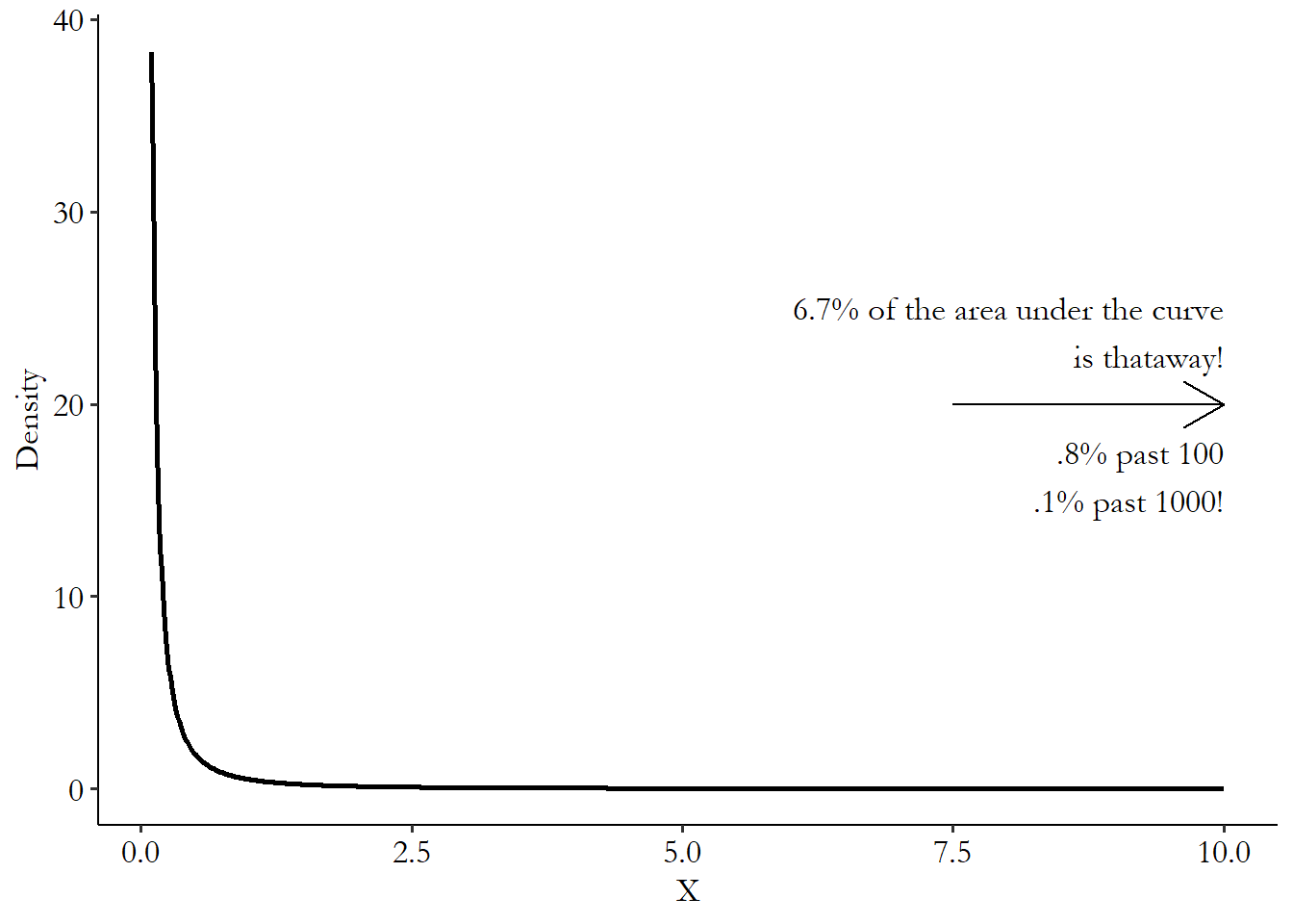
In Figure 23.1, we see the sharp initial drop that we’d expect from, say, a log-normal distribution. A lot of the values are extremely tiny. Then it looks like it goes to 0. So, nothing at the high values, right? Wrong! There’s an area underneath that curve; it’s just declining very slowly. By the time we get to an \(x\)-axis value of 10, there’s still 6.7% of the distribution left to go. Go out ten times further than that and there’s still .8% left to go. Nearly a percent of the distribution is over 100, even though the majority of the data is below 1. Go ten times further than that and there’s still .1% of the distribution left to go! One in a thousand observations will be 1,000 times higher than the median. If .1% doesn’t seem impressive to you, a normal distribution with mean (and thus median) 1 and standard deviation 1 has about .00002% of the distribution left to go at only five times the median. At 1,000 times the median, we’re dealing with a percentage represnted by a decimal point, followed by 216,717 zeroes, followed by a 3.
This distribution also lets us see what it means for the moments to be undefined. If I generate 100,000 random values from this Pareto distribution and calculate the sample mean and variance, they jump around wildly. With a sample that large, normally-distributed data would produce sample data with the true mean and standard deviation nearly every time. But in the ten samples I try with the Pareto, I get sample means anywhere from 9.6 to 38.2 (and if I kept going, I’d get means in the hundreds or thousands occasionally), and sample standard deviations from 282 to 4,413.
Fat-tailed distributions in the social sciences tend to pop up around issues of highly unequal distribution (like income) or anything to do with popularity, where the big tend to be far bigger than the rest. Let’s take music as an example, pulling some information about Spotify followers from Wikipedia at the time I write this in April 2021.
The artist with the most followers on Spotify is Ed Sheeran, with 78.7 million followers. The second-most followed artist is Ariana Grande, with 61.0 million. The #1 spot has a value a full 29% bigger than the #2 spot. By the time we get to #20, Alan Walker,718 Coincidentally, the only one in the top 20 I didn’t recognize. He is not, as I guessed from the name, a country artist. EDM! Who knew? we’re down to 27.9 million. The #1 spot is fully 281% as large as the 20th spot. That’s an enormous drop over a space of only twenty artists, especially when you consider that there are approximately 7 million artists on Spotify. I don’t have figures on all of them, but I can guarantee you that even though Alan Walker is tiny compared to Ed Sheeran, he is enormous compared to the 50th artist on the list, who in turn is enormous compared to the 100th, who in turn… and so on.719 One feature of power laws is that the fatness of their tails shows up no matter where you start the distribution. If we looked at the whole distribution of artists, it would be massively unequal. The distribution would be all squished down near 0. Chop off the little artists to, say, the top 10,000. It would still be massively skewed, and the graph of the distribution would look largely the same as when it was the whole 7 million. Cut to the top 20, as I have here, and it’s still massively skewed, even within this highly select group of super successful artists. A massive portion of those 7 million artists probably have no followers at all. That is what a fat tail looks like. The big are very big, and there aren’t just one or two of them.
Compare that to a distribution that does not have a fat tail, like the time it takes someone to run 1500 meters. Hicham El Guerrouj is the world-record holder as of this writing with a time of 3 minutes and 26 seconds. Second place is Bernard Lagat, with 3 minutes and 26.34 seconds. That’s a .16% difference between first and second place, a far cry from the 29% difference between Ed Sheeran and Ariana Grande. By the time we get to 20th place we’re only up to 3 minutes and 29.46 seconds, 1.7% away from first. Your humble author, not a highly athletic man, can do it in about 6 minutes. In the global population of billions, I’m almost certainly worse than 1 billionth place. And yet the ratio of my time to the all-time world record holder is less than 2. But if I started a locally-popular band, released a few tracks, and got a thousand followers on Spotify (which would be pretty darn good), even Alan Walker would still be beating me by a factor of 27,900. Last I checked, 27,900 is a lot bigger than 2!
Fat tails are far from just for music streams. Power law distributions pop up for income, wealth, city populations,word usages, follower counts on social media, and so on and so on. Further, quite a few variables follow a fairly typical distribution for most of the data, but then follow a power law only in the tails. City sizes are a good example of this - the world’s biggest city, Tokyo, is about twice as large as #11, New York City, which is about 50% larger than #22, Guangzhou. It drops off super quickly. But among cities that don’t have millions of people in them, the distribution is much better-behaved.
So who cares? Different variables have different distributions! So what?
As previously mentioned, the fact that the moments are undefined, but our estimators assume they are defined, means that we’re getting something wrong about our estimates of sampling distribution. How wrong? It depends on the setting. Also, these fat-tail distributions are inherently extra noisy. Whether or not you happen to get the extra-extra-big observations in your data can really change your estimates.
The most common way of dealing with this problem is with the use of logarithms, as in Chapter 13. If \(Y\) follows a power law distribution, then regressing \(log(Y)\) on \(log(X)\), instead of \(Y\) on \(X\), can help turn the relationship into a straight line that OLS can handle.
However, logarithms only go so far. If the tails get fat enough, even the logarithm won’t be able to handle it. A great example of this has been people trying to model pandemic spread during the coronavirus. Viruses tend to spread at exponential rates, since each additional infected person has a chance of infecting others, and some “super-spreaders” who come into contact with high numbers of people spread an astonishing amount of the disease. So there’s a fat tail (Wong and Collins 2020Wong, Felix, and James J. Collins. 2020. “Evidence That Coronavirus Superspreading Is Fat-Tailed.” Proceedings of the National Academy of Sciences 117 (47): 29, 416–29, 418.). And yet, the number of attempts I’ve seen that try to use a linear non-fat-tailed model to measure the causal effect of, say, lockdowns, sunlight, vaccines, or alternative treatments on coronavirus case rates, throwing at best a logarithm or a polynomial at the problem - let’s just say there are a lot of those attempts. And it doesn’t work that well.720 One particularly egregious example involved a model from the US White House predicting that daily coronavirus deaths in the United States would drop to 0 by May 15, 2020. This was extremely wrong. The prediction informed policy despite plenty of researchers pointing out the poorly-chosen model, which used a third-order polynomial. The prediction was, of course, way off, with hundreds of thousands more people in the US dying from the virus after May 15.
In these cases there are some methods we can turn to. One is to use quantile regression, which is a form of regression that, in short, tries to predict a percentile (often the median) instead of a mean. Because percentiles near the center of the distribution are not sensitive to what’s going on in the tail, these can perform better with fat-tailed data.
There are also methods designed to estimate fat tails directly. But this is a deep, deep well of research that gets highly technical. Machine learning techniques have also stepped in to help estimate these models while dealing with the wild values a power-law distribution can throw at you. One approach that is a bit easier to grasp is the application of maximum likelihood (Bauke 2007Bauke, Heiko. 2007. “Parameter Estimation for Power-Law Distributions by Maximum Likelihood Methods.” The European Physical Journal B 58 (2): 167–73.), as in the “Stronger Without You” section of this chapter. Maximum likelihood is all about picking a model that makes the data as likely as possible based on the probability distribution you give it. So, when having it calculate how likely the data is, give it a power-law distribution to work with. It will then pick parameters to help fit the model. Of course, this relies on us having an idea of which power-law distribution we’re working with. There are many!
23.7 The Treatment Mystery
At the end of a long and depressing chapter, I will lead you to a short and depressing question. It’s what I call “the treatment mystery,” and it’s this:
If the observations with different values of treatment are so comparable, then why did one of them get more treatment than the other?
This whole causal inference exercise is about trying to find observations with different levels of treatment but that are otherwise comparable. Then, the differences we see between them in the outcome should just be due to the treatment. We accomplish this by closing back doors, or isolating front doors.
But if we’ve really gotten rid of the ways in which different observations are non-comparable, then why did some of them get more treatment than others? You’d think if we’d really accounted for all the reasons they’re different, there wouldn’t be any difference in treatment, either.
A great example of this is in twin studies. There are a lot of research questions that want to know the effect of education on something - wages, civic participation, etc. There are a lot of back doors into education, however, with things like family background, genetics, demographics, personality, and so on affecting both educational attainment and other outcomes. One way to deal with this problem is by using identical twins.
By comparing one identical twin who has more education to another twin who has less, you are by necessity making a comparison between people with the same family background, genetics, demographics, and probably a lot of similarities on things like personality. Seems like a slam dunk for all those back doors being closed! And so there are quite a few studies using this design. Some of the early ones are collected in Card (1999Card, David. 1999. “The Causal Effect of Education on Earnings.” Handbook of Labor Economics 3: 1801–63.).
But then the question rears its head again. If those twins are really so identical, then why does one of them have more education than the other? Is it the result of some random outside force, as the research design would imply, or is there some real difference between the twins that led one to get more education? If it’s the latter, then that same difference that led to more education may also lead to better outcomes in some other way. The back door returns.
Sometimes this mystery isn’t such a mystery. If the process leading to treatment is really well known (as in an experiment or regression discontinuity), then there’s no real problem. But if it’s not, it’s something we have to grapple with.
Page built: 2025-10-17 using R version 4.5.0 (2025-04-11 ucrt)